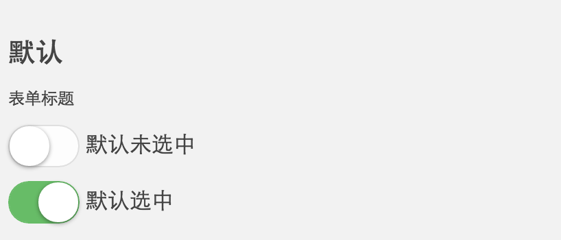
今天继续分享一个iOS风格的switch开关按钮,样子也非常常见,如图:
主要是使用了<input type="checkbox">来模拟实现,具体的HTML:
不加文字效果:(推荐)
<style>
*{margin: 0;padding: 0;}
/*按钮样式*/
.mui-switch {
  width: 52px;
  height: 31px;
  position: relative;
  border: 1px solid #dfdfdf;
  background-color: #fdfdfd;
  box-shadow: #dfdfdf 0 0 0 0 inset;
  border-radius: 20px;
  background-clip: content-box;
  display: inline-block;
  -webkit-appearance: none;
  user-select: none;
  outline: none; }
  .mui-switch:before {
    content: '';
    width: 29px;
    height: 29px;
    position: absolute;
    top: 0px;
    left: 0;
    border-radius: 20px;
    background-color: #fff;
    box-shadow: 0 1px 3px rgba(0, 0, 0, 0.4); }
  .mui-switch:checked {
    border-color: #fd5454;/*颜色修改*/
    box-shadow: #fd5454 0 0 0 16px inset;/*颜色修改*/
    background-color: #fd5454; }
    .mui-switch:checked:before {
      left: 21px; }
  .mui-switch.mui-switch-animbg {/*加过度效果*/
    transition: background-color ease 0.4s; }
    .mui-switch.mui-switch-animbg:before {
      transition: left 0.3s; }
    .mui-switch.mui-switch-animbg:checked {
      box-shadow: #fd5454 0 0 0 0 inset;/*颜色修改*/
      background-color: #fd5454;
      transition: border-color 0.4s, background-color ease 0.4s; }

</style>
</head>
<body>
  <label class="btn"><input class="mui-switch mui-switch-animbg" type="checkbox" checked="checked"></label>
  <label class="btn"><input class="mui-switch mui-switch-animbg" type="checkbox"></label>
</body>
<style>
.wrap{
	width:42px;
	height: 20px;
}
input{
	display: none;
}
label{
	display: block;
	border: 1px solid #888;
	height: 20px;
	border-radius: 15px;
	transition:.3s;
}
label span{
	display: block;
	width: 20px;
	height: 20px;
	box-shadow: 1px 1px 1px #ccc;
	border-radius: 50%;
	background: #fff;
	transition:.3s;
}
input:checked+label{
	background: #4ab10b;
}
input:checked+label span{
	transform:translateX(20px);
	box-shadow: none;
}
</style>
 <div class="wrap">
  	<input type="checkbox" id="checkbox"><!--id后台不能循环-->
  	<label for="checkbox">
  		<span></span>
  	</label>
  </div>
加文字效果on(off):

<style>
.wrap{
	width:42px;
	height: 20px;
}
input{
	display: none;
}
label{
	display: block;
	border: 1px solid #888;
	height: 20px;
	border-radius: 15px;
	transition:.3s;
}
label .move{
	display: block;
	width: 20px;
	height: 20px;
	box-shadow: 1px 1px 1px #ccc;
	border-radius: 50%;
	background: #fff;
	transition:.3s;
	overflow: hidden;
}
input:checked+label{
	background: #4ab10b;
}
input:checked+label .move{
	transform:translateX(20px);
	box-shadow: none;
}
input:checked+label .move span{
	transform:translateX(-20px);
}
.move span{
	width: 40px;
	display: block;
	line-height: 20px;
	transition:.3s;
}
em{
	text-align: center;
	width: 50%;
	font-size: 12px;
	font-style: normal;
	float: left;
}
</style>
 <div class="wrap">
  	<input type="checkbox" id="checkbox"><!--id后台不能循环-->
  	<label for="checkbox">
  		<span class="move">
  			<span>
  				<em>on</em>
  				<em>off</em>
  			</span>
  		</span>
  	</label>
  </div>