一:简介
今天在上课的时候,做完了老师的案例后感觉特别无聊,就随手做了一个小小效果,因为是随便做的,不存在什么逻辑,废话不多说,先上效果。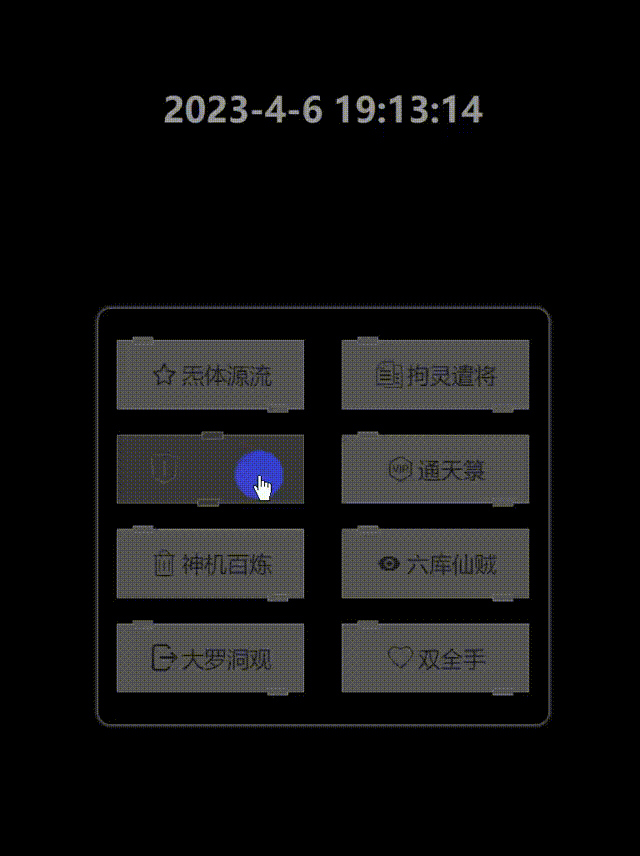
二:代码
HTML
    <div class="date"></div>
    <div class="outside">
        <div><span class='iconfont dragon-shoucang2'></span>炁体源流</div>
        <div><span class='iconfont dragon-tiezi'></span>拘灵遣将</div>
        <div><span class='iconfont dragon-jubao'></span>风后奇门</div>
        <div><span class='iconfont dragon-vip'></span>通天箓</div>
        <div><span class='iconfont dragon-icon_shanchuxian'></span>神机百炼</div>
        <div><span class='iconfont dragon-xianshikejian'></span>六库仙贼</div>
        <div><span class='iconfont dragon-a-icon_tuichudengchu'></span>大罗洞观</div>
        <div><span class='iconfont dragon-xihuan2'></span>双全手</div>
    </div>
    <div class="ton" style='display: none;' title="点击关闭">
        <div>
            <span>Jiale 提醒您:</span>
            <span></span>
        </div>
    </div>
CSS
        * {
            margin: 0;
            padding: 0;
        }

        body {
            width: 100%;
            height: 100vh;
            /* background: url(./travel-bg.png) repeat left top/auto 100%; */
            background-color: rgb(0, 0, 0);
            display: flex;
            justify-content: center;
            align-items: center;
        }

        .outside {
            width: 330px;
            display: flex;
            justify-content: space-between;
            flex-wrap: wrap;
            padding: 15px;
            box-shadow: 0 0 4px rgb(226, 226, 226);
            border-radius: 10px;
        }

        .outside >div {
            width: 150px;
            height: 55px;
            flex-shrink: 0;
            margin: 10px 0;
            background-color: rgb(85, 85, 85);
            cursor: pointer;
            display: flex;
            justify-content: center;
            align-items: center;
            font-size: 18px;
            color: rgb(30, 30, 30);
            transition: all .2s linear;
            position: relative;
            border: solid .5px rgb(114, 114, 114);
            box-sizing: border-box;
        }

        .outside >div::before {
            content: '';
            display: inline-block;
            width: 17px;
            height: 6px;
            background-color: rgb(85, 85, 85);
            border: solid .5px rgb(114, 114, 114);
            box-sizing: border-box;
            position: absolute;
            left: 8%;
            top: 0;
            transform: translateY(-50%);
            transition: all .2s linear;
        }

        .outside >div::after {
            content: '';
            display: inline-block;
            width: 17px;
            background-color: rgb(85, 85, 85);
            height: 6px;
            border: solid .5px rgb(114, 114, 114);
            box-sizing: border-box;
            position: absolute;
            right: 8%;
            bottom: 0;
            transform: translateY(50%);
            transition: all .2s linear;
        }

        .outside >div:active {
            transition: transform .01s linear;
            transform: scale(0.9);
        }

        .outside >div:hover::before {
            background-color: rgb(34, 34, 34);
            left: 80%;
        }

        .outside >div:hover::after {
            background-color: rgb(34, 34, 34);
            right: 80%;
        }

        .outside >div span {
            font-size: 24px;
            margin-right: 2px;
            color: rgb(30, 30, 30);
            transition: all .1s linear;
        }

        .outside >div:hover {
            background-color: rgb(34, 34, 34);
            border: rgb(85, 85, 85) solid 1.5px;
            box-sizing: border-box;
            color: rgb(85, 85, 85);
        }

        .outside >div:hover span {
            color: rgb(85, 85, 85);
        }

        .ton {
            width: 100%;
            height: 100%;
            position: absolute;
            top: 0;
            left: 0;
            display: flex;
            justify-content: center;
            align-items: center;
            background-color: rgba(218, 218, 218, 0.8);
            cursor: pointer;
        }

        .ton >div {
            width: 400px;
            height: 250px;
            border: solid 1px rgb(114, 114, 114);
            padding: 20px;
            box-sizing: border-box;
            background-color: rgb(85, 85, 85);
            color: rgb(204, 204, 204);
        }

        .ton >div span:nth-child(1) {
            display: block;
            width: 100%;
            text-align: center;
            font-size: 22px;
            font-weight: bolder;
        }

        .ton >div span:nth-child(2) {
            display: inline-block;
            text-indent: 1em;
            margin-top: 20px;
        }

        .date {
            width: 100%;
            height: 300px;
            position: absolute;
            top: 0;
            left: 0;
            color: rgb(150 ,150, 150);
            display: flex;
            justify-content: center;
            align-items: center;
            font-size: 28px;
            font-weight: bolder;
        }
Javascript
        var btns = document.querySelectorAll('.outside >div');
        var ton = document.querySelector('.ton');
        var tonText = document.querySelector('.ton span:nth-child(2)');
        for(var i = 0;i < btns.length;i++) {


            btns[i].onclick = function() {


                var txt = this.innerText;
                ton.style.display = 'flex';
                tonText.innerText = '您点了【'+txt+'】按钮~~~';
            };
        }
        ton.onclick = function() {


            this.style.display = 'none';
        };
        var dataTxt = document.querySelector('.date');
        function getYear() {


            var date = new Date();
            var nian = date.getFullYear();
            var yue = date.getMonth();
            var ri = date.getDate();
            var shi = date.getHours();
            var fen = date.getMinutes();
            var miao = date.getSeconds();
            dataTxt.innerText = `${

      nian}-${

      yue+1}-${

      ri} ${

      shi}:${

      fen}:${

      miao}`;
        }
        var dateTimer = setInterval(function(){


            getYear();
        },1000);
        getYear();
按钮上的图标都是用的**阿里巴巴矢量图标库**的,大家可以申请账号去上边找,也可以用我的:
<link rel="stylesheet" href="https://at.alicdn.com/t/c/font_2992255_hcta2cgzds5.css?spm=a313x.7781069.1998910419.74&file=font_2992255_hcta2cgzds5.css">
直接在head标签中引入即可。
三:结论
目前我的代码还存在许多问题,还求大佬们帮我指出错误,十分感谢能看完本篇文章!