使用CSS和JavaScript创建动画
关于Web动画,这是一个非常广泛的主题,目前,有数百个库,工具和插件,可用于创建从简单到复杂的动画。在本文中,我将简要介绍一些可以使用HTML,CSS和JavaScript实现的动画。
使用CSS和JavaScript创建的HTML 动画的基础页面源码如下
<!doctype html>
<html>
<head>
<meta charset="UTF-8">
<title>标题</title>
<style>
/*
CSS部分
*/
</style>
</head>
<body>
<div>
<!-- div部分 -->
</div>
<script>
//JS部分
</script>
</body>
</html>
下面是一个使用CSS和JavaScript创建的HTML 动画实际例子的源码
<!DOCTYPE html>
<html>
<head>
<meta charset="UTF-8">
<title>使用CSS和JavaScript创建动画</title>
<style>
#container {
  width: 400px;
  height: 400px;
  position: relative;
  background: yellow;
}
#animate {
  width: 50px;
  height: 50px;
  position: absolute;
  background-color: red;
}
</style>
</head>

<body>

<p><button onclick="myMove()">单击我</button></p>

<div id ="container">
  <div id ="animate"></div>
</div>

<script>
function myMove() {
  var elem = document.getElementById("animate");
  var pos = 0;
  var id = setInterval(frame, 5);
  function frame() {
    if (pos == 350) {
      clearInterval(id);
    } else {
      pos++;
      elem.style.top = pos + "px";
      elem.style.left = pos + "px";
    }
  }
}
</script>

</body>
</html>
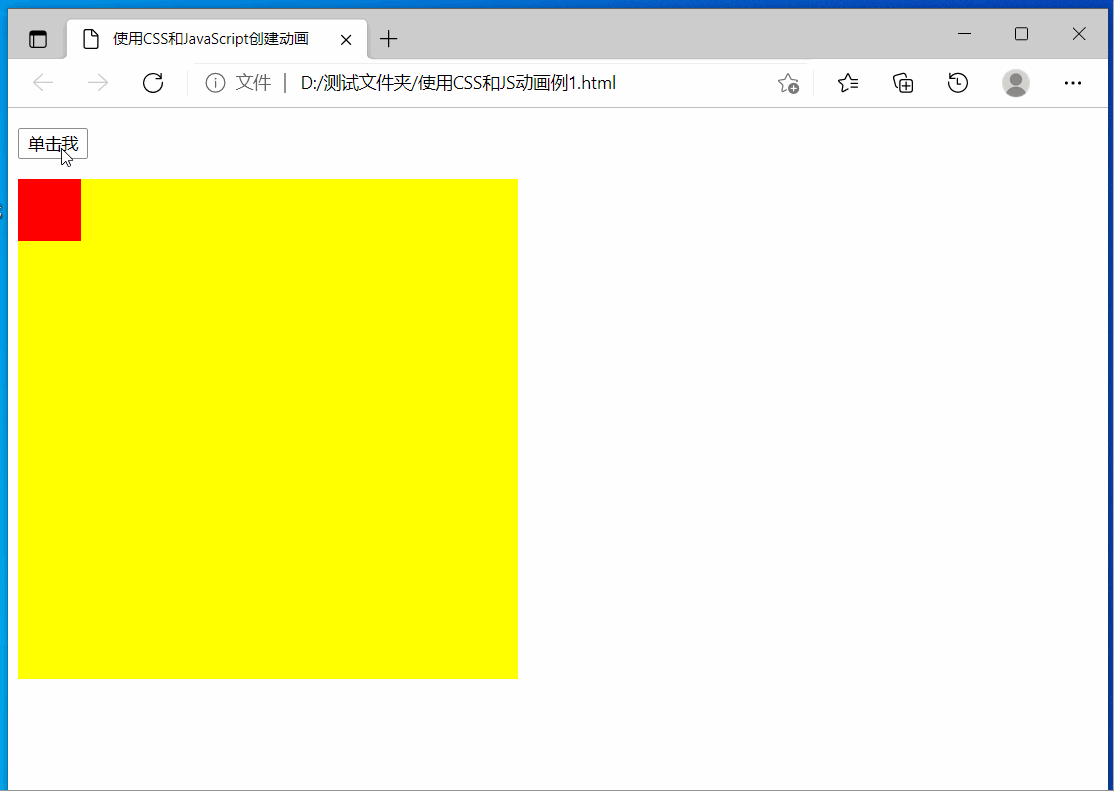
保存文件名为:使用CSS和JS动画例1.html,用浏览器运行之,效果如下图:
@keyframes是CSS的一种规则,可以用来定义CSS动画的一个周期的行为,创建简单的动画。详见@keyframes - CSS(层叠样式表) | MDN
下面是一个动画实际例子的源码:
<!DOCTYPE html>
<html>
<head>
<meta charset="utf-8">
<title>CSS3 动画</title>
<style>
div
{
    width:100px;
    height:100px;
    background:red;
    position:relative;
    animation-name:myfirst;
    animation-duration:5s;
    animation-timing-function:linear;
    animation-delay:2s;
    animation-iteration-count:infinite;
    animation-direction:alternate;
    animation-play-state:running;
    /* Safari and Chrome: */
    -webkit-animation-name:myfirst;
    -webkit-animation-duration:5s;
    -webkit-animation-timing-function:linear;
    -webkit-animation-delay:2s;
    -webkit-animation-iteration-count:infinite;
    -webkit-animation-direction:alternate;
    -webkit-animation-play-state:running;
}

@keyframes myfirst
{
    0%   {background:red; left:0px; top:0px;}
    25%  {background:yellow; left:200px; top:0px;}
    50%  {background:blue; left:200px; top:200px;}
    75%  {background:green; left:0px; top:200px;}
    100% {background:red; left:0px; top:0px;}
}

@-webkit-keyframes myfirst /* Safari and Chrome */
{
    0%   {background:red; left:0px; top:0px;}
    25%  {background:yellow; left:200px; top:0px;}
    50%  {background:blue; left:200px; top:200px;}
    75%  {background:green; left:0px; top:200px;}
    100% {background:red; left:0px; top:0px;}
}
</style>
</head>
<body>

<div>
</div>

</body>
</html>
保存文件名为:使用CSS和JS动画例1.html,用浏览器运行之,效果如下图:

下面是一个仅使用CSS创建HTML文字特效的源码
<!DOCTYPE html>
<html>

<head>
    <meta charset="UTF-8" />
    <title>css文本动画</title>

    <style>
        h1 {
            margin: 0;
            padding: 0;
            position: absolute;
            top: 20%;
            left: 30%;
            font-size: 5em;
            color: #ccc;
        }

        h1::before {
            /* This will create the layer
               over original text*/
            content: attr(data-text);
            position: absolute;
            top: 0;
            left: 0;

            /* Setting different color than
               that of original text  */
            color: green;
            overflow: hidden;

            /* Setting width as 0*/
            width: 0%;
            transition: 1s;
        }

        h1:hover::before {

            /* Setting width to 100 on hover*/
            width: 100%;
        }
    </style>
</head>

<body>
    <p>将鼠标滑过下面的文字看看</p>
    <h1 data-text="Hello,world">Hello,world</h1>
</body>

</html>
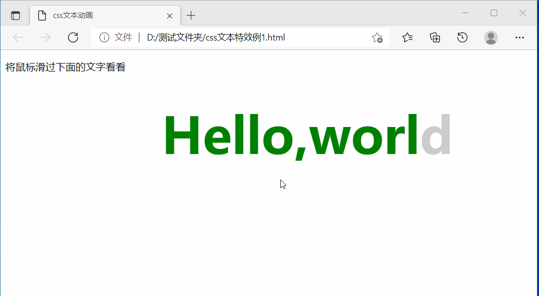
保存文件名为:css文本特效例1.html,用浏览器运行之,效果如下图:
下面是一个仅使用CSS创建HTML图片特效的源码
<!DOCTYPE html>
<html>
<head>
    <meta charset="UTF-8" />
    <title>css图片特效</title>

<style>
* {
  margin: 0; padding: 0;
  box-sizing: border-box;
}
html { height: 600px; min-height: 150%; }
body {
  min-height: 100%;
  background: linear-gradient( hsl(80,51%,8%), #E0D7A3);
}
div {
  perspective: 1000px;
  width: 33%;
  margin: 0 auto;
  margin-top: 3rem;
}
figure {
  margin: 0;
  width: 100%;
  height: 29.5vw;
  background: url("./beauty.jpg");
	background-size: 100%;
	transform-origin: center bottom;
	transform-style: preserve-3d;
	transition: 1s transform;
 }
figure figcaption {
  width: 100%;
  background: linear-gradient(rgba(0, 0, 0, 0.4), rgba(0, 0, 0, 0.4)),
		url("./beauty.jpg");
	background-size: 100%; height: 50px;
	background-repeat: no-repeat;
  background-position: bottom;
  color: #fff;
	position: relative; top: 29.5vw;
	transform-origin: center top;
	transform: rotateX(-89.9deg);
	font-size: 1.2vw;
  font-family: Montserrat, Arial, sans-serif;
  text-align: center;
	line-height: 3;
}
figure:before {
  content: '';
  position: absolute; top: 0; left: 0;
  width: 100%; height: 100%;
	box-shadow: 0 0 100px 50px rgba(0, 0, 0, 0.1), inset 0 0 250px 250px rgba(0, 0, 0, 0.1);
	transition: 1s;
	transform: rotateX(95deg) translateZ(-80px) scale(0.75);
	transform-origin: inherit;
}
div:hover figure {
  transform: rotateX(75deg) translateZ(5vw);
}
div:hover figure:before {
	box-shadow: 0 0 25px 25px rgba(0, 0, 0, 0.5), inset 0 0 250px 250px rgba(0, 0, 0, 0.5);
	transform: rotateX(-5deg) translateZ(-80px) scale(1);
	}

@media screen and (max-width: 800px) {
  div { width: 50%; }
  figure { height: 45vw; }
  figure figcaption {
    top: 45vw;
    font-size: 2vw;
  }
}

@media screen and (max-width: 500px) {
  div {
    width: 80%;
    margin-top: 1rem;
  }
  figure {
    height: 70vw;
  }
  figure figcaption {
    top: 70vw;
    font-size: 3vw;
  }
}
</style>
</head>

<body>

  <div onclick="">
    <figure>
      <figcaption>Anna, happy</figcaption>
    </figure>
    <p>将鼠标滑过图片看看</p>

  </div>

</body>

</html>
保存文件名为:css图片特效例1.html,在此文件名所在的文件夹中,准备一张名为beauty.jpg的图片,用浏览器运行css图片特效例1.html,效果如下图:

附、CSS 动画 使用 CSS 动画 - CSS(层叠样式表) | MDN
CSS动画属性 CSS animated properties - CSS(层叠样式表) | MDN
canvas(画布)标签是 HTML5添加的新标签,一个画布在网页中是一个矩形框用于定义图形,比如图表和其他图像,使用脚本 (通常是JavaScript)来绘制图形、实现动画。HTML Canvas 参考可见HTML Canvas 参考手册
下面是一个仅使用Canvas创建HTML图片特效的源码
<!DOCTYPE html>
<html>
<head>
    <meta charset="UTF-8">
    <title>>Canvas实现游戏人物的跑步</title>
</head>
<body>
<canvas id="cv" width="300px" height="300px">浏览器不支持 canvas</canvas>
<script>
    var imageObj = new Image();//创建图像对象
    var x =300;
    var n =0; //计数器
    function init(){
        imageObj.src = 'Snap1.jpg';
        imageObj.onload = function(){ //图片加载成功
           setInterval(draw,100); //定时器,每 0.1 秒执行一次 draw()函数
        }
    };

    function draw(){
        var mycv = document.getElementById("cv"); //获取网页中的 canvas 对象
        var myctx = mycv.getContext("2d");  //获取 canvas 对象的上下文
        myctx.clearRect(0,0,300,300); //清除 canvas 画布
        //myctx.drawImage(imageObj, 60*n, 0, 60, 80, x, 0, 60, 80); //从原图(60*n)位置开始截取中间一块宽 60*高 80 的区域,显示在屏幕(x,0)处
        myctx.drawImage(imageObj, 55*n, 0, 55, 80, x, 0, 55, 80); //从原图(60*n)位置开始截取中间一块宽 55*高 80 的区域,显示在屏幕(x,0)处
        if(n>=8){
           n=0;
         }else{
            n++;
         }

        if(x>=0){
           x=x-30; //前移 30 像素
        }else{
            x=300; //回到右侧
        }
    }

    window.addEventListener('load', init, true);

</script>

</body>
</html>
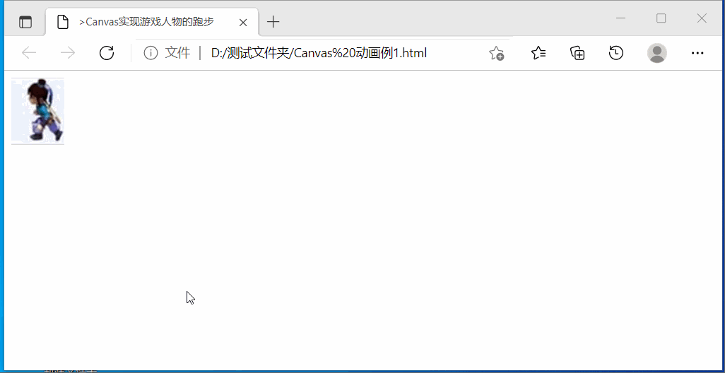
保存文件名为:Canvas 动画例1.html,在此文件名所在的文件夹中,准备一张名为Snap1.jpg的图片:
用浏览器运行css图片特效例1.html,效果如下图: