CSS之@keyframes属性创建动画示例
@keyframes是CSS的一种规则,可以用来定义CSS动画的一个周期的行为,创建简单的动画。详见@keyframes - CSS(层叠样式表) | MDN
下面是一个动画实际例子的源码:
通过 @keyframes 规则创建动画的原理是,将一套 CSS 样式逐渐变化为另一套样式。在动画过程中,您能够多次改变这套 CSS 样式。以百分比来规定改变发生的时间,或者通过关键词 "from" 和 "to",等价于 0% 和 100%。0% 是动画的开始时间,100% 动画的结束时间。为了获得最佳的浏览器支持,您应该始终定义 0% 和 100% 选择器。
示例代码如下:
<!DOCTYPE html>
<html>
<head>
<style>
div
{
  width:100px;
  height:100px;
  background:red;
  position:relative;
  animation:mymove 5s infinite;
}

@keyframes mymove
{
  0%   {top:0px;}
  25%  {top:200px;}
  75%  {top:50px}
  100% {top:100px;}
}

</style>
</head>
<body>

<div></div>

</body>
</html>
保存文件名为: css之@keyframes属性示例.html,用浏览器运行之,效果如下图:

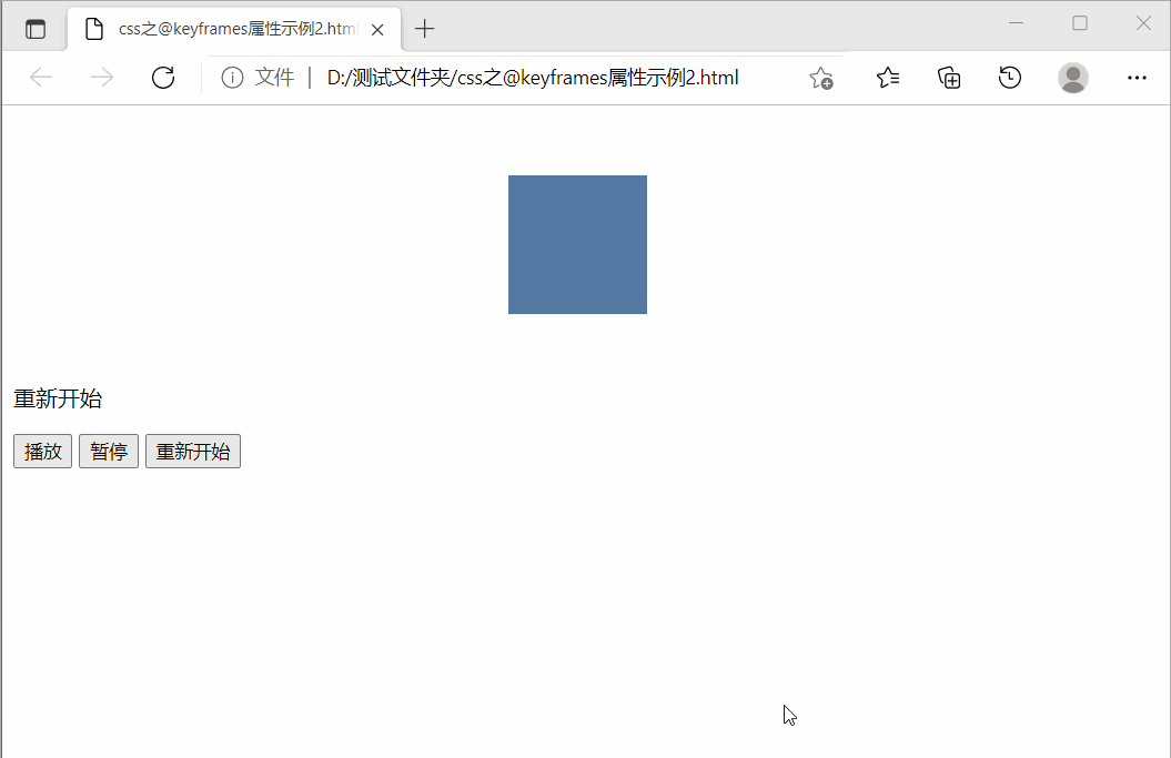
下面示例,增加了“播放”、“暂停”和“重新开始”控制功能
播放动画时,如要暂停动画,就要用到animation-play-state这个属性。animation-play-state属性有两个值:
扫描二维码关注公众号,回复:
13464431 查看本文章

paused: 暂停动画;
running: 继续播放动画;
而要重新开始动画,载一个相同的动画,不同名字,可以达到重新开始的效果。
源码如下:
<!DOCTYPE html>
<html>
<head>
<style>
@keyframes mymove {
    0% {
      margin-left: 0px;
    }
    50% {
      margin-left: 400px;
    }
    100% {
      margin-left: 0px;
    }
  }
  @keyframes mymove1 {
    0% {
      margin-left: 0px;
    }
    50% {
      margin-left: 400px;
    }
    100% {
      margin-left: 0px;
    }
  }
  .box {
    margin: 50px 0;
    width: 100px;
    height: 100px;
    background-color: #5578a2;
  }
  .play {
    animation: mymove 5s infinite ease;
  }
  .restart {
    animation: mymove1 5s infinite ease;
  }
  .pause {
    animation-play-state: paused;
  }
</style>
</head>
<body>
<div id="box" class="box"></div>
  <p id="text"></p>
  <div class="control">
    <button id="play" value="播放">播放</button>
    <button id="pause" value="暂停">暂停</button>
    <button id="restart" value="重新开始">重新开始</button>
  </div>

<script>
var play = document.getElementById('play'),
    pause = document.getElementById('pause'),
    restart = document.getElementById('restart'),
    text = document.getElementById('text'),
    box = document.getElementById('box');
  pause.addEventListener('click', function() {
    if (box.classList.contains('play')) {
      box.className = 'pause play box';
    } else {
      box.className = 'pause restart box';
    }
    text.innerHTML = this.value;
  });
  play.addEventListener('click', function() {
    if (box.classList.contains('play')) {
      box.className = 'play box';
    } else {
      box.className = 'restart box';
    }
    text.innerHTML = this.value;
  });
  restart.addEventListener('click', function() {
    if (box.classList.contains('play')) {
      box.className = 'restart box';
    } else {
      box.className = 'play box';
    }
    text.innerHTML = this.value;
  });
</script>
</body>

</html>
保存文件名为: css之@keyframes属性示例.html,用浏览器运行之,效果如下图:
下面给出使用@keyframes属性实现图片不停旋转效果示例,源码如下:
<!DOCTYPE html>
<html>
	<head>
		<meta charset="UTF-8">
		<title>css实现图片不停旋转</title>
		<style>
			#img {
				border-radius: 50%;
				cursor: pointer;
				position: absolute;
				top: 50%;
				left: 50%;
				margin-top: -150px;
				margin-left: -150px;
				animation: rotate 10s linear infinite;
			}
			#img:hover {
				animation-play-state: paused;
			}
			@keyframes rotate {
				from {
					transform: rotate(0deg);
				}
				to {
					transform: rotate(360deg);
				}
			}
		</style>

	</head>
	<body>
		<img id="img" src="图1.jpg" width="300px" height="300px" />
        鼠标悬停在图片上,停止旋转
	</body>
</html>
保存文件名为: CSS之@keyframes属性实现图片不停旋转.html,此网页文件需要在同一文件夹中有一张名为“图1.jpg”图片,我这里的图片是:

用浏览器运行之,效果如下图:
