赛题的分类:
太阳底下无新事,都是出现过的赛题只是换了场景和数据


建模与问题解决流程
了解场景和目标
了解评估准则
1.数据处理
数据清洗
观察数据是否平衡 比如广告点击 不点才是大概率
需要清除离心点,不然会破坏模型性能
不可信的样本丢掉(需要人根据常识判断)
缺省值极多的字段考虑不用
数据采样
数据采样:上下采样和保证样本均衡(1:3差不多,1:10差距太大)
数据归一化
训练集,验证集,测试集都使用训练集训练的归一化
from sklearn.preprocessing import StandardScaler
#x_train : [None,28,28] -> [None,784]    standardscaler传入的是二维数据
scaler = StandardScaler().fit_transform(x_train.reshape(-1,1)),reshape(-1,28,28)
文本数据的预处理
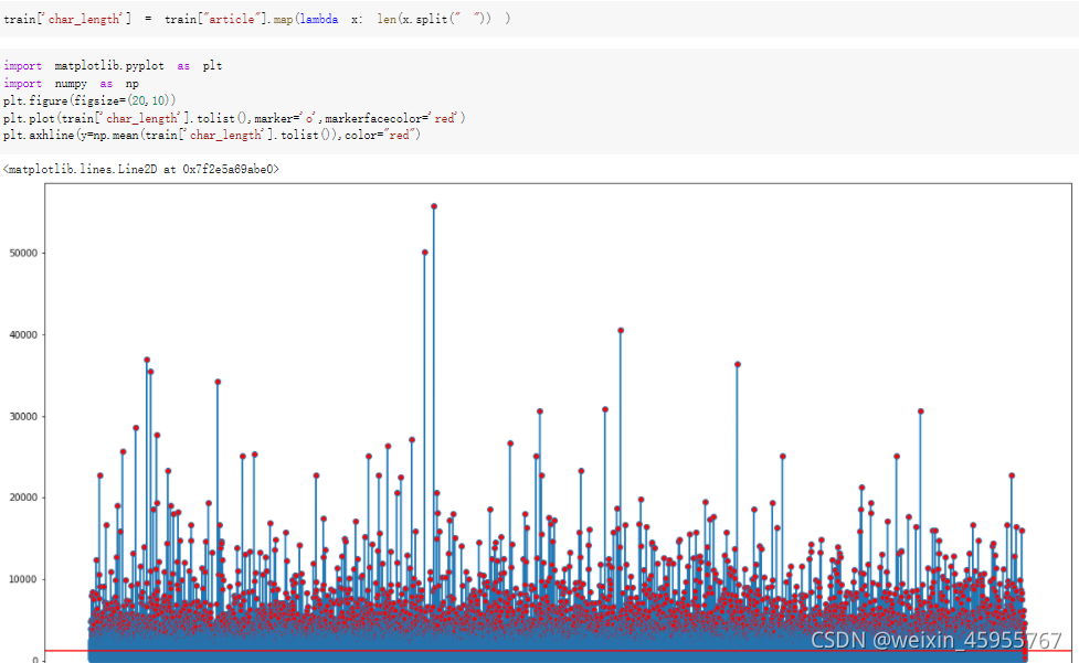
词粒度的文本长度

 字粒度的文本长度
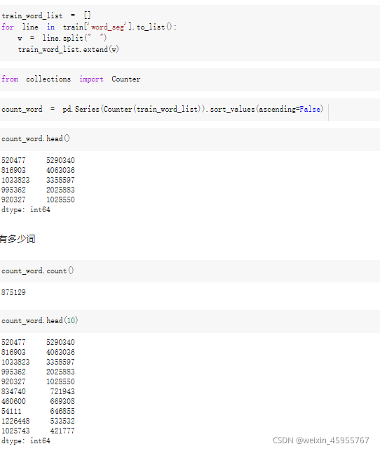
统计词的数量
2.特征工程

时间类的特征可以做成间隔型,也可以做出频度
比如离双十一若干天,比如离放假若干天;比如一周剁手多少次
文本特征的数据可以求n-gram,可以做词袋于统计词频,可以TF- IDF来看词的权重
统计型数据 是用来拿到数值相对总体的位置
sklearn特征抽取:
6.3. Preprocessing data — scikit-learn 0.24.2 documentation
API Reference — scikit-learn 0.24.2 documentation
数据量特别大,那逐类特征做scaling
特征的贡献优于模型

离散化
比如大于xx,为1;小于xx,为0
然后独热编码
enc = preprocessing.OneHotEncoder()
enc.fit(训练编码器的数据)
enc.transform(新数据).toarray()
from sklearn.preprocessing import OneHotEncoder
enc = OneHotEncoder(handle_unknown='ignore') #训练数据
X = [['Male', 1], ['Female', 3], ['Female', 2]] #训练
enc.fit(X)enc.transform([['Female', 1], ['Male', 4]]).toarray() #测试数据缺失值 数量比较少的用众数填充,适中的把缺省值作为独立的类型和其他类做one-hot,缺省值非常多直接放弃
特征的分布长尾且差距很大:可以推出这个特征对结果的贡献不一定很大,如果是连续值,要进行离散化

特征选择:通过特征变换产生了特别多特征就需要特征选择
recursive featyre elimination :把对最终结果贡献绝对值少的特征直接踢掉
feature selection using SelectFromModel:有个feature importance
特征融合:
gp1 = SymbolicTransformer(generations=1, population_size=1000,
                              hall_of_fame=600, n_components=100,
                              function_set=function_set,
                              parsimony_coefficient=0.0005,
                              max_samples=0.9, verbose=1,
                              random_state=0, n_jobs=3)


label = data['TARGET']  #换成标签
train = data.drop(columns=['TARGET'])  #要融合的特征
train = data[['列名1','列名2']]

gp1.fit(train,label)
new_df2 = gp1.transform(train)


#可视化融合的特征
from IPython.display import Image
import pydotplus
graph = gp1._best_programs[0].export_graphviz()
graph = pydotplus.graphviz.graph_from_dot_data(graph)
Image(graph.create_png())
3·模型选择
4.寻找最佳超参数:交叉验证
cross-validation:通过多次测试的平均
确定哪个模型好
from sklearn.model_selection import cross_val_score
clf = svm.SVC(kernel='linear',C=1)
scores = cross_val_score(clf,X_train,y_train,cv=5)
scores
grid search
进一步确定模型的超参数
参数搜索
from scipy.stats import reciprocal
param_distribution={
    "hidden_layers":[1,2,3,4],
    "layer_size":np.arrange(1,100),

    "learning_rate":reciprocal(1e-4,1e-2),
}
from sklearn.model_selection import RandomizedSearchCV
random_search_cv = RandomizedSearchCV(sklearn_model,param_distribution,n_iter=10,n_jobs = 5)
random_search_cv.fit(x_train,y_train,epochs = 100,validation_data =(x_valid,y_valid),callbacks=callbacks)
print(random_search_cv.best_params_) #获取最好的参数
print(random_search_cv.best_score_) #获取最好的结果
print(random_search_cv.best_estimator_) #获取最好的模型
5.模型分析与模型融合
学习曲线来判断overfitting或者underfitting
解决过拟合问题,增大样本的量是最有效的方式,增加正则化可能有用

stacking :将上级分类器的结果中作为下级分类器的特征,神经网络就是在干这样的事情
stacking脚本
"""Kaggle competition: Predicting a Biological Response.

Blending {RandomForests, ExtraTrees, GradientBoosting} + stretching to
[0,1]. The blending scheme is related to the idea Jose H. Solorzano
presented here:
http://www.kaggle.com/c/bioresponse/forums/t/1889/question-about-the-process-of-ensemble-learning/10950#post10950
'''You can try this: In one of the 5 folds, train the models, then use
the results of the models as 'variables' in logistic regression over
the validation data of that fold'''. Or at least this is the
implementation of my understanding of that idea :-)

The predictions are saved in test.csv. The code below created my best
submission to the competition:
- public score (25%): 0.43464
- private score (75%): 0.37751
- final rank on the private leaderboard: 17th over 711 teams :-)

Note: if you increase the number of estimators of the classifiers,
e.g. n_estimators=1000, you get a better score/rank on the private
test set.

Copyright 2012, Emanuele Olivetti.
BSD license, 3 clauses.
"""

from __future__ import division
import numpy as np
import load_data
from sklearn.cross_validation import StratifiedKFold
from sklearn.ensemble import RandomForestClassifier, ExtraTreesClassifier
from sklearn.ensemble import GradientBoostingClassifier
from sklearn.linear_model import LogisticRegression


def logloss(attempt, actual, epsilon=1.0e-15):
    """Logloss, i.e. the score of the bioresponse competition.
    """
    attempt = np.clip(attempt, epsilon, 1.0-epsilon)
    return - np.mean(actual * np.log(attempt) +
                     (1.0 - actual) * np.log(1.0 - attempt))


if __name__ == '__main__':

    np.random.seed(0)  # seed to shuffle the train set

    n_folds = 10
    verbose = True
    shuffle = False

    X, y, X_submission = load_data.load()

    if shuffle:
        idx = np.random.permutation(y.size)
        X = X[idx]
        y = y[idx]

    skf = list(StratifiedKFold(y, n_folds))

    clfs = [RandomForestClassifier(n_estimators=100, n_jobs=-1, criterion='gini'),
            RandomForestClassifier(n_estimators=100, n_jobs=-1, criterion='entropy'),
            ExtraTreesClassifier(n_estimators=100, n_jobs=-1, criterion='gini'),
            ExtraTreesClassifier(n_estimators=100, n_jobs=-1, criterion='entropy'),
            GradientBoostingClassifier(learning_rate=0.05, subsample=0.5, max_depth=6, n_estimators=50)]

    print "Creating train and test sets for blending."

    dataset_blend_train = np.zeros((X.shape[0], len(clfs)))
    dataset_blend_test = np.zeros((X_submission.shape[0], len(clfs)))

    for j, clf in enumerate(clfs):
        print j, clf
        dataset_blend_test_j = np.zeros((X_submission.shape[0], len(skf)))
        for i, (train, test) in enumerate(skf):
            print "Fold", i
            X_train = X[train]
            y_train = y[train]
            X_test = X[test]
            y_test = y[test]
            clf.fit(X_train, y_train)
            y_submission = clf.predict_proba(X_test)[:, 1]
            dataset_blend_train[test, j] = y_submission
            dataset_blend_test_j[:, i] = clf.predict_proba(X_submission)[:, 1]
        dataset_blend_test[:, j] = dataset_blend_test_j.mean(1)

    print
    print "Blending."
    clf = LogisticRegression()
    clf.fit(dataset_blend_train, y)
    y_submission = clf.predict_proba(dataset_blend_test)[:, 1]

    print "Linear stretch of predictions to [0,1]"
    y_submission = (y_submission - y_submission.min()) / (y_submission.max() - y_submission.min())

    print "Saving Results."
    tmp = np.vstack([range(1, len(y_submission)+1), y_submission]).T
    np.savetxt(fname='submission.csv', X=tmp, fmt='%d,%0.9f',
               header='MoleculeId,PredictedProbability', comments='')
boosting 做错就不断重做
参考链接:
机器学习系列(4)_机器学习算法一览,应用建议与解决思路_寒小阳-CSDN博客_机器学习算法
机器学习系列(19)_通用机器学习流程与问题解决架构模板_寒小阳-CSDN博客_通用机器学习
数据预处理
常见的图像数据扩增方法

数据导入和数据报告
优秀的eda合集:
 https://www.kaggle.com/illgamhoduck/nfl-starter-eda
# 导入相关库

import pandas as pd
import pandas_profiling as pp

# 加载数据集
data = pd.read_csv()
report = pp.ProfileReport(data)
report
视频数据的读取
def get_total_frame(video_path):
    cap = cv2.VideoCapture(f"{DATA_DIR}/train/{video_path}")
    #opencv2的属性 进行插帧
    property_id = int(cv2.CAP_PROP_FRAME_COUNT)
    #获取视频的帧长
    length = int(cv2.VideoCapture.get(cap, property_id))

    return length
数据的简单描述
data=pd.read_csv()
data.describe()
data["column"].value_counts() #输出不同值的数量
data["column"].unique() #查看字段的取值空间
data["column"].nunique() #查看字段的取值数量
data.dtypes显示的int64的字段就一定是数值类型的吗
可能是编码后的类别类型
如何计算特征之间的相关性
data.corr()
相关性是有正有负的,正相关负相关都会有用,相关性可以取绝对值进行排序
如何查看离散变量之间的关系
sns.scatterplot(data[" "],data[" "])

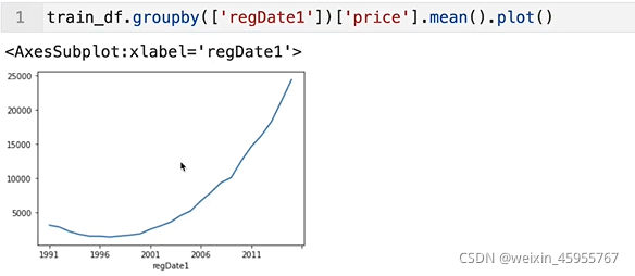
如何从时间数据中获取所需的年份,月份
data[' '].apply(lambda x:str(x)[:4])
怎么用?对年份做groupby之后取出price做均值后画图

如何画特征取值的分布图
sns.distplot()
如何利用id
通过聚类来降维
频次很低的样本
思路1:直接看频次很低的样本本身是不是能直接做判定
思路2:把频次很低的样本堆起来作为一个类别
按照某个标签对数据进行分组
data=pd.read_csv()
data.groupby{'列名',{'列名':g1.aggregate.MEAN('字段值')}}
统计均值,方差,标准差,假如差异特别大,这个就是特别好的特征
时间序列的过滤truncate
时间序列.truncate(before='xx') 在xx之前的值都不要了
时间序列.truncate(after='xx') 在xx之后的值都不要了
对类别进行编码
利用字典和map函数
词性归一化
词干提取:就是把不影响 inflection的尾巴砍掉
walking->walk
from nltk.stem.porter import PorterStemmer
poster_stemmer = PorterStemmer()
porter_stemmer.stem()
词形归一化:将各种类型的词的变形都归一化
went->go


获取单词的词性

有偏数据变正态分布

对数变换:可以让方差和均值呈现线性
data.apply(np.log) 减小偏度和峰度
data.apply(np.log).apply(scipy.stats.skew) #观察偏度
data.apply(np.log).apply(scipy.stats.kurtosis) #观察峰度

def plot_hist(df, variable, bins=20, xlabel=None, by=None,
              ylabel=None, title=None, logx=False, ax=None):

    if not ax:
        fig, ax = plt.subplots(figsize=(12,8))
    if logx:
        if df[variable].min() <=0:
            df[variable] = df[variable] - df[variable].min() + 1
            print('Warning: data <=0 exists, data transformed by %0.2g before plotting' % (- df[variable].min() + 1))

        bins = np.logspace(np.log10(df[variable].min()),
                           np.log10(df[variable].max()), bins)
        ax.set_xscale("log")

    ax.hist(df[variable].dropna().values, bins=bins);

    if xlabel:
        ax.set_xlabel(xlabel);
    if ylabel:
        ax.set_ylabel(ylabel);
    if title:
        ax.set_title(title);

    return ax
plot_hist(recent, 'total_pop', bins=25, logx=True,
          xlabel='Log of total population', ylabel='Number of countries',
          title='Distribution of total population of countries 2013-2017');
基础模型介绍


评估样本量超过50,可以考虑使用ml算法,<50或者特征很少可以参考统计加检索规则
假如是连续值,就走regression
假如是分类,考虑classification或者clustering
假如数据维度很大,考虑dimensionality reuction
Kmeans主要做辅助:先聚类,然后将聚类的结果作为特征然后特征送到监督学习训练
1.感知机模型perception
感知机是个特征空间的超平面 w是超平面的法向量 b是超平面的截距
超平面:超平面下的点带入超平面的方程值<0,超平面上的点=0,超平面以上的点带入线性方程值>0
感知机的训练策略:
假设数据是线性可分的
目标是找到把正例和负例区别
学习策略(损失函数):误分类点(但是这个不可导),那就用误分类点到平面的总距离

 ---------------->
  对所有点求和
![]() ------------->
------------->
- 
求和后的式子带绝对值
2.deepsort 模型
什么用? 可以识别不同帧中的相同物体
怎么用?
方法1:只训练YOLO检测模型,然后YOLO +已有的重识别模块;
方法2:训练YOLO检测模型,也训练重识别模块
从训练完的yolov5拷贝最好的模型
!cp ../input/nfl-train-yolo-single-class/yolov5/weights/best.pt Yolov5_DeepSort_Pytorch/.使用最好的模型结合deepsort 预测
!cd Yolov5_DeepSort_Pytorch && python3 track.py --source ../../input/nfl-health-and-safety-helmet-assignment/test/58102_002798_Sideline.mp4 --yolo_weights best.pt --img 640 --save-vid
利用CNN提取物体特征,然后使用卡尔曼滤波更新状态,并与下一帧进行匹配、物体检测/特征提取模块
可以用YOLO或其他模型运动物体的三个状态:初始化、捕捉、消失;
常见的绘图方式
加入bins设置直方图间隔
加入dpi参数提高图像清晰度
调整x轴刻度
#列表里是x轴的刻度
plt.xticks([])
密集刻度的处理
#横轴数据传入一个列表
plt.xticks(横轴数据[::2])
matlabplotlib显示中文
#这种画法可以用在时间序列里面
plt.xticks(['中文哈哈哈{}'.format(i) for i in range(范围)])
#把这个放到导入库的地方
font = {'family':'MicroSoft YaHei','weight':'bold','size':'larger'}
matplotlib.rc("font",family='MicroSoft YaHei',weight="bold")matlabplotlib xticks设置角度
plt.xticks(rotation=角度值 范围是0-360°)
分格设置

盒图
import matplotlib.pyplot as plt
import numpy as np

tang_data = [np.random.normal(0,std,100) for std in range(1,4)]
fig = plt.figure(figsize = (8,6))
plt.boxplot(tang_data,notch=False,sym='s',vert=True)

plt.xticks([y+1 for y in range(len(tang_data))],['x1','x2','x3'])
plt.xlabel('x')
plt.title('box plot')
不同颜色的盒图
tang_data = [np.random.normal(0,std,100) for std in range(1,4)]
fig = plt.figure(figsize = (8,6))
bplot = plt.boxplot(tang_data,notch=False,sym='s',vert=True,patch_artist=True)

plt.xticks([y+1 for y in range(len(tang_data))],['x1','x2','x3'])
plt.xlabel('x')
plt.title('box plot')
colors = ['pink','lightblue','lightgreen']
for pathch,color in zip(bplot['boxes'],colors):
pathch.set_facecolor(color) 
直方图,散点图
import numpy as np
import matplotlib.pyplot as plt

data = np.random.normal(0,20,1000)
bins = np.arange(-100,100,5)      #bins是范围

plt.hist(data,bins=bins)
plt.xlim([min(data)-5,max(data)+5])
plt.show() 
两个数据分布的直方图
import random
data1 = [random.gauss(15,10) for i in range(500)]
data2 = [random.gauss(5,5) for i in range(500)]
bins = np.arange(-50,50,2.5)

plt.hist(data1,bins=bins,label='class 1',alpha = 0.3)
plt.hist(data2,bins=bins,label='class 2',alpha = 0.3)
plt.legend(loc='best')
plt.show()
带坐标的点图
x_coords = [0.13, 0.22, 0.39, 0.59, 0.68, 0.74, 0.93]
y_coords = [0.75, 0.34, 0.44, 0.52, 0.80, 0.25, 0.55]

plt.figure(figsize = (8,6))
plt.scatter(x_coords,y_coords,marker='s',s=50)

for x,y in zip(x_coords,y_coords):
    plt.annotate('(%s,%s)'%(x,y),xy=(x,y),xytext=(0,-15),textcoords = 'offset points',ha='center')
plt.show() 
带方差的点图
mu_vec1 = np.array([0,0])
cov_mat1 = np.array([[1,0],[0,1]])
X = np.random.multivariate_normal(mu_vec1, cov_mat1, 500)
fig = plt.figure(figsize=(8,6))

R=X**2
R_sum=R.sum(axis = 1)

plt.scatter(X[:,0],X[:,1],color='grey',marker='o',s=20*R_sum,alpha=0.5)
plt.show() 
plt.style.use('ggplot')
plt.plot(x,y)
三维图
fig = plt.figure()
ax = Axes3D(fig)

x = np.arange(-4,4,0.25)
y = np.arange(-4,4,0.25)

X,Y = np.meshgrid(x,y)

Z = np.sin(np.sqrt(X**2+Y**2))
ax.plot_surface(X,Y,Z,rstride = 1,cstride = 1,cmap='rainbow')
ax.contour(X,Y,Z,zdim='z',offset = -2 ,cmap='rainbow')

ax.set_zlim(-2,2)
plt.show() 
带步长的运动轨迹图
fig = plt.figure()
ax = fig.gca(projection='3d')

theta = np.linspace(-4 * np.pi, 4 * np.pi, 100)
z = np.linspace(-2, 2, 100)
r = z**2 + 1
x = r * np.sin(theta)
y = r * np.cos(theta)

ax.plot(x,y,z)
plt.show()
因子对比
fig = plt.figure()
ax = fig.add_subplot(111, projection='3d')

for c, z in zip(['r', 'g', 'b', 'y'], [30, 20, 10, 0]):
    xs = np.arange(20)
    ys = np.random.rand(20)
    cs = [c]*len(xs)
    ax.bar(xs,ys,zs = z,zdir='y',color = cs,alpha = 0.5)
plt.show() 
条件占比图
import pandas as pd
import numpy as np
import matplotlib.pyplot as plt

np.random.seed(0)
df = pd.DataFrame({'Condition 1': np.random.rand(20),
                   'Condition 2': np.random.rand(20)*0.9,
                   'Condition 3': np.random.rand(20)*1.1})
df.head()
fig,ax = plt.subplots()
df.plot.bar(ax=ax,stacked=True)
plt.show() 
pca降维
url = 'https://archive.ics.uci.edu/ml/machine-learning-databases/00383/risk_factors_cervical_cancer.csv'
df = pd.read_csv(url, na_values="?")
df.head()
from sklearn.preprocessing import Imputer
import pandas as pd

impute =  pd.DataFrame(Imputer().fit_transform(df))
impute.columns = df.columns
impute.index = df.index

impute.head()
%matplotlib notebook
import numpy as np
import seaborn as sns
import matplotlib.pyplot as plt
from sklearn.decomposition import PCA
from mpl_toolkits.mplot3d import Axes3D
features = impute.drop('Dx:Cancer', axis=1)
y = impute["Dx:Cancer"]

pca = PCA(n_components=3)
X_r = pca.fit_transform(features)

print("Explained variance:\nPC1 {:.2%}\nPC2 {:.2%}\nPC3 {:.2%}"
      .format(pca.explained_variance_ratio_[0],
              pca.explained_variance_ratio_[1],
              pca.explained_variance_ratio_[2]))

fig = plt.figure()
ax = Axes3D(fig)

ax.scatter(X_r[:, 0], X_r[:, 1], X_r[:, 2], c=y, cmap=plt.cm.coolwarm)

# Label the axes
ax.set_xlabel('PC1')
ax.set_ylabel('PC2')
ax.set_zlabel('PC3')

plt.show()


带文字标注的图
plt.plot(x,y,color='b',linestyle=':',marker = 'o',markerfacecolor='r',markersize = 10)
plt.xlabel('x:---')
plt.ylabel('y:---')
plt.title('xx:---')
plt.text(0,0,'yuandian')
plt.grid(True)
#facecolor是箭头
plt.annotate('model',xy=(-5,0),xytext=(-2,0.3),arrowprops = dict(facecolor='blue',shrink=0.05,headlength= 20,headwidth = 20))
比较好看的直方图
import math
x = np.random.normal(loc = 0.0,scale=1.0,size=300)
width = 0.5
bins = np.arange(math.floor(x.min())-width,math.ceil(x.max())+width,width)
ax = plt.subplot(111)

ax.spines['top'].set_visible(False)
ax.spines['right'].set_visible(False)

plt.tick_params(bottom='off',top='off',left = 'off',right='off')

plt.grid()

plt.hist(x,alpha = 0.5,bins = bins)
懒人循环画曲线图
fig = plt.figure()
ax = plt.subplot(111)

x = np.arange(10)
for i in range(1,4):
    plt.plot(x,i*x**2,label = 'Group %d'%i)
ax.legend(loc='upper center',bbox_to_anchor = (0.5,1.15) ,ncol=3)
懒人画线点图 用marker函数
x = np.arange(10)
for i in range(1,4):
    plt.plot(x,i*x**2,label = 'Group %d'%i,marker='o')
plt.legend(loc='upper right',framealpha = 0.1)
CATEGORICAL X CATEGORICAL
CATEGORICAL X CONTINUOUS
- Box plots of continuous for each category
- Violin plots of continuous distribution for each category
- Overlaid histograms (if 3 or less categories)
CONTINUOUS X CONTINOUS
两个连续值的关系:散点图 plt.scatter

也可以用seaborn 既画出散点图又画出单变量关系
svr = [data.列名.min(), data.列名.max()]
gdpr = [(data.列名.min()), data.列名.max()]
gdpbins = np.logspace(*np.log10(gdpr), 25)
g =sns.JointGrid(x="横坐标名", y="纵坐标名", data=dataframe, ylim=gdpr)
g.ax_marg_x.hist(recent.列名, range=svr)
g.ax_marg_y.hist(recent.列名, range=gdpr, bins=gdpbins, orientation="horizontal")
g.plot_joint(plt.hexbin, gridsize=25)
ax = g.ax_joint
# ax.set_yscale('log')
g.fig.set_figheight(8)
g.fig.set_figwidth(9)
相关系数画图
def conditional_bar(series, bar_colors=None, color_labels=None, figsize=(13,24),
                   xlabel=None, by=None, ylabel=None, title=None):
    fig, ax  = plt.subplots(figsize=figsize)
    if not bar_colors:
        bar_colors = mpl.rcParams['axes.prop_cycle'].by_key()['color'][0]
    plt.barh(range(len(series)),series.values, color=bar_colors)
    plt.xlabel('' if not xlabel else xlabel);
    plt.ylabel('' if not ylabel else ylabel)
    plt.yticks(range(len(series)), series.index.tolist())
    plt.title('' if not title else title);
    plt.ylim([-1,len(series)]);
    if color_labels:
        for col, lab in color_labels.items():
            plt.plot([], linestyle='',marker='s',c=col, label= lab);
        lines, labels = ax.get_legend_handles_labels();
        ax.legend(lines[-len(color_labels.keys()):], labels[-len(color_labels.keys()):], loc='upper right');
    plt.close()
    return fig
只要改recent_corr就行
recent_corr = recent.corr().loc['gdp_per_capita'].drop(['gdp','gdp_per_capita']) #计算相关性
bar_colors = ['#0055A7' if x else '#2C3E4F' for x in list(recent_corr.values < 0)]
color_labels = {'#0055A7':'Negative correlation', '#2C3E4F':'Positive correlation'}

conditional_bar(recent_corr.apply(np.abs), bar_colors, color_labels,
               title='Magnitude of correlation with GDP per capita, 2013-2017',
               xlabel='|Correlation|')
画带颜色的直方图
def plot_hist(df, variable, bins=None, xlabel=None, by=None,
              ylabel=None, title=None, logx=False, ax=None):
    if not ax:
        fig, ax = plt.subplots(figsize=(12, 8))
    if logx:
        bins = np.logspace(np.log10(df[variable].min()),
                           np.log10(df[variable].max()), bins)
        ax.set_xscale("log")

    if by:
        if type(df[by].unique()) == pd.core.categorical.Categorical:
            cats = df[by].unique().categories.tolist()
        else:
            cats = df[by].unique().tolist()

        for cat in cats:
            to_plot = df[df[by] == cat][variable].dropna()
            ax.hist(to_plot, bins=bins);
    else:
        ax.hist(df[variable].dropna().values, bins=bins);

    if xlabel:
        ax.set_xlabel(xlabel);
    if ylabel:
        ax.set_ylabel(ylabel);
    if title:
        ax.set_title(title);

    return ax
plot_hist(recent, 'gdp_per_capita', xlabel='GDP per capita ($)', logx=True,
ylabel='Number of countries', bins=25, by='gdp_bin',
title='Distribution of log GDP per capita, 2013-2017')
特征相关性热力图
data=pd.read_csv()
plt.figure(figsize=(15,15))
# sns.heatmap(data.corr(),annot=True,fmt=".lf",square=True)
#annot=True:把数字写在图标上,fmt=".1f:保留一位小数,square=True:图是方形的
sns.heatmap(data.corr(),annot=True,fmt=".1f",square=True)
plt.show()
类内标签比例图
fig,axes,summary_df=info_plots.target_plot(df=df,feature='sex_male',feature_name='gender',target=['target'])
_=axes['bar_ax'].set_xticklabels(["Female","Male"])


#feature传入列名(通常是类特征)
#feature_name是标题的名字
#target传入标签所在的列

可视化一张图片
def show_single_image(img_arr):
    #img_arr 是图像的numpy数组
    #cmap默认是RGB,假如是灰度图 将cmap='binary'
    plt.imshow(img_arr,cmap="")
    plt.show()
可视化若干张图片
def show_imgs(n_rows,n_cols,x_data,y_data,class_names):
    #n_rows 传入行
    #n_cols 传入列
    #x_data,y_data  数据和标签的数组
    #class_names  类别名
    assert len(x_data) == len(y_data) #验证x的样本数和y的样本数相同
    assert n_rows * n_cols < len(data) #行列的乘积<样本数
    plt.figure(figsize  = ( n_cols * 1.4,n_rows * 1.6) )
    for row in range(n_rows):
        for col in range(n_cols):
            index  = n_cols * row + col
            plt.subplot(n_rows,n_cols,index+1)
            plt.imshow(x_data[index],cmp="binary",interpoltion = "nearest")
            plt.axis("off")
            plt.title(class_names[y_data[index]])
    plt.show()
class_names = []  类别名列表
show_imgs(3,5,x_train,y_train,class_names)
计算iou的底层实现
 #计算iou的函数
 def get_iou_df(self, df):
        """
        This function computes the IOU of submission (sub)
        bounding boxes against the ground truth boxes (gt).
        """
        df = df.copy()

        # 1. get the coordinate of inters
        df["ixmin"] = df[["x1_sub", "x1_gt"]].max(axis=1)
        df["ixmax"] = df[["x2_sub", "x2_gt"]].min(axis=1)
        df["iymin"] = df[["y1_sub", "y1_gt"]].max(axis=1)
        df["iymax"] = df[["y2_sub", "y2_gt"]].min(axis=1)

        df["iw"] = np.maximum(df["ixmax"] - df["ixmin"] + 1, 0.0)
        df["ih"] = np.maximum(df["iymax"] - df["iymin"] + 1, 0.0)

        # 2. calculate the area of inters
        df["inters"] = df["iw"] * df["ih"]

        # 3. calculate the area of union
        df["uni"] = (
            (df["x2_sub"] - df["x1_sub"] + 1) * (df["y2_sub"] - df["y1_sub"] + 1)
            + (df["x2_gt"] - df["x1_gt"] + 1) * (df["y2_gt"] - df["y1_gt"] + 1)
            - df["inters"]
        )
        # print(uni)
        # 4. calculate the overlaps between pred_box and gt_box
        df["iou"] = df["inters"] / df["uni"]

        return df.drop(
            ["ixmin", "ixmax", "iymin", "iymax", "iw", "ih", "inters", "uni"], axis=1
        )
用ffmpeg抽帧比opencv快很多
!ffmpeg \
        -hide_banner \
        -loglevel fatal \
        -nostats \
        -i $video_file temp/%d.png
    ## End of my code ##

    ds = []
    for frame, d in tqdm(video_data.groupby(['frame']), total=video_data['frame'].nunique()):
        d['x'] = (d['left'] + round(d['width'] / 2))
        d['y'] = (d['top'] + round(d['height'] / 2))

        xywhs = d[['x','y','width','height']].values

        ## Start fo my code ##
        image = Image.open(f'/kaggle/working/temp/{frame}.png')
        image = np.array(image)
参考例子
不同的分类回归任务
在线广告(二分类问题:用户点还是不点)
广告的常见计费方式:
CPM(cost-per-mille) 曝光就给钱
CPC(cost-per-click) 点击给钱
CPA (cost per action) 成交给钱
CTR(click through rate):点击占曝光的百分比
点击率高的广告主不一定花很多钱(比如可口可乐这样的知名品牌2)
常用的模型:lr ;random forests
排序相关的模型优先选择lr 可解释性非常高(通过看特征权重变化)
时间序列分析
时间戳:精确到时分秒,就是时间点
推荐系统
推荐系统:推荐系统是一种信息过滤系统,根据用户的历史行为,社交关系,兴趣点
算法可以判断用户当前的感兴趣的物品或内容,就是一家只为你开的商店
自然语言处理

Tokenize 把句子拆分成部件 nltk的word_tokenize方法
import nltk
sentence = ''
tokens = nltk.word_tokenize(sentence)

数据制作与生成
时间序列生成 data_range
# TIMES #2016 Jul 1 7/1/2016 1/7/2016 2016-07-01 2016/07/01
#periods
#freq
    D 天
    M 月
    H 小时
rng = pd.date_range('起始日期', periods = 步数, freq = '步长')
rng
data=pd.data_range('起始时间','终止时间',freq='D/M/H/Y')
含时间序列值的生成 pd.series()
时间作为索引
默认就是day为步长
time=pd.Series(np.random.randn(20),
           index=pd.date_range(dt.datetime(2016,1,1),periods=20))
print(time)
保存结果
matplotlib绘图保存
plt.savefig("图片名称")
model.save('model.h5')
tensorflow
早停:callbacks.EarlyStopping (patience越大,考虑的越长远)
model.fit_generator 会返回history 保存history.history
可以画训练损失和测试损失
pyplot.plot(history.history['loss'])
pyplot.plot(history.history['val_loss'])
模型可解释性
有model传入model
对于ml,model=xxx() #xxx实例化
对于dl,model=xxx(torch.load("pkl"))
画出模型,事实,预测区间和异常值的图表
from sklearn.model_selection import cross_val_score
def mean_absolute_percentage_error(y_true, y_pred):
    return np.mean(np.abs((y_true - y_pred) / y_true)) * 100

def plotModelResults(model, X_train=X_train, X_test=X_test, plot_intervals=False, plot_anomalies=False):
    """
    画出模型、事实值、预测区间和异常值的图表
    """
    prediction = model.predict(X_test)

    plt.figure(figsize=(15, 4))
    plt.plot(prediction, "g", label="prediction", linewidth=2.0)
    plt.plot(y_test.values, label="actual", linewidth=2.0)

    if plot_intervals:
        cv = cross_val_score(model, X_train, y_train,
                             cv=5,
                             scoring="neg_mean_absolute_error")
        mae = cv.mean() * (-1)
        deviation = cv.std()

        scale = 1.96
        lower = prediction - (mae + scale * deviation)
        upper = prediction + (mae + scale * deviation)

        plt.plot(lower, "r--", label="upper bond / lower bond", alpha=0.5)
        plt.plot(upper, "r--", alpha=0.5)

        if plot_anomalies:
            anomalies = np.array([np.NaN]*len(y_test))
            anomalies[y_test < lower] = y_test[y_test < lower]
            anomalies[y_test > upper] = y_test[y_test > upper]
            plt.plot(anomalies, "o", markersize=10, label="Anomalies")

    error = mean_absolute_percentage_error(prediction, y_test)
    plt.title("Mean absolute percentage error {0:.2f}%".format(error))
    plt.legend(loc="best")
    plt.tight_layout()
plt.grid(True) 
有model传入model
对于ml,model=xxx() #xxx实例化
对于dl,model.coef_可以用对应的特征向量替代
绘制模型的排序系数值
model.coef_是模型的参数的系数
X_train.columns是 数据集的因子,格式是索引

def plotCoefficients(model):
    """绘制模型的排序系数值
    """

    coefs = pd.DataFrame(model.coef_, X_train.columns)
    coefs.columns = ["coef"]
    coefs["abs"] = coefs.coef.apply(np.abs)
    coefs = coefs.sort_values(by="abs", ascending=False).drop(["abs"], axis=1)

    plt.figure(figsize=(15, 4))
    coefs.coef.plot(kind='bar')
    plt.grid(True, axis='y')
    plt.hlines(y=0, xmin=0, xmax=len(coefs), linestyles='dashed')
Keras转sklearn
def build_model(
    hidden_layers = 隐藏层层数,
    layer_size = 30,
    learning_rate = 3e-3
):
    model = keras.models.Sequential()
    return model
sklearn_model = keras.wrappers.scikiit_learn.KerasRegegressor(build_model)比如
def build_model(hidden_layers = 中间层层数,layer_size = 30,learning_rate = 3e-3):
    model = keras.models.Sequential()
    model.add(keras.layers.Dense(layer_size,activation='relu',inpu_shape=_train.shape[1:]))

    for _ in range(hidden_layers = 1):
        model.add(keras.layers.Dense(layer_size,activation='relu'))
    model.add(keras.layers.Dense(1))
    optiimizer = keras.optimizers.SGD(learning_rate)
    model.compile(loss='mse')
    return model
node2vec可视化展示

结果分析
模型训练的理想情况:殊途同归

模型训练的欠拟合情况:在靠近,但是始终差距较大

模型训练过拟合的情况:训练步骤过多

数学推导技巧
1.把偏置b视为Wn+1 *1
将Wn+1补充进列行列[W1……Wn],把1补充进行向量[X1,Xn]

2.对于二分类问题 将(错误预测结果-真实结果)*(特征带入超平面的值) 恒大于0
换句话说,通过*(y预测-y真实)的方法得到的损失必大于0
--------------->
3.损失函数必然趋向于0,因此让分子趋向于0或者让分母趋向于0,让分母趋向于0就会出现None,所以让分子趋向于0,那么分母就可以去掉

4.类似于输入法的自动补全 将联合概率分布转化为 概率和条件概率相乘
.
5.比值法
(1)条件概率=统计句子中包含某个词的该句子出现的概率/统计句子中不包含某个词该句子出现的概率(数据会过于稀疏,参数空间太大)

6.近似假设
马尔可夫假设
n趋向于无穷 就是一个句子

赛题案例分析
Planet:Understanding the Amazon from Space赛题:
遥感图像,判断地表的天气和地表覆盖物;目标:对天气和地表进行多分类;
思路:使用预训练模型(ResNet/Desnet/Incetion..),微调CNN模型;
天气会影响模型对地表的判断:
使用去雾算法对数据进行处理;
使用GAN生成部分样本;
难点:类别分布差异大,且训练需要4*1080t的计算能力;
Freesound Audio Tagging 2019
赛题:音频数据,对音频进行识别;
目标:对音频进行标签多分类;
思路:提取音频特征,使用深度学习模型;
难点:需要通过Notebook提交;
Freesound是一个标签极度分布不一致的,所以数据扩增方法是关键。
Mixup:在样本空间中进行数据扩增。


赛题:ctr
思路:样本不均衡(大量0值),直接下采样
pandas非常占内存,所以用LIBSVM格式(第一个位置是标签)
偷懒的代码技巧:
pytorch 此处x均为tensor np为特定的numpy数组
resize x=x.view(-1,n) -1的位置的值可以按照其他维度来计算
tensor变成普通的python值 x.item()
![]()
tensor转numpy数组 x.numpy()
numpy 转 tensor x=torch.from_numpy(np)

pytorch.nn.Moudle 类继承
super().__init__() 父类继承方法
nn.sequential() 批量构建模块
nn.Conv2d(1,4,kernel_size=3) 输入1通道,输出4通道 卷积层大小3*3
nn.Linear(500,5) 500入,5出

output1,output2是特征
工具库
nltk
import nltk
nltk.download() #下载选择语料库
from nltk.corpus import brown #自带语料库
数据集
图神经网络: snap: Stanford Large Network Dataset Collection
研究涵盖:节点分类(node classification)、边预测(link prediction)、社群检测(community detection),网络营销(viral marketing)、网络相似度(network similarity)