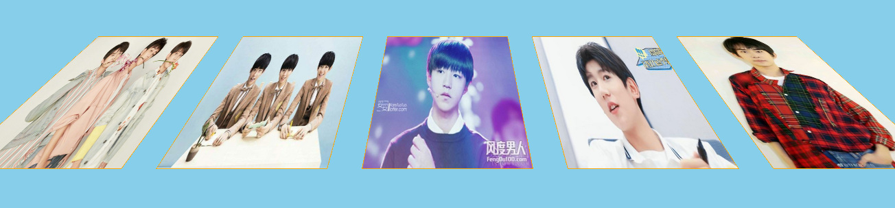
效果:


代码:
<!DOCTYPE html>
<html lang="en">

<head>
    <meta charset="UTF-8">
    <meta name="viewport" content="width=device-width, initial-scale=1.0">
    <meta http-equiv="X-UA-Compatible" content="ie=edge">
    <title>青春修炼手册</title>
    <style>
        * {
            padding: 0;
            margin: 0;
            box-sizing: border-box;
        }

        body {
            background-color: skyblue;
            /*开启视距*/
            perspective: 500px;
            /*超出隐藏*/
            overflow: hidden;
        }

        ul {
            width: 250px;
            height: 300px;
            background-color: green;
            margin: 100px auto;
            list-style: none;
            position: relative;
            /* 开启3d效果 */
            transform-style: preserve-3d;
            transition: all 1s;
            transform-origin: bottom;
        }

        ul:hover {
            /* 往下躺,不是translate,translate是移动距离,谨记 */
            transform: rotateX(45deg);
        }

        li {
            width: 100%;
            height: 100%;
            background-color: red;
            border: 1px solid orange;
            position: absolute;
            transition: all 1s 1s;
            transform-origin: bottom;
        }

        li:nth-child(1) {
            background: url("./imgs/1.jpg") left top/100% 100% no-repeat;
			z-index: 10;
        }

        li:nth-child(2) {
            background: url("./imgs/2.jpg") left top/100% 100% no-repeat;

        }

        li:nth-child(3) {
            background: url("./imgs/3.jpg") left top/100% 100% no-repeat;

        }

        li:nth-child(4) {
            background: url("./imgs/4.jpg") left top/100% 100% no-repeat;

        }

        li:nth-child(5) {
            background: url("./imgs/5.jpg") left top/100% 100% no-repeat;

        }

        ul:hover li:nth-child(2) {
            transform: translateX(300px) rotateY(720deg);
        }

        ul:hover li:nth-child(3) {
            transform: translateX(600px);
        }

        ul:hover li:nth-child(4) {
            transform: translateX(-300px) rotateY(-720deg);
        }

        ul:hover li:nth-child(5) {
            transform: translateX(-600px);
        }
    </style>
</head>

<body>
    <ul>
        <li></li>
        <li></li>
        <li></li>
        <li></li>
        <li></li>
    </ul>
</body>

</html>
不知道会不会涨粉,想想就有点小鸡动(貌似00后10后目前不会来这啊哈哈)!!!