版权声明:本文为博主原创文章,遵循 CC 4.0 BY-SA 版权协议,转载请附上原文出处链接和本声明。
柱状图
x = ['金融','农业','制造业','新能源']
y = [163,86,125,58]
sns.barplot(x,y)

y = ['金融','农业','制造业','新能源']
x = [163,86,125,58]
sns.barplot(x,y,order=['金融','制造业','农业','新能源'],#自定义顺序
           orient='h',#可把图横着显示,但需要把x,y交换
           saturation=0.25#颜色明暗度)

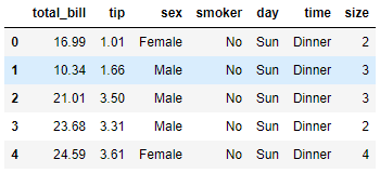
导入数据集(详情可见我的Seaborn(1)中)
tips = sns.load_dataset("tips")
tips.head()
sns.barplot(x='day',y='tip',data=tips,palette=sns.color_palette('Purples_r'))
#竖线为误差线
#高度指的是那一类型的平均数

sns.barplot(x='day',y='tip',data=tips,hue='sex',palette=sns.color_palette('Purples_r'))

sns.barplot(x='day',y='tip',data=tips,hue='sex',palette='Purples')

# 条形图(交换x,y)
sns.barplot(y='day',x='tip',data=tips,palette=sns.color_palette('Purples_r'))

箱线图
sns.set_palette("Accent")
L = [3,2,0,1,4]
sns.boxplot(y=L)#(L)时图会横过来

sns.boxplot(x='day',y='tip',data=tips,hue='sex')

小提琴图(箱线图和密度图结合)
L=[3,2,0,1,4]
sns.violinplot(L,palette='Reds')

L=[3,2,0,1,4]
sns.violinplot(y=L)

sns.violinplot(x='day',y='tip',hue='sex',data=tips)

sns.violinplot(x='day',y='tip',hue='sex',data=tips,split=True)

分类图有两种散点图
- 1.Strip(带状)图
- 2.Swarm(蜂群状)图
sns.stripplot(x='day',y='tip',data=tips)

sns.stripplot(x='day',y='tip',data=tips,hue='sex',palette='Blues')

sns.swarmplot(x='day',y='tip',data=tips)

分面网格分类图
sns.set_palette("hls")
sns.catplot(x='day',y='tip',data=tips,hue='sex',col='time')

sns.catplot(x='day',y='tip',data=tips,hue='sex',col='time',kind="violin")

sns.set_palette("Set2")
sns.catplot(x='day',y='tip',data=tips,hue='sex',col='time',row='smoker')

sns.catplot(x='day',y='tip',data=tips,hue='sex',col='size',kind='bar')

sns.catplot(x='day',y='tip',data=tips,hue='sex',col='size',col_wrap=3,kind='bar')#col_wrap=3一行三个图

散点图
n=500
x=np.random.normal(0,1,n)
y=np.random.normal(0,1,n)
sns.scatterplot(x=x,y=y)
plt.title('绘制散点图',fontproperties='SimHei')

sns.scatterplot(x='total_bill',y='tip',hue='sex',data=tips)

plt.figure(dpi=150)
sns.scatterplot(x='total_bill',y='tip',hue='sex',style='time',size='size',data=tips)

直方图 密度图 毛毯图
sns.distplot(tips['total_bill'])

sns.distplot(tips['total_bill'],hist=False)

sns.distplot(tips['total_bill'],kde=False)

sns.kdeplot(tips['total_bill'],shade=True)

sns.distplot(tips['total_bill'],rug=True)

sns.distplot(tips['total_bill'],rug=True,bins=5)
