Echarts 踩坑
接到一个需求,画个柱状图,两条线分别垂直与x轴与y轴
感觉没什么难度
看文档,开始在线测试
Echarts里提供了markLine功能 (图表标线)
option = {
    xAxis: {
        type: 'category',
        data: ['20', '30', '40', '55', '60', '70', '80']
    },
    yAxis: {
        type: 'value'
    },
    series: [{
        data: [120, 200, 150, 80, 70, 110, 130],
        type: 'bar',
        showBackground: true,
        backgroundStyle: {
            color: 'rgba(180, 180, 180, 0.2)'
        }
    },{
            type: 'line',
            markLine: {
                data: [{
                    name: '均值',
                    yAxis: 62,
                    itemStyle: { color: 'red' },
                    label: { show: true, position: 'insideEndBottom', formatter: '均值 {c}' },
                }, {
                    name: '均值',
                    xAxis: 32,
                    itemStyle: { color: '#339dff' },
                    label: { show: true, position: 'insideEndBottom', formatter: '均值 {c}' },
                }]
            }
        }]
};
运行如图:
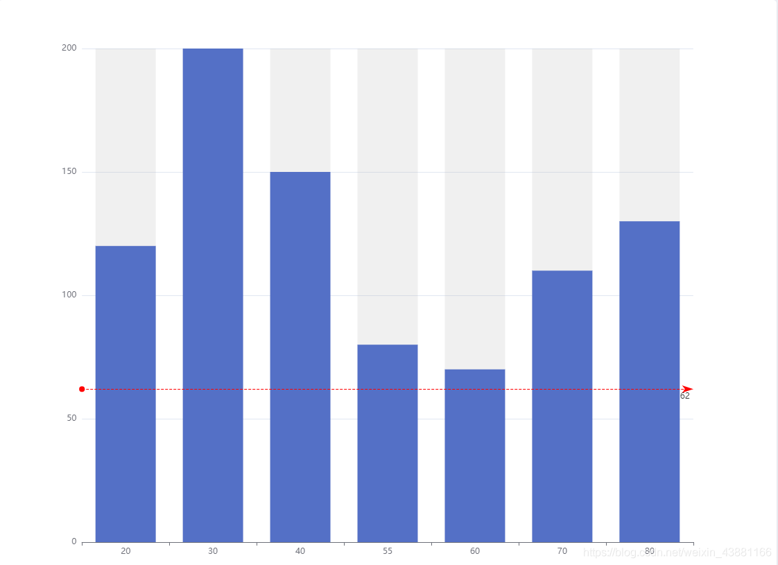 垂直于x轴标线未显示
多次尝试发现将x轴type 设为value 可成功显示标线
option = {
    xAxis: {
        type: 'value',
        data:['70', '30', '30', '55', '80', '70', '80']
    },
    yAxis: {
        type: 'value'
    },
    series: [{
        data: [120, 200, 150, 80, 70, 110, 130],
        type: 'bar',
        showBackground: true,
        backgroundStyle: {
            color: 'rgba(180, 180, 180, 0.2)'
        }
    },{
            type: 'line',
            markLine: {
                data: [{
                    name: '均值',
                    yAxis: 62,
                    itemStyle: { color: 'red' },
                    label: { show: true, position: 'insideEndBottom', formatter: '均值 {c}' },
                }, {
                    name: '均值',
                    xAxis: 32,
                    itemStyle: { color: '#339dff' },
                    label: { show: true, position: 'insideEndBottom', formatter: '均值 {c}' },
                }]
            }
        }]
};
运行如图: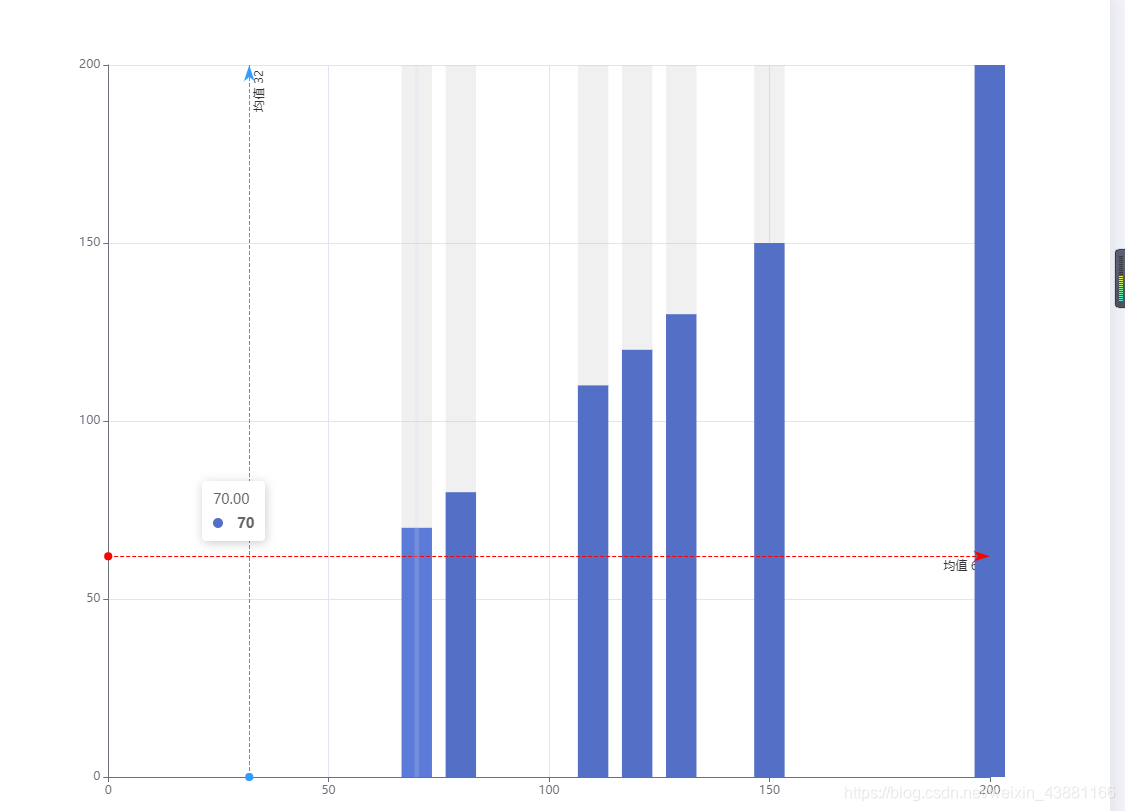
按后台返回x轴数据为无序的数组,按此方式并不能对应到正确的值
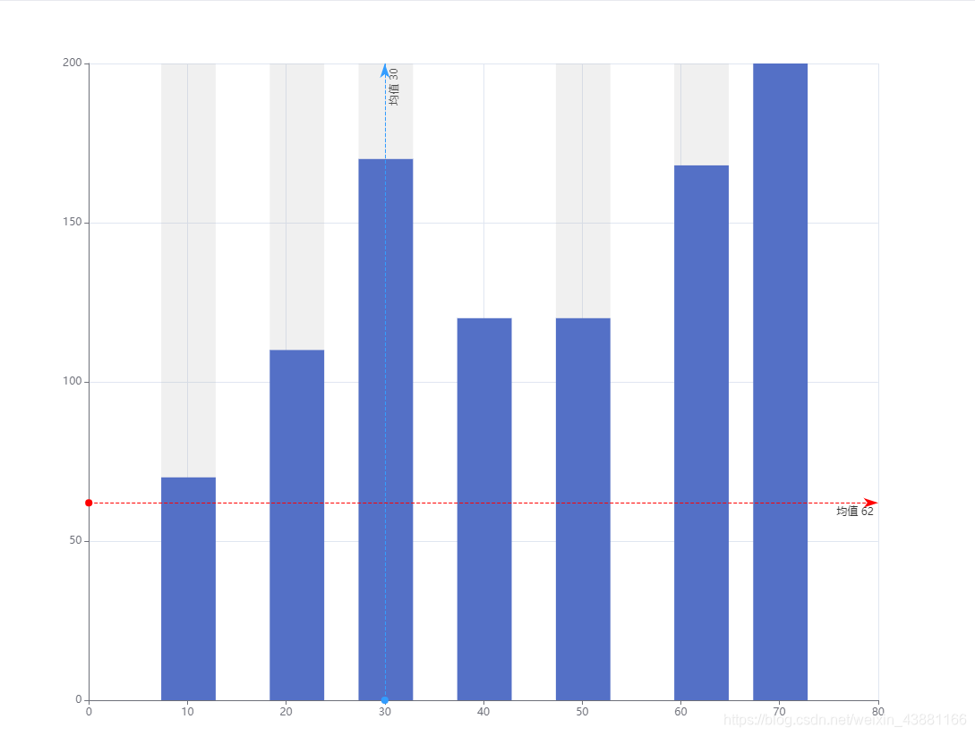
查文档,百度发现当x轴为value类型时,y轴为value类型时, 值要写到series中去,且为两两配对
option = {

    xAxis: {
        type: 'value',
    },
    yAxis: {
        type: 'value'
    },
    series: [{
            data: [
                [30.1, 170],
                [21.1, 110],
                [10.1, 70],
                [70.1, 200],
                [40.1, 120],
                [50.1, 120],
                [62.1, 168]
            ],
            type: 'bar',
            showBackground: true,
            backgroundStyle: {
                color: 'rgba(180, 180, 180, 0.2)'
            }
        },
        {
            type: 'line',
            markLine: {
                data: [{
                    name: '均值',
                    yAxis: 62,
                    itemStyle: { color: 'red' },
                    label: { show: true, position: 'insideEndBottom', formatter: '均值 {c}' },
                }, {
                    name: '均值',
                    xAxis: 30,
                    itemStyle: { color: '#339dff' },
                    label: { show: true, position: 'insideEndBottom', formatter: '均值 {c}' },
                }]
            }
        }
    ]
};
运行如图:
附上markLine data配置
标线的数据数组。每个数组项可以是一个两个值的数组,分别表示线的起点和终点,每一项是一个对象,有下面几种方式指定起点或终点的位置。
- 通过 x, y 属性指定相对容器的屏幕坐标,单位像素,支持百分比。
- 用 coord 属性指定数据在相应坐标系上的坐标位置,单个维度支持设置 ‘min’, ‘max’, ‘average’。
- 直接用 type 属性标注系列中的最大值,最小值。这时候可以使用 valueIndex 或者 valueDim
指定是在哪个维度上的最大值、最小值、平均值。 - 如果是笛卡尔坐标系的话,也可以通过只指定 xAxis 或者 yAxis 来实现 X 轴或者 Y 轴为某值的标线
当多个属性同时存在时,优先级按上述的顺序。也可以是直接通过 type 设置该标线的类型,是最大值的线还是平均线。同样的,这时候可以通过使用 valueIndex 指定维度。
data: [

    {
        name: '平均线',
        // 支持 'average', 'min', 'max'
        type: 'average'
    },
    {
        name: 'Y 轴值为 100 的水平线',
        yAxis: 100
    },
    [{
            // 起点和终点的项会共用一个 name
            name: '最小值到最大值',
            type: 'min'
        },
        {
            type: 'max'
        }
    ],
    [{
            name: '两个坐标之间的标线',
            coord: [10, 20]
        },
        {
            coord: [20, 30]
        }
    ],
    [{
        // 固定起点的 x 像素位置,用于模拟一条指向最大值的水平线
        yAxis: 'max',
        x: '90%'
    }, {
        type: 'max'
    }],
    [{
            name: '两个屏幕坐标之间的标线',
            x: 100,
            y: 100
        },
        {
            x: 500,
            y: 200
        }
    ]
]