响应式原理
使用媒体查询针对于不同宽度的设备进行样式和布局的设置,从而适应不同的设备
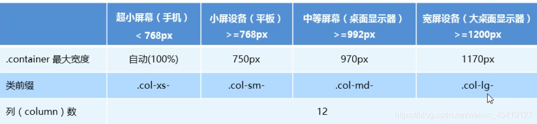
设备的划分
- 小于768的为超小屏幕(手机)
- 768~992之间的为小屏设备(平板)
- 992~1200的中等屏幕(桌面显示器)
- 大于1200的宽屏设备(大桌面显示器)
注意:响应式需要一个父级元素作为容器,配合子级元素来实现更多效果
父容器版心尺寸划分
- 超小屏幕(手机,小于 768px):设置宽度为 100%
- 小屏幕(平板,大于等于 768px):设置宽度为 750px
- 中等屏幕(桌面显示器,大于等于 992px):宽度设置为 970px
- 大屏幕(大桌面显示器,大于等于 1200px):宽度设置为 1170px
<!DOCTYPE html>
<html lang="en">

<head>
    <meta charset="UTF-8">
    <meta name="viewport" content="width=device-width, initial-scale=1.0">
    <title>Document</title>
    <style>
        * {
            margin: 0;
            padding: 0;
        }

        .container {
            width: 100%;
            height: 50px;
            margin: 0 auto;
            text-align: center;
            line-height: 50px;
        }
        /* max-width:767 */

        @media screen and (max-width: 767px) {
            .container {
                width: 100%;
                background-color: blue;
            }
        }
        /* min-width:768px */

        @media screen and (min-width: 768px) {
            .container {
                width: 750px;
                background-color: brown;
            }
        }
        /* min-width:970px */

        @media screen and (min-width: 992px) {
            .container {
                width: 970px;
                background-color: yellow;
            }
        }
        /* min-width:1200px */

        @media screen and (min-width:1200px) {
            .container {
                width: 1170px;
                background-color: purple;
            }
        }
    </style>
</head>

<body>
    <div class="container">尧子陌</div>
</body>

</html>

导航栏案例
<!DOCTYPE html>
<html lang="en">

<head>
    <meta charset="UTF-8">
    <meta name="viewport" content="width=device-width, initial-scale=1.0">
    <title>Document</title>
    <style>
        * {
            margin: 0;
            padding: 0;
        }
        /* 常规尺寸 */

        .container {
            width: 600px;
            height: 40px;
            margin: 0 auto;
        }

        ul {
            list-style: none;
        }

        ul li {
            float: left;
            width: 100px;
            height:40px;
            line-height: 40px;
            text-align: center;
            font-weight: 700;
            background-color: gray;
        }

        li:hover {
            background-color: green;
        }
        /* min-width:900px */

        @media screen and (min-width: 900px) {
            .container {
                width: 900px;
                background-color: pink;
            }
            ul li {
                width: 33.3%;
            }
        }
        /* min-width:1200px */

        @media screen and (min-width: 1200px) {
            .container {
                width: 100%;
                background-color: pink;
            }
            ul li {
                width: 33.3%;
            }
        }
    </style>
</head>

<body>
    <div class="container">
        <ul>
            <li>阿里</li>
            <li>腾讯</li>
            <li>京东</li>
            <li>拼多多</li>
            <li>淘宝</li>
            <li>闲鱼</li>
        </ul>
    </div>
</body>

</html>

bootstarp
bootstrap简介
Bootstrap 来自 Twitter(推特),是目前最受欢迎的前端框架。Bootstrap 是基于HTML、CSS 和 JAVASCRIPT 的,它简洁灵活,使得 Web 开发更加快捷。
官网:www.bootcss.com/
框架:顾名思义就是一套架构,它有一套比较完整的网页功能解决方案,而且控制权在框架本身,有预制样式库、组件和插件。使用者要按照框架所规定的某种规范进行开发。
bootstarp优点
- 标准化的html+css编码规范
- 提供了一套简洁、直观、强悍的组件
- 有自己的生态圈,不断的更新迭代
- 让开发更简单,提高了开发的效率
bootstarp的使用
1.创建文件夹结构
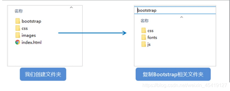
2.创建HTML结构
<!DOCTYPE html>
<html lang="zh-CN">
  <head>
    <meta charset="utf-8">
    <meta http-equiv="X-UA-Compatible" content="IE=edge">
    <meta name="viewport" content="width=device-width, initial-scale=1">
    <!-- 上述3个meta标签*必须*放在最前面,任何其他内容都*必须*跟随其后! -->
    <title>Bootstrap 101 Template</title>

    <!-- Bootstrap -->
    <link href="css/bootstrap.min.css" rel="stylesheet">

    <!-- HTML5 shim and Respond.js for IE8 support of HTML5 elements and media queries -->
    <!-- WARNING: Respond.js doesn't work if you view the page via file:// -->
    <!--[if lt IE 9]>
      <script src="//cdn.bootcss.com/html5shiv/3.7.2/html5shiv.min.js"></script>
      <script src="//cdn.bootcss.com/respond.js/1.4.2/respond.min.js"></script>
    <![endif]-->
  </head>
  <body>
    <h1>你好,世界!</h1>

    <!-- jQuery (necessary for Bootstrap's JavaScript plugins) -->
    <script src="//cdn.bootcss.com/jquery/1.11.3/jquery.min.js"></script>
    <!-- Include all compiled plugins (below), or include individual files as needed -->
    <script src="js/bootstrap.min.js"></script>
  </body>
</html>
3.引入相关的样式文件
<!-- Bootstrap 核心样式-->
<link rel="stylesheet" href="bootstrap/css/bootstrap.min.css">
4.书写内容
-
直接拿Bootstrap 预先定义好的样式来使用
-
修改Bootstrap 原来的样式,注意权重问题
-
学好Bootstrap 的关键在于知道它定义了哪些样式,以及这些样式能实现什么样的效果
bootstarp之案例
<!doctype html>
<html lang="en">

<head>
    <!-- Required meta tags -->
    <meta charset="utf-8">
    <meta name="viewport" content="width=device-width, initial-scale=1, shrink-to-fit=no">

    <!-- Bootstrap CSS -->
    <link rel="stylesheet" href="./bootstrap/css/bootstrap.min.css">

    <title>Hello, world!</title>

    <style>
        * {
            margin: 0;
            padding: 0;
        }

        form {
            width: 600px;
            margin: auto;
        }
    </style>
</head>

<body>

    <form>
        <div class="form-group">
            <label for="exampleInputEmail1">Email address</label>
            <input type="email" class="form-control" id="exampleInputEmail1" aria-describedby="emailHelp">

        </div>
        <div class="form-group">
            <label for="exampleInputPassword1">Password</label>
            <input type="password" class="form-control" id="exampleInputPassword1">
        </div>
        <div class="form-group form-check">
            <input type="checkbox" class="form-check-input" id="exampleCheck1">
            <label class="form-check-label" for="exampleCheck1">Check me out</label>
        </div>
        <button type="submit" class="btn btn-primary">Submit</button>
    </form>
</body>

</html>
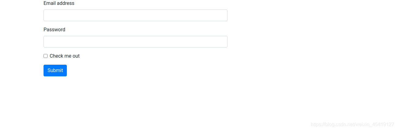
注意:可以直接拿bootstarp定义好的类用来直接使用即可
bootstarp之布局容器
Bootstrap 需要为页面内容和栅格系统包裹一个 .container 或者.container-fluid 容器,它提供了两个作此用处的类
.container
- 响应式布局的容器 固定宽度
- 超小屏(100%)
- 小屏幕(大于或等于768px),宽度设置为750px;
- 中等屏幕(大于或等于992px),宽度设置为970px
- 大屏幕(大于或等于1200px),宽度设置为1170px
.container-fluid
- 流式布局容器,占百分百宽度
- 占据全部视口的容器。
<!DOCTYPE html>
<html lang="en">

<head>

    <meta charset="UTF-8">
    <meta http-equiv="X-UA-Compatible" content="IE=edge">
    <meta name="viewport" content="width=device-width, initial-scale=1.0">
    <title>bootstarp容器的使用</title>
    <!--[if lt IE 9]>
      <script src="https://cdn.jsdelivr.net/npm/[email protected]/dist/html5shiv.min.js"></script>
      <script src="https://cdn.jsdelivr.net/npm/[email protected]/dest/respond.min.js"></script>
    <![endif]-->
    <link rel="stylesheet" href="./bootstrap/css/bootstrap.min.css">
    <style>
        * {
            margin: 0;
            padding: 0;
        }

        .container {
            color: white;
            font-weight: bolder;
            background-color: purple;
            text-align: center;
            margin-bottom: 60px;
        }

        .container-fluid {
            color: white;
            font-weight: bolder;
            background-color: purple;
            text-align: center;
        }
    </style>
</head>

<body>
    <div class="container">container</div>
    <div class="container-fluid">container-flued</div>

</body>

</html>

栅格系统
栅格系统通过一系列的行(row)与列(column)的组合来创建页面布局,内容就可以放入这些创建好的布局
- 按照不同屏幕划分为1~12 等份
- 行(row) 可以去除父容器作用15px的边距
- col-xs:超小; col-sm:小; col-md:中等; col-lg:大;
- 列(column)大于 12,多余的“列(column)”所在的元素将被作为一个整体另起一行排列
- 每一列默认有左右15像素的 padding
- 可以同时为一列指定多个设备的类名,以便划分不同份数 例如 class=“col-md-4 col-sm-6”
<!DOCTYPE html>
<html lang="en">

<head>
    <meta charset="UTF-8">
    <meta name="viewport" content="width=device-width, initial-scale=1.0">
    <title>Document</title>

    <!--[if lt IE 9]>
     <script src="https://cdn.jsdelivr.net/npm/[email protected]/dist/html5shiv.min.js"></script>
     <script src="https://cdn.jsdelivr.net/npm/[email protected]/dest/respond.min.js"></script>
   <![endif]-->

    <link rel="stylesheet" href="./bootstrap/css/bootstrap.min.css">

    <style>
        * {
            margin: 0;
            padding: 0;
        }

        .container {
            color: black;
            font-weight: 700;
            height: 40px;
            padding: 0;
            text-align: center;
            line-height: 40px;
        }

        div[class^=col] {
            border: 1px solid red;
        }
    </style>
</head>

<body>
    <div class="container">

        <div class="row">
            <div class="col-lg-3 col-md-3 col-sm-3 col-xs-3">1</div>
            <div class="col-lg-3 col-md-3 col-sm-3 col-xs-3">2</div>
            <div class="col-lg-3 col-md-3 col-sm-3 col-xs-3">3</div>
            <div class="col-lg-3 col-md-3 col-sm-3 col-xs-3">4</div>
        </div>

    </div>
</body>

</html>

栅格系统的其它情况
- 栅格系统刚好12份,则会占满整个父容器的宽度。
- 栅格系统不满12份,则占不满父容器的宽度,会有剩余的空白。
- 栅格系统多于12份,则会另起一行。
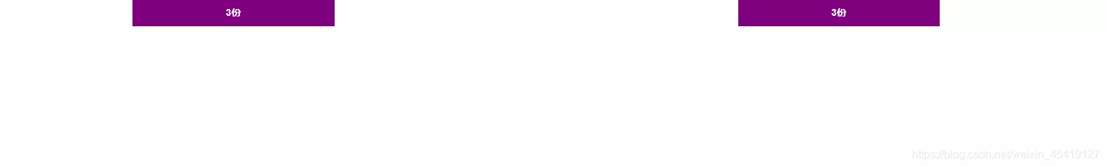
栅格系统之列嵌套
简单而言,就是把一行分为12份,每一份相当于1列,而每一列又可以划分为12等份。
<!DOCTYPE html>
<html lang="en">

<head>
    <meta charset="UTF-8">
    <meta name="viewport" content="width=device-width, initial-scale=1.0">
    <title>Document</title>
    <!--[if lt IE 9]>
      <script src="https://cdn.jsdelivr.net/npm/[email protected]/dist/html5shiv.min.js"></script>
      <script src="https://cdn.jsdelivr.net/npm/[email protected]/dest/respond.min.js"></script>
    <![endif]-->

    <link rel="stylesheet" href="./bootstrap/css/bootstrap.min.css">
    <style>
        * {
            margin: 0;
            padding: 0;
        }

        .container {
            color: white;
            height: 40px;
            text-align: center;
            line-height: 40px;
            font-weight: 700;
            background-color: purple;
        }

        .col-lg-3 {
            border-right: 1px solid red;
        }
    </style>
</head>

<body>
    <div class="container">
        <div class="row">
            <div class="col-lg-3">
                <div class="row">
                    <div class="col-lg-6">6份</div>
                    <div class="col-lg-6">6份</div>
                </div>
            </div>
            <div class="col-lg-3">2</div>
            <div class="col-lg-3">3</div>
            <div class="col-lg-3">4</div>
        </div>
    </div>

</body>

</html>
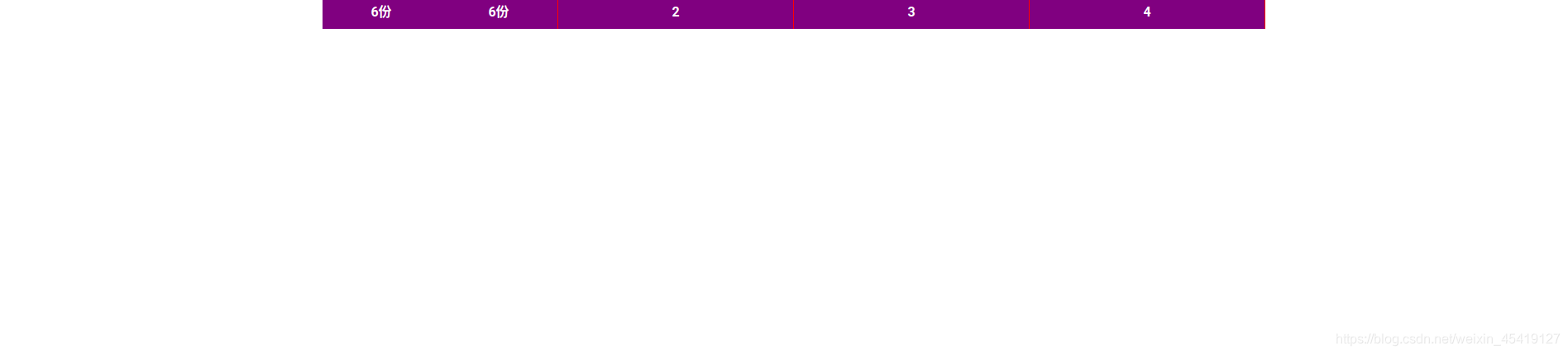
列嵌套要加一个行(row) 即可以去除父级元素的padding值 而且高度会自动和父级一样高
栅格系统之列偏移
<!DOCTYPE html>
<html lang="en">

<head>
   <meta charset="UTF-8">
   <meta name="viewport" content="width=device-width, initial-scale=1.0">
   <title>Document</title>
   <!--[if lt IE 9]>
     <script src="https://cdn.jsdelivr.net/npm/[email protected]/dist/html5shiv.min.js"></script>
     <script src="https://cdn.jsdelivr.net/npm/[email protected]/dest/respond.min.js"></script>
   <![endif]-->

   <link rel="stylesheet" href="./bootstrap/css/bootstrap.min.css">
   <style>
       * {
           margin: 0;
           padding: 0;
       }

       .container {
           color: white;
           height: 40px;
           text-align: center;
           line-height: 40px;
           font-weight: 700;
       }

       .col-lg-3 {
           background-color: purple;
       }
   </style>
</head>

<body>
   <div class="container">
       <div class="row">
           <div class="col-lg-3">3份</div>
           <div class="col-lg-3  col-lg-offset-6">3份</div>
       </div>
   </div>

</body>

</html>
偏移的分数=(12份-当前子元素所占的分数)
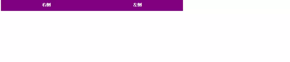
栅格系统之列排序
通过使用 .col-md-push和 .col-md-pull 类就可以很容易的改变列(column)的顺序
<!DOCTYPE html>
<html lang="en">

<head>
    <meta charset="UTF-8">
    <meta name="viewport" content="width=device-width, initial-scale=1.0">
    <title>Document</title>
    <!--[if lt IE 9]>
      <script src="https://cdn.jsdelivr.net/npm/[email protected]/dist/html5shiv.min.js"></script>
      <script src="https://cdn.jsdelivr.net/npm/[email protected]/dest/respond.min.js"></script>
    <![endif]-->

    <link rel="stylesheet" href="./bootstrap/css/bootstrap.min.css">
    <style>
        * {
            margin: 0;
            padding: 0;
        }

        .container {
            color: white;
            height: 40px;
            text-align: center;
            line-height: 40px;
            font-weight: 700;
        }

        .col-md-3 {
            background-color: purple;
        }
    </style>
</head>

<body>
    <div class="container">
        <div class="row">
            <div class="col-md-3 col-md-push-3">左侧</div>
            <div class="col-md-3 col-md-pull-3">右侧</div>
        </div>
    </div>

</body>

</html>
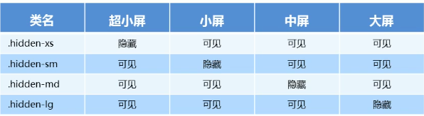
栅格系统之响应式工具
利用媒体查询功能,并使用工具类可以方便的针对不同设备展示或隐藏页面内容。
<!DOCTYPE html>
<html lang="en">

<head>
    <meta charset="UTF-8">
    <meta name="viewport" content="width=device-width, initial-scale=1.0">
    <title>Document</title>

    <!--[if lt IE 9]>
      <script src="https://cdn.jsdelivr.net/npm/[email protected]/dist/html5shiv.min.js"></script>
      <script src="https://cdn.jsdelivr.net/npm/[email protected]/dest/respond.min.js"></script>
    <![endif]-->

    <link rel="stylesheet" href="./bootstrap/css/bootstrap.min.css">


    <style>
        * {
            margin: 0;
            padding: 0;
        }

        .container {
            color: white;
            font-weight: 700;
            padding: 0;
            height: 40px;
            text-align: center;
            line-height: 40px;
        }

        .col-lg-3 {
            background-color: blue;
        }
    </style>
</head>

<body>
    <div class="container">
        <div class="row">
            <div class="col-lg-3 hidden-md">3份</div>
            <div class="col-lg-3">3份</div>
            <div class="col-lg-3">3份</div>
            <div class="col-lg-3">3份</div>
        </div>
    </div>
</body>

</html

hidden:隐藏
visible:显示