在做水平或垂直方向导航栏时,有时导航栏中导航项非常多,显示在同一行或列显得十分拥挤,并且文本可能会换行。而将导航栏显示成两行或者两列又十分难看。这时我们可以将导航栏的部分内容隐藏,并且根据文本宽度,一次只显示几个。
1.代码:
        <div class="swiper-nav">
            <div class="page-tab swiper-container" id="swiper">
                <ul class="tab-wrapper swiper-wrapper">
                    <li class="tab-item swiper-slide">
                        <div class="tab-item-wrapper">
                            <span class="tab-name fontSize18">选项卡一</span>
                        </div>
                    </li>
                    <li class="tab-item swiper-slide">
                        <div class="tab-item-wrapper">
                            <span class="tab-name fontSize18">选项卡二</span>
                        </div>
                    </li>
                    <li class="tab-item swiper-slide">
                        <div class="tab-item-wrapper">
                            <span class="tab-name fontSize18">选项卡三</span>
                        </div>
                    </li>
                    <li class="tab-item swiper-slide">
                        <div class="tab-item-wrapper">
                            <span class="tab-name fontSize18">选项卡四</span>
                        </div>
                    </li>
                    <li class="tab-item swiper-slide">
                        <div class="tab-item-wrapper">
                            <span class="tab-name fontSize18">选项卡五</span>
                        </div>
                    </li>
                </ul>
            </div>
        </div>
        <div class="product-wrapper"></div>
* { margin: 0; padding: 0; }
ul { list-style: none; }
fontSize18 { font-size: 18!important; }
/* 选项卡 */
.swiper-nav {
width: 100%;
height: 5em;
box-sizing: border-box;
border-bottom: 1px solid rgba(0,0,0,0.3);
background-color: #FAFAFA;
display: flex;
justify-content: center;
align-items: flex-end;
}
.page-tab {
width: 80%;
height: 90%;
}
.tab-wrapper {
margin: 0 auto;
height: 100%;
display: flex;
align-items: flex-end;
}
.tab-item {
flex-shrink: 0;
height: 80%;
padding: 0 1.5em;
border-right: 1px solid #CACECA;
box-sizing: border-box;
position: relative;
color: black;
}
.tab-item:last-child { border-right: none; }
.tab-item-wrapper {
width: auto;
height: 100%;
display: flex;
justify-content: center;
align-items: center;
cursor: pointer;
}
.underline { color: #006722!important; }
.underline::before {
content: '';
position: absolute;
left: 50%;
bottom: 0;
width: 60%;
height: 3px;
background-color: #006722;
transform: translate(-50%, 0);
}
.tab-name {
flex-shrink: 0;
font-weight: 300;
word-break: break-word;
}
.product-wrapper {
width: 100%;
text-align: center;
margin-top: 20px;
} var nowWindowWith = $(window).width()
var nowNav = '#swiper'
var $TabNum = 0;
if(nowWindowWith <= 850) $TabNum = 3
else if(nowWindowWith <= 1520) $TabNum = 4
else $TabNum = 5
function initSwiper(tabNum) {
var mySwiper = new Swiper ('#swiper', {
slidesPerView: tabNum,
spaceBetween: 0
})
}
initSwiper($TabNum);
// 选项卡切换
$('.tab-item').on('click', function() {
if($(this).hasClass('underline')) return
$(this).addClass('underline').siblings().removeClass('underline')
$('.product-wrapper').empty().text($(this).find('.tab-name').text() + '内容')
})
$(`.tab-item`).eq(0).trigger('click')
$(window).resize(function() {
var newTabNum = 0;
nowWindowWith = $(window).width()
if(nowWindowWith <= 850) newTabNum = 3
else if(nowWindowWith <= 1520) newTabNum = 4
else newTabNum = 5
if($TabNum == newTabNum) return;
$TabNum = newTabNum;
setTimeout(() => { initSwiper($TabNum) }, 20)
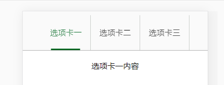
})2.实现效果:
当屏幕宽度为1520px以上时:
当屏幕宽度为850至1520px时:

当屏幕宽度为850px以下时:
3.要点
这里主要使用了swiper插件,该插件功能强大。
使用要点:初始化Swiper时,需要动态地给new Swiper内传递参数,来决定一次要显示几个导航项。
并且通过$(window).resize(function() { $(window).width() })实时获取当前屏幕地宽度,从而决定要显示几个导航项。