多种方法实现自适应三栏布局
网页开发中,经常会遇到左右宽度固定,中间宽度自适应的三栏布局,这里将介绍三种常用的方法(对页面渲染顺序无要求,如要求优先渲染中间部分,移步圣杯布局和双飞翼布局)
方法一:
html结构:
		<div class="box">
			<div class="left"></div>
			<div class="center"></div>
			<div class="right"></div>
		</div>
首先提起左右依次排列,我们可以首先想到浮动,于是统统左浮动。为了方便观察,我们加上背景颜色
		.left{float: left;width: 200px;height: 200px;background-color: #7FFF00;}
		.center{float: left;height: 300px;background-color: #DC143C;}
		.right{float: left;width: 300px;height: 200px;background-color: #FFFF00;}
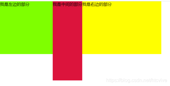
可以看到,中间部分并没有自适应,我们可以用一个css3新增的属性cale。相当于一个计算器,将左右两侧宽度减掉便是中间的宽度。
.center{float: left;height: 300px;background-color: #DC143C;width:calc(100% - 500px);}
这里要注意减号前后要有空格。

缺点:calc为c3新增加的,兼容不是很好。
方法二:
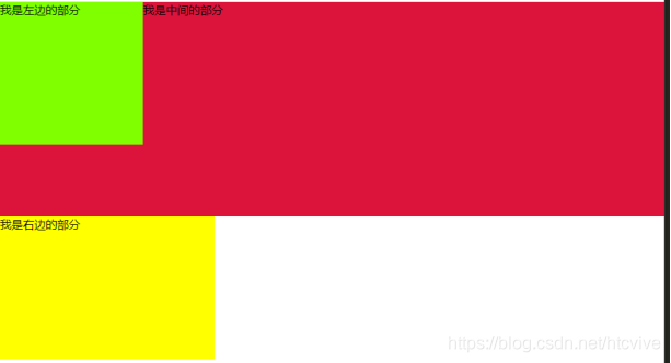
上面方法讲了用浮动,这次我们试试左右浮动,中间不浮动试试,方法二的html结构同方法一。
		.left{float: left;width: 200px;height: 200px;background-color: #7FFF00;}
		.center{height: 300px;background-color: #DC143C;}
		.right{float: left;width: 300px;height: 200px;background-color: #FFFF00;}
这样会导致一个问题,左边浮动脱离文档流势必会导致中间部分上去,右边浮动被迫换行。
我们可以用定位讲右边浮动移动到浏览器右上角,然后利用bfc的一个特性解决中间部分和左边部分重叠的问题。即bfc区域不会与浮动盒子发生重叠。用overflow:hidden;即可,bfc的其他触发方式这里就暂不赘述了。
		.left{float: left;width: 200px;height: 200px;background-color: #7FFF00;}
		.center{height: 300px;background-color: #DC143C;overflow: hidden;}
		.right{float: left;width: 300px;height: 200px;background-color: #FFFF00;
				position:absolute;right: 0;top: 0;}
然后现在只需要给中间区域添加声明margin-right:300px;就可以实现了(此时右边部分绝对定位脱离文档流,并不会被margin-right影响。)
缺点:比较麻烦,但是兼容性比方法一强。
方法三:
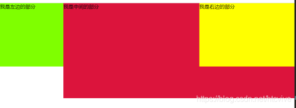
刚才的两种方法html结构都是左中右依次排列,第三种方法换一下排列顺序。
html结构:
		<div class="box">
			<div class="left">我是左边的部分</div>
			<div class="right">我是右边的部分</div>
			<div class="center">我是中间的部分</div>
		</div>
结构变成了左右中。如果我们给左边元素左浮动,右边元素右浮动,那么中间自然而然的就会上去,那么现在只要将中间区域变成bfc,页面就会变成我们想要的三栏布局。
			.left{float: left;width: 200px;height: 200px;background-color: #7FFF00;}
			.center{height: 300px;background-color: #DC143C;overflow: hidden;}
			.right{float: right;width: 300px;height: 200px;background-color: #FFFF00;}

优点:方法简单,容易实现;
缺点:需要改变页面布局,变为左右中布局。
