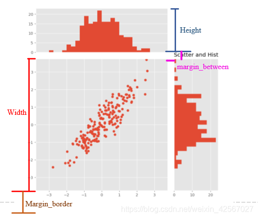
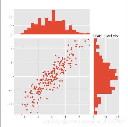
根据要求绘制如下的散点图, 先绘制三个框,然后再依次添加数据。
需要注意的是 由于散点图的值是随机产生的,因此每个绘图时产生的值都不相同。
框图绘制
// An highlighted block
import numpy as np
import matplotlib.pyplot as plt

'''先画三个框'''
#框图的背景设置为“ggplot”
plt.style.use('ggplot')
#根据图中的四个变量进行初始化
margin_border=0.1
width=0.6
height=0.2
margin_between=0.03

#设计主图(正方形)
left_s=margin_border
bottom_s=margin_border
height_s=width
width_s=width

#左边的图(长方形)
left_x=margin_border
bottom_x=margin_border+width+margin_between  #底部距离在最上边
height_x=height
width_x=width
#
#右边的图(长方形,尺寸与上图相同)
left_y=margin_border+width+margin_between #离左边的底部距离为最右边
bottom_y=margin_border
height_y=width
width_y=height

#整个图形的尺寸
plt.figure(1,figsize=(8,8))  #画布为(8*8)
rect_s=[left_s,bottom_s,width_s,height_s]
rect_x=[left_x,bottom_x,width_x,height_x]
rect_y=[left_y,bottom_y,width_y,height_y]

#生成图形
axScatter=plt.axes(rect_s)
axHisX=plt.axes(rect_x)
axHisY=plt.axes(rect_y)

plt.show()
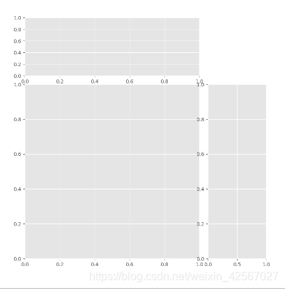
去掉两边的部分坐标
// An highlighted block
#将左边的图的x轴坐标去掉
#将右边的图的y轴坐标去掉
axHisX.set_xticks([])
axHisY.set_yticks([])

plt.show()

内容绘制
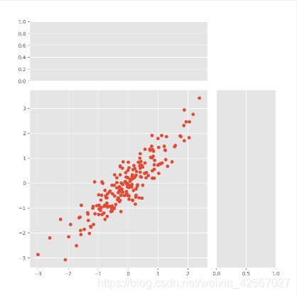
主图的内容
// An highlighted block
在x轴产生200个随机数据
x=np.random.randn(200)
#在x轴附近随机振动
y=x+np.random.randn(200)*0.5
axScatter.scatter(x,y)
plt.show()
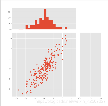
左边的图
// An highlighted block
#设置柱状图的宽度
bin_width=0.25
#寻找x,y的绝对值的最大值作为轴边界
xymax=np.max([np.max(np.fabs(x)),np.max(np.fabs(y))])
#共有多少个bin
slim=int(xymax/bin_width+1)
#slim个bin的总宽度
lim=slim*bin_width
#设置x的最大值,最小值
axScatter.set_xlim(-lim,lim)
#定义每个bin的坐标值
bins=np.arange(-lim,lim+bin_width,bin_width)
#绘制图形
axHisX.hist(x,bins=bins)
axHisX.set_xlim(axScatter.get_xlim())
plt.show()
右边的图
// An highlighted block
#设置y轴的最大值,最小值
axScatter.set_ylim(-lim,lim)
#绘制图形(注意 右边的图是横过来的)
axHisY.hist(y,bins=bins,orientation='horizontal')
axHisY.set_ylim(axScatter.get_ylim())
#增加标题
plt.title('Scatter and Hist')
plt.show()
总程序
// An highlighted block
'''散点图'''
#先画三个框
plt.style.use('ggplot')

#四个变量作为不同的高度和宽度
margin_border=0.1
width=0.6
margin_between=0.03
height=0.2

#设计主图
left_s=margin_border
bottom_s=margin_border
height_s=width
width_s=width

#左边的图
left_x=margin_border
bottom_x=margin_border+width+margin_between
height_x=height
width_x=width
#
#右边的图
left_y=margin_border+width+margin_between
bottom_y=margin_border
height_y=width
width_y=height

#设置为正方形
plt.figure(1,figsize=(8,8))
rect_s=[left_s,bottom_s,width_s,height_s]
rect_x=[left_x,bottom_x,width_x,height_x]
rect_y=[left_y,bottom_y,width_y,height_y]
#生成图
axScatter=plt.axes(rect_s)
axHisX=plt.axes(rect_x)
axHisY=plt.axes(rect_y)

#去掉两边的部分坐标
axHisX.set_xticks([])
axHisY.set_yticks([])

#开始画图
#主图
x=np.random.randn(200)
#在x轴附近随机振动
y=x+np.random.randn(200)*0.5
axScatter.scatter(x,y)

#设置柱状图的宽度
bin_width=0.25
#寻找x,y轴边界
xymax=np.max([np.max(np.fabs(x)),np.max(np.fabs(y))])

#共有多少个bin
slim=int(xymax/bin_width+1)
#slim个bin的总宽度
lim=slim*bin_width
#设置x轴的最大值,最小值
axScatter.set_xlim(-lim,lim)
axScatter.set_ylim(-lim,lim)

#定义每个bin的坐标值
bins=np.arange(-lim,lim+bin_width,bin_width)
#绘制图形
axHisX.hist(x,bins=bins)
axHisY.hist(y,bins=bins,orientation='horizontal')

axHisX.set_xlim(axScatter.get_xlim())
axHisY.set_ylim(axScatter.get_ylim())

#添加标签
plt.title('Scatter and Hist')

plt.show()