使用模块为mpl_finance
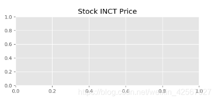
绘制空白框架
// An highlighted block
import matplotlib.pyplot as plt
import mpl_finance as mpf
import pandas as pd
from matplotlib.pylab import date2num
#图片背景设为“ggplot”格式
plt.style.use('ggplot')
'''绘制空白图'''
left=0.1 #左边离边缘的距离
bottom_main=0.1 #底部离边缘的距离
width=0.8 #框架的宽
hight_main=0.4 #框架的高
#框架的基本数据
rect_main=[left,bottom_main,width,hight_main]
#生成画布
fig=plt.figure()
#将框架属性加载上去
ax_main=fig.add_axes(rect_main)
#增加标签
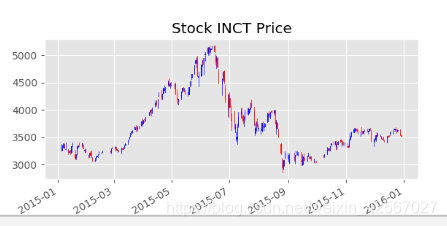
ax_main.set_title('Stock INCT Price')
plt.show()
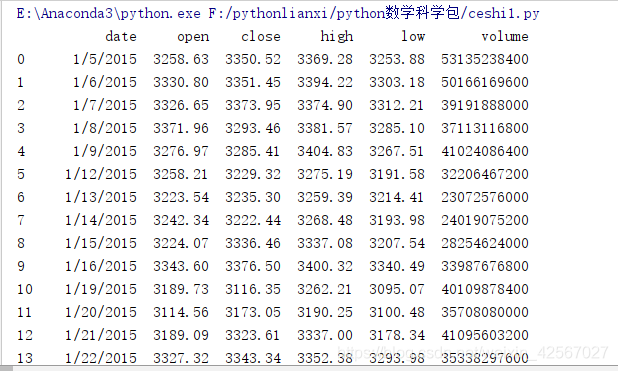
加载股票数据
// An highlighted block
data=pd.read_csv('G:\\python学习计划\\csv\\000001.csv')
k线图
// An highlighted block
'''图形绘制'''
# #按时间升序排列数据
data.sort_values(by='date',ascending=True,inplace=True)
data.date=pd.to_datetime(data.date)
#将date转化为特定的时间戳数据
data.date=data.date.apply(lambda x:date2num(x))
#将 DataFrame 转为 matrix格式
data_mat=data.as_matrix()
#画图
mpf.candlestick_ochl(ax_main,data_mat,colordown='r', colorup='b')
#日期标准化
ax_main.xaxis_date()
fig.autofmt_xdate()