一、python numpy + matplotlib 画股票k线图
# -- coding: utf-8 --
import requests
import numpy as np
from matplotlib import pyplot as plt
from matplotlib import animation

fig = plt.figure(figsize=(8,6), dpi=72,facecolor="white")
axes = plt.subplot(111)
axes.set_title('Shangzheng')
axes.set_xlabel('time')
line, = axes.plot([], [], linewidth=1.5, linestyle='-')
alldata = []

def dapan(code):
	url = 'http://hq.sinajs.cn/?list='+code
	r = requests.get(url)
	data = r.content[21:-3].decode('gbk').encode('utf8').split(',')
	alldata.append(data[3])
	axes.set_ylim(float(data[5]), float(data[4]))
	return alldata

def init():
	line.set_data([], [])
	return line

def animate(i):
  	axes.set_xlim(0, i+10)
  	x = range(i+1)
  	y = dapan('sh000001')
  	line.set_data(x, y)
  	return line

anim=animation.FuncAnimation(fig, animate, init_func=init,  frames=10000, interval=5000)

plt.show()
二、使用matplotlib轻松绘制股票K线图
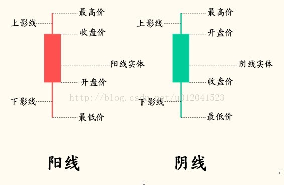
K线图是看懂股票走势的最基本知识,K线分为阴线和阳线,阴线和阳线都包含了最低价、开盘价、最高价和收盘价,一般都K线如下图所示:
在使用Python进行股票分析的过程中,我们可以很容易的对K线图进行绘制,下面介绍两种情形下的K线图绘制:
1. 股票数据来源于Matplotlib:
# 导入需要的库
import tushare as ts
import matplotlib.pyplot as plt
import matplotlib.finance as mpf
%matplotlib inline
# 设置历史数据区间
date1 = (2014, 12, 1) # 起始日期,格式:(年,月,日)元组
date2 = (2016, 12, 1) # 结束日期,格式:(年,月,日)元组
# 从雅虎财经中获取股票代码601558的历史行情
quotes = mpf.quotes_historical_yahoo_ohlc('601558.ss', date1, date2)
# 创建一个子图
fig, ax = plt.subplots(facecolor=(0.5, 0.5, 0.5))
fig.subplots_adjust(bottom=0.2)
# 设置X轴刻度为日期时间
ax.xaxis_date()
# X轴刻度文字倾斜45度
plt.xticks(rotation=45)
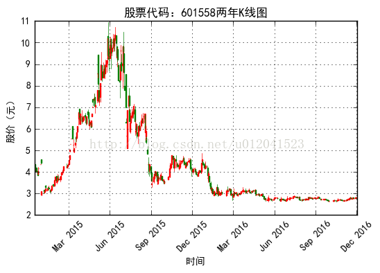
plt.title("股票代码:601558两年K线图")
plt.xlabel("时间")
plt.ylabel("股价(元)")
mpf.candlestick_ohlc(ax,quotes,width=1.2,colorup='r',colordown='green')
plt.grid(True)
绘制出来的K线图如下:

2.股票数据来源于Tushare:
因为从Tushare中获取到的数据为Pandas的DataFrame结构,需要将其转换为matplotlib.finance.candlestick_ohlc()方法能够处理的数据结构。
from matplotlib.pylab import date2num
import datetime

# 对tushare获取到的数据转换成candlestick_ohlc()方法可读取的格式
data_list = []
for dates,row in hist_data.iterrows():
    # 将时间转换为数字
    date_time = datetime.datetime.strptime(dates,'%Y-%m-%d')
    t = date2num(date_time)
    open,high,low,close = row[:4]
    datas = (t,open,high,low,close)
    data_list.append(datas)

# 创建子图
fig, ax = plt.subplots()
fig.subplots_adjust(bottom=0.2)
# 设置X轴刻度为日期时间
ax.xaxis_date()
plt.xticks(rotation=45)
plt.yticks()
plt.title("股票代码:601558两年K线图")
plt.xlabel("时间")
plt.ylabel("股价(元)")
mpf.candlestick_ohlc(ax,data_list,width=1.5,colorup='r',colordown='green')
plt.grid()
同样也能绘制会一样的K线图:
链接:https://zhuanlan.zhihu.com/p/24282861