一.软件使用
1.1.控制台
比较类似于谷歌浏览器的
1.Wxml

1.2.开发者文档
https://developers.weixin.qq.com/miniprogram/dev/component/
1.3.快捷键
1.代码格式化
shift+alt+f
二.配置文件
2.1Appid
wx8a27bff7b2dae6f2
2.2.开发目录
├── app.js
├── app.json
├── app.wxss
├── pages
│   │── index
│   │   ├── index.wxml
│   │   ├── index.js
│   │   ├── index.json
│   │   └── index.wxss
│   └── logs
│       ├── logs.wxml
│       └── logs.js
└── utils
2.3.分析
1.utils
放公共得文件
2.pages
放自己定义得文件
三.app.json(配置)
3.1.定义
- JSON 是一种数据格式
- 控制了小程序的目录结构
3.2.代码
- 所有页面路径
- 界面表现
- 网络超时时间
- 底部tab
json不能注释!
{


  "pages":[
    "pages/index/index",
    "pages/logs/logs"
  ],
  "window":{


    //背景文字样式
    "backgroundTextStyle":"light",
    //导航栏背景颜色
    "navigationBarBackgroundColor": "#fff",
    //导航标题
    "navigationBarTitleText": "WeChat",
    //导航栏文字样式
    "navigationBarTextStyle":"black"
  },
  "style": "v2",
  "sitemapLocation": "sitemap.json"
}
3.3.pages对应
1.新建文件夹
2.新建pages
3.要对应
4.默认启动顺序
- 先启动index
- 再启动logs
3.4.windows
1.导航栏标题文字
navigationBarTitleText
"navigationBarTitleText": "WeChat",
2导航栏背景颜色
.navigationBarBackgroundColor
默认值是#000000
"navigationBarBackgroundColor": "#fff",
3.导航栏字体颜色
navigationBarTextStyle
- black
- white
4.开启下拉刷新
enablePullDownRefresh
"enablePullDownRefresh":true
5.下拉刷新效果
backgroundTextStyle
- dark
- light
"backgroundTextStyle": "dark",
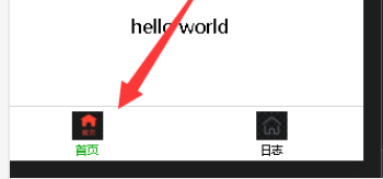
3.5.底部导航栏tabBar
至少要包含2个
"tabBar": {


    "list": [{


      "pagePath": "pages/index/index",
      "text": "首页",
      "iconPath": "pages/icons/index.png",
      "selectedIconPath": "pages/icons/index_active.png"
    },
    {


      "pagePath": "pages/logs/logs",
      "text": "日志",
      "iconPath": "pages/icons/index.png",
      "selectedIconPath": "pages/icons/index_active.png"
    }
    ]
  },
1.自动有补全
2.list数组
(1)pagePath
页面的路径
(2)text
tabBar名称
(3)iconPath
图标路径
(4)selectedIconPath
选中时候图标的路径
(5)效果
3.color字体颜色
字体颜色
"color": "#000000",
4.选中后的颜色
selectedColor
- 可以截图选取颜色
- 然后
ctrl+C
"selectedColor": "#F94A35",
5.tarBar背景颜色
"backgroundColor": "#0094ff",
6.上边框颜色
仅支持 black/white
"borderStyle":"black",
7.位置
"position":"top",
3.6.超时时间
networkTimeout
四.pages.json
4.1.与app.json区别
直接加入相关部分即可,不需要多加原来的文件
五.wxml(html)
5.1.显示
1.直接显示
<view>helloworld

</view>
2.显示变量
1’js设置
  //定义变量
  data: {


    message:"hello world!",
    number:123456,
    isBoy:true,
    //类似于结构体
    person:{


        name:"小工",
        height:150
    }
  },
2’wxml设置{ {}}
<view>hello world {

   {message}}

<view>number:{

   {number}}</view>
<view>isBoy{

   {isBoy}}</view>
<view>perser.name{

   {person.name}} -- person.height{

   {person.height}}</view>
</view>
3.换行
一对<view>就是一行
5.2.组件显示
1.js设置
  data: {


    //title
    title:"这是一个新的页面",
  },
2.wxml
<view data-id = "{

   {title}}">title</view>
5.3.单选框
<view><checkbox>请选择</checkbox></view>
  <!-- 默认勾选 -->
  <view><checkbox checked="{

     {true}}">请选择</checkbox></view>
六.运算
6.1.三元
1.定义变量
  data: {


    isChecked:true
  },
2.使用
<view>
<checkbox checked="{

     {isChecked ? true:false}}">
</checkbox>
</view>
6.2.算数
1.定义变量
  data: {


    num1:123,
    num2:456,
  },
2.wxml
<view>num1+num2:{

   {num1+num2}}</view>
6.3.逻辑判断
1.js
  data: {


    len:123,
  },
2.wxml
<checkbox checked="{

     {len > 50}}">
</checkbox>
3.注意
引号""与括号之间{}没有空格得!
七.列表渲染
7.1.wx:for
1.默认变量名
- 项
item wx:for - item
- 下标
index wx:for - index
2.遍历数组
data: {


//数组
array:["苹果","香蕉","西瓜"]
},
<view>
<view wx:for="{

     {array}}"
wx:key="index">
<!-- index就是索引 -->
{

   {index}}:{

   {item}}
</view>
</view>
3.遍历对象
  data: {


    person:{


      name:"郭德纲",
      height:150
    }
  },
<view wx:for="{

     {person}}" wx:key="index">
{

   {index}}:{

   {item}}
</view>
4.改名
<!-- index改名为key -->
<view wx:for="{

     {person}}" wx:key="index" wx:for-index="key">
{

   {key}}:{

   {item}}</view>
5.不换行block
<block wx:for="{

     {person}}" wx:key="index" wx:for-index="key">
{

   {key}}:{

   {item}}</block>
7.2.wx:key
八.wxss(css)
8.1.尺寸单位
1.定义
- rpx(respnsive pixel)可以根据屏幕宽度进行自适应
- 规定屏幕宽度为750rpx,rpx可以看作是物理像素
- 750rpx=375px
- 1rpx=0.5px
2.常见尺寸
3.使用
<view class="box1">box</view>
.box1{


  /* 竟然用分号得.. */
  /* 样式文件 */
  /* 750px 高度和宽度 100px */
    /* 375px 高度和宽度 50px */
  width: 100px;
  height:100px;
  font-size: 100rpx;
  background-color:aqua;
}
8.2.样式导入
1.新建类?
.lg_box{


  width: 200px;
  height: 200px;
  background-color: aqua;
  font-size:50px;
  color: blue;
}
2.导入
@import "../../stylues/box.wxss";
8.3.内联样式
1.单行
  data: {


    myColor:"red"
  },
<view style="background-color: yellow;color:{

       {

       myColor}};">style</view>
2.类
  data: {


    myClass:"box",
  },
<view class="{

     {myClass}}">box</view>
.box{


  width: 50px;
  height: 50px;
  background-color: pink;
}
8.4.选择器
1.基本
8.5.全局与局部样式
1.全局样式
app.wxss
view{


  font-size: 25px;
}
九.基本组件
9.1.view
1.概念
- 类似于
div
2.点击使用
.hover_class{


  background-color: aqua;
  /* 透明度 */
  opacity: 5;
}
<view hover-class="hover_class">component</view>
9.2.text
1.概念
显示普通得文本,text只能嵌套text
2.文本可选
<!-- 文本是可选 -->
<view><text selectable="true">普通得文本</text></view>
3.解码
<!-- 解码 变成空格-->
<text decode="true">普 通</text>
9.3.image
1.概念
默认宽度是320px,高度是240px
2.使用
<view>
<!-- image标签是web的img标签和背景图片的结合体 -->
<image src="../../images/heima.png"></image>
</view>
3.修改高度宽度
<view>
<!-- image标签是web的img标签和背景图片的结合体 -->
<image src="../../images/heima.png" mode="scaleToTill"></image>
</view>
image{


  width: 100%;
  height: 300px;
  /* 红色边框 ,这里要设置mode=上面那个*/
  border: 1px solid red;
}
9.4.swiper
1.概念
可以滑动的图片
2.使用
<!-- 自动切换 -->
<swiper autoplay="true">

<swiper-item>
<image src="../../images/1.png" mode="withFix">
</image>
</swiper-item>

<swiper-item>
<image src="../../images/2.png" mode="withFix"></image>
</swiper-item>

<swiper-item>
<image src="../../images/3.png" mode="withFix"></image>
</swiper-item>

<swiper-item>
<image src="../../images/4.png" mode="withFix"></image>
</swiper-item>

</swiper>
image{


  width: 100%;
  height: 300px;
  /* 红色边框 */
  border: 1px solid red;
}
3.显示…
indicator-dots="true"
<swiper autoplay="true" indicator-dots="true">
</swiper>
9.5.navigator
1.概念
- 导航组件,类似于超链接标签
- 不能跳到tarBar
2.保留当前页面
- ,wxml
<navigator url="../textView/textView" open-type="navigate">textView</navigator>
3.删除当前页面
- ,wxml
<navigator url="../textView/textView" open-type="redirect">textView</navigator>
4.跳到tabBar关闭其他
<!-- 跳转到首页 -->
<navigator url="../index/index" open-type="switchTab">index</navigator>
5.关闭所有,打开应用内某个页面
- ,wxml
<navigator url="../index/index" open-type="reLaunch">index</navigator>
9.6.video
1.使用
- ,wxml
<!-- duration="60" 是60s播放时间 -->
<!-- autoplay是自动播放 -->
<!-- true 循环播放 -->
<!-- muted 静音 -->
<video src="https://s1.ananas.chaoxing.com/audio/55/a9/e6/40486489bc1c22c7b136f588f21864fa/audio.mp3?at_=1587087954387&ak_=8ce0249bd5bceebefed8d24584ac8873&ad_=b72d6a4ddcd156a814fb10e04e6ee7e8" controls="true" duration="60" autoplay loop="true" muted ></video>
9.7.自定义组件
1.创建自定义组件
类似于页面,有json,wxml,wxss,js这4个页面组成
1’新建目录结构
2’新建Component
3’声明组件
- .json
{


  "component": true,
  "usingComponents": {

    }
}
- .js
  properties: {


    cData:{


      valub:"组件默认值",
      type:String,
    }
  },
- .wxss
.my_header{


  font-size: 50px;
  background-color: yellow;
}
4.引用组件
- .json
{


  "usingComponents": {


    "MyHeader":"../../components/MyHeader/MyHeader"
  }
}
- wxml
<view>
<MyHeader>
我的组件
</MyHeader>
</view>