做数据显示时总需要各种图表,显示的更形象,什么饼状图,柱状图的。常用的就是Chart.js。或者Highchartsjs写的
chartjs可以方便的绘制出各种图形,同时对数据进行切换。 chartjs是canvas写的,所以
var ctx = document.getElementById("canvas");
Highchartsjs则是svg绘制。
以线形图为例

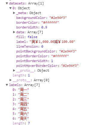
var datas = {
 labels: ["1月", "2月", "3月", "4月", "5月", "6月", "7月"],
 datasets: [{
 label: "浏览UV",
 data: [2,34,34345,45,46345,6546],
 fill: false,
 backgroundColor:'#0084ff',
 pointBackgroundColor:'#0084ff',
 pointHoverBorderColor:'#0084ff',
 }, {
 label: '浏览PV',
 data: [324,34,4335,46346546],
 fill: false,
 backgroundColor:'#fe5551',
 pointBackgroundColor:'#fe5551',
 pointHoverBorderColor:'#fe5551'
 }]
 };
labels 就是横坐标,datasets数据集合,data数组为每一项的,对应每个月的数据,y轴坐标显示根据每一项data计算显示出。
fill是否有填充,曲线下方和x轴之间是否有填充色,
pointBackgroundColor数据点的背景色,
pointHoverBorderColor鼠标覆盖时颜色,手机为点击时的样式,
scales,中参数有
scales: {
                        xAxes: [{
                            display: true, // X轴 上竖线是否显示
                            color: '#ffffff', //颜色
                            stacked: true,
                            scaleLabel: {
                                display: true, // x轴下面显示 x名字 是否显示
                                labelString: 'Month', //名字
                            },
                            gridLines: {
                                color: '#aab5fd', // X轴 上竖线颜色
                                zeroLineColor: "#aab5fd" // 起点的颜色
                            },
                            ctx: {
                                font: "18px  Helvetica, Arial, sans-serif"
                            }
                        }],
                        yAxes: [{
                            display: true,
                            scaleLabel: {
                                display: false,
                                labelString: 'Value'
                            },
                            ticks: { // 刻度线
                                suggestedMin: 0,
                                suggestedMax: 250,
                            },
                            gridLines: {
                                color: '#aab5fd',
                                zeroLineColor: "#aab5fd"
                            }
                        }],
                    },
                    legend: { //表头顶部显示的信息
                        display: false,
                    },
chartjs对数据的切换都是在数组里,对数据的数据 datasets 更换,然后重新绘制。
datasets.push(data);
同时需要update 才重新绘制
chart.update()
var DataSets = (function () {
    var instance;

    function Init(args) {
        var args = args || {};
        this.dataAry = args.dataAry;
        this.gbColor = args.gbColor;

        function setDataSets() {

            var datas = {},
                datasetsAry = [],
                labelAry = dataAry[2][0],
                labelItem = [],
                Ary = dataAry[1];

            datas['labels'] = dataAry[0];

            labelAry.forEach(function (i) {
                labelItem.push(i);
            });

            for (var i = 0, item; item = Ary[i++];) {
                var j = i - 1,
                    color = gbColor[j];
                var itemData = {
                    label: labelItem[j],
                    data: item,
                    fill: false,
                    backgroundColor: color,
                    pointBackgroundColor: color,
                    pointHoverBorderColor: color
                }
                datasetsAry.push(itemData);
            }
            datas['datasets'] = datasetsAry;
            console.log(datas)
            return datas;
        }

        return {
            getDataSets: function () {
                return setDataSets();
            }
        }
    };
    return {
        getInstance: function (args) {
            if (!instance) {
                instance = Init(args);
            }
            return instance;
        }
    };
})();
初次进入页面绘制 ,gbColor 线条颜色 dataAry就是数据了
var dataUtil = DataSets.getInstance({
            gbColor: ['#2e94f3', '#a81f12', '#095660', '#0e3eb7', '#d85f1d', '#6542be', '#ffc658', '#f99e8c', '#4bd2eb', '#c2b2ea'],
            dataAry: arr
        });
statistics = $('#canvas').statistics({
            data: dataUtil.getDataSets(),
            color: ['#2e94f3', '#a81f12', '#095660', '#0e3eb7', '#d85f1d', '#6542be', '#ffc658', '#f99e8c', '#4bd2eb', '#c2b2ea']
        });
statistics.setDataSets(arr[1], arr[0], arr[2]);
arr[1] x轴坐标,arr[0],要展示的数据的值,里面就是多个数组。
arr[2] 鼠标覆盖上去显示的label 数据,即DataSets里
var itemData = {
                    label: labelItem[j],
                    ××××××

                }
chartjs 线形图jq封装如下
(function ($) {
    //初始加载
    $.fn.statistics = function (_options) {
        var $this = $(this),
            $myStatistics = {},
            dataset = [],
            currentIndex = null,
            defaults = {
                color: [],
                type: 'line',
                options: {
                    responsive: true,
                    title: {
                        display: false,
                    },
                    tooltips: {
                        mode: 'label',
                        callbacks: {}
                    },
                    hover: {
                        mode: 'dataset'
                    },
                    scales: {
                        xAxes: [{
                            display: true,
                            color: '#ffffff',
                            stacked: true,
                            scaleLabel: {
                                display: false,
                                labelString: 'Month',
                            },
                            gridLines: {
                                color: '#aab5fd',
                                zeroLineColor: "#aab5fd"
                            },
                            ctx: {
                                font: "18px  Helvetica, Arial, sans-serif"
                            }
                        }],
                        yAxes: [{
                            display: true,
                            scaleLabel: {
                                display: false,
                                labelString: 'Value'
                            },
                            ticks: {
                                suggestedMin: 0,
                                suggestedMax: 250,
                            },
                            gridLines: {
                                color: '#aab5fd',
                                zeroLineColor: "#aab5fd"
                            }
                        }],
                    },
                    legend: {
                        display: false,
                    },
                }
            },
            _options = $.extend(defaults, _options);
        var _optionsData = {
            type: _options.type,
            options: _options.options,
            data: _options.data
        };

        var _initStats = function () {
            var max = 0;
            $.each(_options.data.datasets, function (i, dataset) {
                dataset.borderColor = '#ffffff';
                dataset.borderWidth = 0.9;
                dataset.pointBorderColor = '#ffffff';
                dataset.pointBorderWidth = 1;
                dataset.lineTension = 0;
                for(var x in dataset){
                    max = max > dataset[x] ? max : dataset[x];
                }
            });
            _options.options.scales.yAxes[0].ticks.suggestedMax = parseInt(max, 10) * 1.5 + 20;

            $myStatistics = new Chart($this, _optionsData);
        };

        var _init = function () {
            _initStats();
        };

        var _addDataSets = function (index) {
            dataset = _rmDataSets();
            if (currentIndex == index) { //同一元素被点击第二次,全部显示
                _options.data.datasets = dataset;
                currentIndex = null;
            } else {
                $.each(dataset, function (i, n) {
                    if (i == index) {
                        _options.data.datasets.push(n);
                    }
                });
                currentIndex = index;
            }
        };

        var _rmDataSets = function () {
            var len = _options.data.datasets.length;
            if (len == 1 && currentIndex == null) {
                return _options.data.datasets.splice(0);
            }
            if (len < 2) {
                _options.data.datasets.splice(0);
                return dataset;
            }

            return _options.data.datasets.splice(0);
        };

        var _setDataAry = function (ary, titleAry) {
            var titleItem = [];

            titleAry.forEach(function (i) {
                titleItem.push(i);
            });

            _options.data.datasets.splice(0);
            _dataUtil(ary);

            var max = 0;
            $.each(_options.data.datasets, function (i, n) {
                n.data = ary[i];
                n.label = titleItem[i];
                for(var x in ary[i]){
                    max = max > ary[i][x] ? max : ary[i][x];
                }
            });
            _options.options.scales.yAxes[0].ticks.suggestedMax = parseInt(max, 10) * 1.5 + 20;

            currentIndex = null;
            dataset = [];
        };

        var _setLabels = function (labels) {
            _options.data.labels = labels;
        };
        var _dataUtil = function (ary) {
            for (var i = 0, item; item = ary[i++];) {
                var j = i - 1;
                var itemData = {
                    data: ary[i],
                    fill: false,
                    backgroundColor: _options.color[j],
                    pointBackgroundColor: _options.color[j],
                    pointHoverBorderColor: _options.color[j],
                    borderColor: '#ffffff',
                    pointBorderColor: '#ffffff',
                    borderWidth: 0.9,
                    pointBorderWidth: 1,
                    lineTension:0
                }
                _options.data.datasets.push(itemData);
            }
        };
        var _changeCss = function (obj) {
            if(obj.attr('style')){
                obj.removeAttr('style');
            } else {
                var color = _options.color[obj.index()];
                obj.css('color', color);
                obj.siblings().removeAttr('style');
            }
        };

        this.setDataSets = function (dataAry, labels, title) {
            _setDataAry(dataAry, title);
            _setLabels(labels);
            $myStatistics.update();
        };
        //单个 多个 切换
        this.changeDataSets = function (obj) {
            var index = obj.index();
            _addDataSets(index);
            _changeCss(obj);
            $myStatistics.update();
        };

        _init();

        return this;
    };
})(jQuery);
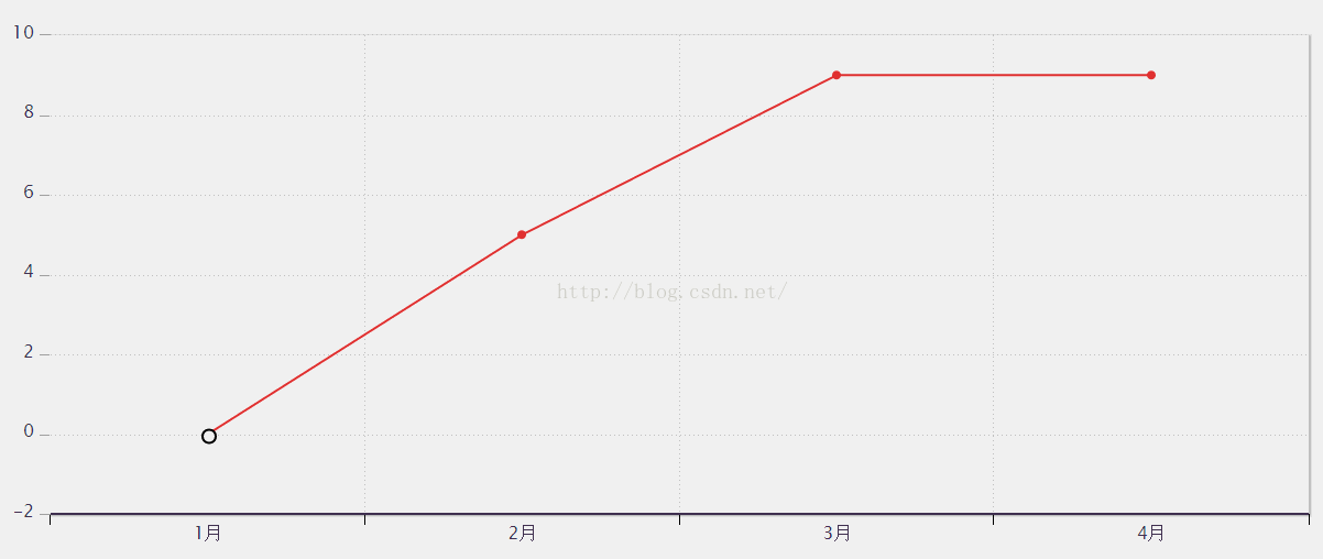
Highcharts如下
$(function() {
	    chart = new Highcharts.Chart({
	        chart: {
	            renderTo: 'chart_line', //图表放置的容器,DIV
	            defaultSeriesType: 'line', //图表类型line(折线图),
	            zoomType: 'x',   //x轴方向可以缩放
	            plotBackgroundColor:'#ffffff',
	            backgroundColor:'#ffffff',
	            plotBorderWidth:0,
	            borderWidth:0
	        },
	        credits: {
	            enabled: false   //右下角不显示LOGO
	        },
	        title: {
	            text: '' //图表标题
	        },
	        subtitle: {
	            text: ''  //副标题
	        },
	        xAxis: {  //x轴
	            categories: [
	            	'1月', '2月', '3月', '4月', '5月', '6月', '7月', '8月', '9月', '10月', '11月', '12月'
	            ], //x轴标签名称
	            gridLineWidth: 1, //设置网格宽度为1
	            lineWidth: 2,  //基线宽度
	            labels:{y:20},  //x轴标签位置:距X轴下方26像素
	            gridLineColor: '#c6c5cf',
	       		gridLineDashStyle:'Dot',
	       		lineColor: '#423e5f',
	       		labels: {
	       			style: {
	       				color: '#423e5f',
	       				font: '16px Lucida Grande, Lucida Sans Unicode, Verdana, Arial, Helvetica, sans-serif'
	       			}
	       		}
	        },
	       yAxis: {
	       		gridLineColor: '#c6c5cf',
	       		gridLineDashStyle:'Dot',
	       		labels: {
	       			style: {
	       				color: '#423e5f',
	       				font: '16px Lucida Grande, Lucida Sans Unicode, Verdana, Arial, Helvetica, sans-serif'
	       			}
	       		},
	       		lineColor: '#ffffff',
	       		minorTickInterval: null,
	       		tickColor: '#A0A0A0',
	       		tickWidth: 1,
	       		title: null
	       	},
	        plotOptions:{ //设置数据点
	            line:{
	                dataLabels:{
	                    enabled:false  //在数据点上显示对应的数据值
	                },
	                color: '#e93938',
	                enableMouseTracking: false,//取消鼠标滑向触发提示框
	                cursor:"pointer"
	            },
	            series: {
   					allowPointSelect: true
 				}

	        },
	        legend: {  //图例
	            layout: 'horizontal',  //图例显示的样式:水平(horizontal)/垂直(vertical)
	            backgroundColor: '#ffffff', //图例背景色
	            align: 'left',  //图例水平对齐方式
	            verticalAlign: 'top',  //图例垂直对齐方式
	            x: 100,  //相对X位移
	            y: 70,   //相对Y位移
	            floating: true, //设置可浮动
	            shadow: true , //设置阴影
	            enabled:false
	        },
	        exporting: {
	            enabled: false  //设置导出按钮不可用
	        },
	        series: [{  //数据列
	           name: '一楼1号',
	           data: [{
					color: '#e93938',
					y: 0,
					marker: {
               			 symbol: 'circle', //数据点 图形样式设置
               			 width:12,
               			 height:12,
               			 fillColor:'#ffffff',
               			 lineWidth:2,
               			 lineColor:'#000000'
           			 }
				}, {
					y: 5
				}, {
					y: 9
				}, {
					y: 9
				}],
	        }]
	    });
	});
有需要的交流的可以加个好友