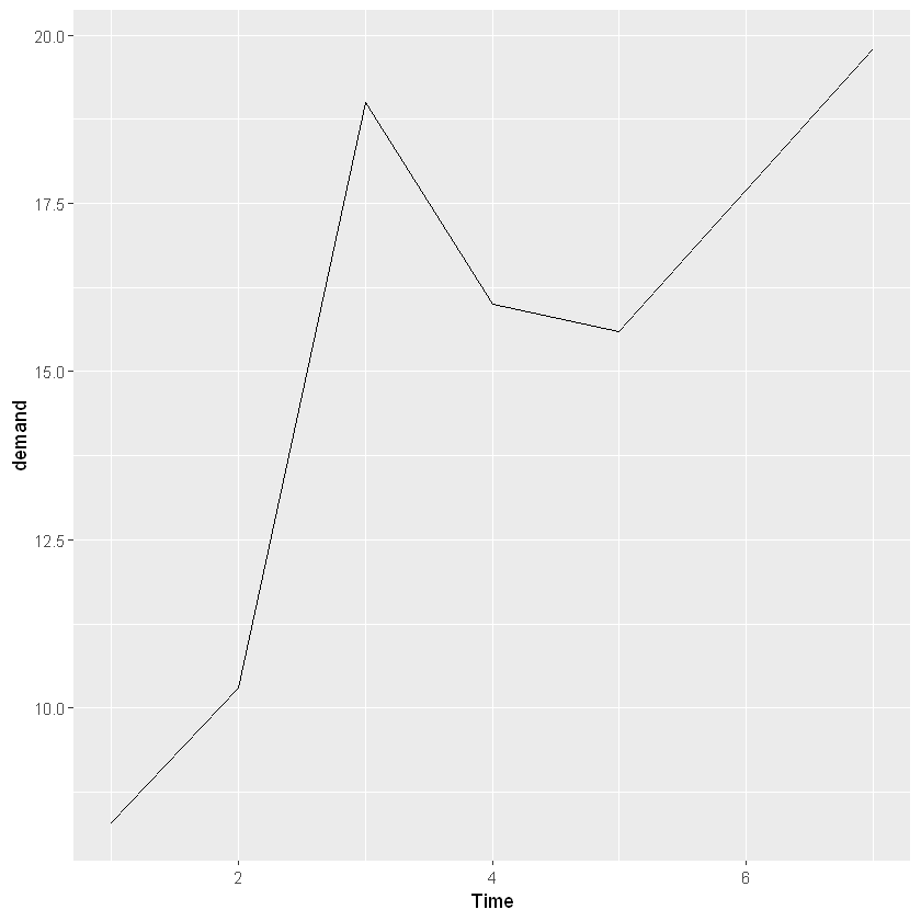
一条折线
library(gcookbook)
library(ggplot2)
ggplot(BOD, aes(x = Time, y = demand)) +
geom_line()
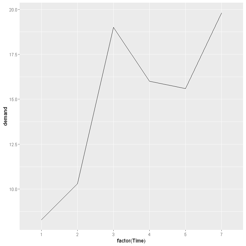
如果改成因子型变量,由于Time不包括6,X轴上也不会出现6,从5直接蹦到7。
ggplot(BOD, aes(x = factor(Time), y = demand, group = 1)) +
geom_line()
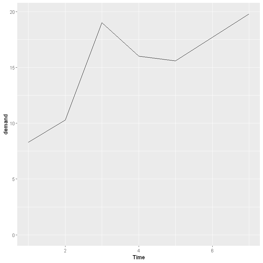
控制Y轴从0开始
ggplot(BOD, aes(x = Time, y = demand)) +
geom_line() +
ylim(0, max(BOD$demand))
设置不同的线性
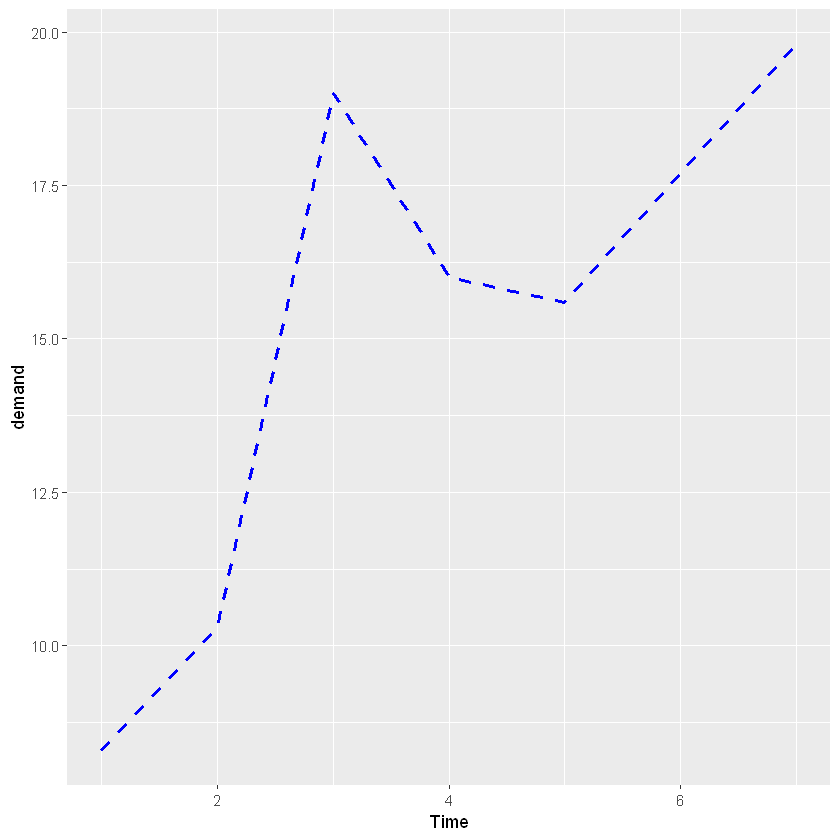
ggplot(BOD, aes(x = Time, y = demand)) +
geom_line(linetype = 'dashed', size = 1, colour = 'blue')
点线图
ggplot(BOD, aes(x = factor(Time), y = demand, group = 1)) +
geom_line() +
geom_point()

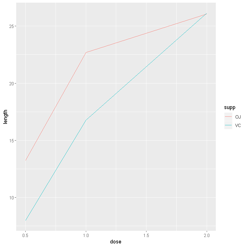
多条折线
library(plyr)
# 取由不同的supp和dose构成的每一组数据对应的len的平均值
tg <- ddply(ToothGrowth, c('supp', 'dose'), summarise, length = mean(len))
# 将颜色映射给supp
ggplot(tg, aes(x = dose, y = length, colour = supp)) +
geom_line()
# 将线型映射给supp
ggplot(tg, aes(x = dose, y = length, linetype = supp)) +
geom_line()
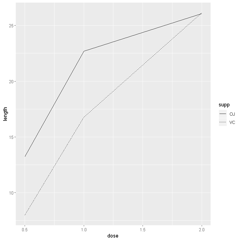
大约有如下类型
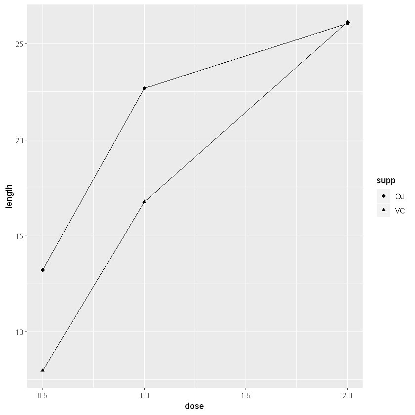
# 将形状映射给supp
ggplot(tg, aes(x = dose, y = length, shape = supp)) +
geom_line() +
geom_point()
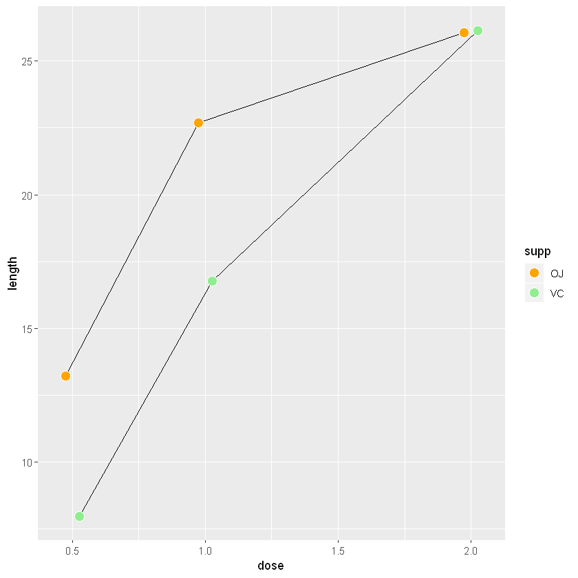
# 将填充色映射给supp7
ggplot(tg, aes(x = dose, y = length, fill = supp)) +
geom_line() +
# colour指的是边框颜色,默认是黑色
geom_point(size = 4, shape = 21, colour = 'white')

当shape取NA时,不显示点;当shape取单独一个字母时,显示为那个字母;当shape取.时,显示一个不随size增大的小点;其他情况下shape的取值在0到25,分别对应不同形状。
# 将数据标记点错开
# 将填充色映射给supp7
ggplot(tg, aes(x = dose, y = length, fill = supp)) +
geom_line(position = position_dodge(0.1)) +
geom_point(size = 4, shape = 21, position = position_dodge(0.1), colour = 'white') +
# 手动设置颜色
scale_fill_manual(values = c('orange', 'lightgreen'))
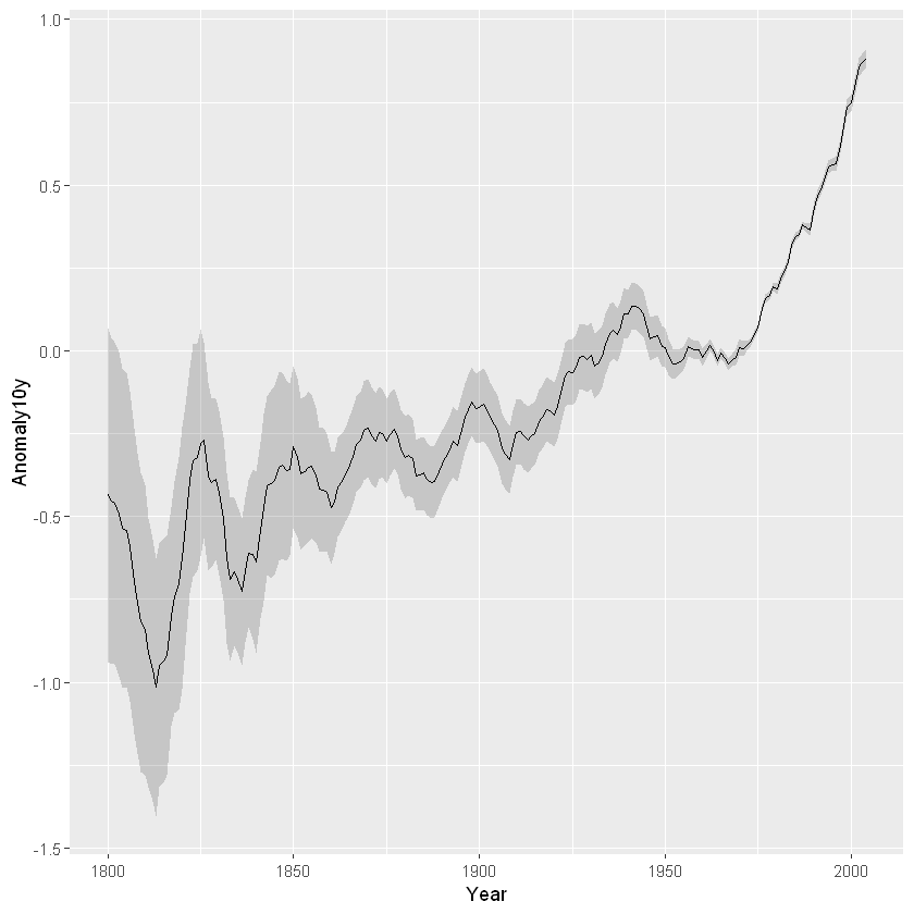
带置信域的折线
# 提取伯克利温度的移动平均及其95%置信区间
clim <- subset(climate, Source == "Berkeley", select = c("Year", "Anomaly10y", "Unc10y"))
head(clim)
| Year | Anomaly10y | Unc10y |
|---|---|---|
| <dbl> | <dbl> | <dbl> |
| 1800 | -0.435 | 0.505 |
| 1801 | -0.453 | 0.493 |
| 1802 | -0.460 | 0.486 |
| 1803 | -0.493 | 0.489 |
| 1804 | -0.536 | 0.483 |
| 1805 | -0.541 | 0.475 |
- 阴影式置信域
ggplot(clim, aes(x = Year, y = Anomaly10y)) +
# 指定置信域上下界及使用阴影的透明度,alpha越小越透明
geom_ribbon(aes(ymin = Anomaly10y-Unc10y,ymax = Anomaly10y+Unc10y), alpha = 0.2) +
geom_line()
- 虚线式置信域
ggplot(clim, aes(x = Year, y = Anomaly10y)) +
geom_line(aes(y = Anomaly10y-Unc10y), colour = 'grey10', linetype = "dotted") +
geom_line(aes(y = Anomaly10y+Unc10y), colour = 'grey10', linetype = "dotted") +
geom_line()
