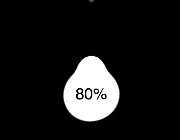
Demo展示
源代码
index.html
<!DOCTYPE html>
<html lang="en">
<head>
    <meta charset="UTF-8">
    <meta name="viewport" content="width=device-width, initial-scale=1.0">
    <title>Document</title>
    <link href="style.css" type="text/css" rel="stylesheet" />
</head>
<body>
    <div class="container">
        <div class="drop"></div>
        <div class="drop"></div>
        <div class="drop"></div>

        <div class="collection"></div>
        <span>80%</span>
      </div>
</body>
</html>
style.css
body {
    margin: 0;
  }

  .container {
    display: flex;
    justify-content: center;
    align-items: center;
    min-height: 100vh;
    background-color: #000;
    flex-direction: column;
    filter: contrast(30);
  }

  .drop {
    width: 100px;
    height: 100px;
    background-color: #fff;
    border-radius: 50%;
    position: absolute;
    filter: blur(20px);
    opacity: 0;
    animation: 2.5s drop linear infinite;
  }

  .drop:nth-child(2) {
    animation-delay: .5s;
  }

  .drop:nth-child(3) {
    animation-delay: .7s;
  }

  .collection {
    width: 100px;
    height: 100px;
    background-color: #fff;
    border-radius: 50%;
    filter: blur(20px);
    animation: 3s collection linear infinite;
  }

  span {
    position: absolute;
    font-family: Helvetica;
    font-size: 30px;
  }

  @keyframes drop {
    0% {
      transform: scale(.7) translateY(-600%);
      opacity: 0;
    }
    50% {
      transform: scale(.4) translateY(-80%);
      opacity: 1;
    }
    100% {
      transform: scale(.3) translateY(0px);
    }
  }

  @keyframes collection {
    0% {
      transform: scale(1) rotate(0deg);
    }
    50% {
      transform: scale(1.3) rotate(180deg);
      width: 90px;
      border-top-left-radius: 40%;
      border-bottom-left-radius: 45%;
    }
    100% {
      transform: scale(1) rotate(360deg);
    }
  }
学习资料来源
UP:CodingStartup起码课
链接: https://www.bilibili.com/video/BV1S64y1F7Y8