使用css3的3D制作一个正方形
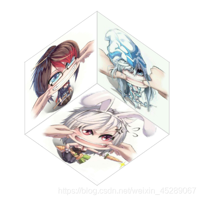
首先我们来看效果
-
首先想要制作 3D的效果 最重要的是 css3 中的 transfom-style 属性, 它有2个属性
- flat : 正常的平铺效果,
- preserve-3d : 将子元素转化为三维立体元素
-
接下来通过定位让所有的子元素都 重叠在一起,并且通过transform 属性向 Y轴正方向移动正方形一半的距离
-
因为每个子元素都是立体元素, 最后只要通过rotate(2D旋转) 让每个li标签通过旋转变成正方形的每一个面就ok了
下面是代码, 有空就研究一下吧
<style>
    div {
      padding-top: 100px;
    }
    ul {
      width: 200px;
      height: 200px;
      padding-top: 100px;
      list-style: none;
      margin: 50px auto;
      padding: 0;
      position: relative;
      transform-style: preserve-3d; /*将子元素转为3D*/
      transition: all 5s linear;
      transform: rotateX(45deg) rotateY(45deg); /*让ul整体向下转45度,向右转45度*/
    }

    li {
      width: 200px;
      height: 200px;
      /* border-radius: 50%; */
      text-align: center;
      line-height: 200px;
      position: absolute; /*让所有的子元素都重叠在一起*/
      border: 1px solid #ccc;
      left: 0;
      right: 0;
    }

    li:nth-child(1) {
      transform: translateZ(100px); /*正面*/
      background: url('./image/lol1.jpg') 0 0 no-repeat;
      background-size: cover;
    }

    li:nth-child(2) {
      transform: rotateX(180deg) translateZ(100px);/*背面*/
      background: url('./image/lol2.jpg') 0 0 no-repeat;
      background-size: cover;

    }

    li:nth-child(3) {
      transform: rotateY(-90deg) translateZ(100px);/*右面*/
      background: url('./image/lol3.jpg') 0 0 no-repeat;
      background-size: cover;

    }

    li:nth-child(4) {
      transform: rotateY(90deg) translateZ(100px);/*左面*/
      background: url('./image/lol4.jpg') 0 0 no-repeat;
      background-size: cover;

    }

    li:nth-child(5) {
      transform: rotateX(90deg) translateZ(100px);/*下面*/
      background: url('./image/lol5.jpg') 0 0 no-repeat;
      background-size: cover;

    }

    li:nth-child(6) {
      transform: rotateX(-90deg) translateZ(100px); /*上面*/
      background: url('./image/lol6.jpg') 0 0 no-repeat;
      background-size: cover;

    }

    ul:hover {/*鼠标移动到盒子上就可以让正方体旋转起来了*/
      transform: rotateX(360deg) rotateY(360deg) rotateZ(360deg);
      background-size: 200px;
    }
  </style>
  <div>
    <ul>
      <li></li>
      <li></li>
      <li></li>
      <li></li>
      <li></li>
      <li></li>
    </ul>
  </div>