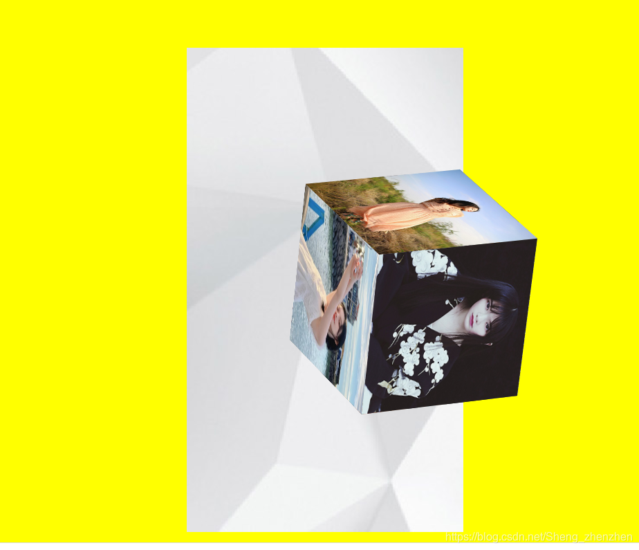
效果图
HTML
<!DOCTYPE html>
<html lang="en">
<head>
<meta charset="UTF-8">
<meta name="viewport" content="width=device-width, initial-scale=1.0">
<meta http-equiv="X-UA-Compatible" content="ie=edge">
<title>Document</title>
<style>
*{
margin: 0;
padding: 0;
}
body{
background: yellow;
}
.bg{
width:320px;
height:560px;
margin:100px auto;
background: url("./img/zf_cubeBg.jpg") no-repeat 100% 100%;
perspective: 3000px;
}
.list{
position: relative;
transform-style: preserve-3d;
width:100%;
height:100%;
list-style: none;
animation: move 6s infinite;
}
@keyframes move {
0%{
transform: translate(200px) rotateX(90deg);
}
50%{
transform: translate(100px) rotateY(180deg);
}
100%{
transform: translateY(100px) rotateZ(45deg);
}
}
.list li{
width:200px;
height:200px;
position: absolute;
left:50%;
top:50%;
margin-left:-100px;
margin-top:-100px;
}
.list li:nth-child(1){
transform:translateZ(100px);
}
.list li:nth-child(2){
transform:translateZ(-100px) rotateY(180deg);
}
.list li:nth-child(3){
transform:translate(-100px) rotateY(-90deg);
}
.list li:nth-child(4){
transform:translate(100px) rotateY(90deg);
}
.list li:nth-child(5){
transform:translateY(-100px) rotateX(90deg);
}
.list li:nth-child(6){
transform:translateY(100px) rotateX(-90deg);
}
.list li img{
width:100%;
height:100%;
}
</style>
</head>
<body>
<div class="bg">
<ul class="list">
<li><img src="./img/zf_cube1.png" alt=""></li>
<li><img src="./img/zf_cube2.png" alt=""></li>
<li><img src="./img/zf_cube3.png" alt=""></li>
<li><img src="./img/zf_cube4.png" alt=""></li>
<li><img src="./img/zf_cube5.png" alt=""></li>
<li><img src="./img/zf_cube6.png" alt=""></li>
</ul>
</div>
<script>
</script>
</body>
</html>
