实例1 学会使用tex/latex
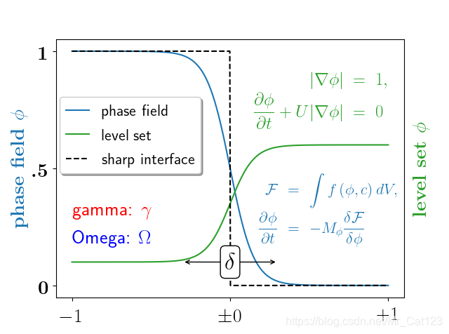
第一眼看这个图的时候觉得很震撼,代码来自官网useTex demo,以及Latex
代码在本例题末尾
首先需要注意的是,使用latex时可能会比不使用慢,因为需要调用到latex里面的一些程序,但latex语言美观。
使用latex最简单的方式就是加’$'符号(记住要加r),同时在开头使用rc,设置usetex=True
(第一次调用会比较耗时间,之后就比较快了)
import matplotlib.pyplot as plt
plt.rc('text', usetex=True)
如一个有latex公式的三角函数图

import numpy as np
import matplotlib.pyplot as plt
plt.rc('text', usetex=True) #使用latex

x = np.linspace(-3,3,100)
y = np.sin(x)

plt.plot(x,y,'r')
plt.xlabel(r'$\theta$') #一定要加r转义,避免将$读错
plt.ylabel(r'$\delta$')
plt.text(-1.5,.5,r'$\Omega=\theta+\delta+\phi$') #在位置(-1.5,0.5)处开始写公式
plt.show()
下面的代码是上面第一个图的代码
import numpy as np
import matplotlib.pyplot as plt
plt.rc('text', usetex=True)

# interface tracking profiles
N = 500
delta = 0.6
X = np.linspace(-1, 1, N)
plt.plot(X, (1 - np.tanh(4 * X / delta)) / 2,    # phase field tanh profiles
         X, (1.4 + np.tanh(4 * X / delta)) / 4, "C2",  # composition profile
         X, X < 0, 'k--')                        # sharp interface

# legend
plt.legend(('phase field', 'level set', 'sharp interface'),
           shadow=True, loc=(0.01, 0.48), handlelength=1.5, fontsize=16)

# the arrow
plt.annotate("", xy=(-delta / 2., 0.1), xytext=(delta / 2., 0.1),
             arrowprops=dict(arrowstyle="<->", connectionstyle="arc3"))
plt.text(0, 0.1, r'$\delta$',
         {'color': 'black', 'fontsize': 24, 'ha': 'center', 'va': 'center',
          'bbox': dict(boxstyle="round", fc="white", ec="black", pad=0.2)})

# Use tex in labels
plt.xticks((-1, 0, 1), ('$-1$', r'$\pm 0$', '$+1$'), color='k', size=20)

# Left Y-axis labels, combine math mode and text mode
plt.ylabel(r'\bf{phase field} $\phi$', {'color': 'C0', 'fontsize': 20})
plt.yticks((0, 0.5, 1), (r'\bf{0}', r'\bf{.5}', r'\bf{1}'), color='k', size=20)

# Right Y-axis labels
plt.text(1.02, 0.5, r"\bf{level set} $\phi$", {'color': 'C2', 'fontsize': 20},
         horizontalalignment='left',
         verticalalignment='center',
         rotation=90,
         clip_on=False,
         transform=plt.gca().transAxes)

# Use multiline environment inside a `text`.
# level set equations
eq1 = r"\begin{eqnarray*}" + \
      r"|\nabla\phi| &=& 1,\\" + \
      r"\frac{\partial \phi}{\partial t} + U|\nabla \phi| &=& 0 " + \
      r"\end{eqnarray*}"
plt.text(1, 0.9, eq1, {'color': 'C2', 'fontsize': 18}, va="top", ha="right")

# phase field equations
eq2 = r'\begin{eqnarray*}' + \
      r'\mathcal{F} &=& \int f\left( \phi, c \right) dV, \\ ' + \
      r'\frac{ \partial \phi } { \partial t } &=& -M_{ \phi } ' + \
      r'\frac{ \delta \mathcal{F} } { \delta \phi }' + \
      r'\end{eqnarray*}'
plt.text(0.18, 0.18, eq2, {'color': 'C0', 'fontsize': 16})

plt.text(-1, .30, r'gamma: $\gamma$', {'color': 'r', 'fontsize': 20})
plt.text(-1, .18, r'Omega: $\Omega$', {'color': 'b', 'fontsize': 20})
实例2 学会画坐标轴
一个简单的方法是直接画两条线,代表x,y,但是这样不美观,也不好用
2.1过程
matplotlib画图的时候总是默认的方框,有时候想展示的是x,y左边轴。
绘制坐标系需要用到axisartist,这个可以参考官网axisartist
例外也可以参考博文Python-matplotlib绘制带箭头x-y坐标轴图形
官网上给的一个复杂的demo是
可见axisartist在画线上还是很实用的。
所以本小节从axisartist说起
创建子图
子图是通过subplot来绘制的,111表示一行一列只有一个图,第三个1是表示第一个图。
如221表示有两行两列(则有四个图)第一个图,分别展示如下。

import matplotlib.pyplot as plt
import mpl_toolkits.axisartist as AA

fig = plt.figure()  #创建画布
ax = AA.Subplot(fig,111)
fig.add_axes(ax)  #将坐标ax加入画布中
(111)
(221)
上下左右(top, bottom,left,right)共四条线,即四个坐标轴,下面隐藏右边和上边


ax.axis['right'].set_visible(False)
ax.axis['top'].set_visible(False)
或者
ax.axis['right','top'].set_visible(False)
在y=0处加横坐标(horizontal axis)

#在第一个轴(即x轴,nth_coord是nth coordinate的简称,即第n个坐标轴)
#当nth_coord=1表示x轴。
#所以nth_coord=0, value=0表示画一条x轴,并经过y=0点。
ax.axis['y=0'] = ax.new_floating_axis(nth_coord=0, value=0)
# 可以将参数名去掉直接写(0,0)
#画一条经过x=0.5的y轴,图见下
ax.axis['x=0.5'] = ax.new_floating_axis(nth_coord=1, value=0.5)
结合上面的知识,我们可以画出如下的图形
代码为

扫描二维码关注公众号,回复:
11310761 查看本文章

import matplotlib.pyplot as plt
import mpl_toolkits.axisartist as AA

fig = plt.figure()  #创建画布
ax = AA.Subplot(fig,111)
fig.add_axes(ax)  #将坐标ax加入画布中

#设置某些坐标轴不可见
ax.axis['right','top','bottom'].set_visible(False)
# 增加浮动轴
ax.axis['y=0'] = ax.new_floating_axis(nth_coord=0, value=0)
#如果不想显示坐标轴上的数字可以如下
#ax.axis["left"].toggle(ticklabels=False)
#给坐标轴添加文本
ax.axis['y=0'].label.set_text('y=0')
#将数字变成红色
ax.axis["left"].major_ticklabels.set_color("r")
#所有轴的数字都变成红色
#ax.axis[:].major_ticklabels.set_color("r")
#y轴范围
ax.set_ylim(-4,4)

plt.show()
如果是画一条经过x=0.5的y轴
画箭头

ax.axis['y=0'].set_axisline_style('->',size=1.5)
2.2 典型例子
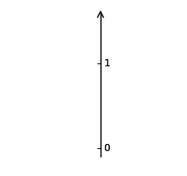
2.2.1 一条带箭头的竖线
(图一:数字显示在左边,实心箭头)
(图2:数字显示在右边)
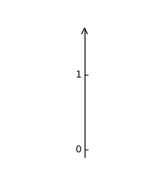
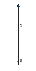
import matplotlib.pyplot as plt
import mpl_toolkits.axisartist as axisartist
#定义一个画轴线的函数
def setup_axes(fig, rect):
    ax = axisartist.Subplot(fig, rect) #建立子图
    fig.add_axes(ax) #子图加入画布

    ax.set_ylim(-0.1, 1.5)
    ax.set_yticks([0, 1])

    ax.axis[:].set_visible(False)#四条边框线都消失

    ax.axis["x"] = ax.new_floating_axis(1, 0.5)#y轴经过x=0.5
    ax.axis["x"].set_axisline_style("->", size=1.5)#空心箭头
    #('-|>')实心箭头

    return ax


fig = plt.figure(figsize=(3, 2.5))#建立画布,尺寸为长3宽2.5
fig.subplots_adjust(top=0.8)#可不要
ax1 = setup_axes(fig, "111") #“111”可以写成111,即str或者int都可以

ax1.axis["x"].set_axis_direction("left")#数字显示在左边right则右边

plt.show()
2.2.2 坐标系

import matplotlib.pyplot as plt
import mpl_toolkits.axisartist as axisartist

def setup_axes(fig, rect):
    ax = axisartist.Subplot(fig, rect)
    fig.add_axes(ax)
	#手动设置y轴,从-0.1开始,我对x轴不做设置
	#大家可以对比x跟y有什么不同
    ax.set_ylim(-0.1, 1.5)
    ax.set_yticks([0, 0.1,0.5]) #手动写参数
	#4个边框线不可见
    ax.axis[:].set_visible(False)
	#第2条线,即y轴
    ax.axis["y"] = ax.new_floating_axis(1, 0)
    ax.axis["y"].set_axisline_style("-|>", size=1.5)
    #第一条线,x轴
    ax.axis["x"] = ax.new_floating_axis(0, 0)
    ax.axis["x"].set_axisline_style("-|>", size=1.5)
    return(ax)

fig = plt.figure(figsize=(8, 8))#设置画布大小(建议可以默认为空括号,不设置大小)
ax1 = setup_axes(fig, 111)
ax1.axis["x"].set_axis_direction("bottom")#x轴数字显示在线的下方
ax1.axis['y'].set_axis_direction('right')#y轴数字显示在线的右边

plt.show()
2.2.3 坐标系上画三角函数

import mpl_toolkits.axisartist as axisartist
import numpy as np

#定义坐标轴函数
def setup_axes(fig, rect):
    ax = axisartist.Subplot(fig, rect)
    fig.add_axes(ax)

    ax.set_ylim(-10, 10)
    #自定义刻度
#    ax.set_yticks([-10, 0,9])
    ax.set_xlim(-10,10)
    ax.axis[:].set_visible(False)

	#第2条线,即y轴,经过x=0的点
    ax.axis["y"] = ax.new_floating_axis(1, 0)
    ax.axis["y"].set_axisline_style("-|>", size=1.5)
#    第一条线,x轴,经过y=0的点
    ax.axis["x"] = ax.new_floating_axis(0, 0)
    ax.axis["x"].set_axisline_style("-|>", size=1.5)

    return(ax)

#设置画布
fig = plt.figure(figsize=(8, 8)) #建议可以直接plt.figure()不定义大小
ax1 = setup_axes(fig, 111)
ax1.axis["x"].set_axis_direction("bottom")
ax1.axis['y'].set_axis_direction('right')

#在已经定义好的画布上加入三角函数
x = np.arange(-15,15,0.1)
y = np.sin(x)
plt.plot(x,y)

plt.show()