python的数据可视化教程,不包含seaborn的原生数据展示。
一、坐标系
限制坐标范围、取消边线颜色、确定坐标系原点
import numpy as np
import matplotlib.pyplot as plt

x = np.linspace(-1,3,100)
y1 = 2 * x - 0.5
y2 = x**2
plt.figure()
l1, = plt.plot(x, y2, label='y2')
l2, = plt.plot(x, y1, label="y1", lw=2, linestyle="--")

## 定义新的坐标标注点
new_ticks = np.linspace(-1,2,10)
plt.xticks(new_ticks)
y_ticks = np.linspace(-1,4,5)
## 用文字替代数字标注
plt.yticks(y_ticks, [r"so bad", r"bad", r"normal", r"good", r"very good"])
plt.xlim((-1,2))
plt.ylim((-1,5))

ax = plt.gca() # get current axis
## 将右边的坐标线颜色取消
ax.spines['right'].set_color('none')
ax.spines['top'].set_color('none')
ax.xaxis.set_ticks_position("bottom")
ax.yaxis.set_ticks_position("left")
## 设置坐标系的中心, data对应的是y轴数据和x轴数据
ax.spines['bottom'].set_position(('data', 0))
ax.spines['left'].set_position(('data', -1))

# 标注点 x0, y0
x0 = 1
y0 = 2*x0 +1
plt.scatter(x0, y0)
plt.plot([x0, x0], [y0, 0], 'k--', color="g", lw=2.5)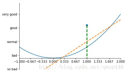
二、两种标注方法
# 标注点 x0, y0
x0 = 1
y0 = 2*x0 +1
plt.scatter(x0, y0)
plt.plot([x0, x0], [y0, 0], 'k--', color="g", lw=2.5)
# annoation 标注, 有两种方法
## 方法 1
plt.annotate(r'$2x+1=%s$' % y0, xy=(x0, y0), xycoords='data', xytext=(+30, -30), textcoords="offset points",
            fontsize=16, arrowprops=dict(arrowstyle="->", connectionstyle='arc3, rad=0'))
## 方法 2 文字
plt.text(-1, 3, "This is the some text.")

for label in ax.get_xticklabels() + ax.get_yticklabels():
    label.set_fontsize(10)
    label.set_bbox(dict(facecolor="blue", edgecolor='None', alpha=0.5))
## 图例
plt.legend(handles=[l1, l2], labels=["aaa", "bbb"], loc="upper right") # handels, labels, loc: best, upper right, lower right
plt.show()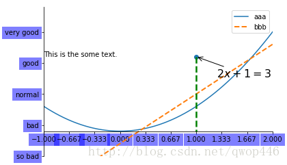
三、散点图
# 散点图
n = 1024
## 产生随机数
X = np.random.normal(0, 1, n)
Y = np.random.normal(0, 1, n)
## 产生颜色数
T = np.arctan2(Y, X)
plt.figure()
plt.scatter(X, Y, s=75, c=T, alpha=0.5 )
plt.xlim((-1.5, 1.5))
plt.ylim((-1.5, 1.5))
plt.xticks(())
plt.yticks(())
plt.show()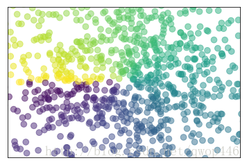
四、 柱状图
# 柱状图
n = 12
X = np.arange(n)
Y1 = (1-X/float(n))*np.random.uniform(0.5, 1, n)
Y2 = (1-X/float(n))*np.random.uniform(0.5, 1, n)
plt.figure()
plt.bar(X, +Y1, facecolor='#9999ff')
plt.bar(X, -Y2)
for x, y in zip(X, Y1):
    # ha: horizontal alignment
    plt.text(x, y+0.05, '%.2f' % y, ha="center", va="bottom")
for x, y in zip(X, -Y2):
    # va: vertical alignment
    plt.text(x, y-0.05, "%.2f" % y, ha="center", va="top")
plt.xlim((-.5, 12))
plt.ylim((-2, 2))
plt.xticks(())
plt.yticks(())
plt.show()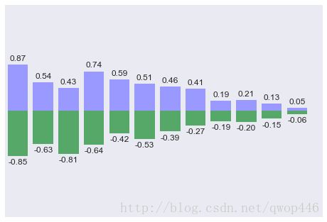
五、等高线图
# 柱状图
n = 12
X = np.arange(n)
Y1 = (1-X/float(n))*np.random.uniform(0.5, 1, n)
Y2 = (1-X/float(n))*np.random.uniform(0.5, 1, n)
plt.figure()
plt.bar(X, +Y1, facecolor='#9999ff')
plt.bar(X, -Y2)
for x, y in zip(X, Y1):
    # ha: horizontal alignment
    plt.text(x, y+0.05, '%.2f' % y, ha="center", va="bottom")
for x, y in zip(X, -Y2):
    # va: vertical alignment
    plt.text(x, y-0.05, "%.2f" % y, ha="center", va="top")
plt.xlim((-.5, 12))
plt.ylim((-2, 2))
plt.xticks(())
plt.yticks(())
plt.show()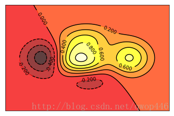
六、图片显示(二维数组)
# 图片
plt.figure()
image = np.random.uniform(0, 1, 81).reshape(9, 9)
## interpolation: nearest
###[具体参数选择]
###[https://matplotlib.org/examples/images_contours_and_fields/interpolation_methods.html]
plt.imshow(image, interpolation="nearest", cmap=plt.cm.rainbow, origin='lower')
## shrink 图例表长度
plt.colorbar(shrink=0.9)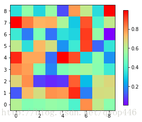
七、3D 图像
# 3D 图像
from mpl_toolkits.mplot3d import Axes3D
x = np.arange(-4, 4, 0.25)
y = np.arange(-4, 4, 0.25)
X,Y = np.meshgrid(x, y)
R = np.sqrt(X**2 + Y**2)
Z = np.sin(R)
fig = plt.figure()
ax = Axes3D(fig)
## rstride 步长
ax.plot_surface(X, Y, Z, rstride=1, cstride=1, cmap=plt.get_cmap("rainbow"))
ax.contourf(X,Y,Z,zdir='z', offset=-2, cmap=plt.cm.rainbow)
ax.set_zlim(-2, 2)
plt.show()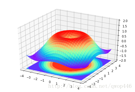
八、subplot 划分的三种方法
# subplot
## method 1
plt.figure()
x = np.linspace(-1,3,100)
y1 = 2 * x - 0.5
y2 = x**2
y3 = np.sin(x)
y4 = np.exp(x)

plt.subplot(2, 1, 1)
plt.plot(x, y1)

plt.subplot(2,3,4)
plt.plot(x, y2)

plt.subplot(2,3,5)
plt.plot(x, y3)

plt.subplot(2,3,6)
plt.plot(x, y4)
plt.show()

## method 2
import matplotlib.gridspec as gridspec
fig = plt.figure()
ax1 = plt.subplot2grid((3,3),(0,0), colspan=3, rowspan=1)
ax1.plot(x, y1)
ax1.set_title("axes_1")
ax2 = plt.subplot2grid((3,3),(1,0), colspan=2, rowspan=1)
ax2.plot(x, y2)
ax3 = plt.subplot2grid((3,3),(1,2), colspan=1, rowspan=2)
ax3.plot(x, y3)
ax4 = plt.subplot2grid((3,3),(2,0), colspan=1, rowspan=1)
ax4.plot(x, y4)
ax5 = plt.subplot2grid((3,3),(2,1), colspan=1, rowspan=1)
ax5.plot(x, y1)
fig.show()

## method 3 索引的方法
gs = gridspec.GridSpec(3,3)
ax1 = plt.subplot(gs[0, :])
ax2 = plt.subplot(gs[1, :2])
ax3 = plt.subplot(gs[1:, 2])
ax4 = plt.subplot(gs[2, 0])
ax5 = plt.subplot(gs[2, 1])
plt.show()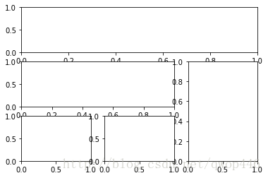
九、 图中图(多图共存)
# 图中图
fig = plt.figure()
x = [i for i in range(1, 8)]
y = [1, 3, 4, 2, 5, 8, 6]

left, bottom, width, height = 0.1, 0.1, 0.8, 0.8
ax1 = fig.add_axes([left, bottom, width, height])
ax1.plot(x, y, 'r')
ax1.set_xlabel('x')
ax1.set_ylabel('y')
ax1.set_title('title')

left, bottom, width, height = 0.2, 0.6, 0.25, 0.25
ax2 = fig.add_axes([left, bottom, width, height])
ax2.plot(x, y, 'b')
ax2.set_xlabel('x')
ax2.set_ylabel('y')
ax2.set_title('inside1')


left, bottom, width, height = 0.6, 0.2, 0.25, 0.25
plt.axes([left, bottom, width, height])
plt.plot(x, y, 'g')
plt.xlabel('x')
plt.ylabel('y')
plt.title('inside3')
fig.show()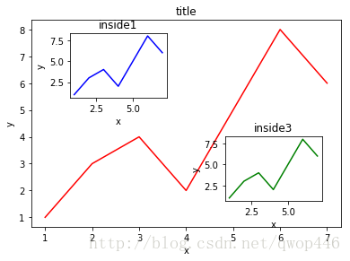
十、主次坐标轴(两个坐标轴)
# 主次坐标轴
x = np.arange(0, 10, 0.1)
y1 = 0.05 * x**2
y2 = -1 * y1
fig, ax1 = plt.subplots()
ax2 = ax1.twinx()
ax1.plot(x, y1, color='g')
ax2.plot(x, y2, 'b--')

ax1.set_xlabel("X DATA")
ax1.set_ylabel("Y1", color='g')
ax2.set_ylabel("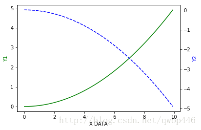
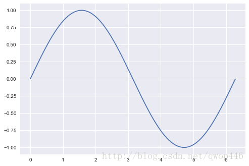
十一、动画
这个不太懂,估计用到的地方也不是很多,先举个例子,以后有空再研究。
# 动画
from matplotlib import animation
fig, ax = plt.subplots()
x = np.arange(0, 2*np.pi, 0.01)
line, = ax.plot(x, np.sin(x))

def animation_fun(i):
    line.set_ydata(np.sin(x+i/10))
    return line,

def init_fun():
    line.set_ydata(np.sin(x))
    return line,

ani = animation.FuncAnimation(fig=fig, func=animation_fun, frames=100, init_func=init_fun, interval=20, blit=False)

fig.show()