Homework 1
Part Ⅰ The curse of dimensionality
(a) Describe the curse of dimensionality. Why does it make learning difficult in high dimensional spaces?
Assuming that the feature is binary, each additional feature will exponentially increase the number of samples required. Moreover, many characteristics are not only binary, but also require a large number of samples. In order to get a better classification effect, we can add more features, such as color, texture distribution and statistical information. Maybe we’ll get a hundred features, but will the classifier work better?The answer is somewhat depressing: no!In fact, when the number of features exceeds a certain value, the effect of the classifier decreases, which is called “the curse of dimensionality”.
(b) For a hypersphere of radius on a space of dimension , its volume is given by
where is the Gamma function, and Consider a crust of the hypersphere of thickness What is the ratio between the volume of the crust and the volume of the hypersphere? How does the ratio change as increases?

So,
Since is less than zero, the ratio tends to 1 as increases.
(c) -dimensional unit hypersphere (i.e. ) centered at the origin, and the target point is also located at the origin. Define a hyperspherical neighborhood around the target point with radius How big should be to ensure that the hypersperical neighborhood contains of the data (on average)? How big to contain
there,when hypersperical neighborhood contains of the data (on average), ,So ;
when hypersperical neighborhood contains of the data (on average), ,So 。
Part II (Optional, Extra Credits)
Principle Component Analysis (PCA) and Fisher Linear Discriminant (FLD)
In this problem, we will work on a set of data samples which contains three categories, each category contains 2000 samples, and each sample has a dimension of 2. Please download and uncompress hw1_partII_problem1.zip, and then we will have three text files contains the data of three categories, respectively.
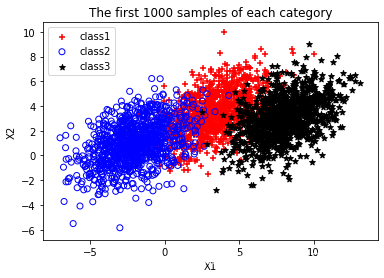
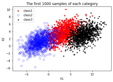
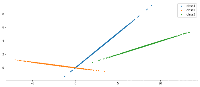
(a) (0 points) Warming up. Plot the first 1000 samples of each category. Your result should be similar to Figure 2.
fig = plt.figure()
ax = fig.add_subplot(111)
# 设置标题
ax.set_title('The first 1000 samples of each category')
# 设置x轴标签
plt.xlabel('X1')
# 设置y轴标签
plt.ylabel('X2')
# 画散点图
ax.scatter(data_1['X'][:1000], data_1['Y'][:1000], c='red', marker='+')
ax.scatter(data_2['X'][:1000], data_2['Y'][:1000], c='', edgecolors='b')
ax.scatter(data_3['X'][:1000], data_3['Y'][:1000], c='black', marker='*')
#设置图标
plt.legend(['class1', 'class2', 'class3'])

plt.show()
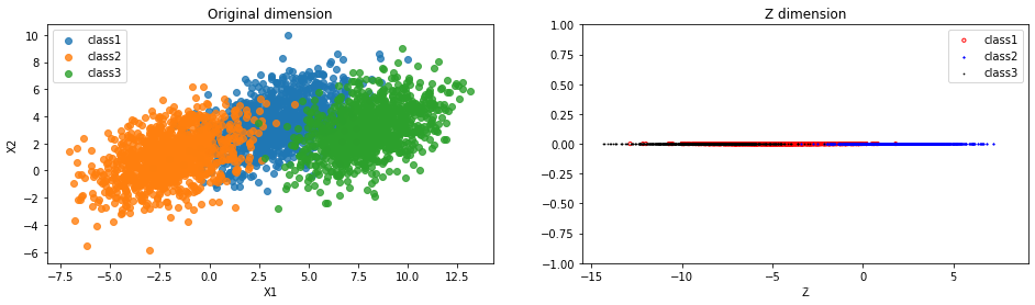
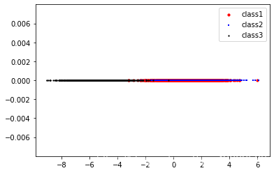
(b) Assume that the first 1000 samples of each category are training samples. We first perform dimension reduction to the training samples (i.e. from two dimen-sions to one dimension) with PCA method. Please plot the projected points of the training samples along the first PCA axis. Your figure should be similar to Figure 3.
fig, (ax1, ax2) = plt.subplots(ncols=2, figsize=(16, 4))

sns.regplot('X1',
            'X2',
            data=pd.DataFrame(data_1[:1000].values, columns=['X1', 'X2']),
            fit_reg=False,
            ax=ax1)
sns.regplot('X1',
            'X2',
            data=pd.DataFrame(data_2[:1000].values, columns=['X1', 'X2']),
            fit_reg=False,
            ax=ax1)
sns.regplot('X1',
            'X2',
            data=pd.DataFrame(data_3[:1000].values, columns=['X1', 'X2']),
            fit_reg=False,
            ax=ax1)
#设置图标
ax1.legend(['class1', 'class2', 'class3'])
# 设置图表标题
ax1.set_title('Original dimension')

Z = []
for i in range(len(Y)):
    Z.append(0)
# 画散点图
ax2.scatter(Y.tolist(), Z, c='', edgecolors='red', s=10)
ax2.scatter(Y_2.tolist(), Z, c='blue', marker='*', s=2)
ax2.scatter(Y_3.tolist(), Z, c='black', marker='.', s=2)
ax2.set_xlabel('Z')
ax2.set_title('Z dimension')
#设置图标
ax2.legend(['class1', 'class2', 'class3'])
plt.ylim(-1, 1)
plt.show()

(c)Assume that the rest of the samples in each category are target samples requesting for classification. Please use PCA method and the nearest-neighbor classifier to classify these samples, and then compute the misclassification rate of each category.

So the misclassification rate = 0.205.
(d) Repeat (b) and (c)with FLD method.


The misclassification rate = 0.120.
(e) Describe and interpret your findings by comparing the misclassification rates of (c)and (d).
| similarities and differences | LDA | PCA |
|---|---|---|
| similarities | 1. Both can reduce the dimension of data; 2. Both of them use the idea of matrix eigendecomposition in dimensionality reduction; 3. Both assume that the data conform to the gaussian distribution; |
|
| differences | 1. Dimension reduction method with supervision; 2. Dimension reduction to k-1 at most; 3. It can be used for dimensionality reduction, it can also be used for classification; 4. Select the projection direction with the best classification performance; 5. More explicit, more reflective of sample differences. |
1. Unsupervised dimensionality reduction method; 2. There is no limit to how many dimensions you can reduce; 3. Only for dimensionality reduction; 4. The direction with the maximum variance of the sample point projection is selected. 5. The purpose is vague. |
代码
import pandas as pd
import numpy as np
import seaborn as sns
import matplotlib.pyplot as plt
from collections import Counter
%matplotlib inline
C:\Users\86187\AppData\Local\Continuum\anaconda3\lib\site-packages\statsmodels\tools\_testing.py:19: FutureWarning: pandas.util.testing is deprecated. Use the functions in the public API at pandas.testing instead.
  import pandas.util.testing as tm
# 加上这两行可以一次性输出多个变量而不用print
from IPython.core.interactiveshell import InteractiveShell
InteractiveShell.ast_node_interactivity = "all"
# 读取数据
data_1 = pd.read_table('data1.txt', sep = '\s+', header=None)
data_1.columns = ['X', 'Y']
data_1.head()

data_2 = pd.read_table('data2.txt', sep = '\s+', header=None)
data_2.columns = ['X', 'Y']
data_2.head()

data_3 = pd.read_table('data3.txt', sep = '\s+', header=None)
data_3.columns = ['X', 'Y']
data_3.head()
| X | Y | |
|---|---|---|
| 0 | 1.64 | 4.787905 |
| 1 | 4.14 | 3.500201 |
| 2 | 3.80 | 2.498570 |
| 3 | 2.22 | 3.659135 |
| 4 | 3.03 | 1.952685 |
| X | Y | |
|---|---|---|
| 0 | -0.40 | -0.670954 |
| 1 | -2.63 | 0.266194 |
| 2 | 0.42 | -0.863024 |
| 3 | 3.37 | 3.544320 |
| 4 | -1.81 | 3.884483 |
| X | Y | |
|---|---|---|
| 0 | 9.19 | 1.823379 |
| 1 | 6.11 | 4.435678 |
| 2 | 8.41 | 0.701513 |
| 3 | 8.12 | 4.034459 |
| 4 | 9.42 | 3.413219 |
fig = plt.figure()
ax = fig.add_subplot(111)
# 设置标题
ax.set_title('The first 1000 samples of each category')
# 设置x轴标签
plt.xlabel('X1')
# 设置y轴标签
plt.ylabel('X2')
# 画散点图
ax.scatter(data_1['X'][:1000],
           data_1['Y'][:1000],
           c='red',
           marker='+',
           linewidths=0.1)
ax.scatter(data_2['X'][:1000],
           data_2['Y'][:1000],
           c='',
           edgecolors='blue',
           linewidths=0.5)
ax.scatter(data_3['X'][:1000],
           data_3['Y'][:1000],
           c='black',
           marker='*',
           linewidths=0.1)
#设置图标
plt.legend(['class1', 'class2', 'class3'])

plt.show()
Text(0.5, 1.0, 'The first 1000 samples of each category')
Text(0.5, 0, 'X1')
Text(0, 0.5, 'X2')
<matplotlib.collections.PathCollection at 0x20c7cef9668>
<matplotlib.collections.PathCollection at 0x20c0fee1978>
<matplotlib.collections.PathCollection at 0x20c0fee1d30>
<matplotlib.legend.Legend at 0x20c0fee1c18>
# 计算协方差矩阵
def covariance_matrix(X):
    X = np.matrix(X)
    cov = (X.T * X) / X.shape[0]
    return cov
def pca(X):
    # 计算协方差矩阵
    C = covariance_matrix(X)
    # 进行奇异值分解
    U, S, V = np.linalg.svd(C)
    return U, S, V
sns.lmplot('X1',
           'X2',
           data=pd.DataFrame(data_1[:1000].values, columns=['X1', 'X2']),
           fit_reg=False)
plt.title('data_1')
plt.show()
<seaborn.axisgrid.FacetGrid at 0x20c0ff26550>
Text(0.5, 1, 'data_1')

# 协方差矩阵
C = covariance_matrix(data_1[:1000].values)
C_2 = covariance_matrix(data_2[:1000].values)
C_3 = covariance_matrix(data_3[:1000].values)
C
C_2
C_3
matrix([[14.8890802 , 13.71671894],
        [13.71671894, 15.77144815]])

matrix([[ 7.3542239 , -0.57617091],
        [-0.57617091,  3.98839773]])

matrix([[67.292491  , 25.89958357],
        [25.89958357, 12.42358874]])
# 奇异值分解后的矩阵
U, S, V = pca(data_1[:1000].values)
U_2, S_2, V_2 = pca(data_2[:1000].values)
U_3, S_3, V_3 = pca(data_3[:1000].values)
U
S
V
matrix([[-0.69564814, -0.71838267],
        [-0.71838267,  0.69564814]])

array([29.05407639,  1.60645195])

matrix([[-0.69564814, -0.71838267],
        [-0.71838267,  0.69564814]])
# 计算投影并且仅选择顶部K个分量的函数
def project_data(X, U, k):

    U_reduced = U[:,:k]
    return np.dot(X, U_reduced)

Y = project_data(data_1[:1000].values, U, 1)
Y_2 = project_data(data_2[:1000].values, U_2, 1)
Y_3 = project_data(data_3[:1000].values, U_3, 1)
Y[:10]
Y_2[:10]
Y_3[:10]
matrix([[-4.58041095],
        [-5.39446676],
        [-4.438392  ],
        [-4.17299811],
        [-3.51058904],
        [-2.48643935],
        [-8.97803446],
        [-3.42946611],
        [-4.01241018],
        [-4.02284718]])

matrix([[ 0.28441362],
        [ 2.63801533],
        [-0.55599348],
        [-2.74235632],
        [ 2.42320001],
        [ 1.51969933],
        [ 0.9640574 ],
        [ 4.3276547 ],
        [ 6.68310255],
        [ 0.10989084]])

matrix([[ -9.21363592],
        [ -7.31628983],
        [ -8.07442501],
        [ -9.03596853],
        [-10.01458613],
        [ -8.74633998],
        [ -6.51346752],
        [ -6.21613128],
        [ -9.86868417],
        [ -8.75848441]])
fig, (ax1, ax2) = plt.subplots(ncols=2, figsize=(16, 4))

sns.regplot('X1',
            'X2',
            data=pd.DataFrame(data_1[:1000].values, columns=['X1', 'X2']),
            fit_reg=False,
            ax=ax1)
sns.regplot('X1',
            'X2',
            data=pd.DataFrame(data_2[:1000].values, columns=['X1', 'X2']),
            fit_reg=False,
            ax=ax1)
sns.regplot('X1',
            'X2',
            data=pd.DataFrame(data_3[:1000].values, columns=['X1', 'X2']),
            fit_reg=False,
            ax=ax1)
#设置图标
ax1.legend(['class1', 'class2', 'class3'])
# 设置图表标题
ax1.set_title('Original dimension')

Z = []
for i in range(len(Y)):
    Z.append(0)
# 画散点图
ax2.scatter(Y.tolist(), Z, c='', edgecolors='red', s=10)
ax2.scatter(Y_2.tolist(), Z, c='blue', marker='*', s=2)
ax2.scatter(Y_3.tolist(), Z, c='black', marker='.', s=2)
ax2.set_xlabel('Z')
ax2.set_title('Z dimension')
#设置图标
ax2.legend(['class1', 'class2', 'class3'])
plt.ylim(-1, 1)
plt.show()
<matplotlib.axes._subplots.AxesSubplot at 0x20c10045160>

<matplotlib.axes._subplots.AxesSubplot at 0x20c10045160>

<matplotlib.axes._subplots.AxesSubplot at 0x20c10045160>

<matplotlib.legend.Legend at 0x20c1003f518>

Text(0.5, 1.0, 'Original dimension')

<matplotlib.collections.PathCollection at 0x20c10031eb8>

<matplotlib.collections.PathCollection at 0x20c104cda20>

<matplotlib.collections.PathCollection at 0x20c104a1a20>

Text(0.5, 0, 'Z')

Text(0.5, 1.0, 'Z dimension')

<matplotlib.legend.Legend at 0x20c104cddd8>

(-1, 1)
# 返向转换
def recover_data(Y, U, k):
    U_reduced = U[:,:k]
    return np.dot(Y, U_reduced.T)
X_recovered = recover_data(Y, U, 1)
X_recovered_2 = recover_data(Y_2, U_2, 1)
X_recovered_3 = recover_data(Y_3, U_3, 1)
X_recovered
matrix([[3.18635435, 3.29048787],
        [3.75265076, 3.87529146],
        [3.08755914, 3.18846392],
        ...,
        [4.62361968, 4.77472459],
        [1.64974339, 1.7036588 ],
        [2.77176769, 2.86235207]])
fig, ax = plt.subplots(figsize=(12,5))
ax.scatter(list(X_recovered[:, 0]), list(X_recovered[:, 1]), s=5)
ax.scatter(list(X_recovered_2[:, 0]), list(X_recovered_2[:, 1]), s=5)
ax.scatter(list(X_recovered_3[:, 0]), list(X_recovered_3[:, 1]), s=5)
plt.legend(['class1', 'class2', 'class3'])
plt.show()
<matplotlib.collections.PathCollection at 0x20c106bd1d0>
<matplotlib.collections.PathCollection at 0x20c106bd630>
<matplotlib.collections.PathCollection at 0x20c106bd748>
<matplotlib.legend.Legend at 0x20c106bd518>
class KNN:
    def __init__(self, X_train, y_train, n_neighbors=3, p=2):
        """
        n_neighbors: 临近点个数
        p: 距离度量
        """
        self.n = n_neighbors
        self.p = p
        self.X_train = X_train
        self.y_train = y_train

    def predict(self, X):
        # 取出n个点
        knn_list = []
        for i in range(self.n):
            dist = np.linalg.norm(X - self.X_train[i], ord=self.p)
            knn_list.append((dist, self.y_train[i]))

        for i in range(self.n, len(self.X_train)):
            max_index = knn_list.index(max(knn_list, key=lambda x: x[0]))
            dist = np.linalg.norm(X - self.X_train[i], ord=self.p)
            if knn_list[max_index][0] > dist:
                knn_list[max_index] = (dist, self.y_train[i])

        # 统计
        knn = [k[-1] for k in knn_list]
        count_pairs = Counter(knn)
#         max_count = sorted(count_pairs, key=lambda x: x)[-1]
        max_count = sorted(count_pairs.items(), key=lambda x: x[1])[-1][0]
        return max_count

    def score(self, X_test, y_test):
        right_count = 0
        n = 10
        for X, y in zip(X_test, y_test):
            label = self.predict(X)
            if label == y:
                right_count += 1
        return right_count / len(X_test)
data_1['label'] = 1
data_2['label'] = 2
data_3['label'] = 3
data_1.head()
| X | Y | label | |
|---|---|---|---|
| 0 | 1.64 | 4.787905 | 1 |
| 1 | 4.14 | 3.500201 | 1 |
| 2 | 3.80 | 2.498570 | 1 |
| 3 | 2.22 | 3.659135 | 1 |
| 4 | 3.03 | 1.952685 | 1 |
# 训练集
Train = pd.concat([data_1[:1000], data_2[:1000]])
Train = pd.concat([Train, data_3[:1000]])

data = np.array(Train.iloc[:, [0, 1, -1]])
X_train, y_train = data[:,:-1], data[:,-1]
X_train.shape
(3000, 2)
# 测试集
Test = pd.concat([data_1[1000:], data_2[1000:]])
Test = pd.concat([Test, data_3[1000:]])

data = np.array(Test.iloc[:, [0, 1, -1]])
X_test, y_test = data[:,:-1], data[:,-1]
X_test.shape
(3000, 2)
# 进行PCA降维
C = covariance_matrix(X_train)
U, S, V = pca(X_train)
X_train = project_data(X_train, U, 1)

C = covariance_matrix(X_test)
U, S, V = pca(X_test)
X_test = project_data(X_test, U, 1)
# 用KNN分类器进行训练
clf = KNN(X_train, y_train)
PCA进行降维后分类结果
# 预测结果准确率
clf.score(X_test, y_test)
0.8053333333333333
# k为目标维度
def LDA(X, y, k):
    label_ = list(set(y))
    X_classify = {}
    for label in label_:
        X1 = np.array([X[i] for i in range(len(X)) if y[i] == label])
        X_classify[label] = X1

    miu = np.mean(X, axis=0)
    miu_classify = {}
    for label in label_:
        miu1 = np.mean(X_classify[label], axis=0)
        miu_classify[label] = miu1

    # St = np.dot((X - mju).T, X - mju)
    # 计算类内散度矩阵Sw
    Sw = np.zeros((len(miu), len(miu)))
    for i in label_:
        Sw += np.dot((X_classify[i] - miu_classify[i]).T,
                     X_classify[i] - miu_classify[i])

    #Sb = St-Sw
    # 计算类内散度矩阵Sb
    Sb = np.zeros((len(miu), len(miu)))
    for i in label_:
        Sb += len(X_classify[i]) * np.dot((miu_classify[i] - miu).reshape(
            (len(miu), 1)), (miu_classify[i] - miu).reshape((1, len(miu))))

    # 计算S_w^{-1}S_b的特征值和特征矩阵
    eig_vals, eig_vecs = np.linalg.eig(np.linalg.inv(Sw).dot(Sb))
    sorted_indices = np.argsort(eig_vals)
    # 提取前k个特征向量
    topk_eig_vecs = eig_vecs[:, sorted_indices[:-k - 1:-1]]
    return topk_eig_vecs


def main():
    # 训练集
    Train = pd.concat([data_1[:1000], data_2[:1000]])
    Train = pd.concat([Train, data_3[:1000]])

    data = np.array(Train.iloc[:, [0, 1, -1]])
    X_train, y_train = data[:,:-1], data[:,-1]
    X_train.shape

    # 测试集
    Test = pd.concat([data_1[1000:], data_2[1000:]])
    Test = pd.concat([Test, data_3[1000:]])

    data = np.array(Test.iloc[:, [0, 1, -1]])
    X_test, y_test = data[:,:-1], data[:,-1]
    X_test.shape

    X1 = X_train[:1000]
    X2 = X_train[1000:2000]
    X3 = X_train[2000:]

    y1 = y_train[:1000]
    y2 = y_train[1000:2000]
    y3 = y_train[2000:]

    W1 = LDA(X1, y1, 1)
    W2 = LDA(X2, y2, 1)
    W3 = LDA(X3, y3, 1)

    X_new1 = np.dot(X1, W1)
    X_new2 = np.dot(X2, W2)
    X_new3 = np.dot(X3, W3)

    Z = []
    for i in range(len(X_new1)):
        Z.append(0)
    plt.scatter(X_new1, Z, marker='o', c='red', s=10)
    plt.scatter(X_new2, Z, marker='+', c='blue', s=5)
    plt.scatter(X_new3, Z, marker='*', c='black', s=2)
    plt.legend(['class1','class2','class3'])
    plt.show()

main()
# 训练集
Train = pd.concat([data_1[:1000], data_2[:1000]])
Train = pd.concat([Train, data_3[:1000]])

data = np.array(Train.iloc[:, [0, 1, -1]])
X_train, y_train = data[:,:-1], data[:,-1]
X_train.shape

# 测试集
Test = pd.concat([data_1[1000:], data_2[1000:]])
Test = pd.concat([Test, data_3[1000:]])

data = np.array(Test.iloc[:, [0, 1, -1]])
X_test, y_test = data[:,:-1], data[:,-1]
X_test.shape

# 进行LDA降维
X = X_train
y = y_train
W = LDA(X, y, 1)
X_train = np.dot(X, W)

X_ = X_test
y_ = y_test
W_ = LDA(X_, y_, 1)
X_test = np.dot(X_, W_)
(3000, 2)

(3000, 2)
# 用KNN分类器进行训练
clf = KNN(X_train, y_train)
LDA进行降维后分类结果
# 预测结果准确率
clf.score(X_test, y_test)
0.8806666666666667