效果图
代码
<template>
<div>
<div class="boxs">
<div class="box1">正面1</div>
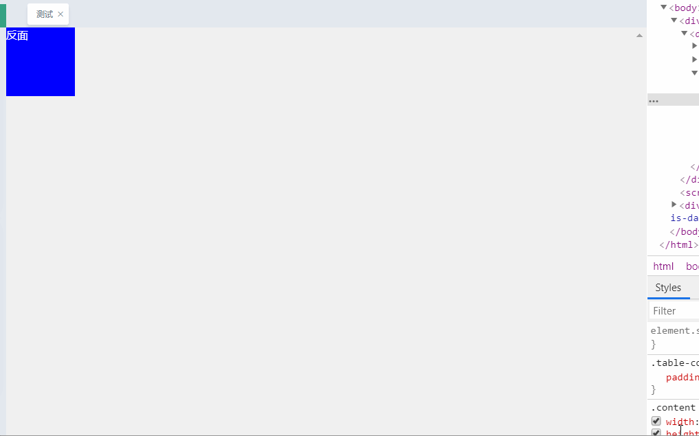
<div class="box2">反面1</div>
</div>
<div class="boxs">
<div class="box1">正面2</div>
<div class="box2">反面2</div>
</div>
</div>
</template>
<script>
export default {
name: "yxf",
components: {},
data() {
return {};
},
};
</script>
<style scoped>
</style>>
<style>
.boxs {
position: relative;
transform: rotateY(0);
width: 100px;
height: 100px;
float: left;
/* animation: boxRoate 2s infinite; */
}
.boxs div {
width: 100px;
height: 100px;
position: absolute;
left: 0;
top: 0;
color: #fff
}
.box1 {
transform: translate(0);
background: red;
z-index: 2; /*因为图片中用了绝对定位,所以最后定位的图片会盖住最先定位的,设置这个属性是为了让它显示到最上面*/
backface-visibility: hidden;//因为这两张图片都旋转了180度,所以我们可以给上面那张图片设置这个属性(注意:记住只给上面那张图片设置哦),让它不是正面面对屏幕时就隐藏起来
animation: boxRotate 3s infinite;
}
.box2 {
transform: rotateY(-180deg);
background: blue;
animation: boxRotate2 3s infinite;
}
@keyframes boxRotate{
0% {
transform: rotateY(0);
}
50% {
transform: rotateY(-180deg);
}
100% {
transform: rotateY(0deg);
}
}
@keyframes boxRotate2{
0% {
transform: rotateY(-180deg);
}
50% {
transform: rotateY(-360deg);
}
100% {
transform: rotateY(-180deg);
}
}
</style>
