matplotlib 一
一. 点与线的操作
方法一:
.plot(x, y, linestyle, linewidth, marker, markersize, color, alpha)
(1) linestyle:
线的风格
| 字符 | 描述 | 中文 |
|---|---|---|
| - | solid line | 实线(一个 -,默认值) |
| – | dashed line | 虚线(两个 - ) |
| -. | dash-dot line | 点划线 |
| : | dotted line | 点线 |
(2) linewidth:
线的宽度。数值型
(3) marker:
关键点、标记点的形状
| 字符 | 描述 | 中文 |
|---|---|---|
| . | point maker | 点标记 |
| , | pixel marker | 像素标记 |
| o | circle marker | 圆形标记 |
| v | triangle_down marker | 下三角形 |
| ^ | triangle_up marker | 上三角形 |
| < | triangle_left marker | 左三角形 |
| > | triangle_right | 右三角形 |
| 1 | tri_down marker | 下细三角形 |
| 2 | tri_up marker | 上细三角形 |
| 3 | tri_left marker | 左细三角形 |
| 4 | tri_right marker | 右细三角形 |
| s | square marker | 正方形 |
| p | pentagon marker | 五角星 |
| * | star marker | 星型 |
| h | hexagon1 | 六边形1 |
| H | hexagon2 | 六边形2 |
| + | plus marker | 加符号 |
| x | x marker | x符号 |
| D | diamond marker | 菱形 |
| d | thin_diamond marker | 瘦菱形 |
| | | vline | 垂线 |
| _ | hline | 水平线 |
对比图案:

marker-官网
(4) markersize:
标志点的大小。数值型。
(5) color:
颜色
| 字符 | 描述 | 中文 |
|---|---|---|
| b | blue | 蓝色(默认) |
| g | green | 绿色 |
| r | red | 红色 |
| c | cyan | 蓝绿色 |
| m | magenta | 紫红色 |
| y | yellow | 黄色 |
| k | black | 黑色 |
| w | white | 白色 |
- 全名 or 缩写
“red” 或者 “r” - 十六进制字符串,如:
“#008000”
- RGBA - (Red, Green, Blue, Alpha)
RGBA values should be within 0-1 range
color = (0.3, 0.5, 0.7, 0.9)
(6) alpha:
线条的透明度
取值范围[0,1], 左闭右闭
方法二:
plot(x, y, fmt)
fmt = [color] [marker] [linestyle]
例如:
b   ---  blue markers with default shape
ro  ---  red circles
g-  ---  green solid line
--  ---  dashed line with default color
二. 图表的操作
1. 设置轴标签 .xlabel 和 .ylabel
.xlabel(xlabel, fontproporties=None, fontsize=12, rotation=0, backgroundcolor='b', color='k', alpha=None, bbox=None)
.ylabel(ylabel, fontproporties=None, fontsize=12, rotation=90, backgroundcolor='b', color='k', alpha=None, bbox=None)
参数说明:
(1)基本参数
xlabel         --- 标签。
fontproporties --- 字体路径,默认None。(注意:font设置后,fontdict部分属性失效)
fontsize       --- 字体大小,默认12
rotation       --- 旋转角度,从0开始。ylabel默认90,即垂直;xlabel默认0,即水平。
backgroundcolor--- 背景色。
color          --- 标签颜色。
alpha          --- 字体透明度。取值[0,1]。

(2)fontdict  ---字体字典参数(key加引号),包含font属性
"fontsize":12                       --- 字体大小,默认12。整型
"fontweight":"medium"               --- 字体粗细。可选:'light', 'normal', 'medium', 'semibold', 'bold', 'heavy', 'black'
"fontstyle":"normal"                --- 字体风格。可选:"normal", "italic"-斜体, "oblique"-倾斜
"verticalalignment":"baseline"      --- 设置垂直对齐方式。可选:"center", "bottom", "top", "baseline"
"horizontalalignment":"center"      --- 设置水平对齐方式。可选:"left","right","center"

注意:fontdict里的参数可不加引号,然后直接当做基本参数使用

(3)bbox  ---设置标题盒属性字典参数(key不加引号)
boxstyle                   --- 设置边框风格。如:"round"
facecolor                  --- fc。设置标题框背景颜色。
edgecolor                  --- ec。设置边框颜色。
linewidth                  --- lw。设置边框厚度。
alpha                      --- 设置背景透明度
plt.xlabel("时间")
plt.ylabel("数量")
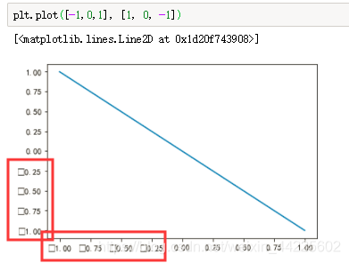
打印输出,横纵坐标没有显示中文:
注意matplotlib没有中文字体,解决办法:
<1>. 直接在代码中加入:
plt.rcParams['font.sans-serif']=['SimHei']
<2>. 或按照下列步骤:
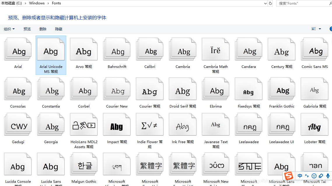
第一步:C:\Windows\Fonts 可以找到电脑上自带的字体
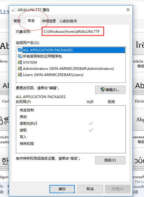
第二步:选择合适的字体后,去找该字体的对象名称。在该字体文件上:右键属性 - >安全 - >对象名称 (复制)
第三步:在代码中,导入库的部分
from matplotlib import font_manager
font = font_manager.FontProperties(fname="C:\Windows\Fonts\ARIALUNI.TTF")
第四步:在轴标签的函数中加个fontproperties参数,等于上面指定的字体路径
plt.xlabel("时间", fontproperties=font)
plt.ylabel("数量", fontproperties=font)
结果,中文可以按字体正常显示:
2. 设置刻度 .xticks 和.yticks
matplotlib会根据数据自动生成x轴与y轴的、比较合适的刻度。所以,若果要手动指定,则需要调用函数:
.xticks(ticks=None, labels=None, rotation=0, color='k', fontsize=12, alpha=None, backgroundcolor=None, fontdict=None, bbox=None)
.yticks(ticks=None, labels=None, rotation=0, color='k', fontsize=12, alpha=None, backgroundcolor=None, fontdict=None, bbox=None)
ticks           --- 可迭代类数组对象
labels          --- 更改刻度上的标签,但实际值还是ticks指定的。

其余属性同上
注意:轴的设置应放在作图函数的后面,例如:放在折线图plt.plot()的后面,就是先将图画好后,再根据自己的喜好设置刻度。否则,matplotlib会在做完图后自动调整刻度,使之前的刻度设置无效。
3. 设置轴长 .xlim 和 .ylim
.xlim(left, right)
.ylim(left, right)
left     --- 左界限
right    --- 右界限
注意1:设置lim时,matplotlib会根据left和right以及图像进行合适的刻度设置,即自动实现ticks
注意2:设置轴长与设置刻度很类似,当lim与ticks同时存在时,轴上的刻度显示以ticks为标准,轴的实际长度以靠后的方法为标准 (即 lim 与 ticks 谁在后面就按照它的长度来显示最大轴长) 。但是不同的是,lim的轴设置可以小于图表中的图,即对图部分显示,或称截取;但ticks则无法截取,matplotlib会自动将其显示为:满足显示整个图的最低轴刻度。
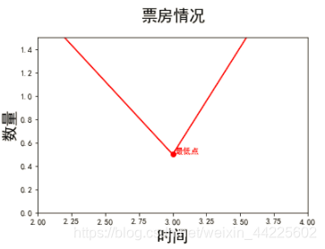
使用xlim与ylim进行截取:成功截取
plt.xlim(2,4)
plt.ylim(0,1.5)
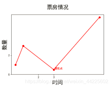
使用xticks与yticks进行截取:自动还原
plt.xticks([2,3])
plt.yticks(np.arange(0,4,2))
4. 设置标题 .title
.title(label, fontporperties=None, loc='center', pad=None, rotation, alpha, backgroundcolor, color, fontdict=None, bbox=None)
(1)基本参数
label            ---  标题
fontporperties   ---  同上。字体文件路径font。(注意:font设置后,fontdict部分属性失效)
loc              ---  标题的位置。默认"center"。其余:"left","right"
pad              ---  标题到图表的上下距离。浮点型数据
rotation         ---  旋转角度。"vertical", "horizontal"。可以为数字
alpha            ---  字体透明度。取值[0,1],同上。
backgroundcolor  ---  背景颜色。同color字体颜色使用方法。
color            ---  字体颜色。

(2)fontdict  ---字体字典参数(key加引号),包含font属性
"fontsize":12                       --- 字体大小,默认12。整型
"fontweight":"medium"               --- 字体粗细。可选:'light', 'normal', 'medium', 'semibold', 'bold', 'heavy', 'black'
"fontstyle":"normal"                --- 字体风格。可选:"normal", "italic"-斜体, "oblique"-倾斜
"verticalalignment":"baseline"      --- 设置垂直对齐方式。可选:"center", "bottom", "top", "baseline"
"horizontalalignment":"center"      --- 设置水平对齐方式。可选:"left","right","center"

注意:fontdict里的参数可不加引号,然后直接当做基本参数使用

(3)bbox  ---设置标题盒属性字典参数(key不加引号)
boxstyle                   --- 设置边框风格。如:"round"
facecolor                  --- 设置标题框背景颜色。
edgecolor                  --- 设置边框颜色。
linewidth                  --- 设置边框厚度。
alpha                      --- 设置背景透明度
同样要加上fontproperties字体属性:
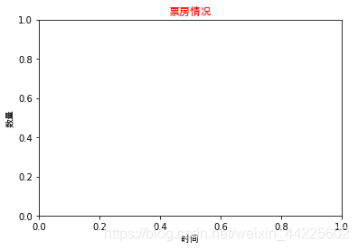
plt.title("票房情况", fontproperties=font, fontsize=12, color="red")
输出结果:
5. 注释文本 .annotate
.annotate(text, xy, xytext, arrowprops=dict(), fontdict=None, bbox=None)
(1)基本属性
text          --- 注释文本内容
xy            --- 要注释点的坐标
xytext        --- 注释文本的新坐标
color         --- 注释的颜色

(2)arrowprops ---箭头字典属性
color         --- 箭头的颜色
width         --- 箭头的箭身的宽度
headwidth     --- 箭头的头部的宽度
headlength    --- 箭头的头部的长度
shrink        --- 箭头的整体长度进行缩水调整。取值[0.1,0.5),表示箭头的头部和尾部同时缩小该值比例长度;取值[0.5, 0.9]表示箭头的尾部缩小该比例。其余值按原整体长度不变。
arrowstyle    --- 箭头的样式风格
	``'-'``        None
    ``'->'``       head_length=0.4,head_width=0.2
    ``'-['``       widthB=1.0,lengthB=0.2,angleB=None
    ``'|-|'``      widthA=1.0,widthB=1.0
    ``'-|>'``      head_length=0.4,head_width=0.2
    ``'<-'``       head_length=0.4,head_width=0.2
    ``'<->'``      head_length=0.4,head_width=0.2
    ``'<|-'``      head_length=0.4,head_width=0.2
    ``'<|-|>'``    head_length=0.4,head_width=0.2
    ``'fancy'``    head_length=0.4,head_width=0.4,tail_width=0.4
    ``'simple'``   head_length=0.5,head_width=0.5,tail_width=0.2
    ``'wedge'``    tail_width=0.3,shrink_factor=0.5
(3)fontdict 文字属性,同上
(4)bbox 盒框属性,同上。
简单例子:
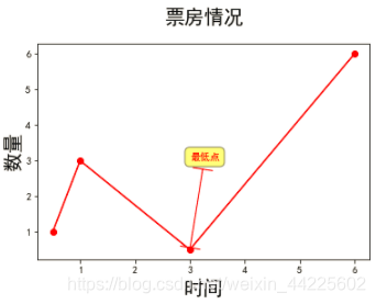
plt.xlabel("时间", fontsize=20)
plt.ylabel("数量", fontsize=20)

plt.title("票房情况",fontsize=20, loc="center", pad=20)

plt.plot([0.5,1, 3, 6], [1,3, 0.5, 6], marker='o', color='r')

plt.annotate("最低点",xy=(3,0.5), xytext=(3, 3), color='r', arrowprops=dict(arrowstyle='|-|', color='r'),bbox=dict(boxstyle='round,pad=0.5', fc='yellow', ec='k',lw=1 ,alpha=0.5))
6. 负号显示问题
一般默认负号无法显示,为框框:
前面代码中加上:
plt.rcParams['axes.unicode_minus'] = False
注意:
熟记这两段代码,每次作图前可直接加入:
plt.rcParams['font.sans-serif']=['SimHei']    # 显示中文
plt.rcParams['axes.unicode_minus'] = False    # 显示负号
