运行环境 jupyter notebook
import matplotlib.pyplot as plt
from pandas import DataFrame,Series
import pandas as pd
import numpy as np
import scipy as sp
from pyecharts import Bar
from pyecharts import WordCloud
plt.rcParams["font.sans-serif"]=['SimHei']
plt.rcParams['axes.unicode_minus']=False
第一题
1.1 导入数据并查看【切片】
->
chipo=pd.read_csv('datasets/chipo.csv')
chipo.iloc[0:10]
|
|
Unna
med: 0 |
order_id |
quantity |
item_name |
choice_description |
item_price |
| 0 |
0 |
1 |
1 |
Chips and Fresh Tomato Salsa |
NaN |
$2.39 |
| 1 |
1 |
1 |
1 |
Izze |
[Clementine] |
$3.39 |
| 2 |
2 |
1 |
1 |
Nantucket Nectar |
[Apple] |
$3.39 |
| 3 |
3 |
1 |
1 |
Chips and Tomatillo-Green Chili Salsa |
NaN |
$2.39 |
| 4 |
4 |
2 |
2 |
Chicken Bowl |
[Tomatillo-Red Chili Salsa (Hot), [Black Beans… |
$16.98 |
| 5 |
5 |
3 |
1 |
Chicken Bowl |
[Fresh Tomato Salsa (Mild), [Rice, Cheese, Sou… |
$10.98 |
| 6 |
6 |
3 |
1 |
Side of Chips |
NaN |
$1.69 |
| 7 |
7 |
4 |
1 |
Steak Burrito |
[Tomatillo Red Chili Salsa, [Fajita Vegetables… |
$11.75 |
| 8 |
8 |
4 |
1 |
Steak Soft Tacos |
[Tomatillo Green Chili Salsa, [Pinto Beans, Ch… |
$9.25 |
| 9 |
9 |
5 |
1 |
Steak Burrito |
[Fresh Tomato Salsa, [Rice, Black Beans, Pinto… |
$9.25 |
1.2 统计列[item_name]中每种商品出现的频率,绘制柱状图
item_name_01=chipo.groupby('item_name').count().sort_values(by='Unnamed: 0',ascending=False)
item_name_01=item_name_01['Unnamed: 0']
item_name_01.head()
item_name
Chicken Bowl 726
Chicken Burrito 553
Chips and Guacamole 479
Steak Burrito 368
Canned Soft Drink 301
Name: Unnamed: 0, dtype: int64
item_name_02 = item_name_01.head()
y=item_name_02.values
x=item_name_02.index
plt.figure(figsize=(15,7))
plt.bar(x,y,label='商品名')
plt.title('购买次数最多的商品排名')
plt.xlabel('商品名称')
plt.ylabel('出现的订单次数')
plt.legend(loc='upper right')
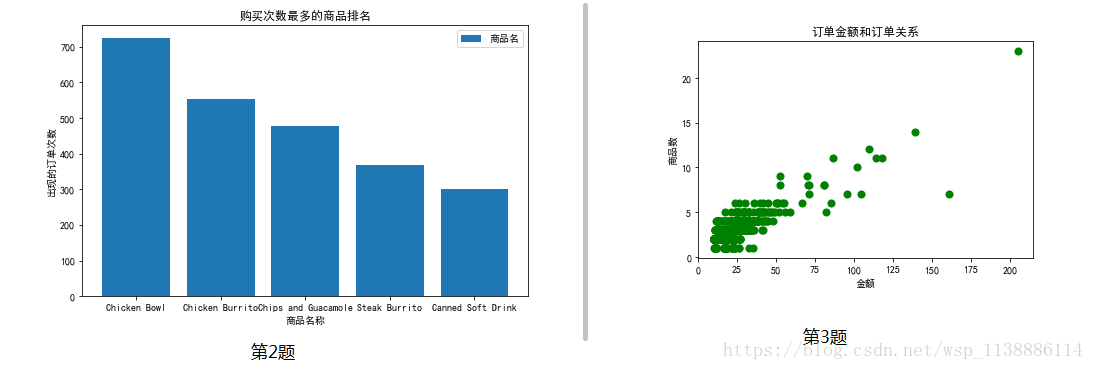
1.3 根据列 [odrder_id] 分组,求出每个订单花费的总金额。然后根据每笔订单的总金额和其商品的总数量画出散点图(如上)。
function = lambda x: float(x[1:])
chipo['price'] = chipo['item_price'].agg(function)
data=DataFrame([chipo["order_id"],chipo["price"]])

data=data.T   #数据转置
price_X=data.groupby('order_id')['price'].sum()
order_id_Y=data.groupby('order_id').count()
x=price_X.values
y=order_id_Y.values

plt.scatter(x,y,label='商品名',color='g',s=50,marker='o')
plt.title('订单金额和订单关系')
plt.xlabel('金额')
plt.ylabel('商品数')
第二题
2.1 加载datasets下的tips.csv文件数据,并显示前五行记录
df_01 = pd.read_csv('datasets/tips.csv')
df_01.head(5)
|
|
Unnamed: 0 |
total_bill |
tip |
sex |
smoker |
day |
time |
size |
| 0 |
0 |
16.99 |
1.01 |
Female |
No |
Sun |
Dinner |
2 |
| 1 |
1 |
10.34 |
1.66 |
Male |
No |
Sun |
Dinner |
3 |
| 2 |
2 |
21.01 |
3.50 |
Male |
No |
Sun |
Dinner |
3 |
| 3 |
3 |
23.68 |
3.31 |
Male |
No |
Sun |
Dinner |
2 |
| 4 |
4 |
24.59 |
3.61 |
Female |
No |
Sun |
Dinner |
4 |
2.2 在同一图中绘制:吸烟顾客与不吸烟顾客的消费金额与小费之间的散点图
smoker=df_01[df_01['smoker'] !='No']
no_smoker = df_01[df_01['smoker'] =='No']
plt.figure(figsize=(12,6))
plt.subplot(1,2,1)
plt.scatter(smoker['total_bill'],smoker['tip'])
plt.xlabel('消费总金额')
plt.ylabel('小费金额')
plt.title('吸烟顾客')
plt.subplot(1,2,2)
plt.scatter(no_smoker['total_bill'],no_smoker['tip'])
plt.xlabel('消费总金额')
plt.ylabel('小费金额')
plt.title('不吸烟顾客')

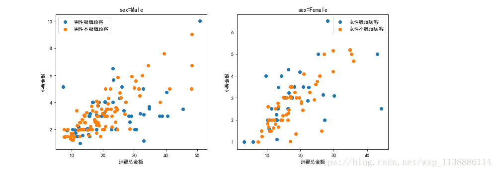
2.3 在同一图中绘制:女性与男性中吸烟与不吸烟顾客的消费金额与小费之间的散点图关系
smoker=df_01[df_01['smoker'] !='No']
male_smoker = smoker[smoker['sex']=='Male']
Female_smoker = smoker[smoker['sex']=='Female']
no_smoker = df_01[df_01['smoker'] =='No']
male_nosmoker= no_smoker[no_smoker['sex']=='Male']
Female_nosmoker = no_smoker[no_smoker['sex']=='Female']
plt.figure(figsize=(12,5))
plt.subplot(1,2,1)
plt.scatter(male_smoker['total_bill'],
male_smoker['tip'],label='男性吸烟顾客')
plt.scatter(male_nosmoker['total_bill'],
male_nosmoker['tip'],label='男性不吸烟顾客')
plt.xlabel('消费总金额')
plt.ylabel('小费金额')
plt.title('sex=Male')
plt.legend()
plt.subplot(1,2,2)
plt.scatter(Female_smoker['total_bill'],
Female_smoker['tip'],label='女性吸烟顾客')
plt.scatter(Female_nosmoker['total_bill'],
Female_nosmoker['tip'],label='女性不吸烟顾客')
plt.xlabel('消费总金额')
plt.ylabel('小费金额')
plt.title('sex=Female')
plt.legend()