1 气泡图
气泡图和上面的散点图非常类似,只是点的大小不一样,而且是通过参数 s 来进行控制的,多的不说,还是看个示例:
例子一:
import matplotlib.pyplot as plt
import numpy as np

# 处理中文乱码
plt.rcParams['font.sans-serif']=['SimHei']

x_data = np.array([2011,2012,2013,2014,2015,2016,2017])
y_data = np.array([58000,60200,63000,71000,84000,90500,107000])

# 根据 y 值的不同生成不同的颜色
colors = y_data * 10
# 根据 y 值的不同生成不同的大小
area = y_data / 300

plt.scatter(x_data, y_data, s = area, c = colors, marker='o', edgecolor='black', alpha=0.5, label = '产品销量')

plt.legend()

plt.savefig("scatter_demo1.png")
例子二:
import numpy as np
import matplotlib.pyplot as plt
import matplotlib.cbook as cbook

# Load a numpy record array from yahoo csv data with fields date, open, close,
# volume, adj_close from the mpl-data/example directory. The record array
# stores the date as an np.datetime64 with a day unit ('D') in the date column.
with cbook.get_sample_data('goog.npz') as datafile:
    price_data = np.load(datafile)['price_data'].view(np.recarray)
price_data = price_data[-250:]  # get the most recent 250 trading days

delta1 = np.diff(price_data.adj_close) / price_data.adj_close[:-1]

# Marker size in units of points^2
volume = (15 * price_data.volume[:-2] / price_data.volume[0])**2
close = 0.003 * price_data.close[:-2] / 0.003 * price_data.open[:-2]

fig, ax = plt.subplots()
ax.scatter(delta1[:-1], delta1[1:], c=close, s=volume, alpha=0.5)

ax.set_xlabel(r'$\Delta_i$', fontsize=15)
ax.set_ylabel(r'$\Delta_{i+1}$', fontsize=15)
ax.set_title('Volume and percent change')

ax.grid(True)
fig.tight_layout()

plt.show()

堆叠图
堆叠图的作用和折线图非常类似,它采用的是 stackplot() 方法。
plt.stackplot(x, y, labels, colors)
import matplotlib.pyplot as plt

# 处理中文乱码
plt.rcParams['font.sans-serif']=['SimHei']

x_data = [2011,2012,2013,2014,2015,2016,2017]
y_data = [58000,60200,63000,71000,84000,90500,107000]
y_data_1 = [78000,80200,93000,101000,64000,70500,87000]

plt.title(label='xxx 公司 xxx 产品销量')

plt.stackplot(x_data, y_data, y_data_1, labels=['产品销量', '用户增长数'])

plt.legend()

plt.savefig("stackplot_demo.png")
例子二:
import numpy as np
import matplotlib.pyplot as plt

x = [1, 2, 3, 4, 5]
y1 = [1, 1, 2, 3, 5]
y2 = [0, 4, 2, 6, 8]
y3 = [1, 3, 5, 7, 9]

y = np.vstack([y1, y2, y3])

labels = ["Fibonacci ", "Evens", "Odds"]

fig, ax = plt.subplots()
ax.stackplot(x, y1, y2, y3, labels=labels)
ax.legend(loc='upper left')
plt.show()
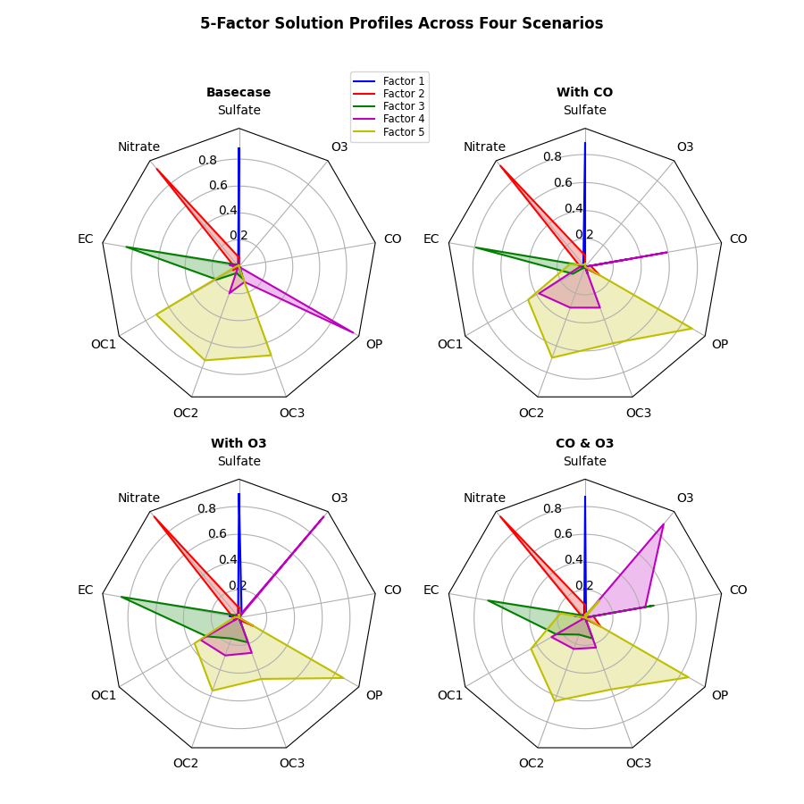
雷达图
它可以直观的看出来一个事物的优势与不足。
在 plt 中建立雷达图是用 polar() 方法的,这个方法其实是用来建立极坐标系的,而雷达图就是先在极坐标系中将各个点找出来,然后再将他们连线连起来。
plt.polar(theta, r, **kwargs)
- theta : 每一个点在极坐标系中的角度
- r : 每一个点在极坐标系中的半径
import numpy as np
import matplotlib.pyplot as plt

# 中文和负号的正常显示
plt.rcParams['font.sans-serif']=['SimHei']
plt.rcParams['axes.unicode_minus'] = False

# 使用ggplot的绘图风格
plt.style.use('ggplot')

# 构造数据
values = [3.2, 2.1, 3.5, 2.8, 3]
feature = ['攻击力', '防御力', '恢复力', '法术强度', '生命值']

N = len(values)
# 设置雷达图的角度,用于平分切开一个圆面
angles = np.linspace(0, 2 * np.pi, N, endpoint=False)

# 为了使雷达图一圈封闭起来,需要下面的步骤
values = np.concatenate((values, [values[0]]))
angles = np.concatenate((angles, [angles[0]]))

# 绘图
fig = plt.figure()
# 这里一定要设置为极坐标格式
ax = fig.add_subplot(111, polar=True)
# 绘制折线图
ax.plot(angles, values, 'o-', linewidth=2)
# 填充颜色
ax.fill(angles, values, alpha=0.25)
# 添加每个特征的标签
ax.set_thetagrids(angles * 180 / np.pi, feature)
# 设置雷达图的范围
ax.set_ylim(0, 5)
# 添加标题
plt.title('游戏人物属性')
# 添加网格线
ax.grid(True)
# 显示图形
plt.savefig('polar_demo.png')
例子二
import numpy as np

import matplotlib.pyplot as plt
from matplotlib.patches import Circle, RegularPolygon
from matplotlib.path import Path
from matplotlib.projections.polar import PolarAxes
from matplotlib.projections import register_projection
from matplotlib.spines import Spine
from matplotlib.transforms import Affine2D


def radar_factory(num_vars, frame='circle'):
    """Create a radar chart with `num_vars` axes.

    This function creates a RadarAxes projection and registers it.

    Parameters
    ----------
    num_vars : int
        Number of variables for radar chart.
    frame : {'circle', 'polygon'}
        Shape of frame surrounding axes.

    """
    # calculate evenly-spaced axis angles
    theta = np.linspace(0, 2*np.pi, num_vars, endpoint=False)

    class RadarAxes(PolarAxes):

        name = 'radar'
        # use 1 line segment to connect specified points
        RESOLUTION = 1

        def __init__(self, *args, **kwargs):
            super().__init__(*args, **kwargs)
            # rotate plot such that the first axis is at the top
            self.set_theta_zero_location('N')

        def fill(self, *args, closed=True, **kwargs):
            """Override fill so that line is closed by default"""
            return super().fill(closed=closed, *args, **kwargs)

        def plot(self, *args, **kwargs):
            """Override plot so that line is closed by default"""
            lines = super().plot(*args, **kwargs)
            for line in lines:
                self._close_line(line)

        def _close_line(self, line):
            x, y = line.get_data()
            # FIXME: markers at x[0], y[0] get doubled-up
            if x[0] != x[-1]:
                x = np.concatenate((x, [x[0]]))
                y = np.concatenate((y, [y[0]]))
                line.set_data(x, y)

        def set_varlabels(self, labels):
            self.set_thetagrids(np.degrees(theta), labels)

        def _gen_axes_patch(self):
            # The Axes patch must be centered at (0.5, 0.5) and of radius 0.5
            # in axes coordinates.
            if frame == 'circle':
                return Circle((0.5, 0.5), 0.5)
            elif frame == 'polygon':
                return RegularPolygon((0.5, 0.5), num_vars,
                                      radius=.5, edgecolor="k")
            else:
                raise ValueError("unknown value for 'frame': %s" % frame)

        def _gen_axes_spines(self):
            if frame == 'circle':
                return super()._gen_axes_spines()
            elif frame == 'polygon':
                # spine_type must be 'left'/'right'/'top'/'bottom'/'circle'.
                spine = Spine(axes=self,
                              spine_type='circle',
                              path=Path.unit_regular_polygon(num_vars))
                # unit_regular_polygon gives a polygon of radius 1 centered at
                # (0, 0) but we want a polygon of radius 0.5 centered at (0.5,
                # 0.5) in axes coordinates.
                spine.set_transform(Affine2D().scale(.5).translate(.5, .5)
                                    + self.transAxes)
                return {'polar': spine}
            else:
                raise ValueError("unknown value for 'frame': %s" % frame)

    register_projection(RadarAxes)
    return theta


def example_data():
    # The following data is from the Denver Aerosol Sources and Health study.
    # See doi:10.1016/j.atmosenv.2008.12.017
    #
    # The data are pollution source profile estimates for five modeled
    # pollution sources (e.g., cars, wood-burning, etc) that emit 7-9 chemical
    # species. The radar charts are experimented with here to see if we can
    # nicely visualize how the modeled source profiles change across four
    # scenarios:
    #  1) No gas-phase species present, just seven particulate counts on
    #     Sulfate
    #     Nitrate
    #     Elemental Carbon (EC)
    #     Organic Carbon fraction 1 (OC)
    #     Organic Carbon fraction 2 (OC2)
    #     Organic Carbon fraction 3 (OC3)
    #     Pyrolized Organic Carbon (OP)
    #  2)Inclusion of gas-phase specie carbon monoxide (CO)
    #  3)Inclusion of gas-phase specie ozone (O3).
    #  4)Inclusion of both gas-phase species is present...
    data = [
        ['Sulfate', 'Nitrate', 'EC', 'OC1', 'OC2', 'OC3', 'OP', 'CO', 'O3'],
        ('Basecase', [
            [0.88, 0.01, 0.03, 0.03, 0.00, 0.06, 0.01, 0.00, 0.00],
            [0.07, 0.95, 0.04, 0.05, 0.00, 0.02, 0.01, 0.00, 0.00],
            [0.01, 0.02, 0.85, 0.19, 0.05, 0.10, 0.00, 0.00, 0.00],
            [0.02, 0.01, 0.07, 0.01, 0.21, 0.12, 0.98, 0.00, 0.00],
            [0.01, 0.01, 0.02, 0.71, 0.74, 0.70, 0.00, 0.00, 0.00]]),
        ('With CO', [
            [0.88, 0.02, 0.02, 0.02, 0.00, 0.05, 0.00, 0.05, 0.00],
            [0.08, 0.94, 0.04, 0.02, 0.00, 0.01, 0.12, 0.04, 0.00],
            [0.01, 0.01, 0.79, 0.10, 0.00, 0.05, 0.00, 0.31, 0.00],
            [0.00, 0.02, 0.03, 0.38, 0.31, 0.31, 0.00, 0.59, 0.00],
            [0.02, 0.02, 0.11, 0.47, 0.69, 0.58, 0.88, 0.00, 0.00]]),
        ('With O3', [
            [0.89, 0.01, 0.07, 0.00, 0.00, 0.05, 0.00, 0.00, 0.03],
            [0.07, 0.95, 0.05, 0.04, 0.00, 0.02, 0.12, 0.00, 0.00],
            [0.01, 0.02, 0.86, 0.27, 0.16, 0.19, 0.00, 0.00, 0.00],
            [0.01, 0.03, 0.00, 0.32, 0.29, 0.27, 0.00, 0.00, 0.95],
            [0.02, 0.00, 0.03, 0.37, 0.56, 0.47, 0.87, 0.00, 0.00]]),
        ('CO & O3', [
            [0.87, 0.01, 0.08, 0.00, 0.00, 0.04, 0.00, 0.00, 0.01],
            [0.09, 0.95, 0.02, 0.03, 0.00, 0.01, 0.13, 0.06, 0.00],
            [0.01, 0.02, 0.71, 0.24, 0.13, 0.16, 0.00, 0.50, 0.00],
            [0.01, 0.03, 0.00, 0.28, 0.24, 0.23, 0.00, 0.44, 0.88],
            [0.02, 0.00, 0.18, 0.45, 0.64, 0.55, 0.86, 0.00, 0.16]])
    ]
    return data


if __name__ == '__main__':
    N = 9
    theta = radar_factory(N, frame='polygon')

    data = example_data()
    spoke_labels = data.pop(0)

    fig, axs = plt.subplots(figsize=(9, 9), nrows=2, ncols=2,
                            subplot_kw=dict(projection='radar'))
    fig.subplots_adjust(wspace=0.25, hspace=0.20, top=0.85, bottom=0.05)

    colors = ['b', 'r', 'g', 'm', 'y']
    # Plot the four cases from the example data on separate axes
    for ax, (title, case_data) in zip(axs.flat, data):
        ax.set_rgrids([0.2, 0.4, 0.6, 0.8])
        ax.set_title(title, weight='bold', size='medium', position=(0.5, 1.1),
                     horizontalalignment='center', verticalalignment='center')
        for d, color in zip(case_data, colors):
            ax.plot(theta, d, color=color)
            ax.fill(theta, d, facecolor=color, alpha=0.25)
        ax.set_varlabels(spoke_labels)

    # add legend relative to top-left plot
    labels = ('Factor 1', 'Factor 2', 'Factor 3', 'Factor 4', 'Factor 5')
    legend = axs[0, 0].legend(labels, loc=(0.9, .95),
                              labelspacing=0.1, fontsize='small')

    fig.text(0.5, 0.965, '5-Factor Solution Profiles Across Four Scenarios',
             horizontalalignment='center', color='black', weight='bold',
             size='large')

    plt.show()
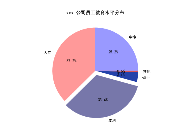
饼图
matplotlib.pyplot.pie(x, explode=None, labels=None, colors=None, autopct=None, pctdistance=0.6, shadow=False, labeldistance=1.1, startangle=None, radius=None, counterclock=True, wedgeprops=None, textprops=None, center=(0, 0), frame=False, hold=None, data=None)
- x : array-like
- explode : array-like, optional, default: None(设置饼图偏离)
- labels : list, optional, default: None(标签)
- colors : array-like, optional, default: None(颜色设置)
- autopct : None (default), string, or function, optional(设置百分比显示)
- pctdistance : float, optional, default: 0.6(百分比距圆心的位置)
- shadow : bool, optional, default: False(设置阴影)
- labeldistance : float, optional, default: 1.1(标签距圆心的距离)
- startangle : float, optional, default: None(开始位置的旋转角度,第一个分类是在右45度位置)
- radius : float, optional, default: None(设置半径的大小)
- counterclock : bool, optional, default: True(是否逆时针)
- wedgeprops : dict, optional, default: None(内外边界设置)
- textprops : dict, optional, default: None(文本设置)
- center : list of float, optional, default: (0, 0)(设置中心位置)
- frame : bool, optional, default: False(是否显示饼图背后图框)
import matplotlib.pyplot as plt

# 中文和负号的正常显示
plt.rcParams['font.sans-serif']=['SimHei']
plt.rcParams['axes.unicode_minus'] = False

# 数据
edu = [0.2515,0.3724,0.3336,0.0368,0.0057]
labels = ['中专','大专','本科','硕士','其他']

# 让本科学历离圆心远一点
explode = [0,0,0.1,0,0]

# 将横、纵坐标轴标准化处理,保证饼图是一个正圆,否则为椭圆
plt.axes(aspect='equal')

# 自定义颜色
colors=['#9999ff','#ff9999','#7777aa','#2442aa','#dd5555'] # 自定义颜色

# 绘制饼图
plt.pie(x=edu,  # 绘图数据
    explode = explode,  # 突出显示大专人群
    labels = labels,  # 添加教育水平标签
    colors = colors,  # 设置饼图的自定义填充色
    autopct = '%.1f%%',  # 设置百分比的格式,这里保留一位小数
    )

# 添加图标题
plt.title('xxx 公司员工教育水平分布')

# 保存图形
plt.savefig('pie_demo.png')
例子二
import numpy as np
import matplotlib.pyplot as plt

fig, ax = plt.subplots(figsize=(6, 3), subplot_kw=dict(aspect="equal"))

recipe = ["375 g flour",
          "75 g sugar",
          "250 g butter",
          "300 g berries"]

data = [float(x.split()[0]) for x in recipe]
ingredients = [x.split()[-1] for x in recipe]


def func(pct, allvals):
    absolute = int(pct/100.*np.sum(allvals))
    return "{:.1f}%\n({:d} g)".format(pct, absolute)


wedges, texts, autotexts = ax.pie(data, autopct=lambda pct: func(pct, data),
                                  textprops=dict(color="w"))

ax.legend(wedges, ingredients,
          title="Ingredients",
          loc="center left",
          bbox_to_anchor=(1, 0, 0.5, 1))

plt.setp(autotexts, size=8, weight="bold")

ax.set_title("Matplotlib bakery: A pie")

plt.show()
