In cp4, Building Good Training Sets – Data Preprocessing, you learned about the different approaches for reducing the dimensionality of a dataset using different feature selection techniques. An alternative approach to feature selection for dimensionality reduction is feature extraction. In this chapter, you will learn about three fundamental techniques that will help us to summarize the information content of a dataset by transforming it onto a new feature subspace of lower dimensionality than the original one. Data compression is an important topic in machine learning, and it helps us to store and analyze the increasing amounts of data that are produced and collected in the modern age of technology.
In this chapter, we will cover the following topics:
- Principal Component Analysis (PCA) for unsupervised data compression
- Linear Discriminant判别式 Analysis (LDA) as a supervised dimensionality reduction technique for maximizing class separability可分离性
- Nonlinear dimensionality reduction via Kernel Principal Component Analysis (KPCA)
Unsupervised dimensionality reduction via principal component analysis
Similar to feature selection, we can use different feature extraction techniques to reduce the number of features in a dataset. The difference between feature selection and feature extraction提取 is that while we maintain the original features when we used feature selection algorithms, such as sequential backward selection, we use feature extraction to transform or project the data onto a new feature space. In the context of dimensionality reduction, feature extraction can be understood as an approach to data compression with the goal of maintaining most of the relevant information. In practice, feature extraction is not only used to improve storage space or the computational efficiency of the learning algorithm, but can also improve the predictive performance by reducing the curse of dimensionality—especially if we are working with non-regularized models.
The main steps behind principal component analysis
In this section, we will discuss PCA (Principal Component Analysis), an unsupervised linear transformation technique that is widely used across different fields, most prominently for feature extraction and dimensionality reduction. Other popular applications of PCA include
exploratory data analyses and de-noising去噪 of signals in stock market trading, and the analysis of genome data and gene expression levels in the field of bioinformatics生物信息学.
PCA helps us to identify patterns in data based on the correlation between features. In a nutshell简言之, PCA aims to find the directions of maximum variance in highdimensional data and projects it onto a new subspace with equal or fewer dimensions than the original one. The orthogonal axes (principal components) of the new subspace can be interpreted as the directions of maximum variance given the constraint that the new feature axes are orthogonal to each other, as illustrated in the following figure: Here,
Here, ![]() and
and ![]() are the original feature axes, and PC1 and PC2 are the principal components.
are the original feature axes, and PC1 and PC2 are the principal components.
If we use PCA for dimensionality reduction, we construct a ![]() –dimensional transformation matrix W that allows us to map a sample vector x onto a new k–dimensional feature subspace that has fewer dimensions than the original d–dimensional feature space(k<d):
–dimensional transformation matrix W that allows us to map a sample vector x onto a new k–dimensional feature subspace that has fewer dimensions than the original d–dimensional feature space(k<d):![]()
![]()
![]()
As a result of transforming the original d-dimensional data onto this new k-dimensional subspace (typically k << d), the first principal component will have the largest possible variance, and all consequent principal components will have the largest variance given the constraint that these components are uncorrelated (orthogonal) to the other principal components—even if the input features are correlated, the resulting principal components will be mutually orthogonal (uncorrelated). Note that the PCA directions are highly sensitive to data scaling, and we need to standardize the features prior to PCA if the features were measured on different scales and we want to assign equal importance to all features.
Before looking at the PCA algorithm for dimensionality reduction in more detail, let's summarize the approach in a few simple steps:
- Standardize the d-dimensional dataset.
- Construct the covariance matrix.
- Decompose分解 the covariance matrix into its eigenvectors and eigenvalues.
- Sort the eigenvalues by decreasing order to rank the corresponding eigenvectors.
- Select k eigenvectors which correspond to the k largest eigenvalues, where k is the dimensionality of the new feature subspace (
 ).
). - Construct a projection matrix W from the "top" k eigenvectors.
- Transform the d-dimensional input dataset X using the projection matrix W to obtain the new k-dimensional feature subspace.
In the following sections, we will perform a PCA step by step, using Python as a learning exercise. Then, we will see how to perform a PCA more conveniently using scikit-learn.
Total and explained variance
In this subsection, we will tackle the first four steps of a PCA (principal component analysis):
- standardizing the data,
- constructing the covariance matrix,
- obtaining the eigenvalues and eigenvectors of the covariance matrix,
- and sorting the eigenvalues by decreasing order to rank the eigenvectors.
https://archive.ics.uci.edu/ml/machine-learning-databases/wine/wine.data
Data Set Information:
These data are the results of a chemical analysis of wines grown in the same region in Italy but derived from three different cultivars. The analysis determined the quantities of 13 constituents found in each of the three types of wines.
I think that the initial data set had around 30 variables, but for some reason I only have the 13 dimensional version. I had a list of what the 30 or so variables were, but a.) I lost it, and b.), I would not know which 13 variables are included in the set.
The attributes are (dontated by Riccardo Leardi, riclea '@' anchem.unige.it )
1) Alcohol
2) Malic acid
3) Ash
4) Alcalinity of ash
5) Magnesium
6) Total phenols
7) Flavanoids
8) Nonflavanoid phenols
9) Proanthocyanins
10)Color intensity
11)Hue
12)OD280/OD315 of diluted wines
13)Proline

First, we will start by loading the Wine dataset that we have been working with in Chapter 4, Building Good Training Sets – Data Preprocessing:
import pandas as pd

df_wine = pd.read_csv('https://archive.ics.uci.edu/ml/machine-learning-databases/wine/wine.data', header=None)

df_wine.head()
Next, we will process the Wine data into separate training and test sets—using 70 percent and 30 percent of the data, respectively—and standardize it to unit variance:
from sklearn.model_selection import train_test_split

X,y = df_wine.iloc[:,1:].values, df_wine.iloc[:,0].values
X_train, X_test, y_train, y_test = train_test_split(X,y, test_size=0.3, stratify=y, random_state=0)
standardize the features
# standardize the features
from sklearn.preprocessing import StandardScaler

sc = StandardScaler()
X_train_std = sc.fit_transform(X_train)
X_test_std = sc.transform(X_test)
After completing the mandatory强制的 preprocessing steps by executing the preceding code, let's advance to the second step: constructing the covariance matrix. The symmetric d × d -dimensional covariance matrix, where d is the number of dimensions in the dataset, stores the pairwise成对地 covariances between the different features. For example, the covariance between two features ![]() and
and ![]() on the population level can be calculated via the following equation:
on the population level can be calculated via the following equation:![]()
Here, ![]() and
and ![]() are the sample means of feature j and k , respectively. Note that the sample means are zero if we standardize the dataset. A positive covariance between two features indicates that the features increase or decrease together, whereas a negative covariance indicates that the features vary in opposite directions. For example, a covariance matrix of three features can then be written as (note that
are the sample means of feature j and k , respectively. Note that the sample means are zero if we standardize the dataset. A positive covariance between two features indicates that the features increase or decrease together, whereas a negative covariance indicates that the features vary in opposite directions. For example, a covariance matrix of three features can then be written as (note that ![]() stands for the Greek uppercase letter sigma, which is not to be confused with the sum symbol):
stands for the Greek uppercase letter sigma, which is not to be confused with the sum symbol):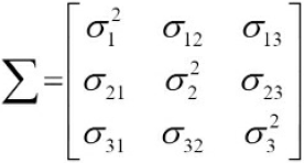
The eigenvectors of the covariance matrix represent the principal components (the directions of maximum variance ), whereas the corresponding eigenvalues will define their magnitude. In the case of the Wine dataset, we would obtain 13 eigenvectors and eigenvalues from the 13×13 -dimensional covariance matrix.
Now, let's obtain the eigenpairs of the covariance matrix. As we surely remember from our introductory linear algebra or calculus classes, an eigen vector ![]() satisfies the following condition:
satisfies the following condition:![]()
Here, ![]() is a scalar: the eigenvalue(Lagrange multiplier). Since the manual computation of eigenvectors and eigenvalues is a somewhat tedious and elaborate复杂 task, we will use the linalg.eig function from NumPy to obtain the eigenpairs of the Wine covariance matrix:
is a scalar: the eigenvalue(Lagrange multiplier). Since the manual computation of eigenvectors and eigenvalues is a somewhat tedious and elaborate复杂 task, we will use the linalg.eig function from NumPy to obtain the eigenpairs of the Wine covariance matrix:
########################################
https://blog.csdn.net/Linli522362242/article/details/105139547
12.1.1 Maximum variance formulation
Consider a data set of observations where n = 1, . . . , N, and  is a Euclidean variable with dimensionality D. Our goal is to project the data onto a space having dimensionality M <D while maximizing the variance of the projected data. For the moment, we shall assume that the value of M is given. Later in this chapter, we shall consider techniques to determine an appropriate value of M from the data.
To begin with, consider the projection onto a one-dimensional space (M = 1). We can define the direction of this space using a D-dimensional vector , which for convenience (and without loss of generality) we shall choose to be a unit vector so that ![]() = 1 (note that we are only interested in the direction defined by
= 1 (note that we are only interested in the direction defined by  , not in the magnitude of itself). Each data point
  is then projected onto a scalar value
  . The mean of the projected data is
  where
where  is the sample set mean given by
 ![]() (12.1)
(12.1)
and the variance of the projected data is given by  (12.2)
where S is the data covariance 协方差 matrix defined by  (12.3)
We now maximize the projected variance ![]() with respect to
with respect to ![]() . Clearly, this has to be a constrained maximization to prevent
. Clearly, this has to be a constrained maximization to prevent ![]() . The appropriate constraint comes from the normalization condition归一化条件
. The appropriate constraint comes from the normalization condition归一化条件 ![]() = 1. To enforce this constraint, we introduce a Lagrange multiplier that we shall denote by
= 1. To enforce this constraint, we introduce a Lagrange multiplier that we shall denote by , and then make an unconstrained maximization of
 ![]() (12.4)
(12.4)
By setting the derivative with respect to equal to zero, we see that this quantity will have a stationary point驻点 when ![]() (12.5) which says that
(12.5) which says that ![]() must be an eigenvector 特征向量 of S. If we left-multiply by
must be an eigenvector 特征向量 of S. If we left-multiply by and make use of
  = 1, we see that the variance is given by
 ![]() (12.6)
(12.6)
and so the variance will be a maximum when we set equal to the eigenvector having the largest eigenvalue . This eigenvector is known as the first principal component.
We can define additional principal components in an incremental fashion方式 by choosing each new direction to be that which maximizes the projected variance amongst all possible directions orthogonal to those already considered. If we consider the general case of an M-dimensional projection space, the optimal linear projection for which the variance of the projected data is maximized is now defined by the M eigenvectors  of the data covariance matrix S corresponding to the M largest eigenvalues
  . This is easily shown using proof by induction.
########################################
Here, ![]() is a scalar: the eigenvalue(Lagrange multiplier). Since the manual computation of eigenvectors and eigenvalues is a somewhat tedious and elaborate复杂 task, we will use the linalg.eig function from NumPy to obtain the eigenpairs of the Wine covariance matrix:
is a scalar: the eigenvalue(Lagrange multiplier). Since the manual computation of eigenvectors and eigenvalues is a somewhat tedious and elaborate复杂 task, we will use the linalg.eig function from NumPy to obtain the eigenpairs of the Wine covariance matrix:
import numpy as np

cov_mat = np.cov(X_train_std.T) #the covariance matrix
eigen_vals, eigen_vecs = np.linalg.eig( cov_mat )
print('\nEigenValues \n%s' % eigen_vals) 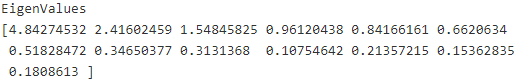
Using the numpy.cov function, we computed the covariance matrix of the standardized training dataset. Using the linalg.eig function, we performed the eigen decomposition, which yielded a vector (eigen_vals) consisting of 13 eigenvalues and the corresponding eigenvectors stored as columns in a 13 x 13-dimensional matrix (eigen_vecs).
####################################################
Note
The numpy.linalg.eig function was designed to operate on both symmetric and non-symmetric square matrices. However, you may find that it returns complex eigenvalues in certain cases.
A related function, numpy.linalg.eigh, has been implemented to decompose Hermetian matrices, which is a numerically more stable approach to work with symmetric matrices such as the covariance matrix; numpy.linalg.eigh always returns real eigenvalues.
####################################################
Total and explained variance
Since we want to reduce the dimensionality of our dataset by compressing it onto a new feature subspace, we only select the subset of the eigenvectors (principal components) that contains most of the information (variance). The eigenvalues define the magnitude of the eigenvectors, so we have to sort the eigenvalues by decreasing magnitude; we are interested in the top k eigenvectors based on the values
of their corresponding eigenvalues. But before we collect those k most informative eigenvectors, let us plot the variance explained ratios of the eigenvalues. The variance explained ratio(方差解释比率或者方差贡献率) of an eigenvalue![]() is simply the fraction of an eigenvalue
is simply the fraction of an eigenvalue![]() and the total sum of the eigenvalues:
and the total sum of the eigenvalues:
Using the NumPy cumsum function, we can then calculate the cumulative sum of explained variances, which we will then plot via Matplotlib's step function:
tot = sum(eigen_vals) #the total sum of the eigenvalues
var_exp = [ (i/tot) for i in sorted(eigen_vals, reverse=True) ] #The variance explained ratio of an eigenvalue
cum_var_exp = np.cumsum( var_exp ) #the cumulative sum of explained variances

import matplotlib.pyplot as plt

         #13 eigenvalues
plt.bar( range(1,14), var_exp, alpha=0.5, align="center", label="individual explained variance")
#where="mid": Steps occur half-way between the *x* positions.
plt.step( range(1,14), cum_var_exp, where="mid", label="cumulative explained variance")
plt.ylabel("Explained variance ratio")
plt.xlabel("Principal component index")
plt.legend(loc="best")
plt.show()
The resulting plot indicates that the first principal component alone accounts for approximately 40 percent of the variance. Also, we can see that the first two principal components combined explain almost 60 percent of the variance in the dataset:
Although the explained variance plot reminds us of the feature importance values that we computed in Chapter 4, Building Good Training Sets – Data Preprocessing, via random forests, we should remind ourselves that PCA is an unsupervised method, which means that information about the class labels is ignored. Whereas a random forest uses the class membership information to compute the node impurities, variance measures the spread of values along a feature axis.
Feature transformation
After we have successfully decomposed the covariance matrix into eigenpairs(eigenvector and eigenvalue), let's now proceed with the last three steps to transform the Wine dataset onto the new principal component axes. The remaining steps we are going to tackle in this section are the following ones:
- Select k eigenvectors, which correspond to the k largest eigenvalues, where k is the dimensionality of the new feature subspace (
 ).
). - Construct a projection matrix W from the "top" k eigenvectors.
- Transform the d-dimensional input dataset X using the projection matrix W to obtain the new k-dimensional feature subspace.
Or, in less technical terms, we will sort the eigenpairs by descending order of the eigenvalues, construct a projection matrix from the selected eigenvectors, and use the projection matrix to transform the data onto the lower-dimensional subspace.
We start by sorting the eigenpairs by decreasing order of the eigenvalues:
# Make a list of (eigenvalue, eigenvector) tuples
eigen_pairs = [ (np.abs(eigen_vals[i]), eigen_vecs[:,i]) for i in range(len(eigen_vals)) ]
eigen_pairs.sort(reverse=True)
Next, we collect the two eigenvectors that correspond to the two largest eigenvalues, to capture about 60 percent of the variance in this dataset. Note that we only chose two eigenvectors for the purpose of illustration, since we are going to plot the data via a two-dimensional scatter plot later in this subsection. In practice, the number of principal components has to be determined by a trade-off between computational efficiency and the performance of the classifier:
eigen_pairs[:2]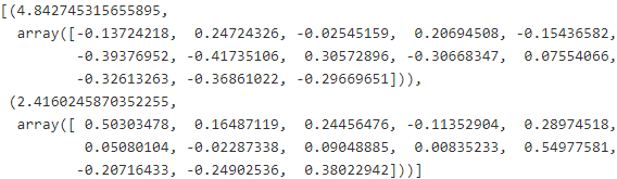
#eigen_pairs:[(eigen_value, eigen_vector(array type)),
#             (eigen_value, eigen_vector),...]
              #eigen_pairs[0][1]: get first eigenvector or first principal component
w = np.hstack((eigen_pairs[0][1][:, np.newaxis],#[:, np.newaxis]:the principal component as 1st column
               eigen_pairs[1][1][:, np.newaxis] #[:, np.newaxis]:the principal component as 2nd column
              )
             )#( ([1st column], [second column]) )
print('Matrix W:\n', w)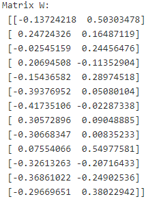
By executing the preceding code, we have created a 13 x 2-dimensional projection matrix W from the top two eigenvectors.
#########################################
Note
Depending on which version of NumPy and LAPACK(Linear Algebra PACKage) you are using, you may obtain the matrix W with its signs flipped. Please note that this is not an issue; if v is an eigenvector of a (covariance) matrix ![]() , we have:
, we have:
![]()
Here ![]() is our eigenvalue, and
is our eigenvalue, and ![]() - is also an eigenvector(
- is also an eigenvector(![]() and v is a unit vector, note that we are only interested in the direction defined by v) that has the same eigenvalue, since:
and v is a unit vector, note that we are only interested in the direction defined by v) that has the same eigenvalue, since:![]()
#########################################
Using the projection matrix, we can now transform a sample x (represented as a 1 x 13-dimensional row) onto the PCA subspace (the principal components one and two) obtaining ![]() , now a two-dimensional sample vector consisting of two new features:
, now a two-dimensional sample vector consisting of two new features:![]()
X_train_std[0].dot(w)![]()
Similarly, we can transform the entire 124 x 13-dimensional training dataset onto the two principal components by calculating the matrix dot product:![]()
X_train_pca = X_train_std.dot(w)
X_train_std[:3]
X_train_pca[:3]
Lastly, let us visualize the transformed Wine training set, now stored as an 124 x 2-dimensional matrix, in a two-dimensional scatterplot:
colors = ['r', 'b', 'g']
markers = ['s', 'x', 'o']
for label, c, m in zip(np.unique(y_train), colors, markers):
    plt.scatter( X_train_pca[y_train==label, 0],
                 X_train_pca[y_train==label, 1],
                 c=c, label=label, marker=m
               )
plt.xlabel( 'Principal Component 1' )
plt.ylabel( 'Principal Component 2' )
plt.legend( loc='lower left' )
plt.show()
As we can see in the resulting plot, the data is more spread along the x-axis—the first principal component—than the second principal component (y-axis), which is consistent with the explained variance ratio plot that we created in the previous subsection. However, we can intuitively see that a linear classifier will likely be able to separate the classes well:
Although we encoded the class labels information for the purpose of illustration in the preceding scatter plot, we have to keep in mind that PCA is an unsupervised technique that doesn't use class label information.
Principal component analysis in scikit-learn
Although the verbose approach in the previous subsection helped us to follow the inner workings of PCA, we will now discuss how to use the PCA class implemented in scikit-learn. PCA is another one of scikit-learn's transformer classes, where we first fit the model using the training data before we transform both the training data and the test data using the same model parameters. Now, let's use the PCA from scikitlearn on the Wine training dataset, classify the transformed samples via logistic regression, and visualize the decision regions via the plot_decision_region function that we defined in Chapter 2, Training Machine Learning Algorithms for Classification:
from matplotlib.colors import ListedColormap

def plot_decision_regions( X, y, classifier, resolution=0.02 ):
    # setup marker generator and color map
    markers = ('s', 'x', 'o', '^', 'v')
    colors = ('red', 'blue', 'lightgreen', 'gray', 'cyan')
    cmap = ListedColormap( colors[:len(np.unique(y))] )

    # plot the decision surface
    x1_min, x1_max = X[:,0].min() - 1, X[:,0].max() + 1
    x2_min, x2_max = X[:,1].min() - 1, X[:,1].max() + 1
    xx1, xx2 = np.meshgrid( np.arange(x1_min, x1_max, resolution),
                            np.arange(x2_min, x2_max, resolution)
                          )
    Z = classifier.predict( np.array( [xx1.ravel(), xx2.ravel()] ).T ) # .T transpose to 2 columns
    Z = Z.reshape(xx1.shape)
    plt.contourf( xx1, xx2, Z, alpha=0.4, cmap=cmap ) # plot decision regions
    plt.xlim( xx1.min(), xx1.max() )
    plt.ylim( xx2.min(), xx2.max() )

    # plot class samples
    for idx, cl in enumerate( np.unique(y) ):
        plt.scatter( x=X[y==cl, 0], y=X[y==cl, 1], alpha=0.8, c=cmap(idx), marker=markers[idx], label=cl )
from sklearn.linear_model import LogisticRegression
from sklearn.decomposition import PCA
pca = PCA(n_components=2)
lr = LogisticRegression()
X_train_pca = pca.fit_transform(X_train_std) # pca projection
X_test_pca = pca.transform(X_test_std)
lr.fit( X_train_pca, y_train )
plot_decision_regions( X_train_pca, y_train, classifier=lr )
plt.xlabel('Principal Component 1')
plt.ylabel('Principal Component 2')
plt.legend( loc='lower left' )
plt.show()By executing the preceding code, we should now see the decision regions for the training data reduced to two principal component axes:

If we compare the PCA projection via scikit-learn with our own PCA implementation, we notice that the plot above is a mirror image of the previous PCA via our step-by-step approach. Note that this is not due to an error in any of those two implementations, but the reason for this difference is that, depending on the eigensolver, eigenvectors can have either negative or positive signs. Not that it matters, but we could simply revert the mirror image by multiplying the data with -1 if we wanted to; note that eigenvectors are typically scaled to unit length 1. For
the sake of completeness, let's plot the decision regions of the logistic regression on the transformed test dataset to see if it can separate the classes well:
plot_decision_regions( X_test_pca, y_test, classifier=lr)
plt.xlabel('Principal Component 1')
plt.ylabel('Principal component 2')
plt.legend( loc='lower left' )
plt.show()
After we plotted the decision regions for the test set by executing the preceding code, we can see that logistic regression performs quite well on this small two-dimensional feature subspace and only misclassifies very few samples in the test dataset:

If we are interested in the explained variance ratios of the different principal components, we can simply initialize the PCA class with the n_components parameter set to None, so all principal components are kept and the explained variance ratio can then be accessed via the explained_variance_ratio_ attribute:
pca = PCA(n_components=None)
X_train_pca = pca.fit_transform(X_train_std)
pca.explained_variance_ratio_ 
Note that we set n_components=None when we initialized the PCA class so that it will return all principal components in a sorted order instead of performing a dimensionality reduction.
################################
The variance explained ratio(方差解释比率或者方差贡献率) of an eigenvalue![]() is simply the fraction of an eigenvalue
is simply the fraction of an eigenvalue![]() and the total sum of the eigenvalues:
and the total sum of the eigenvalues:
#var_exp = [ (i/tot) for i in sorted(eigen_vals, reverse=True) ] #The variance explained
np.array( var_exp) #var_exp is a list
################################
Supervised data compression via linear discriminant analysis
Linear Discriminant Analysis (LDA) can be used as a technique for feature extraction to increase the computational efficiency and reduce the degree of overfitting due to the curse of dimensionality in non-regularized models.
The general concept behind LDA is very similar to PCA. Whereas PCA attempts to find the orthogonal component axes of maximum variance in a dataset, the goal in LDA is to find the feature subspace that optimizes class separability. In the following sections, we will discuss the similarities between LDA and PCA in more detail and walk through the LDA approach step by step.
Principal component analysis versus linear discriminant analysis
Both LDA and PCA are linear transformation techniques that can be used to reduce the number of dimensions in a dataset; the former is an unsupervised algorithm, whereas the latter is supervised. Thus, we might intuitively think that LDA is a superior feature extraction technique for classification tasks compared to PCA. However, A.M. Martinez reported that preprocessing via PCA tends to result in better classification results in an image recognition task in certain cases, for instance if each class consists of only a small number of samples (PCA Versus LDA, A. M. Martinez and A. C. Kak, IEEE Transactions on Pattern Analysis and Machine Intelligence, 23(2): 228-233, 2001).
#######################
Note
LDA is sometimes also called Fisher's LDA. Ronald A. Fisher initially formulated Fisher's Linear Discriminant for two-class classification problems in 1936 (The Use of Multiple Measurements in Taxonomic Problems, R. A. Fisher, Annals of Eugenics,7(2): 179-188, 1936). Fisher's linear discriminant was later generalized for multiclass problems by C. Radhakrishna Rao under the assumption of equal class covariances and normally distributed classes in 1948, which we now call LDA (The Utilization of Multiple Measurements in Problems of Biological Classification, C. R. Rao, Journal of the Royal Statistical Society. Series B (Methodological), 10(2): 159-203, 1948).
#######################
The following figure summarizes the concept of LDA for a two-class problem. Samples from class 1 are shown as circles, and samples from class 2 are shown as crosses:
A linear discriminant, as shown on the x-axis (LD 1), would separate the two normally distributed classes well. Although the exemplary示范的 linear discriminant shown on the y-axis (LD 2) captures a lot of the variance in the dataset, it would fail as a good linear discriminant since it does not capture any of the class-discriminatory information.
One assumption in LDA is that the data is normally distributed. Also, we assume that the classes have identical相同 covariance matrices and that the features are statistically independent of each other. However, even if one or more of those assumptions are (slightly) violated, LDA for dimensionality reduction can still work reasonably well (Pattern Classification 2nd Edition, R. O. Duda, P. E. Hart, and D. G. Stork, New York, 2001).
The inner workings of linear discriminant analysis
Before we dive into the code implementation, let's briefly summarize the main steps that are required to perform LDA:
- Standardize the d-dimensional dataset (d is the number of features).
- For each class, compute the d-dimensional mean vector.
- Construct the between-class scatter matrix
 and the within-class scatter matrix
  .
. - Compute the eigenvectors and corresponding eigenvalues of the matrix
 .
. - Sort the eigenvalues by decreasing order to rank the corresponding eigenvectors.
- Choose the k eigenvectors that correspond to the k largest eigenvalues to construct a
 -dimensional transformation matrix
  ; the eigenvectors are the columns of this matrix.
 - Project the samples onto the new feature subspace using the transformation matrix .
As we can see, LDA is quite similar to PCA in the sense that we are decomposing matrices into eigenvalues and eigenvectors, which will form the new lower dimensional feature space. However, as mentioned before, LDA takes class label information into account, which is represented in the form of the mean vectors(a class-specific mean vector, k is class label,
 ![]() is the number of instances belong to class k) computed in step 2. In the following sections, we will discuss these seven steps in more detail, accompanied by illustrative code implementations.
is the number of instances belong to class k) computed in step 2. In the following sections, we will discuss these seven steps in more detail, accompanied by illustrative code implementations.
Computing the scatter matrices
Since we already standardized the features of the Wine dataset in the PCA section at the beginning of this chapter, we can skip the first step and proceed with the calculation of the mean vectors![]() , which we will use to construct the within-class scatter matrix and between-class scatter matrix, respectively. Each mean vector stores the mean feature value
, which we will use to construct the within-class scatter matrix and between-class scatter matrix, respectively. Each mean vector stores the mean feature value ![]() with respect to the samples of class i:
with respect to the samples of class i: (OR a class-specific mean vector, k is class label,
 ![]() is the number of instances belong to class k)
is the number of instances belong to class k) ![]() is short for dimension of each instance(of class i)
is short for dimension of each instance(of class i)
This results in three mean vectors:
For each class, compute the d-dimensional mean vector:
np.set_printoptions(precision=4)
mean_vecs = []
for label in range(1,4): #3 classes
    mean_vecs.append( np.mean(X_train_std[y_train==label], axis=0) )#hidden class order: 1,2,3
    print( 'Mean Vector %s: %s\n' % (label, mean_vecs[label-1]) )
Using the mean vectors, we can now compute the within-class scatter matrix ![]() (d dimensions, d dimensions) :
(d dimensions, d dimensions) :![]() note: here, c is the class list or label list
note: here, c is the class list or label list
This is calculated by summing up the individual scatter matrices![]() (d dimensions, d dimensions) of each individual class i:
(d dimensions, d dimensions) of each individual class i: # note: here, c is the instance list of each individual class i,
![]() is short for dimension of each instance(of class i)
is short for dimension of each instance(of class i)![]() both x.shape or
both x.shape or ![]() .shape ==(1,d), they have to do reshape (d,1) ==>shape(d,1) dot shape(1,d) ==> shape (d,d),
.shape ==(1,d), they have to do reshape (d,1) ==>shape(d,1) dot shape(1,d) ==> shape (d,d),
d = 13 # number of features
S_W = np.zeros( (d,d) )
for label, mv in zip( range(1,4), mean_vecs ): # (1~3), ( 1~3, 13 ) #class loop
    class_scatter = np.zeros( (d,d) ) # .shape= (13,13)
    for X_train_each_row in X_train[y_train==label]:# instance loop for specified(selected) class
        X_train_each_row, mv = X_train_each_row.reshape(d,1), mv.reshape(d,1)
        # note: In current inner loop, only instances of selected class do dot product, the rest not
                                #shape(13,1) dot shape(1,13) ==> shape (13,13)
        class_scatter += (X_train_each_row-mv).dot( (X_train_each_row-mv).T ) #X_train_each_row- mv of each class
    S_W += class_scatter # shape(13,13) += shape(13,13) for each class
print( "Within-class scatter matrix: %sx%s" % (S_W.shape[0], S_W.shape[1]) )
The assumption that we are making when we are computing the scatter matrices![]() is that the class labels in the training set are uniformly distributed. However, if we print the number of class labels, we see that this assumption is violated:
is that the class labels in the training set are uniformly distributed. However, if we print the number of class labels, we see that this assumption is violated:
#                  bin/index:   0  1   2   3 and class or label list ==[1,2,3]
# np.bincount(y_train)==array([ 0, 41, 50, 33], dtype=int64)
print('Class label distribution: %s' % np.bincount(y_train)[1:])![]()
Thus, we want to scale the individual scatter matrices
before we sum them up as scatter matrix
. When we divide the scatter matrices by the number of class samples
, we can see that computing the scatter matrix is in fact the same as computing the covariance matrix
—the covariance matrix is a normalized version of the scatter matrix:
<==
<==
d = 13 # number of features
S_W = np.zeros( (d,d) )
for label, mv in zip( range(1,4), mean_vecs ):
    class_scatter = np.cov(X_train_std[y_train==label].T) #do transpose then np.cov --> shape (13,13)
    S_W += class_scatter #shape (13,13)
print('Scaled within-class scatter matrix: %sx%s' % (S_W.shape[0], S_W.shape[1]))![]()
After we have computed the scaled within-class scatter matrix (or covariance matrix), we can move on to the next step and compute the between-class scatter matrix ![]() :
:![]() note, here c is a class list or label list
note, here c is a class list or label list
Here, m is the overall mean that is computed, including samples from all classes.
mean_overall = np.mean( X_train_std, axis=0 )
d = 13 # number of features
S_B = np.zeros( (d,d) )
for i,mean_vec in enumerate( mean_vecs ): #( 1~3, 13 ) #class loop
    n = X_train[ y_train==i+1, :].shape[0] # the number of instances in current class
    mean_vec = mean_vec.reshape(d,1) # shape(1,d) ==> shape(d,1)
    mean_overall = mean_overall.reshape(d,1) # shape(1,d) ==> shape(d,1)
    S_B += n * (mean_vec - mean_overall).dot( (mean_vec - mean_overall).T ) # dot product ==> shape(d,d)
print( 'Between-class scatter matrix: %sx%s' % (S_B.shape[0], S_B.shape[1]) )
Selecting linear discriminants for the new feature subspace
The remaining steps of the LDA are similar to the steps of the PCA. However, instead of performing the eigen decomposition on the covariance matrix, we solve the generalized eigenvalue problem of the matrix ![]() :
:
eigen_vals, eigen_vecs = np.linalg.eig( np.linalg.inv(S_W).dot(S_B) )After we computed the eigenpairs, we can now sort the eigenvalues in descending order:
eigen_pairs = [ (np.abs(eigen_vals[i]), eigen_vecs[:,i]) for i in range(len(eigen_vals)) ]
eigen_pairs = sorted(eigen_pairs, key= lambda k: k[0], reverse=True) # k[0] :np.abs(eigen_vals[i]) # k: (np.abs(eigen_vals[i]), eigen_vecs[:,i]) or the tuple in list
print('Eigenvalues in descending order:\n')
for eigen_val in eigen_pairs:
    print(eigen_val[0])
In LDA, the number of linear discriminants is at most c−1(cxc 维度的协方差的秩最大为c-1), where c is the number of class labels, since the in-between scatter matrix![]() is the sum(
is the sum(![]() ) of c matrices with rank秩 1 or less. We can indeed see that we only have two nonzero eigenvalues (the eigenvalues 3-13 are not exactly zero, but this is due to the floating point arithmetic in NumPy).
) of c matrices with rank秩 1 or less. We can indeed see that we only have two nonzero eigenvalues (the eigenvalues 3-13 are not exactly zero, but this is due to the floating point arithmetic in NumPy).
https://www.zhihu.com/question/21605094
https://zh.wikipedia.org/wiki/%E7%A7%A9_(%E7%BA%BF%E6%80%A7%E4%BB%A3%E6%95%B0)
####################
矩阵可以看做是由向量组成。要理解秩,需要先理解什么是向量的线性相关:所谓相关,就是指这些向量是成比例的。
比如:α1:(1,2,3) α2:(2,4,6) α3:(3,6,9),他们可以组成一个3✘3的矩阵。我们可以发现,其实三个向量的值是成比例的。如果我们考虑这么一组方程:
x+2y+3z =0 x,y,z are features or dimmension, (1,2,3) is a eigenvector, 0 is a eigenvalue, each row is an instance
2x+4y+6z =0
3x+6y+9z =0
看到这里,很多人会发现,其实后面两个方程是多余的,因为两边把系数一除就跟第一个一样了。真正有用的就一个,另外两个是废话。没错,矩阵的秩,其实就是把废话去掉以后,留下来的向量个数(rank=1,因为就一个有用向量α1)。
####################
Note
Note that in the rare case of perfect collinearity共线性 (all aligned sample points fall on a straight line), the covariance matrix would have rank one秩为1, which would result in only one eigenvector with a nonzero eigenvalue.
###############################
FIGURE 4.2. Classification using the Default data. Left: Estimated probability of default using linear regression. Some estimated probabilities are negative! The orange ticks indicate the 0/1 values coded for default(No or Yes). Right: Predicted probabilities of default using logistic regression. All probabilities lie between 0 and 1.
4.4 Linear Discriminant Analysis线性判别分析
Logistic regression involves directly modeling Pr(Y = k|X = x) using the logistic function, given by (4.7 ![]() <==
<==![]() <==
<==![]() <==
<==![]() ) for the case of two response classes. In statistical jargon行业术语, we model the conditional distribution of the response Y , given the predictor(s) X. We now consider an alternative and less direct approach to estimating these probabilities. In this alternative approach, we model the distribution of the predictors X separately in each of the response classes (i.e. given Y ), and then use Bayes’ theorem to flip these around into estimates for Pr(Y = k|X = x). When these distributions are assumed to be normal, it turns out that the model is very similar in form to logistic regression.
) for the case of two response classes. In statistical jargon行业术语, we model the conditional distribution of the response Y , given the predictor(s) X. We now consider an alternative and less direct approach to estimating these probabilities. In this alternative approach, we model the distribution of the predictors X separately in each of the response classes (i.e. given Y ), and then use Bayes’ theorem to flip these around into estimates for Pr(Y = k|X = x). When these distributions are assumed to be normal, it turns out that the model is very similar in form to logistic regression.
Why do we need another method, when we have logistic regression?
There are several reasons:
- When the classes are well-separated, the parameter estimates for the logistic regression model are surprisingly unstable. Linear discriminant analysis does not suffer from this problem.
- If n is small and the distribution of the predictors X is approximately normal(近似正态分布) in each of the classes, the linear discriminant model is again more stable than the logistic regression model.
- As mentioned in Section 4.3.5, linear discriminant analysis is popular when we have more than two response classes.
4.4.1 Using Bayes’ Theorem for Classification
Suppose that we wish to classify an observation into one of K classes, where K ≥ 2. In other words, the qualitative定性 response variable Y can take on K possible distinct and unordered values. Let ![]() represent the overall or prior probability that a randomly chosen observation comes from the kth class; this is the probability that a given observation is associated with the kth category of the response variable Y . Let
represent the overall or prior probability that a randomly chosen observation comes from the kth class; this is the probability that a given observation is associated with the kth category of the response variable Y . Let ![]() (= Pr(X=x and Y=k) / Pr(Y=k) = Pr(X=x) * Pr(Y=k/ X=x) / Pr(Y=k) note: Pr(Y=k) is the total probility Y=k in all predictors' space X (X=x1, x2, ...)
(= Pr(X=x and Y=k) / Pr(Y=k) = Pr(X=x) * Pr(Y=k/ X=x) / Pr(Y=k) note: Pr(Y=k) is the total probility Y=k in all predictors' space X (X=x1, x2, ...)
https://blog.csdn.net/Linli522362242/article/details/93034532)denote the density function of X for an observation that comes from the kth class. In other words, ![]() is relatively large if there is a high probability that an observation in the kth class has X ≈ x, and
is relatively large if there is a high probability that an observation in the kth class has X ≈ x, and ![]() is small if it is very unlikely that an observation in the kth class has X ≈ x. Then Bayes’ theorem states that
is small if it is very unlikely that an observation in the kth class has X ≈ x. Then Bayes’ theorem states that![]() (4.10)
(4.10)
In accordance with our earlier notation, we will use the abbreviation ![]() =
= ![]() . This suggests that instead of directly computing
. This suggests that instead of directly computing ![]() as in Section 4.3.1, we can simply plug in estimates of
as in Section 4.3.1, we can simply plug in estimates of ![]() and
and ![]() into (4.10). In general, estimating
into (4.10). In general, estimating ![]() is easy if we have a random sample of Ys from the population: we simply compute (
is easy if we have a random sample of Ys from the population: we simply compute (![]() =)the fraction of the training observations that belong to the kth class. However, estimating
=)the fraction of the training observations that belong to the kth class. However, estimating ![]() tends to be more challenging, unless we assume some simple forms for these densities(
tends to be more challenging, unless we assume some simple forms for these densities(![]() ). We refer to
). We refer to ![]() as the posterior probability that an observation X = x belongs to the kth class given the predictor value. That is,
as the posterior probability that an observation X = x belongs to the kth class given the predictor value. That is, ![]() it is the probability that the observation belongs to the kth class, given the predictor value for that observation.
it is the probability that the observation belongs to the kth class, given the predictor value for that observation.
We know from Chapter 2 that the Bayes classifier, which classifies an observation to the class for which ![]() is largest, has the lowest possible error rate out of all classifiers. (This is of course only true if the terms in (4.10) are all correctly specified.) Therefore, if we can find a way to estimate
is largest, has the lowest possible error rate out of all classifiers. (This is of course only true if the terms in (4.10) are all correctly specified.) Therefore, if we can find a way to estimate ![]() , then we can develop a classifier that approximates the Bayes classifier. Such an approach is the topic of the following sections.
, then we can develop a classifier that approximates the Bayes classifier. Such an approach is the topic of the following sections.
4.4.2 Linear Discriminant Analysis for p = 1
For now, assume that p = 1—that is, we have only one predictor. We would like to obtain an estimate for ![]() that we can plug into (4.10) in order to estimate
that we can plug into (4.10) in order to estimate ![]() . We will then classify an observation to the class for which
. We will then classify an observation to the class for which ![]() is greatest. In order to estimate
is greatest. In order to estimate ![]() , we will first make some assumptions about its form.
, we will first make some assumptions about its form.
Suppose we assume that ![]() is normal or Gaussian. In the one dimensional setting, the normal density takes the form
is normal or Gaussian. In the one dimensional setting, the normal density takes the form![]()
![]()
![]()
where ![]() and
and ![]() are the mean and variance parameters for the kth class.
are the mean and variance parameters for the kth class.
For now, let us further assume that ![]() : that is, there is a shared variance term across all K classes, which for simplicity we can denote by
: that is, there is a shared variance term across all K classes, which for simplicity we can denote by![]() . Plugging (4.11) into (4.10
. Plugging (4.11) into (4.10 ![]() =
= ![]() ), we find that
), we find that
![]()
(Note that in (4.12), ![]() denotes the prior probability that an observation belongs to the kth class, not to be confused with π ≈ 3.14159, the mathematical constant.) The Bayes classifier involves assigning an observation X = x to the class for which (4.12) is largest. Taking the log of (4.12) and rearranging the terms, it is not hard to show that this is equivalent to assigning the observation to the class for which
denotes the prior probability that an observation belongs to the kth class, not to be confused with π ≈ 3.14159, the mathematical constant.) The Bayes classifier involves assigning an observation X = x to the class for which (4.12) is largest. Taking the log of (4.12) and rearranging the terms, it is not hard to show that this is equivalent to assigning the observation to the class for which![]()
![]()
is largest. For instance, if K = 2 and ![]() , then the Bayes classifier assigns an observation to class 1 if
, then the Bayes classifier assigns an observation to class 1 if ![]() , and to class 2 otherwise. In this case, the Bayes decision boundary corresponds to the point where
, and to class 2 otherwise. In this case, the Bayes decision boundary corresponds to the point where ![]() (4.14) (<==
(4.14) (<==![]() =
=![]() )
)
FIGURE 4.4. Left: Two one-dimensional normal density functions are shown. The dashed vertical line represents the Bayes decision boundary.
An example is shown in the left-hand panel of Figure 4.4. The two normal density functions that are displayed, ![]() and
and ![]() , represent two distinct classes. The mean and variance parameters for the two density functions are μ1 = −1.25, μ2 = 1.25, and
, represent two distinct classes. The mean and variance parameters for the two density functions are μ1 = −1.25, μ2 = 1.25, and ![]() . The two densities overlap, and so given that X = x, there is some uncertainty about the class to which
. The two densities overlap, and so given that X = x, there is some uncertainty about the class to which
the observation belongs. If we assume that an observation is equally likely to come from either class—that is, π1 = π2 = 0.5—then by inspection of (4.14), we see that the Bayes classifier assigns the observation to class 1 if x < 0 and class 2 otherwise. Note that in this case, we can compute the Bayes classifier because we know that X is drawn from a Gaussian
distribution within each class, and we know all of the parameters involved. In a real-life situation, we are not able to calculate the Bayes classifier.
In practice, even if we are quite certain of our assumption that X is drawn from a Gaussian distribution within each class, we still have to estimate the parameters ![]() , and
, and ![]() . The linear discriminant analysis (LDA) method approximates the Bayes classifier by plugging estimates for
. The linear discriminant analysis (LDA) method approximates the Bayes classifier by plugging estimates for ![]() ,
, ![]() , and
, and ![]() into (4.13). In particular, the following estimates are used:
into (4.13). In particular, the following estimates are used:
![]() : weighted average
: weighted average
where n is the total number of training observations, and ![]() is the number of training observations in the kth class. The estimate for
is the number of training observations in the kth class. The estimate for ![]() is simply the average of all the training observations from the kth class, while
is simply the average of all the training observations from the kth class, while ![]() can be seen as a weighted average加权平均 of the sample variances for each of the K classes. Sometimes we have knowledge of the class membership probabilities
can be seen as a weighted average加权平均 of the sample variances for each of the K classes. Sometimes we have knowledge of the class membership probabilities ![]() , which can be used directly. In the absence of any additional information, LDA estimates
, which can be used directly. In the absence of any additional information, LDA estimates ![]() using the proportion of the training observations that belong to the kth class. In other words,
using the proportion of the training observations that belong to the kth class. In other words,![]()
![]()
The LDA classifier plugs the estimates given in (4.15) and (4.16) into (4.13 ![]() ), and assigns an observation X = x to the class for which
), and assigns an observation X = x to the class for which 
![]()
is largest. The word linear in the classifier’s name stems from the fact that the discriminant functions ![]() in (4.17) are linear functions of x (as discriminant opposed to a more complex function of x).
in (4.17) are linear functions of x (as discriminant opposed to a more complex function of x).
FIGURE 4.4. Right: 20 observations were drawn from each of the two classes, and are shown as histograms. The Bayes decision boundary is again shown as a dashed vertical line. The solid vertical line represents the LDA decision boundary estimated from the training data.
The right-hand panel of Figure 4.4 displays a histogram of a random sample of 20 observations from each class. To implement LDA, we began by estimating ![]() ,
, ![]() , and
, and ![]() using (4.15) and (4.16).We then computed the decision boundary, shown as a black solid line, that results from assigning an observation to the class for which (4.17) is largest. All points to the left of this line will be assigned to the green class, while points to the right of this line are assigned to the purple class. In this case, since n1 = n2 = 20, we have
using (4.15) and (4.16).We then computed the decision boundary, shown as a black solid line, that results from assigning an observation to the class for which (4.17) is largest. All points to the left of this line will be assigned to the green class, while points to the right of this line are assigned to the purple class. In this case, since n1 = n2 = 20, we have ![]() . As a result, the decision boundary corresponds to the midpoint between the sample means for the two classes,
. As a result, the decision boundary corresponds to the midpoint between the sample means for the two classes, ![]() . The figure indicates that the LDA decision boundary is slightly to the left of the optimal Bayes decision boundary, which instead equals (μ1 + μ2)/2 =0. How well does the LDA classifier perform on this data? Since this is simulated data, we can generate a large number of test observations in order to compute the Bayes error rate and the LDA test error rate. These are 10.6% and 11.1%, respectively. In other words, the LDA classifier’s error rate is only 0.5% above the smallest possible error rate! This indicates that LDA is performing pretty well on this data set.
. The figure indicates that the LDA decision boundary is slightly to the left of the optimal Bayes decision boundary, which instead equals (μ1 + μ2)/2 =0. How well does the LDA classifier perform on this data? Since this is simulated data, we can generate a large number of test observations in order to compute the Bayes error rate and the LDA test error rate. These are 10.6% and 11.1%, respectively. In other words, the LDA classifier’s error rate is only 0.5% above the smallest possible error rate! This indicates that LDA is performing pretty well on this data set.
To reiterate重申, the LDA classifier results from assuming that the observations within each class come from a normal distribution with a class-specific mean vector and a common相同 variance ![]() , and plugging estimates for these parameters into the Bayes classifier. In Section 4.4.4, we will consider a less stringent严格的 set of assumptions, by allowing the observations in the kth class to have a class-specific variance,
, and plugging estimates for these parameters into the Bayes classifier. In Section 4.4.4, we will consider a less stringent严格的 set of assumptions, by allowing the observations in the kth class to have a class-specific variance,![]() .
.
4.4.3 Linear Discriminant Analysis for p >1
We now extend the LDA classifier to the case of multiple predictors. To do this, we will assume that X = ![]() is drawn from a multivariate Gaussian (or multivariate normal) distribution, with a class-specific mean vector and a common covariance matrix.We begin with a brief review of such a distribution.
is drawn from a multivariate Gaussian (or multivariate normal) distribution, with a class-specific mean vector and a common covariance matrix.We begin with a brief review of such a distribution.
FIGURE 4.5. Two multivariate Gaussian density functions are shown, with p = 2. Left: The two predictors are uncorrelated(![]() ). Right: The two variables have a correlation of 0.7.
). Right: The two variables have a correlation of 0.7.
The multivariate Gaussian distribution assumes that each individual predictor follows a one-dimensional normal distribution, as in (4.11 ![]() ), with some correlation between each pair of predictors. Two examples of multivariate Gaussian distributions with p = 2 are shown in Figure 4.5. The height of the surface at any particular point represents the probability that both
), with some correlation between each pair of predictors. Two examples of multivariate Gaussian distributions with p = 2 are shown in Figure 4.5. The height of the surface at any particular point represents the probability that both ![]()
and ![]() fall in a small region around that point. In either panel, if the surface is cut along the
fall in a small region around that point. In either panel, if the surface is cut along the ![]() axis or along the
axis or along the ![]() axis, the resulting cross-section will have the shape of a one-dimensional normal distribution. The left-hand panel of Figure 4.5 illustrates an example in which
axis, the resulting cross-section will have the shape of a one-dimensional normal distribution. The left-hand panel of Figure 4.5 illustrates an example in which ![]() and
and ![]() ; this surface has a characteristic bell shape. However, the bell shape will be distorted 使变形 if the predictors are correlated or have unequal variances, as is illustrated in the right-hand panel of Figure 4.5. In this situation, the base of the bell will have an elliptical像椭圆形的, rather than circular, shape. To indicate that a p-dimensional random variable X has a multivariate
; this surface has a characteristic bell shape. However, the bell shape will be distorted 使变形 if the predictors are correlated or have unequal variances, as is illustrated in the right-hand panel of Figure 4.5. In this situation, the base of the bell will have an elliptical像椭圆形的, rather than circular, shape. To indicate that a p-dimensional random variable X has a multivariate
Gaussian distribution, we write X ∼ N(μ,Σ). Here E(X) = μ is the mean of X (a vector with p components,![]() ), and Cov(X) = Σ is the p × p covariance matrix of X. Formally, the multivariate Gaussian density is defined as
), and Cov(X) = Σ is the p × p covariance matrix of X. Formally, the multivariate Gaussian density is defined as ![]()
![]()
In the case of p > 1 predictors, the LDA classifier assumes that the observations in the kth class are drawn from a multivariate Gaussian distribution ![]() , where
, where ![]() is a class-specific mean vector, and Σ is a covariance matrix that is common to all K classes. Plugging the density function for the kth class,
is a class-specific mean vector, and Σ is a covariance matrix that is common to all K classes. Plugging the density function for the kth class, ![]() , into (4.10
, into (4.10 ![]() ) and performing a little bit of algebra reveals that the Bayes classifier assigns an observation X = x to the class for which
) and performing a little bit of algebra reveals that the Bayes classifier assigns an observation X = x to the class for which![]()
![]()
is largest. This is the vector/matrix version of (4.13 ![]() ).
).
FIGURE 4.6. An example with three classes. The observations from each class are drawn from a multivariate Gaussian distribution with p = 2, with a class-specific mean vector and a common covariance matrix. Left: Ellipses that contain 95% of the probability for each of the three classes are shown. The dashed lines are the Bayes decision boundaries. Right: 20 observations were generated from each class, and the corresponding LDA decision boundaries are indicated using solid black lines. The Bayes decision boundaries are once again shown as dashed lines.
An example is shown in the left-hand panel of Figure 4.6. Three equally sized Gaussian classes are shown with class-specific mean vectors and a common covariance matrix. The three ellipses represent regions that contain 95% of the probability for each of the three classes. The dashed lines are the Bayes decision boundaries. In other words, they represent the set of values x for which ![]() ; i.e.
; i.e.![]()
![]()
for k ![]() l. (The
l. (The ![]() term from (4.19) has disappeared because each of the three classes has the same number of training observations; i.e. πk is the same for each class. LDA estimates
term from (4.19) has disappeared because each of the three classes has the same number of training observations; i.e. πk is the same for each class. LDA estimates ![]() using the proportion of the training observations that belong to the kth class.
using the proportion of the training observations that belong to the kth class. ![]() ) Note that there are three lines representing the Bayes decision boundaries because there are three pairs of classes among
) Note that there are three lines representing the Bayes decision boundaries because there are three pairs of classes among
the three classes. That is, one Bayes decision boundary separates class 1 from class 2, one separates class 1 from class 3, and one separates class 2
from class 3. These three Bayes decision boundaries divide the predictor space into three regions. The Bayes classifier will classify an observation according to the region in which it is located.
Once again, we need to estimate the unknown parameters ![]() ,
, ![]() , and
, and ![]() ; the formulas are similar to those used in the one dimensional case, given in (4.15 ). To assign a new observation X = x,
; the formulas are similar to those used in the one dimensional case, given in (4.15 ). To assign a new observation X = x,
LDA plugs these estimates into (4.19 ![]() ) and classifies to the class for which
) and classifies to the class for which ![]() is largest. Note that in (4.19)
is largest. Note that in (4.19) ![]() is a linear function of x; that is, the LDA decision rule depends on x only through a linear combination of
is a linear function of x; that is, the LDA decision rule depends on x only through a linear combination of
its elements. Once again, this is the reason for the word linear in LDA.
In the right-hand panel of Figure 4.6, 20 observations drawn from each of the three classes are displayed, and the resulting LDA decision boundaries are shown as solid black lines. Overall, the LDA decision boundaries are pretty close to the Bayes decision boundaries, shown again as dashed lines. The test error rates for the Bayes and LDA classifiers are 0.0746 and 0.0770, respectively. This indicates that LDA is performing well on this data.
We can perform LDA on the Default data in order to predict whether or not an individual will default违约 on the basis of credit card balance and student status. The LDA model fit to the 10, 000 training samples results in a training error rate of 2.75 %. This sounds like a low error rate, but two caveats警告 must be noted.
- First of all, training error rates will usually be lower than test error rates, which are the real quantity of interest. In other words, we might expect this classifier to perform worse if we use it to predict whether or not a new set of individuals will default. The reason is that we specifically adjust the parameters of our model to do well on the training data. The higher the ratio of parameters p(p dimensions) to number of samples n, the more we expect this overfitting to play a role. For these data we don’t expect this to be a problem, since p = 4 and n = 10, 000.
- Second, since only 3.33%(=333/10,000) of the individuals in the training sample defaulted, a simple but useless classifier that always predicts that each individual will not default, regardless of his or her credit card balance and student status, will result in an error rate of 3.33%. In other words, the trivial无价值的 null classifier will achieve an error rate that is only a bit higher than the LDA training set error rate.


TABLE 4.4. A confusion matrix compares the LDA predictions to the true default statuses真实违约 for the 10, 000 training observations in the Default data set. Elements on the diagonal of the matrix represent individuals whose default statuses were correctly predicted, while off-diagonal elements represent individuals that were misclassified. LDA made incorrect predictions for 23 individuals who did not default and for 252 individuals who did default.
In practice, a binary classifier such as this one can make two types of errors: it can incorrectly assign an individual who defaults to the no default category, or it can incorrectly assign an individual who does not default to the default category. It is often of interest to determine which of these two types of errors are being made. A confusion matrix, shown for the Default data in Table 4.4, is a convenient way to display this information. The table reveals that LDA predicted that a total of 104 people would default. Of these people, 81 actually defaulted and 23 did not. Hence only 23 out of 9, 667 of the individuals who did not default were incorrectly labeled. This looks like a pretty low error rate! However, of the 333 individuals who defaulted, 252 (or 75.7%=252/333) were missed by LDA. So while the overall error rate is low, the error rate among individuals who defaulted is very high. From the perspective of a credit card company that is trying to identify high-risk individuals, an error rate of 252/333 = 75.7% among individuals who default may well be unacceptable.
https://blog.csdn.net/Linli522362242/article/details/103786116
(Recall: you expect high recall rate since you want all most defaulters are identified; Specifity answers the following question: Of all the people who are non-defaulters, how many of those did we correctely predict)
Class-specific performance is also important in medicine and biology, where the terms sensitivity and specificity characterize the performance of a classifier or screening test筛选测试. In this case the sensitivity(also called Recall=TP/(TP+FN), TP: True prediction and the prediction's Boolean Value=Yes OR Positive; FN: False predicion and the prediction's Boolean Value=No OR Negative) is the percentage of true defaulters that are identified, a low 24.3%(=81/(81+252)) in this case. The specificity(called TNR, 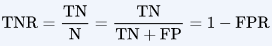 , TN: True prediction and the prediction's Boolean Value=No OR Negative; FP: False predicion and the prediction's Boolean Value=Yes OR Positive;
 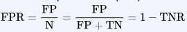 , The FPR is the ratio of negative instances that are incorrectly classified as positive) is the percentage of non-defaulters that are correctly identified, here (1 −23/9, 667)× 100 = 99.8%(=9644/(9644+23) ==1-23/(23+9664)).
Why does LDA do such a poor job of classifying the customers who default? In other words, why does it have such a low sensitivity? As we have seen, LDA is trying to approximate the Bayes classifier, which has the lowest total error rate out of all classifiers (if the Gaussian model is correct). That is, the Bayes classifier will yield the smallest possible total number
of misclassified observations(23+252), irrespective不考虑的 of which class the errors come from. That is, some misclassifications will result from incorrectly assigning a customer who does not default to the default class, and others will result from incorrectly assigning a customer who defaults to the non-default class. In contrast, a credit card company might particularly wish to avoid incorrectly classifying an individual who will default, whereas incorrectly classifying an individual who will not default, though still to be avoided, is less problematic比较起来重要程度不高. We will now see that it is possible to modify LDA in order to develop a classifier that better meets the credit card company’s needs.
The Bayes classifier works by assigning an observation to the class for which the posterior probability ![]() (=
(=![]() )is greatest. In the two-class case, this amounts to assigning an observation to the default class if
)is greatest. In the two-class case, this amounts to assigning an observation to the default class if ![]()
![]()
Thus, the Bayes classifier, and by extension LDA, uses a threshold of 50% for the posterior probability of default in order to assign an observation to the default class. However, if we are concerned about incorrectly predicting the default status for individuals who default, then we can consider lowering this threshold. For instance, we might label any customer with a posterior probability of default above 20% to the default class(例如可以将后验违约概率在20% 以上的人纳人违约一
组). In other words, instead of assigning an observation to the default class if (4.21) holds, we could instead assign an observation to this class if ![]()
![]()
The error rates that result from taking this approach are shown in Table 4.5. Now LDA predicts that 430 individuals will default. Of the 333 individuals who default, LDA correctly predicts all(=195) but 138, or 41.4%(=138/333). This is a vast improvement over the error rate of 75.7% that resulted from using the threshold of 50%. However, this improvement comes at a cost: now 235 individuals who do not default are incorrectly classified. As a result, the overall error rate has increased slightly to 3.73 %. But a credit card company may consider this slight increase in the total error rate to be a small price to pay for more accurate identification of individuals who do indeed default.
TABLE 4.5. A confusion matrix compares the LDA predictions to the true default statuses for the 10, 000 training observations in the Default data set, using a modified threshold value that predicts default for any individuals whose posterior default probability exceeds 20%(![]() ).
).
FIGURE 4.7. For the Default data set, error rates are shown as a function of the threshold value for the posterior probability that is used to perform the assignment. The black solid line displays the overall error rate. The blue dashed line represents the fraction of defaulting customers that are incorrectly classified, and the orange dotted line indicates the fraction of errors among the non-defaulting customers.
Figure 4.7 illustrates the trade-off that results from modifying the threshold value for the posterior probability of default. Various error rates are shown as a function of the threshold value. Using a threshold of 0.5, as in (4.21), minimizes the overall error rate, shown as a black solid line. This is to be expected, since the Bayes classifier uses a threshold of 0.5 and is known to have the lowest overall error rate. But when a threshold of 0.5 is used, the error rate among the individuals who default is quite high (blue dashed line). As the threshold is reduced, the error rate among individuals who default decreases steadily, but the error rate among the individuals who do not default increases. How can we decide which threshold value is best? Such a decision must be based on domain knowledge, such as detailed information about the costs associated with default.

FIGURE 4.8. A ROC curve for the LDA classifier on the Default data. It traces out two types of error as we vary the threshold value for the posterior probability of default. The actual thresholds are not shown. The true positive rate is the sensitivity (=TP/(TP+FN) ): the fraction of defaulters that are correctly identified, using a given threshold value. The false positive rate is 1-specificity: the fraction of non-defaulters that we classify incorrectly as defaulters, using that same threshold value. The ideal ROC curve hugs the top left corner, indicating a high true positive rate and a low false positive rate. The dotted line represents the “no information” classifier; this is what we would expect if student status and credit card balance are not associated with probability of default.
The ROC curve is a popular graphic for simultaneously displaying the two types of errors for all possible thresholds. The name “ROC” is historic, and comes from communications theory. It is an acronym for receiver operating characteristics. Figure 4.8 displays the ROC curve for the LDA classifier on the training data. The overall performance of a classifier, summarized over all possible thresholds, is given by the area under the (ROC) curve (AUC). An ideal ROC curve will hug the top left corner, so the larger the AUC the better the classifier. For this data the AUC is 0.95, which is close to the maximum of one so would be considered very good. We expect a classifier that performs no better than chance to have an AUC of 0.5 (when evaluated on an independent test set not used in model training). ROC curves are useful for comparing different classifiers, since they take into account all possible thresholds. It turns out that the ROC curve for the logistic regression model of Section 4.3.4 fit to these data is virtually indistinguishable from this one for the LDA model, so we do not display it here.
TABLE 4.6. Possible results when applying a classifier or diagnostic test to a population总体.
(N=the total number of actual non-defaulters, P=the total number of actual defaulters;![]() = the total number of predicted non-defullters,
= the total number of predicted non-defullters, ![]() =the total number of predicted defaulters)
=the total number of predicted defaulters)
As we have seen above, varying the classifier threshold changes its true positive and false positive rate(TPR and FPR). These are also called the sensitivity(=TP/(TP+FN)) and one minus the specificity(1-specificity=![]() ) of our classifier. Since there is an almost bewildering让人困惑的; array of terms used in this context, we now give a summary. Table 4.6 shows the possible results when applying a classifier (or diagnostic test) to a population. To make the connection with the epidemiology literature流行病学, we think of “+” as the “disease” that we are trying to detect, and “−” as the “non-disease” state. To make the connection to the classical hypothesis testing literature, we think of “−” as the null hypothesis and “+” as the alternative (non-null) hypothesis. In the context of the Default data, “+” indicates an individual who defaults, and “−” indicates one who does not.
) of our classifier. Since there is an almost bewildering让人困惑的; array of terms used in this context, we now give a summary. Table 4.6 shows the possible results when applying a classifier (or diagnostic test) to a population. To make the connection with the epidemiology literature流行病学, we think of “+” as the “disease” that we are trying to detect, and “−” as the “non-disease” state. To make the connection to the classical hypothesis testing literature, we think of “−” as the null hypothesis and “+” as the alternative (non-null) hypothesis. In the context of the Default data, “+” indicates an individual who defaults, and “−” indicates one who does not.
TABLE 4.7. Important measures for classification and diagnostic testing, derived from quantities in Table 4.6.
Table 4.7 lists many of the popular performance measures that are used in this context. The denominators for the false positive and true positive rates are the actual population counts in each class. In contrast, the denominators for the positive predictive value and the negative predictive value are the total predicted counts for each class.
###############################
To measure how much of the class-discriminatory information is captured by the linear discriminants (eigenvectors), let's plot the linear discriminants by decreasing eigenvalues similar to the explained variance plot that we created in the PCA section. For simplicity, we will call the content of the class-discriminatory information "discriminability".
##################################################
eigen_pairs before sorting
eigen_pairs = [ (np.abs(eigen_vals[i]), eigen_vecs[:,i]) for i in range(len(eigen_vals)) ]
eigen_pairs[:2]
eigen_vals #the eigen_value is a complex number and we just need the real number
eigen_vals.real
##################################################
tot = sum( eigen_vals.real )
discr = [ (i/tot) for i in sorted( eigen_vals.real, reverse=True) ] #discriminability
cum_discr = np.cumsum( discr )
plt.bar( range(1,14), discr, alpha=0.5, align='center',
         label='individual "discriminability"') # range(1,14) since 13 features
plt.step( range(1,14), cum_discr, where='mid',
         label='cumulative "discriminability"')
plt.ylabel('"discriminability" ratio')
plt.xlabel('Linear Discriminants')
plt.ylim([-0.1, 1.1])
plt.legend(loc='best')
plt.show()
As we can see in the resulting figure, the first two linear discriminants capture about 100 percent of the useful information in the Wine training dataset:

Let's now stack the two most discriminative eigenvector columns to create the transformation matrix W :
#eigen_pairs:[(eigen_value, eigen_vector(array type)),
#             (eigen_value, eigen_vector),...]
              #eigen_pairs[0][1]: get first eigenvector or first principal component
w = np.hstack( (eigen_pairs[0][1][:,np.newaxis].real,#[:, np.newaxis]:the principal component(real number) as 1st column
                eigen_pairs[1][1][:,np.newaxis].real #[:, np.newaxis]:the principal component(real number) as 2nd column
               ))
print('Matrix W:\n', w)
Projecting samples onto the new feature space
Using the transformation matrix W that we created in the previous subsection, we can now transform the training dataset by multiplying the matrices:![]()
X_train_std[:5]
X_train_lda = X_train_std.dot(w)
X_train_lda[:5]
colors = ['r', 'b','g']
markers = ['s','x','o']
for label,c,m in zip(np.unique(y_train), colors, markers):
    plt.scatter( X_train_lda[y_train==label, 0],
                 X_train_lda[y_train==label, 1]*(-1), # *(-1) for plotting labels
                 c=c, label=1abel, marker=m
               )
plt.xlabel('LD 1')
plt.ylabel('LD 2')
plt.legend(loc='lower right')
plt.show()
As we can see in the resulting plot, the three wine classes are now linearly separable in the new feature subspace:

LDA via scikit-learn
The step-by-step implementation was a good exercise for understanding the inner workings of LDA and understanding the differences between LDA and PCA.
Now, let's take a look at the LDA class implemented in scikit-learn:
from sklearn.discriminant_analysis import LinearDiscriminantAnalysis as LDA

lda = LDA(n_components=2)
X_train_lda = lda.fit_transform(X_train_std, y_train)
X_train_lda[:5]
Next, let's see how the logistic regression classifier handles the lower-dimensional training dataset after the LDA transformation:
lr = LogisticRegression()
lr = lr.fit(X_train_lda, y_train)
plot_decision_regions(X_train_lda, y_train, classifier=lr)
plt.xlabel('LD 1')
plt.ylabel('LD 2')
plt.legend(loc='lower left')
plt.show()
Looking at the resulting plot

if we see that the logistic regression model misclassifies one of the samples from class 2:
By lowering the regularization strength, we could probably shift the decision boundaries so that the logistic regression models classify all samples in the training dataset correctly. However, let's take a look at the results on the test set:
X_test_lda = lda.transform(X_test_std)
plot_decision_regions(X_test_lda, y_test, classifier=lr)
plt.xlabel('LD 1')
plt.ylabel('LD 2')
plt.legend(loc='lower left')
plt.show()
As we can see in the following plot, the logistic regression classifier is able to get a perfect accuracy score for classifying the samples in the test dataset by only using a two-dimensional feature subspace instead of the original 13 Wine features:

####################################
An iterative algorithm is said to converge when, as the iterations proceed, the output gets closer and closer to some specific value. More precisely, no matter how small an error range you choose, if you continue long enough the function will eventually stay within that error range around the final value.
####################################
Using kernel principal component analysis for nonlinear mappings
Many machine learning algorithms make assumptions about the linear separability of the input data. You learned that the perceptron even requires perfectly linearly separable training data to converge. Other algorithms that we have covered so far assume that the lack of perfect linear separability is due to noise: Adaline, logistic regression, and the (standard) support vector machine (SVM) to just name a few只举几个.
However, if we are dealing with nonlinear problems, which we may encounter rather frequently in real-world applications, linear transformation techniques for dimensionality reduction, such as PCA and LDA, may not be the best choice. In this section, we will take a look at a kernelized version of PCA, or KPCA, which relates to the concepts of kernel SVM that we remember from Cp3, A Tour of Machine Learning Classifiers Using scikit-learn (https://blog.csdn.net/Linli522362242/article/details/96480059). Using kernel PCA, we will learn how to transform data that is not linearly separable onto a new, lower-dimensional subspace that is suitable for linear classifiers.
Kernel functions and the kernel trick
As we remember from our discussion about kernel SVMs in Cp3, A Tour of Machine Learning Classifiers Using Scikit-learn, we can tackle nonlinear problems by projecting them onto a new feature space of higher dimensionality where the classes become linearly separable. To transform the samples ![]() onto this higher k-dimensional subspace, we defined a nonlinear mapping function
onto this higher k-dimensional subspace, we defined a nonlinear mapping function ![]() :
:![]()
We can think of ![]() as a function that creates nonlinear combinations of the original features to map the original d-dimensional dataset onto a larger, k-dimensional feature space. For example, if we had feature vector
as a function that creates nonlinear combinations of the original features to map the original d-dimensional dataset onto a larger, k-dimensional feature space. For example, if we had feature vector ![]() ( x is a column vector consisting of d features) with two dimensions (d = 2) , a potential mapping onto a 3D space could be as follows:
( x is a column vector consisting of d features) with two dimensions (d = 2) , a potential mapping onto a 3D space could be as follows:
In other words, via kernel PCA we perform a nonlinear mapping that transforms the data onto a higher-dimensional space and use standard PCA in this higher-dimensional space to project the data back onto a lower-dimensional space
where the samples can be separated by a linear classifier (under the condition that the samples can be separated by density in the input space). However, one downside of this approach is that it is computationally very expensive, and this is where we use the kernel trick. Using the kernel trick, we can compute the similarity between two high-dimension feature vectors in the original feature space.
Before we proceed with more details about the kernel trick to tackle this computationally expensive problem, let us think back to the standard PCA approach that we implemented at the beginning of this chapter. We computed the covariance between two features k and j as follows:![]()
################
a covariance matrix of three features can then be written as (note that ![]() stands for the Greek uppercase letter sigma, which is not to be confused with the sum symbol):
stands for the Greek uppercase letter sigma, which is not to be confused with the sum symbol):

################
Since the standardizing of features centers them at mean zero, for instance, ![]() and
and ![]() , we can simplify this equation
, we can simplify this equation ![]() as follows:
as follows:![]()
Note that the preceding equation refers to the covariance between two features; now, let's write the general equation to calculate the covariance matrix ![]() :
:![]()
Bernhard Scholkopf generalized this approach (B. Scholkopf, A. Smola, and K.-R. Muller. Kernel Principal Component Analysis. pages 583–588, 1997) so that we can replace the dot products between samples in the original feature space by the nonlinear feature combinations via ![]() :
:![]()
To obtain the eigenvectors—the principal components—from this covariance matrix, we have to solve the following equation:
(###https://blog.csdn.net/Linli522362242/article/details/105139547 consider the projection onto a one-dimensional space,  (
(![]() is a unit vector, we only interested in the direction defined by
is a unit vector, we only interested in the direction defined by ![]() , the normalization condition归一化条件
, the normalization condition归一化条件 ![]() = 1, is a Lagrange multiplier
= 1, is a Lagrange multiplier , By setting the derivative with respect to
 ![]() equal to zero, we see that this quantity will have a stationary point驻点 when
equal to zero, we see that this quantity will have a stationary point驻点 when ![]() (12.5) which says that
(12.5) which says that ![]() must be an eigenvector 特征向量 of S.
must be an eigenvector 特征向量 of S.
If we left-multiply by ![]() and make use of
and make use of ![]() = 1, we see that the variance is given by
= 1, we see that the variance is given by  (12.6)
and so the variance will be a maximum when we set equal to the eigenvector having the largest eigenvalue . This eigenvector is known as the first principal component
###)
Here, ![]() and
and ![]() are the eigenvalues and eigenvectors of the covariance matrix , and
are the eigenvalues and eigenvectors of the covariance matrix , and ![]() can be obtained by extracting the eigenvectors of the kernel (similarity) matrix K as we will see in the following paragraphs.
can be obtained by extracting the eigenvectors of the kernel (similarity) matrix K as we will see in the following paragraphs.
The derivation of the kernel matrix is as follows:
First, let's write the covariance matrix as in matrix notation, where ![]() is an n× k -dimensional matrix:
is an n× k -dimensional matrix:![]() note:
note: ![]() is k-dimenional vector(k features)
is k-dimenional vector(k features)
Now, we can write the eigenvector equation as follows:
Since ![]() , we get:
, we get:![]()
Multiplying it by ![]() on both sides yields the following result:
on both sides yields the following result:
Here, K is the similarity (kernel) matrix:![]()
As we recall from the SVM section in Chapter 3, A Tour of Machine Learning Classifiers Using Scikit-learn, we use the kernel trick to avoid calculating the pairwise dot products of the samples ![]() under
under ![]() explicitly by using a kernel function K so that we don't need to calculate the eigenvectors explicitly:
explicitly by using a kernel function K so that we don't need to calculate the eigenvectors explicitly:![]()
In other words, what we obtain after kernel PCA are the samples already projected onto the respective components rather than constructing a transformation matrix as in the standard PCA approach. Basically, the kernel function (or simply kernel) can be understood as a function that calculates a dot product between two vectors—a measure of similarity相似度.
The most commonly used kernels are as follows:
- The polynomial kernel:

Here, is the threshold and p is the power that has to be specified by the user.
 - The hyperbolic tangent双曲线的正切 (sigmoid) kernel:

- The Radial Basis Function (RBF) or Gaussian kernel that we will use in the following examples in the next subsection:

It is also written as follows:
For example, if our dataset contains 100 training samples, the symmetric
kernel matrix of the pair-wise similarities would be 100×100 dimensional.
To summarize what we have discussed so far, we can define the following three steps to implement an RBF kernel PCA:
- We compute the kernel (similarity) matrix k , where we need to calculate the following:

We do this for each pair of samples: note: is k-dimenional vector(k features)
For example, if our dataset contains n=100 training samples, the symmetric kernel matrix of the pair-wise similarities would be 100×100 dimensional. - We center the kernel matrix k using the following equation:

Here, is an n× n - dimensional matrix (the same dimensions as the kernel matrix) where all values are equal to
  .
. - We collect the top k eigenvectors of the centered kernel matrix based on their corresponding eigenvalues, which are ranked by decreasing magnitude. In contrast to standard PCA, the eigenvectors are not the principal component axes but the samples projected onto those axes.
At this point, you may be wondering why we need to center the kernel matrix in the second step. We previously assumed that we are working with standardized data, where all features have mean zero(![]() <==
<==![]() ,
, ![]() and
and ![]() , ) when we formulated the covariance matrix(
, ) when we formulated the covariance matrix(![]() ) and replaced the dot products(
) and replaced the dot products(![]() ) by the nonlinear feature combinations via
) by the nonlinear feature combinations via ![]() .Thus, the centering of the kernel matrix in the second step becomes necessary, since we do not compute the new feature space explicitly and we cannot guarantee that the new feature space is also centered at zero.
.Thus, the centering of the kernel matrix in the second step becomes necessary, since we do not compute the new feature space explicitly and we cannot guarantee that the new feature space is also centered at zero.
In the next section, we will put those three steps into action by implementing a kernel PCA in Python.
Implementing a kernel principal component analysis in Python
In the previous subsection, we discussed the core concepts behind kernel PCA. Now, we are going to implement an RBF kernel PCA in Python following the three steps that summarized the kernel PCA approach. Using some SciPy and NumPy helper functions, we will see that implementing a kernel PCA is actually really simple:
from scipy.spatial.distance import pdist, squareform
from scipy import exp
from scipy.linalg import eigh
import numpy as np

def rbf_kernel_pca(X, gamma, n_components):
    """
    RBF kernel PCA implementation.

    Parameters
    -----------
    X: {Numpy ndarray}, shape=[n_samples, n_features]

    gamma: float
        Tuning parameter of the RBF kernel

    n_components: int
        Number of principal components to return

    Returns
    -----------
        X_pc: {Numpy ndarray}, shape=[n_samples, k_features]
            Projected dataset
    """
    # Calculate pairwise squared Euclidean distance
    # in the MxN dimensional dataset.
    sq_dists = pdist(X, 'sqeuclidean')

    # Convert pairwise distances into a square matrix.
    mat_sq_dists = squareform( sq_dists )

    # Compute the symmetric kernel matrix.
    K = exp(-gamma*mat_sq_dists)

    # Center the kernel matrix
    N = K.shape[0]
    one_n = np.ones( (N,N) ) / N
    K = K - one_n.dot(K) - K.dot(one_n) + one_n.dot(K).dot(one_n)

    # Obtaining eigenpairs from the centere3d kernel matrix
    # numpy.eigh returns them in sorted order
    eigvals, eigvecs = eigh(K)

    # Connect the top k eigenvectors (projected samples)
    X_pc = np.column_stack( (eigvecs[:,-i] for i in range(1, n_components+1)) )

    return X_pc
One downside of using an RBF kernel PCA for dimensionality reduction is that we have to specify the parameter ![]() a priori. Finding an appropriate value for
a priori. Finding an appropriate value for ![]() requires experimentation and is best done using algorithms for parameter tuning, for example, grid search, which we will discuss in more detail in Chapter 6, Learning Best Practices for Model Evaluation and Hyperparameter Tuning.
requires experimentation and is best done using algorithms for parameter tuning, for example, grid search, which we will discuss in more detail in Chapter 6, Learning Best Practices for Model Evaluation and Hyperparameter Tuning.
Example 1 – separating half-moon shapes
Now, let's apply our rbf_kernel_pca on some nonlinear example datasets. We will start by creating a two-dimensional dataset of 100 sample points representing two half-moon shapes:
from sklearn.datasets import make_moons

X, y = make_moons( n_samples=100, random_state=123 )

#X: array([ [ 8.7132e-01,  4.9072e-01],
#           [ 7.1547e-01, -4.5867e-01],
#           ...
#         ])
plt.scatter( X[y==0, 0], X[y==0, 1], color = 'red', marker='^', alpha=0.5)
plt.scatter( X[y==1, 0], X[y==1, 1], color = 'blue', marker='o', alpha=0.5)
plt.show()
For the purposes of illustration, the half-moon of triangle symbols shall represent one class, and the half-moon depicted by the circle symbols represent the samples from another class:
Clearly, these two half-moon shapes are not linearly separable, and our goal is to unfold the half-moons via kernel PCA so that the dataset can serve as a suitable input for a linear classifier.
But first, let's see how the dataset looks if we project it onto the principal components via standard PCA:
from sklearn.decomposition import PCA

scikit_pca = PCA( n_components=2 )
# we project it onto the principal components via standard PCA
X_standard_pca = scikit_pca.fit_transform( X )

fig, ax = plt.subplots( nrows=1, ncols=2, figsize=(10,4) )

ax[0].scatter(X_standard_pca[y==0, 0], X_standard_pca[y==0,1], color='red', marker='^', alpha=0.5)
ax[0].scatter(X_standard_pca[y==1, 0], X_standard_pca[y==1,1], color='blue', marker='o', alpha=0.5)
ax[0].set_xlabel('PC1')
ax[0].set_ylabel('PC2')

#Simply projecting onto a line (e.g., by dropping pc2) would squash挤压 different layers of half-moon shapes together,
ax[1].scatter(X_standard_pca[y==0, 0], np.zeros((50,1))+0.02, color='red', marker='^', alpha=0.5) #+0.02 for better visualization
ax[1].scatter(X_standard_pca[y==1, 0], np.zeros((50,1))-0.02, color='blue', marker='o', alpha=0.5) #-0.02 for better visualization
ax[1].set_xlabel('PC1')
ax[1].set_ylim([-1,1])
ax[1].set_yticks([])

plt.show()
Clearly, we can see in the resulting figure that a linear classifier would be unable to perform well on the dataset transformed via standard PCA:
Note that when we plotted the first principal component only (right subplot), we shifted the triangular samples slightly upwards and the circular samples slightly downwards to better visualize the class overlap. As the left subplot shows, the
original half-moon shapes are only slightly sheared剪切 and flipped across the vertical center—this transformation would not help a linear classifier in discriminating between circles and triangles. Similarly, the circles and triangles corresponding to
the two half-moon shapes are not linearly separable if we project the dataset onto a one-dimensional feature axis, as shown in the right subplot.
Note
Please remember that PCA is an unsupervised method and does not use class label information in order to maximize the variance in contrast to LDA. Here, the triangle and circle symbols were just added for visualization purposes to indicate the degree of separation.
Now, let's try out our kernel PCA function rbf_kernel_pca, which we implemented in the previous subsection:
from scipy.spatial.distance import pdist, squareform
from scipy import exp
from scipy.linalg import eigh
import numpy as np

def rbf_kernel_pca(X, gamma, n_components):
    """
    RBF kernel PCA implementation.

    Parameters
    -----------
    X: {Numpy ndarray}, shape=[n_samples, n_features]

    gamma: float
        Tuning parameter of the RBF kernel

    n_components: int
        Number of principal components to return

    Returns
    -----------
        X_pc: {Numpy ndarray}, shape=[n_samples, k_features]
            Projected dataset
    """
    # Calculate pairwise squared Euclidean distance
    # in the MxN dimensional dataset.
    sq_dists = pdist(X, 'sqeuclidean') # X.shape==(100, 2)
    #print(sq_dists.shape) #(4950,) # 4950 <== 100*99/2 <== C(100,2)

    # Convert pairwise distances into a square matrix.
    mat_sq_dists = squareform( sq_dists )
    #print(mat_sq_dists.shape) #(100,100)

    # Compute the symmetric kernel matrix K.
    K = exp(-gamma*mat_sq_dists) # find an appropriate gamma value by using grid search

    # Center the kernel matrix using the equation
    N = K.shape[0] #number of instances
    one_n = np.ones( (N,N) ) / N
    K = K - one_n.dot(K) - K.dot(one_n) + one_n.dot(K).dot(one_n)

    # Obtaining eigenpairs from the centere3d kernel matrix
    # numpy.eigh returns them in sorted order
    eigvals, eigvecs = eigh(K)

    # Connect the top k eigenvectors (projected samples)
    #the eigenvectors are not the principal component axes but the samples projected onto those axes
    #In other words, what we obtain after kernel PCA are the samples already projected onto the respective components
    X_pc = np.column_stack( (eigvecs[:,-i] for i in range(1, n_components+1)) )

    return X_pc
################################################

from matplotlib.ticker import FormatStrFormatter

X_kpca = rbf_kernel_pca(X, gamma=15, n_components=2)

fig, ax = plt.subplots( nrows=1, ncols=2, figsize=(15,6) )

ax[0].scatter( X_kpca[y==0, 0], X_kpca[y==0,1], color='red', marker='^', alpha=0.5 )
ax[0].scatter( X_kpca[y==1, 0], X_kpca[y==1,1], color='blue', marker='o', alpha=0.5 )
ax[0].set_xlabel('PC1')
ax[0].set_ylabel('PC2')
ax[0].xaxis.set_major_formatter( FormatStrFormatter('%0.1f') )

ax[1].scatter( X_kpca[y==0, 0], np.zeros((50,1))+0.02, color='red', marker='^', alpha=0.5 )
ax[1].scatter( X_kpca[y==1, 0], np.zeros((50,1))-0.02, color='blue', marker='o', alpha=0.5 )
ax[1].set_xlabel('PC1')
ax[1].set_ylim([-1,1])
#ax[1].set_yticks([])
ax[1].xaxis.set_major_formatter( FormatStrFormatter('%0.1f') )
plt.show()
We can now see that the two classes (circles and triangles) are linearly well separated so that it becomes a suitable training dataset for linear classifiers:

Unfortunately, there is no universal通用的 value for the tuning parameter ![]() that works well for different datasets. To find a
that works well for different datasets. To find a ![]() value that is appropriate for a given problem requires experimentation. In Chapter 6, Learning Best Practices for Model Evaluation and Hyperparameter Tuning, we will discuss techniques that can help us to automate the task of optimizing such tuning parameters. Here, I will use values for
value that is appropriate for a given problem requires experimentation. In Chapter 6, Learning Best Practices for Model Evaluation and Hyperparameter Tuning, we will discuss techniques that can help us to automate the task of optimizing such tuning parameters. Here, I will use values for ![]() that I found produce good results.
that I found produce good results.
Example 2 – separating concentric同心的 circles
In the previous subsection, we showed you how to separate half-moon shapes via kernel PCA. Since we put so much effort into understanding the concepts of kernel PCA, let's take a look at another interesting example of a nonlinear problem: concentric circles.
from sklearn.datasets import make_circles

X,y = make_circles( n_samples=1000, random_state=123, noise=0.1, factor=0.2 )

plt.scatter( X[y==0, 0], X[y==0, 1], color='red', marker='^', alpha=0.5 )
plt.scatter( X[y==1, 0], X[y==1, 1], color='blue', marker='o', alpha=0.5 )

plt.show()
Again, we assume a two-class problem where the triangle shapes represent one class, and the circle shapes represent another class:
Let's start with the standard PCA approach to compare it to the results of the RBF kernel PCA:
scikit_pca = PCA( n_components=2 )
X_spca = scikit_pca.fit_transform( X )

fig, ax = plt.subplots( nrows=1, ncols=2, figsize=(15,6) )

#project the dataset onto a 2-dimensional feature axes
ax[0].scatter( X_spca[y==0,0], X_spca[y==0,1], color='red', marker='^', alpha=0.5 )
ax[0].scatter( X_spca[y==1,0], X_spca[y==1,1], color='blue', marker='o', alpha=0.5 )
ax[0].set_xlabel('PC1')
ax[0].set_ylabel('PC2')

#project the dataset onto a one-dimensional feature axis
                                        #1000/2=500
ax[1].scatter( X_spca[y==0,0], np.zeros((500,1))+0.02, color='red', marker='^', alpha=0.5 )
ax[1].scatter( X_spca[y==1,0], np.zeros((500,1))-0.02, color='blue', marker='o', alpha=0.5 )
ax[1].set_xlabel('PC1')
ax[1].set_ylim([-1,1])
#ax[1].set_yticks([])

plt.show()
Again, we can see that standard PCA is not able to produce results suitable for training a linear classifier:
Given an appropriate value for ![]() , let us see if we are luckier using the RBF kernel PCA implementation:
, let us see if we are luckier using the RBF kernel PCA implementation:
from scipy.spatial.distance import pdist, squareform
from scipy import exp
from scipy.linalg import eigh
import numpy as np

def rbf_kernel_pca(X, gamma, n_components):
    """
    RBF kernel PCA implementation.

    Parameters
    -----------
    X: {Numpy ndarray}, shape=[n_samples, n_features]

    gamma: float
        Tuning parameter of the RBF kernel

    n_components: int
        Number of principal components to return

    Returns
    -----------
        X_pc: {Numpy ndarray}, shape=[n_samples, k_features]
            Projected dataset
    """
    # Calculate pairwise squared Euclidean distance
    # in the MxN dimensional dataset.
    sq_dists = pdist(X, 'sqeuclidean') # X.shape==(100, 2)
    #print(sq_dists.shape) #(4950,) # 4950 <== 100*99/2 <== C(100,2)

    # Convert pairwise distances into a square matrix.
    mat_sq_dists = squareform( sq_dists )
    #print(mat_sq_dists.shape) #(100,100)

    # Compute the symmetric kernel matrix K.
    K = exp(-gamma*mat_sq_dists) # find an appropriate gamma value by using grid search

    # Center the kernel matrix using the equation
    N = K.shape[0] #number of instances
    one_n = np.ones( (N,N) ) / N
    K = K - one_n.dot(K) - K.dot(one_n) + one_n.dot(K).dot(one_n)

    # Obtaining eigenpairs from the centere3d kernel matrix
    # numpy.eigh returns them in sorted order
    eigvals, eigvecs = eigh(K)

    # Connect the top k eigenvectors (projected samples)
    #the eigenvectors are not the principal component axes but the samples projected onto those axes
    #In other words, what we obtain after kernel PCA are the samples already projected onto the respective components
    X_pc = np.column_stack( (eigvecs[:,-i] for i in range(1, n_components+1)) )

    return X_pc

X_kpca = rbf_kernel_pca( X, gamma=15, n_components=2 )

fig, ax = plt.subplots( nrows=1, ncols=2, figsize=(15,6) )

ax[0].scatter( X_kpca[y==0, 0], X_kpca[y==0,1], color='red', marker='^', alpha=0.5 )
ax[0].scatter( X_kpca[y==1, 0], X_kpca[y==1,1], color='blue', marker='o', alpha=0.5 )
ax[0].set_xlabel('PC1')
ax[0].set_ylabel('PC2')

ax[1].scatter( X_kpca[y==0, 0], np.zeros((500,1))+0.02, color='red', marker='^', alpha=0.5 )
ax[1].scatter( X_kpca[y==1, 0], np.zeros((500,1))-0.02, color='blue', marker='o', alpha=0.5 )
ax[1].set_xlabel('PC1')
ax[1].set_ylim([-1,1])
#ax[1].set_yticks([])
plt.show()
Again, the RBF kernel PCA projected the data onto a new subspace(left plotting) where the two classes become linearly separable:

Projecting new data points
In the two previous example applications of kernel PCA, the half-moon shapes and the concentric circles, we projected a single dataset onto a new feature. In real applications, however, we may have more than one dataset that we want to transform, for example, training and test data, and typically also new samples we will collect after the model building and evaluation. In this section, you will learn how to project data points that were not part of the training dataset.
As we remember from the standard PCA approach at the beginning of this chapter, we project data by calculating the dot product(![]() ) between a transformation matrix and the input samples; the columns of the projection matrix are the top k eigenvectors (v) that we obtained from the covariance matrix.
) between a transformation matrix and the input samples; the columns of the projection matrix are the top k eigenvectors (v) that we obtained from the covariance matrix.
#eigen_pairs:[(eigen_value, eigen_vector(array type)),
#             (eigen_value, eigen_vector),...]
              #eigen_pairs[0][1]: get first eigenvector or first principal component
w = np.hstack((eigen_pairs[0][1][:, np.newaxis],#[:, np.newaxis]:the principal component as 1st column
               eigen_pairs[1][1][:, np.newaxis] #[:, np.newaxis]:the principal component as 2nd column
              )
             )#( ([1st column], [second column]) )
print('Matrix W:\n', w)
Now, the question is how we can transfer this concept to kernel PCA. If we think back to the idea behind kernel PCA, we remember that we obtained an eigenvector (![]() ) of the centered kernel matrix (not the covariance matrix), which means that those are the samples that are already projected onto the principal component axis v. Thus, if we want to project a new sample
) of the centered kernel matrix (not the covariance matrix), which means that those are the samples that are already projected onto the principal component axis v. Thus, if we want to project a new sample ![]() onto this principal component axis, we'd need to compute the following:
onto this principal component axis, we'd need to compute the following:![]()
Fortunately, we can use the kernel trick so that we don't have to calculate the projection ![]() explicitly. However, it is worth noting that kernel PCA, in contrast to standard PCA, is a memory-based method, which means that we have to reuse the original training set each time to project new samples. We have to calculate the pairwise RBF kernel (similarity) between each i_th sample in the training dataset and the new sample
explicitly. However, it is worth noting that kernel PCA, in contrast to standard PCA, is a memory-based method, which means that we have to reuse the original training set each time to project new samples. We have to calculate the pairwise RBF kernel (similarity) between each i_th sample in the training dataset and the new sample ![]() :
:
######################=>
Since ![]() and
and ![]() , we get:
, we get: ![]()
Multiplying it by ![]() on both sides yields the following result:
on both sides yields the following result:
Here, K is the similarity (kernel) matrix:![]()
As we recall from the SVM section in Chapter 3, A Tour of Machine Learning Classifiers Using Scikit-learn, we use the kernel trick to avoid calculating the pairwise dot products of the samples ![]() under
under ![]() explicitly by using a kernel function K so that we don't need to calculate the eigenvectors explicitly:
explicitly by using a kernel function K so that we don't need to calculate the eigenvectors explicitly:![]()
######################
Fortunately, we can use the kernel trick so that we don't have to calculate the projection ![]() explicitly. However, it is worth noting that kernel PCA, in contrast to standard PCA, is a memory-based method, which means that we have to reuse the original training set each time to project new samples. We have to calculate the pairwise RBF kernel (similarity) between each i_th sample in the training dataset and the new sample
explicitly. However, it is worth noting that kernel PCA, in contrast to standard PCA, is a memory-based method, which means that we have to reuse the original training set each time to project new samples. We have to calculate the pairwise RBF kernel (similarity) between each i_th sample in the training dataset and the new sample ![]() :
: 
The following just uses one sample ![]()

Here, the eigenvectors ![]() and eigenvalues
and eigenvalues ![]() of the kernel matrix K satisfy the following condition in the equation:
of the kernel matrix K satisfy the following condition in the equation:![]()
After calculating the similarity between the new samples and the samples in the training set, we have to normalize the eigenvector ![]() by its eigenvalue. Thus, let us modify the rbf_kernel_pca function that we implemented earlier so that it also
by its eigenvalue. Thus, let us modify the rbf_kernel_pca function that we implemented earlier so that it also
returns the eigenvalues of the kernel matrix:
def rbf_kernel_pca( X, gamma, n_components ):
    """
    RBF kernel PCA implementation.
    Parameters
    ------------
    X: {Numpy ndarray}, shape=[n_samples, n_features]
    gamma: float
        Tuning parameter of the RBF kernel
    n_components: int
        Number of principal components to return

    Returns
    ------------
        X_pc: {NumPy ndarray}, shape=[n_samples, n_features]
            Projected dataset
        lambdas: list
            Eigenvalues
    """
    # Calculate pairwise squared Euclidean distances in the MxN dimensional dataset.
    sq_dists = pdist(X, 'sqeuclidean')

    # Convert pairwise distances into a square matrix
    mat_sq_dists = squareform(sq_dists)

    # Center the kernel matrix.
    K = exp(-gamma * mat_sq_dists)

    # Center the kernel matrix.
    N = K.shape[0] #the number of samples/instances
    one_n = np.ones((N,N)) /N
    K = K-one_n.dot(K) - K.dot(one_n) + one_n.dot(K).dot(one_n)

    # Obtaining eigenpairs from the centered kernel matrix
    # scipy.linalg.eigh returns them in ascending order
    eigvals, eigvecs = eigh(K)
    eigvals, eigvecs = eigvals[::-1], eigvecs[::-1] #descending

    # Collect the top k eigenvectors (projected samples)
    alphas = np.column_stack((eigvecs[:,i] for i in range(n_components)))

    # Collect the corresponding eigenvalues
    lambdas = [ eigvals[i] for i in range(n_components) ]

    return alphas, lambdas
Now, let's create a new half-moon dataset and project it onto a one-dimensional subspace using the updated RBF kernel PCA implementation:
X, y = make_moons( n_samples=100, random_state=123 )
alphas, lambdas = rbf_kernel_pca(X, gamma=15, n_components=1)
To make sure that we implemented the code for projecting new samples, let us assume that the 26th point from the half-moon dataset is a new data point![]() , and our task is to project it onto this new subspace:
, and our task is to project it onto this new subspace:
np.set_printoptions(precision=7)
x_new = X[25]
x_new![]()
x_proj = alphas[25] # original projection
x_proj![]()
By executing the following code, we are able to reproduce the original projection. Using the project_x function, we will be able to project any new data sample as well. The code is as follows:
def project_x( x_new, X, gamma, alphas, lambdas):
    pair_dist = np.array([ np.sum( (x_new-row)**2 ) for row in X ])
    k = np.exp(-gamma*pair_dist)
    return k.dot(alphas/lambdas) # alphas/lambdas : to normalize the eigenvector  by its eigenvalue.

x_reproj = project_x(x_new, X, gamma=15, alphas=alphas, lambdas=lambdas)
x_reproj![]()
Lastly, let's visualize the projection on the first principal component:
plt.scatter( alphas[y==0, 0], np.zeros((50)), color='red', marker='^', alpha=0.5 )
plt.scatter( alphas[y==1, 0], np.zeros((50)), color='blue', marker='o', alpha=0.5 )

plt.scatter( x_proj, 0, color='black', label='original projection of point X[25]', marker='^',s=100) # scatter 1 point with (1 label and 1 marker)
plt.scatter( x_reproj, 0 ,color='green', label='remapped point X[25]', marker='x', s=500)
plt.legend(scatterpoints=1) # # scatter 1 point with (1 label and 1 marker)
# scatterpoints: The number of marker points in the legend when creating a legend entry for a PathCollection (scatter plot).
# Default is None, which means using rcParams["legend.scatterpoints"] (default: 1).
plt.show()
As we can see in the following scatterplot, we mapped the sample ![]() onto the first principal component correctly:
onto the first principal component correctly:

Kernel principal component analysis in scikit-learn
For our convenience, scikit-learn implements a kernel PCA class in the sklearn.decomposition submodule. The usage is similar to the standard PCA class, and we can specify the kernel via the kernel parameter:
from sklearn.decomposition import KernelPCA

X, y = make_moons( n_samples=100, random_state=123 )
scikit_kpca = KernelPCA( n_components=2, kernel='rbf', gamma=15 )
X_skernpca = scikit_kpca.fit_transform(X)
To check that we get results that are consistent with our own kernel PCA implementation, let's plot the transformed half-moon shape data onto the first two principal components:
plt.scatter( X_skernpca[y==0, 0], X_skernpca[y==0, 1], color='red', marker='^', alpha=0.5 )
plt.scatter( X_skernpca[y==1, 0], X_skernpca[y==1, 1], color='blue', marker='o', alpha=0.5 )
plt.xlabel('PC1')
plt.ylabel('PC2')
plt.show()
As we can see, the results of scikit-learn's KernelPCA are consistent with our own implementation:
Note
The scikit-learn library also implements advanced techniques for nonlinear dimensionality reduction that are beyond the scope of this book. The interested reader can find a nice overview of the current implementations in scikit-learn, complemented by illustrative examples, at https://scikit-learn.org/stable/modules/manifold.html.
Summary
In this chapter, you learned about three different, fundamental dimensionality reduction techniques for feature extraction: standard PCA, LDA, and kernel PCA. Using PCA, we projected data onto a lower-dimensional subspace to maximize the
variance along the orthogonal feature axes, while ignoring the class labels.
LDA, in contrast to PCA, is a technique for supervised dimensionality reduction, which means that it considers class information in the training dataset to attempt to maximize the class-separability in a linear feature space.
Lastly, you learned about a nonlinear feature extractor, kernel PCA. Using the kernel trick and a temporary projection into a higher-dimensional feature space, you were ultimately able to compress压缩 datasets consisting of nonlinear features onto a lower dimensional subspace where the classes became linearly separable.
Equipped with these essential preprocessing techniques, you are now well prepared to learn about the best practices for efficiently incorporating different preprocessing techniques and evaluating the performance of different models in the next chapter.
