效果图:
说明:
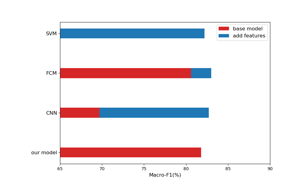
- 柱状图中每一条数据的名字比较长时,选择用横着的柱状图显示,使用plt.barh
- Y轴数据显示时默认从下至上,想从上至下显示时,把数据翻转一下,使用reverse()
代码实现:
import numpy as np
import matplotlib.pyplot as plt
import matplotlib

p = matplotlib.rcParams
p["figure.subplot.left"] = 0.2

plt.figure(figsize=(9.8, 6))

base= [0, 80.6, 69.7, 81.8]
add= [82.2, 83.0, 82.7, 0]
add = list(np.maximum(np.array(add) - np.array(base), 0))
base.reverse()
add.reverse()

N = len(base)
ind = np.arange(N)
width = 0.25

p1 = plt.barh(ind, base, width, color='#d62728')
p2 = plt.barh(ind, add, width, left=base)

plt.xlabel('Macro-F1(%)', fontsize=12)

names = ['SVM', 'FCM', 'CNN', 'our model']
names.reverse()
plt.yticks(ind, names, fontsize=12)

plt.xlim(65, 90)
plt.xticks(np.arange(65, 91, 5))

plt.legend((p1[0], p2[0]), ('base model','add features'), fontsize=12)

plt.show()
# plt.savefig('D:\\result.eps')
