使用echarts实现动态的正负轴堆叠柱状图

1.ECharts

 ECharts是一个基于JavaScript的开源可视化库,它可以帮助用户创建各种类型的图表,例如线图、饼图、散点图和柱状图等等。ECharts提供了非常方便的API,可以帮助你轻松自定义你的图表,并且可以使用JSON格式的数据进行配置。
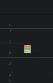
2. 动态堆叠柱状图

 动态堆叠柱状图是一种非常流行的数据可视化方法,它可以帮助用户更好地理解大量数据中的趋势和模式。在这种类型的图表中,每个类别都被表示为一个颜色代码,然后,在X轴上,你会看到每个类别的累积值。在某些情况下,这些值可能会超过Y轴的最大值,因此,在这种情况下,它们会被堆叠在其他值之上。

数据可视化和交互性是动态堆叠柱状图的一个重要优点,它可以帮助用户更好地理解大量复杂数据。这种类型的图表还可以通过拖动和缩放来支持交互性,使用户能够更好地探索和理解数据。 

3.实现 

以下是在vue组件中的应用:

<template>
    <div class="myEchartsContent"></div>
</template>

<script>
import * as echarts from 'echarts';
export default {
    data(){
        return{
            databar:[]
        }
    },
    props:{
        cableda:{
            type:Array
        }
    },
    watch:{
        cableda:{
            immediate: true,
            handler (val) {
                this.databar[0]=val[0]
                this.initChart()
            },
            deep: true

        }
    },
    name: 'Echarts',
    mounted() {
        this.initChart();
    },
    methods: {
        initChart() {
            let myChart = echarts.init(document.querySelector('.myEchartsContent'));
            const rightColor = {

                color: new echarts.graphic.LinearGradient(0, 1, 0, 0, [
                    {
                        offset: 1,
                        color: '#FF4A4A'
                    },
                     {
                        offset: 0.5,
                        color: '#fbc21b'
                     },
                    {
                        offset: 0,
                        color: '#41FF80'
                    }
                ])
            }
            const leftColor = {
                color: new echarts.graphic.LinearGradient(0, 1, 0, 0, [
                    {
                        offset: 0,
                        color: '#FF4A4A'
                    },
                    {
                        offset: 0.5,
                        color: '#fbc21b'
                    },
                    {
                        offset: 1,
                        color: '#41FF80'
                    }
                ])
            }
             this.cableda.map(v => {
                 databar.push({
                     value: v,
                     itemStyle: v > 0 ? rightColor : leftColor
                 })
             })


            let    option = {
                backgroundColor: 'rgba(255, 255, 255,0)',
                tooltip: {
                    trigger: 'axis',
                    axisPointer: {
                        type: 'none' // 隐藏鼠标移入的辅助提示线
                    }
                },
                grid: {
                    left: '30%'  // 将左侧距离设置为图表宽度的 30%
                },
                xAxis: [{
                    type: 'category',
                    data: ['2020/02/01'],
                    color: '#59588D',
                    // x轴坐标刻度线
                    axisTick: {
                        show: false
                    },
                    axisLabel: {
                        show:false,
                        color: '#4d4d4d', // x轴文字颜色
                        fontSize: 12,
                        margin: 10, // x轴刻度文字与x轴的距离
                        formatter: (value, index) => {
                            return index === 0 ? value : value.slice('5')
                        }
                    },
                    axisLine: {
                        lineStyle: {
                            color: '#fad0c4' // x轴线颜色
                        }
                    }
                }],
                yAxis: [{
                    type: 'value',
                    scale: 'fixed',
                    axisTick: {
                        show: false
                    },
                    axisLine: {
                        show: false // 隐藏y轴线
                    },
                    axisLabel: {
                        // show:false,
                        offset:5,
                        color: '#4d4d4d'
                    },
                    splitLine: {
                        show:false,
                        lineStyle: {
                            color: '#fad0c4' // 背景横线颜色
                        }
                    },
                    // 计算左侧y轴对应的柱状图数据的最大值
                    max: 5,
                    min: -5
                },

                ],
                series: [{
                    symbolOffset: [5, 0],
                    type: 'bar',
                    data: this.databar,
                    barWidth: '30%',
                    barMaxWidth: 20,
                    itemStyle:this.databar[0] > 0 ? rightColor : leftColor
                },
                    {
                        // 分隔
                        type: 'pictorialBar',
                        itemStyle: {
                            normal: {
                                color: '#ccc'
                            }
                        },
                        symbolRepeat: 'fixed',
                        symbolMargin: 2,
                        symbol: 'rect',
                        symbolClip: true,
                        symbolSize: [18, 2],
                        symbolPosition: 'start',
                        symbolOffset: [0, -1],
                        // symbolBoundingData: this.total,
                        // data: [20, 80, 100, 40, 34, 90, 60],
                        data: this.databar,

                        width: "100%",
                        z: 0,
                        zlevel: 1
                    }
                ]
            };

            myChart.setOption(option);
        }
    }
};
</script>

<style scoped>
.myEchartsContent{
    width: 150px;
    height: 300px;
}
</style>

4.运行效果


猜你喜欢

转载自blog.csdn.net/qq_45870314/article/details/131249875
今日推荐