plt.title设置标题名字
plt.xlabel/ylabel 设置x轴y轴的名字
plt.tick_params 设置坐标轴的刻度样式
需要注意的是假如如果plt.plot只接受到一组列表的话会默认表示在y轴,x轴会默认为0,1,2,3,4
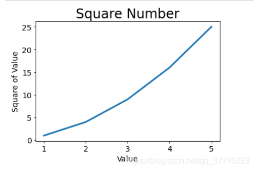
import matplotlib.pyplot as plt

input_value = [1,2,3,4,5]
squares = [1, 4, 9, 16, 25]
plt.plot(input_value, squares, linewidth=3)
#设置图标标题,并给坐标轴加上标签
 绘制一个点
绘制一个点
plt.scatter(2, 4, s = 100)
2是横坐标,4是纵坐标,s=100是设置点的大小
绘制一堆点
x_value = [1, 2, 3, 4, 5]
y_value = [1, 4, 9, 16, 25]

plt.scatter(x_value, y_value, s = 20)
这个和之前绘制线不同,假如失去一个变量的话,并不会有默认值来补充
使用循环来绘制1000个点
import matplotlib.pyplot as plt

x_values = list(range(1,1001))
y_values = [x**2 for x in x_values]

plt.scatter(x_values, y_values, s = 10)

#设置图表标题并给坐标轴加上标签
plt.title("Square Number", fontsize=24)
plt.xlabel("Value", fontsize=14)
plt.ylabel("Square of Value", fontsize=14)

#设置刻度标记大小
plt.tick_params(axis = 'both', which = 'major', labelsize = 14)

plt.axis([0, 1100, 0, 1100000])
#x轴坐标的范围0-1100,y轴的坐标0-1100000
plt.show()
改变点的颜色和轮廓颜
plt.scatter(x_values, y_values, s = 10, c = 'red', edgecolor = 'none')
若要使用RGB则
plt.scatter(x_values, y_values, s = 10, c = (0,0,0.8), edgecolor = 'none')
colormap(颜色映射)
plt.scatter(x_values, y_values, s = 10, c = y_values, cmap = plt.cm.viridis,
            edgecolor = 'none')
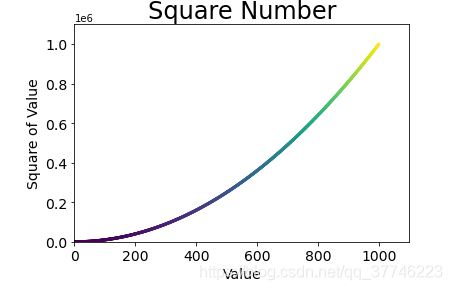 我们将c这个设置颜色的值设置为y_values,然后调用cmap = plt.cm来选择样色的样式,我选择的是viridis,可以发现和官网的样式是一样的

保存图表
plt.savefig(‘squares_plot.png’, bbox_inches = ‘tight’)
