1.1 安装
https://dev.windows.com/ 下载Visual Studio Community
https://pypi.python.org/pypi/matplotlib/ 下载matplotlib安装程序,查找与使用的python版本匹配的wheel文件
打开命令窗口,切换到项目文件夹使用pip安装matplotlib
python -m pip install --user matplotlib-2.2.2-cp36-win32.whl
1.2 测试
使用python3 IDLE 尝试导入matplotlib
>>> import matplotlib
>>>
如果没出现任何错误信息,安装成功。
2.1 绘制简单的折线图
首先导入matplotlib.pyplot,
模块pyplot中包含很多用于生成图表的函数,
将数据列表传递给函数plot(),这个函数常识根据这些数字绘制有意义的图形,
plt.show()打开matplotlib查看器
import matplotlib.pyplot as pltsquares = [1, 4, 9, 16, 25, 36]
plt.plot(squares)
plt.show()
2.2 修改标签文字和线条粗细
.plot()中加入参数linewidth表示线条粗细,
.title()给图标指定标题,并指定字体大小,
.xlabel()和.ylabel()为x,y轴设置标题
.tick_params(axis='')设置刻度样式
import matplotlib.pyplot as plt


squares = [1, 4, 9, 16, 25, 36]
plt.plot(squares, linewidth=5, color='green')

plt.title('Squares Number', fontsize=14)                    # 设置标题
plt.xlabel('Number', fontsize=6, color='red')               # 设置x轴标题
plt.ylabel('Squares of Number', fontsize=6, color='blue')   # 设置y轴标题

plt.tick_params(axis='both', labelsize=6, colors='gold')     # 设置刻度尺样式

plt.show()
.tick_params()参数设置:
axis='x'设置x轴刻度样式
axis='y'设置y轴刻度样式
width=2,设置刻度粗细
which='major'/ 'minor'/ 'both' 表示设置主刻度,副刻度,同时设置
direction='in'/ 'out'/ 'inout' 设置刻度在轴内,轴外,内外都显示
lenth=5,设置刻度长度
pad=5,设置刻度与值的距离
color, labelcolor, colors分别设置刻度颜色,值的颜色,同时设置颜色
labelsize设置值的字体大小
top, bottom, left, right=True/False,为布尔值,表示各方向边框的刻度线是否显示
labeltop, labelbottom, labelleft, labelright=True/False,表示各方向边框的值是否显示
2.3 校正图形
给.plot()提供值时,它默认第一个数据对应的x坐标值为0,但我们的第一个点对应的x为1,我们要给.plot同时提供输入值和输出值
import matplotlib.pyplot as plt

input_values = [1, 2, 3, 4, 5, 6]
squares = [1, 4, 9, 16, 25, 36]
plt.plot(input_values, squares, linewidth=5, color='green')

plt.title('Squares Number', fontsize=14)
plt.xlabel('Number', fontsize=6, color='red')
plt.ylabel('Squares of Number', fontsize=6, color='blue')

plt.tick_params(axis='both', labelsize=6, colors='gold')

plt.show()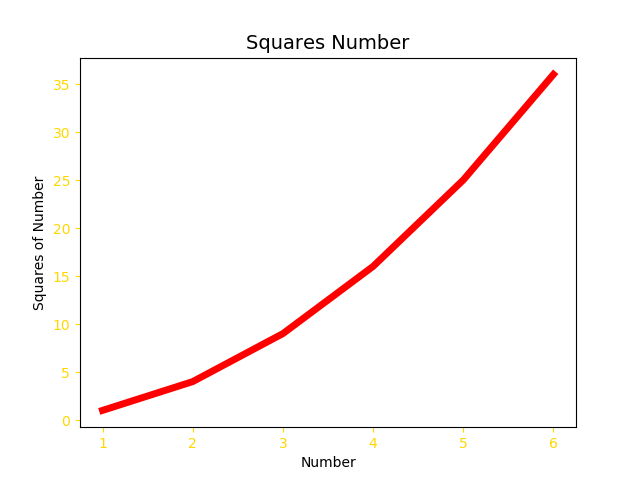
2.4 用scatter()绘制散点图并设置其样式
import matplotlib.pyplot as plt


plt.scatter(2, 4, s=50)   # (2, 4)为坐标,s设置点的大小
plt.title('Squares Number', fontsize=20)
plt.xlabel('Value', fontsize=10)
plt.ylabel('Squares of Value', fontsize=10)

plt.tick_params(axis='both', which='maior', labelsize=14)

plt.show()
2.5 使用scatter绘制一系列的点
设置x,y对应的值绘制多个点
import matplotlib.pyplot as plt


x_values = [1, 2, 3, 4, 5]
y_values = [1, 4, 9, 16, 25]
plt.scatter(x_values, y_values, s=50)
plt.title('Squares Number', fontsize=20)
plt.xlabel('Value', fontsize=10)
plt.ylabel('Squares of Value', fontsize=10)

plt.tick_params(axis='both', which='maior', labelsize=14)

plt.show()
2.6 绘制多个点时,利用函数完成
import matplotlib.pyplot as plt


x_values = range(0, 1000)                 # 设置x取值
y_values = [x ** 2 for x in x_values]     # 设置y取值
plt.scatter(x_values, y_values, s=10)
plt.title('Squares Number', fontsize=20)
plt.xlabel('Value', fontsize=10)
plt.ylabel('Squares of Value', fontsize=10)

plt.axis([0, 1001, 0, 1000001])           # 设置x,y轴范围
plt.tick_params(axis='both', which='maior', labelsize=14)

plt.show()
2.7 自定义颜色
.scatter(c=(0.1, 0.5, 0.2))函数参数c指定点的颜色,也可以用.scatter(c='red')
import matplotlib.pyplot as plt


x_values = range(0, 1000)
y_values = [x ** 2 for x in x_values]
plt.scatter(x_values, y_values, c=(0, 1, 1), s=10)
plt.title('Squares Number', fontsize=20)
plt.xlabel('Value', fontsize=10)
plt.ylabel('Squares of Value', fontsize=10)

plt.axis([0, 1001, 0, 1000001])
plt.tick_params(axis='both', which='maior', labelsize=14)

plt.show()
c中的值,越接近0,颜色越深,越接近1,颜色越浅
2.8 使用颜色映射
.scatter(c=y_values, cmap=plt.cm.Reds) ,c设置为y值列表,cmap告诉pyplot使用哪个颜色映射
import matplotlib.pyplot as plt


x_values = range(0, 1000)
y_values = [x ** 2 for x in x_values]
plt.scatter(x_values, y_values, c=y_values, cmap=plt.cm.Reds, s=10)
plt.title('Squares Number', fontsize=20)
plt.xlabel('Value', fontsize=10)
plt.ylabel('Squares of Value', fontsize=10)

plt.axis([0, 1001, 0, 1000001])
plt.tick_params(axis='both', which='maior', labelsize=14)

plt.show()
2.9 自动保存图标
.show()调用替换为.savefig()
plt.savefig('squares_plot.png', bbox_inchs='tight')'squares_plot.jpg'为图片保存名称, bbox_inchs=='tight'将多余的空白区域裁掉
支持的保存格式:eps, pdf, pgf, png, ps, raw, rgba, svg, svgz