一.线性渐变
1.基本语法格式:
background-image:linear-gradient([<angle>|<side-or-center>,] color stop,color stop[,color stop]*);
2.属性解释:
<angel>:表示渐变的角度,角度数的取值范围为0~360deg,这个角度是以圆心为起点的角度,并以这个角度为发散方向进行渐变<side-or-center>:表示通过关键字来确定渐变方向。默认值为top(从上到下),取值范围是[left,rigth,top,bottom,center,top rigth,top left,bottom rigth, bottom right,left center,right center ]其中注意Chrome没有[center,left center,right center]color stop:用于设置颜色边界,color为边界颜色,stop为该边界的位置,stop的值可为像素或百分比数值。
3.示例如下:
(1.1)代码部分:
<!DOCTYPE html>
<html>
<head lang="en">
    <meta charset="UTF-8">
    <title>CSS3线性渐变</title>
</head>
<style type="text/css">
    .rainbow-linear-gradient{
        width: 460px;
        height: 160px;
        background-image: -webkit-linear-gradient(left,#E50743 0%, #F9870F 15%, #E8ED30 30%, #3FA62E 45%,#3BB4D7 60%,#2F4D9E 75%,#71378A 80%);
    }
</style>
<body>
<div class="rainbow-linear-gradient"></div>
</body>
</html>
(1.2)效果如下:

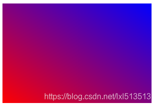
(2.1)代码部分:
<!DOCTYPE html>
<html>
<head>
<meta charset="utf-8">
<style>
#grad1 {
height: 200px;
background: linear-gradient(to bottom left, blue, red );
}
</style>
</head>
<body>
<div id="grad1"></div>
</body>
</html>
(2.2)效果如下:
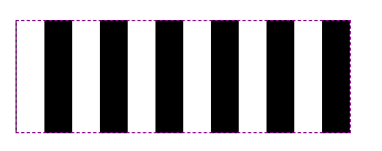
(3.1)代码部分:
<!DOCTYPE html>
<html>
<head>
<meta charset="UTF-8">
<title></title>
<style>
.box {
width: 300px;
height: 100px;
margin: 100px auto;
border: 1px dashed darkmagenta;
background-size: 100px 100px;
background-image: linear-gradient(90deg,white 25%, black 25%, black 50%, white 50%, white 75%, black 75%, black 100%);
}
</style>
</head>
<body>
<div class="box"></div>
</body>
</html>
(3.2)效果如下:
二.径向渐变
1.基本语法格式:
background-image:radial-gradient(圆心坐标,渐变形状 渐变大小,color stop,color stop[,color stop]*)
圆心坐标:用于表示放射的圆形坐标,可设置为形如10px 20px的x-offset y-offset,或使用预设值center。
-渐变形状:circle为圆形;ellipse为椭圆形,默认值渐变大小:
closest-side或contain:以距离圆心最近的边的距离作为渐变半径。
closest-corner:以距离圆心最近的角的距离作为渐变半径。
farthest-side:以距离圆心最远的边的距离作为渐变半径。
farthest-corner或cove:以距离圆心最远的角的距离为渐变半径。
2.示例如下:
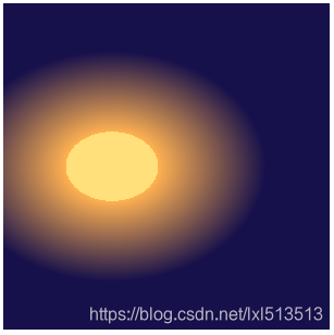
(1.1)代码部分:
<!DOCTYPE html>
<html>
<head lang="en">
    <meta charset="UTF-8">
    <title>CSS3径向渐变</title>
    <style type="text/css">
        .rainbow-radial-gradient{
            width: 300px;
            height: 300px;
            background-image: -webkit-radial-gradient(100px, #ffe07b 15%, #ffb151 2%, #16104b 50%);
        }
    </style>
</head>
<body>
<div class="rainbow-radial-gradient"></div>
</body>
</html>
(1.2)效果如下:
(2.1)代码如下:
<!DOCTYPE html>
<html>
<head>
<meta charset="utf-8">
<title></title>
<style>
#one {
height: 150px;
width: 200px;
background: -webkit-radial-gradient(red, yellow, green);
background: -o-radial-gradient(red, yellow, green);
background: -moz-radial-gradient(red, yellow, green);
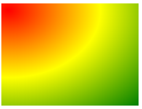
background: radial-gradient(at 10px 10px,red, yellow, green);
}
</style>
</head>
<body>
<div id="one"></div>
</body>
</html>
(2.2)效果如下:
(3.1)代码如下:
<!DOCTYPE html>
<html>
<head>
<meta charset="utf-8">
<title></title>
<style>
#one {
height: 150px;
width: 200px;
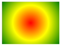
background: -webkit-radial-gradient(circle, red, yellow, green);
background: -o-radial-gradient(circle, red, yellow, green);
background: -moz-radial-gradient(circle, red, yellow, green);
background: radial-gradient(circle, red, yellow, green);
}
</style>
</head>
<body>
<div id="one"></div>
</body>
</html>
(3.2)效果如下:
三.重复渐变
1.线性重复渐变
(1)基本语法格式:
repeating-linear-gradient(起始角度,color stop[,color stop]*)
(2)示例如下:
<!DOCTYPE html>
<html>
<head>
<meta charset="utf-8">
<title></title>
<style>
#grad1 {
width: 300px;
height: 200px;
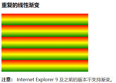
background: -webkit-repeating-linear-gradient(red, yellow 10%, green 20%);
background: -o-repeating-linear-gradient(red, yellow 10%, green 20%);
background: -moz-repeating-linear-gradient(red, yellow 10%, green 20%);
background: repeating-linear-gradient(red, yellow 10%, green 20%);
}
</style>
</head>
<body>
<h3>重复的线性渐变</h3>
<div id="grad1"></div>
<p><strong>注意:</strong> Internet Explorer 9 及之前的版本不支持渐变。</p>
</body>
</html>
(3)效果如下:
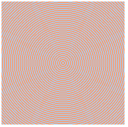
2.径向重复渐变
(1)基本语法格式:
repeating-linear-gradient(圆心坐标,渐变形状,渐变大小,color stop[,color stop]*)
(2)示例如下:
<!DOCTYPE html>
<html>
<head>
<meta charset="gb2312">
<meta name="author" content="http://www.softwhy.com/" />
<title></title>
<style type="text/css">
div{
  width:250px;
  height:250px;
}
.antzone{
  background:repeating-radial-gradient(#ace, #ace 2px, #f96 2px, #f96 4px);
}
</style>
</head>
<body>
<div class="antzone"></div>
</body>
</html>
(3)效果如下: