一、如何编辑出一个正方体
上后下前的顺序编写,最后在写左右
<!DOCTYPE html> <html lang="en"> <head> <meta charset="UTF-8"> <title>D184_3DTransformCube</title> <style> *{ margin:0; padding:0; } ul{ width: 200px; height: 200px; border: 1px solid black; box-sizing:border-box; margin:100px auto; position:relative; transform: rotateY(0deg) rotateX(0deg); transform-style: preserve-3d;/*转换成一个3D的面*/ } li{ list-style: none; width: 200px; height: 200px; text-align:center; line-height:200px; font-size:60px; position:absolute; } ul li:nth-child(1){ background-color: red; transform:rotateX(90deg) translateZ(100px) ; } ul li:nth-child(2){ background-color: blue; transform:rotateX(180deg) translateZ(100px) ; } ul li:nth-child(3){ background-color: purple; transform:rotateX(270deg) translateZ(100px) ; } ul li:nth-child(4){ background-color: pink; transform:rotateX(360deg) translateZ(100px) ; } ul li:nth-child(5){ background-color: white; } ul li:nth-child(6){ background-color: yellow; } </style> </head> <body> <ul> <!--这里的六个li代表的就是正方体的六个面--> <li>1</li> <li>2</li> <li>3</li> <li>4</li> <li>5</li> <li>6</li> </ul> </body> </html>
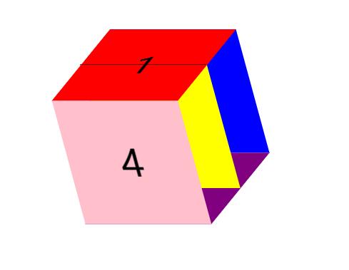
二、如何编辑出一个长方体
要点:我们可以在正方体的基础上,利用属性tranform:scale(水平倍数,垂直倍数)的方式进行扩展,直接举个例子
<!DOCTYPE html> <html lang="en"> <head> <meta charset="UTF-8"> <title>D185_Cubiod</title> <style> *{ margin:0; padding:0; } ul{ width: 200px; height: 200px; border: 1px solid black; box-sizing:border-box; margin:100px auto; position:relative; transform: rotateY(0deg) rotateX(0deg); transform-style: preserve-3d;/*转换成一个3D的面*/ } li{ list-style: none; width: 200px; height: 200px; text-align:center; line-height:200px; font-size:60px; position:absolute; } ul li:nth-child(1){ background-color: red; transform:translate(-100px) rotateY(-90deg) scale(1.5,1); } ul li:nth-child(2){ background-color: blue; transform:translate(100px) rotateY(90deg) scale(1.5,1); } ul li:nth-child(3){ background-color: purple; transform:translateY(100px) rotateX(-90deg) scale(1,1.5); } ul li:nth-child(4){ background-color: pink; transform:translateY(-100px) rotateX(90deg) scale(1,1.5); } ul li:nth-child(5){ background-color: white; transform:translateZ(150px) rotateX(0deg); } ul li:nth-child(6){ background-color: yellow; transform:translateZ(-150px) rotateX(-180deg); } </style> </head> <body> <ul> <!--这里的六个li代表的就是正方体的六个面--> <li>1</li> <li>2</li> <li>3</li> <li>4</li> <li>5</li> <li>6</li> </ul> </body> </html>

三、源码:
D184_3DTransformCube.html
D185_Cubiod.html
地址:
https://github.com/ruigege66/HTML_learning/blob/master/D184_3DTransformCube.html
https://github.com/ruigege66/HTML_learning/blob/master/D185_Cubiod.html
2.CSDN:https://blog.csdn.net/weixin_44630050
3.博客园:https://www.cnblogs.com/ruigege0000/
4.欢迎关注微信公众号:傅里叶变换,个人账号,仅用于技术交流,后台回复“礼包”获取Java大数据学习视频礼包