Qml自定义控件其实比较容易,简单来说,只需将自定义控件的界面布局写在qml文件里面,在其它地方,直接用这个qml的文件名作为类名,就可以使用这个自定义控件了
这里我们主要讲解一些自定义控件细节和可维护性方面的东西
下面我们以一个带图标的按钮控件为例,来讲解自定义控件的完整过程
新建Qml文件
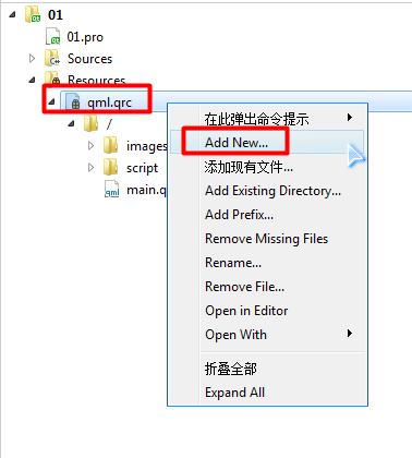
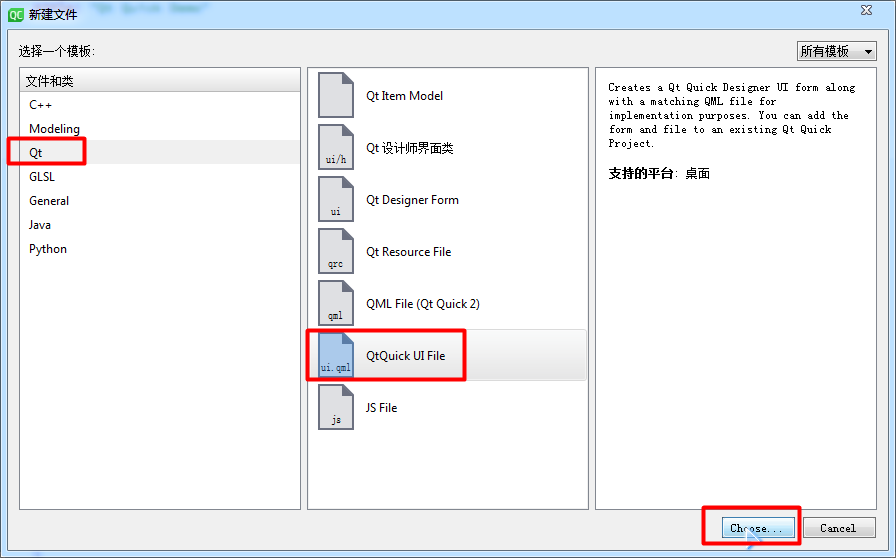
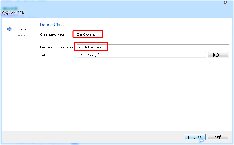
ui.qml文件和qml文件的关系
可以看到,Qt Creator为我们创建了两个qml文件,一个是IconButton.qml,另一个是IconButtonForm.ui.qml
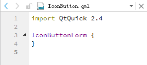
打开代码我们可以看到,IconButton里面什么内容都没,只有一个名为IconButtonForm的根节点
实际上,IconButton就是IconButtonForm,之所有要分成两个qml文件,是为了将界面代码和业务代码分离开来
IconButtonForm.ui.qml中定义界面布局,IconButton.qml以IconButtonForm作为根节点,然后再为它添加业务代码
其实我们不使用IconButtonForm.ui.qml,直接在IconButton.qml编写界面代码和业务代码,也是可以的
只是这样一来,界面代码和方法代码全部混在一起,就很难阅读了,一般只在一些简单的控件中,我们才会这么做

编写界面文件(IconButtonForm.ui.qml)
	import QtQuick 2.4

	Item {
		id: _root

	    //使用一个Rectangle作为按钮背景
	    Rectangle {
	        id: _background
	        anchors.fill: parent
	        gradient: Gradient {
	            GradientStop {
	                position: 0.0
	                color: "#999999"
	            }
	            GradientStop {
	                position: 1.0
	                color: "#CCCCCC"
	            }
	        }
	        border.color: "grey"
	        border.width: 1
	        radius: 5

	        //图标
	        Image {
	            id: _icon
	            width: _background.width
	            height: _background.height - 50
	            source: "images/1.png"
	            fillMode: Image.PreserveAspectFit
	        }

	        //文字
	        Text {
	            id: _text
	            anchors.fill: parent
	            anchors.topMargin: _icon.height
	            anchors.horizontalCenter: _background.horizontalCenter
	            horizontalAlignment: Text.AlignHCenter
	            verticalAlignment: Text.AlignVCenter
	            text: "Security"
	            color: "white"
	            font.pointSize: 18
	            font.bold: true
	        }
	    }
	}
编写业务文件(IconButton.qml)
ui.qml虽然本质上也是qml文件,但是为了规范,Qt Creator限制了在Form.ui.qml中无法添加方法,包括onClicked这些内置方法,因为这些都属于业务代码,因此我们需要在IconButton.qml中来编写这些代码
定义别名属性(IconButtonForm.ui.qml)
Item中的节点在其它文件中是不可访问的,我们必须在Item中定义一个属性,指向其它节点
这和我们定义一个普通的新属性性质是一样的,只不过它指向了其它节点,起到了别名作用
接下来我们要给IconButton添加,由于控件存在边距之类的无效区域,我们希望把点击区域加在background上,而不是Item上,又由于在其它文件中是没法修改子节点的,只能修改指定属性,所以我们必须让别名属性指向MouseArea节点,而不是Rectangle节点
	Item {
	    id: _root

	    //定义别名属性,指向点击区域
	    property alias clickRect: _mouse_area

	    //使用一个Rectangle作为按钮背景
	    Rectangle {
		    id: _background
	        anchors.fill: parent
	        anchors.margins: 20

	        //点击区域
	        MouseArea {
	            id: _mouse_area
	            anchors.fill: parent
			}
		}
	}
添加信号(IconButton.qml)
到此为止,我们已经可以在IconButton.qml中直接访问Form.MouseArea
但是由于我们这是自定义控件,点击事件应该是由用户去实现的,所以不应该在IconButton.qml实现
我们可以在main.qml实现clickRect.onClicked方法,但这样等于将clickRect这种控件细节暴漏给了用户,不是很规范
我们可以通过信号槽机制,来改善这种设计,当clickRect被点击时,发出一个信号,main.qml响应这个信号就可以了
信号槽机制一个很大的好处就是,外部文件使用IconButton时,只需响应IconButton的信号即可,不必去管IconButton内部有哪些节点,它们是怎样合作的
	import QtQuick 2.4

	IconButtonForm {
	    id: _root

	    signal clicked(int x, int y)

	    clickRect.onClicked: {

	        _root.clicked(mouse.x, mouse.y)
	    }
	}
实现槽函数(main.qml)
那么问题来了,我们该如何在main.qml中响应IconButton发出的信号呢
还记得我们学习Qt Widget时提到过的吗,Qt可以自动将名为[signalName]的信号与名为on[ObjectName][SignalName]的连接起来
在Qml中也是如此,我们定义了一个clicked(int x, int y)信号,就会自动生成一个onClicked(int x, int y)槽函数,虽然函数名和参数都不是显式可见的,但在外部都可以直接使用
	import QtQuick 2.12
	import QtQuick.Window 2.12
	import QtQuick.Layouts 1.12

	//窗口节点
	Window {
	    id: root
	    visible: true
	    width: 640
	    height: 480
	    title: "Qt Quick Demo"

	    //使用自定义控件
	    IconButton {
	        anchors.fill: parent
	        anchors.margins: 100

	        onClicked: {
	            console.debug(x, y)
	        }
	    }
	}
信号处理器
在Qml中,我们一般不把响应信号的函数成为槽函数,而是称为信号处理器(Signal Handler),其实它们功能是一样的
自定义函数(IconButton.qml)
这个比较简单,定义一个函数,在IconButton节点下即可直接调用使用,我们简单测试下
	IconButtonForm {
	    id: _root

	    function showWindowSize() {
	        //注意:root这个id现在是不存在的,但是也可以在调用它的文件里定义,只要id在Window中存在即可
	        console.debug("window size:", root.width, root.height)
	    }
	}
完整代码
我们再完善下,然后给出全部代码,由于控件图标和文本是可变的,也应当作为属性提取出来,由用户设定
	//IconButtonForm.ui.qml

	import QtQuick 2.13

	Item {
	    id: _root

	    //定义别名属性
	    property alias clickRect: _mouse_area
	    property alias icon: _icon.source
	    property alias text: _text.text

	    //使用一个Rectangle作为按钮背景
	    Rectangle {
	        id: _background
	        anchors.fill: parent
	        anchors.margins: 20
	        gradient: Gradient {
	            GradientStop {
	                position: 0.0
	                color: "#999999"
	            }
	            GradientStop {
	                position: 1.0
	                color: "#CCCCCC"
	            }
	        }
	        border.color: "grey"
	        border.width: 1
	        radius: 5

	        //点击区域
	        MouseArea {
	            id: _mouse_area
	            anchors.fill: parent
	        }

	        //图标
	        Image {
	            id: _icon
	            width: _background.width
	            height: _background.height - 50
	            source: "images/1.png"
	            fillMode: Image.PreserveAspectFit
	        }

	        //文字
	        Text {
	            id: _text
	            anchors.fill: parent
	            anchors.topMargin: _icon.height
	            anchors.horizontalCenter: _background.horizontalCenter
	            horizontalAlignment: Text.AlignHCenter
	            verticalAlignment: Text.AlignVCenter
	            text: "Security"
	            color: "white"
	            font.pointSize: 18
	            font.bold: true
	        }
	    }
	}
	//IconButton.qml

	import QtQuick 2.13

	IconButtonForm {
	    id: _root

	    //点击信号
	    signal clicked(var mouse)

	    //点击事件
	    clickRect.onClicked: {
	        _root.clicked(mouse)
	    }

	    //打印鼠标位置
	    function printMousePosition(mouse) {
	        console.debug("mouse position:", mouse.x, mouse.y)
	    }
	}
	//main.qml

	import QtQuick 2.13
	import QtQuick.Window 2.13

	//窗口节点
	Window {
	    id: root
	    visible: true
	    width: 640
	    height: 480
	    title: "Qt Quick Demo"

	    //使用自定义控件
	    IconButton {
	        anchors.fill: parent
	        anchors.margins: 100

	        icon: "images/1.png"
	        text: "Print Mouse Position"

	        //点击时打印鼠标点击位置
	        onClicked: {
	            printMousePosition(mouse)
	        }
	    }
	}
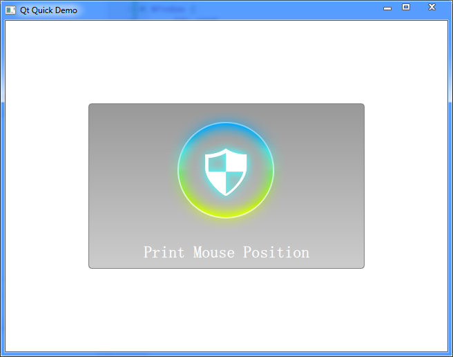
运行效果
一个带图标和标题的按钮,点击时打印鼠标位置,没啥特殊功能,越简单越方便演示代码