小记:前段时间写程序,要在PyQt5中插入统计图,在网上查了很多资料,这里整理一下。
# coding:utf-8
import matplotlib
# 使用 matplotlib中的FigureCanvas (在使用 Qt5 Backends中 FigureCanvas继承自QtWidgets.QWidget)
from matplotlib.backends.backend_qt5agg import FigureCanvasQTAgg as FigureCanvas
from PyQt5 import QtCore, QtWidgets, QtGui
from PyQt5.QtWidgets import QDialog, QPushButton, QVBoxLayout
import matplotlib.pyplot as plt
import numpy as np
import sys
class Main_window(QDialog):
def __init__(self):
super().__init__()
# 几个QWidgets
self.figure = plt.figure(facecolor='#FFD7C4') #可选参数,facecolor为背景颜色
self.canvas = FigureCanvas(self.figure)
self.button_draw = QPushButton("绘图")
# 连接事件
self.button_draw.clicked.connect(self.Draw)
# 设置布局
layout = QVBoxLayout()
layout.addWidget(self.canvas)
layout.addWidget(self.button_draw)
self.setLayout(layout)
def Draw(self):
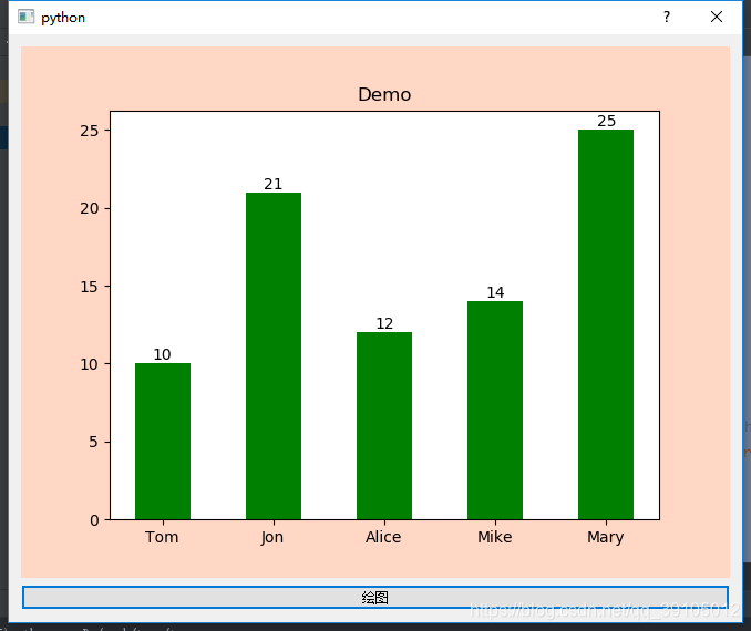
AgeList = ['10', '21', '12', '14', '25']
NameList = ['Tom', 'Jon', 'Alice', 'Mike', 'Mary']
#将AgeList中的数据转化为int类型
AgeList = list(map(int, AgeList))
# 将x,y轴转化为矩阵式
self.x = np.arange(len(NameList)) + 1
self.y = np.array(AgeList)
#tick_label后边跟x轴上的值,(可选选项:color后面跟柱型的颜色,width后边跟柱体的宽度)
plt.bar(range(len(NameList)), AgeList, tick_label=NameList, color='green', width=0.5)
# 在柱体上显示数据
for a, b in zip(self.x, self.y):
plt.text(a-1, b, '%d' % b, ha='center', va='bottom')
#设置标题
plt.title("Demo")
self.canvas.draw()
# 运行程序
if __name__ == '__main__':
app = QtWidgets.QApplication(sys.argv)
main_window = Main_window()
main_window.show()
app.exec()