.gradient{
    width:300px;
    height:150px;
    filter:alpha(opacity=100 finishopacity=50 style=1 startx=0,starty=0,finishx=0,finishy=150) progid:DXImageTransform.Microsoft.gradient(startcolorstr=red,endcolorstr=blue,gradientType=0);
    -ms-filter:alpha(opacity=100 finishopacity=50 style=1 startx=0,starty=0,finishx=0,finishy=150) progid:DXImageTransform.Microsoft.gradient(startcolorstr=red,endcolorstr=blue,gradientType=0);/*IE8*/
    background: linear-gradient(to bottom, #ff0000 0%,#0000ff 100%);
    background:-moz-linear-gradient(top, red, rgba(0, 0, 255, 0.5));
    background:-webkit-gradient(linear, 0 0, 0 bottom, from(#ff0000), to(rgba(0, 0, 255, 0.5)));
   background: -webkit-linear-gradient(top, #000000 0%,#ffffff 100%);
    background: -ms-linear-gradient(top, #000000 0%,#ffffff 100%);
    background:-o-linear-gradient(top, red, rgba(0, 0, 255, 0.5));
    filter: progid:DXImageTransform.Microsoft.gradient( startColorstr='#000000', endColorstr='#ffffff',GradientType=0 );
}
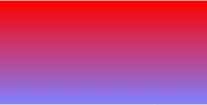
类似效果图:
ie 滤镜:filter
filter 是 ie 的私有属性,linear-gradient 在 ie9 以下是不支持的,所以对于 ie6 - ie8 我们可以使用滤镜来解决
其中各个参数的含义如下:
opacity表示透明度,默认的范围是从0 到 100,他们其实是百分比的形式。也就是说,0代表完全透明,100代表完全不透明。
finishopacity 是一个可选参数,如果想要设置渐变的透明效果,就可以使用他们来指定结束时的透明度。范围也是0 到 100。
style用来指定透明区域的形状特征:
0 代表统一形状
1 代表线形
2 代表放射状
3 代表矩形。
startx 渐变透明效果开始处的 X坐标。
starty 渐变透明效果开始处的 Y坐标。
finishx 渐变透明效果结束处的 X坐标。
finishy 渐变透明效果结束处的 Y坐标。