一、两列布局模式(最佳方案3)
1.display: inline-block 结合calc
<!-- 两列布局 inline-block -->
<div class="warpper">
<div class="left">left</div>
<div class="right">right</div>
</div>
.warpper {
/** font-size 设置为0是因为 display: inline-block;两个元素之间会产生一个间隙 */
font-size: 0;
}
.left {
width: 300px;
height: 50px;
background-color: skyblue;
display: inline-block;
font-size: 16px;
}
.right {
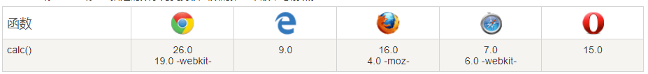
/** 使用clac注意 减号两边是有间隔的,并且calc的兼容性一般,如果要针对较老版本的浏览器兼容,不推荐使用 */
width: calc(100% - 300px);
height: 50px;
background-color: teal;
display: inline-block;
font-size: 16px;
}

2.flex两列布局
<div class="flex-warpper">
   <div class="flex-left">left</div>
   <div class="flex-right">right</div>
</div>

.flex-warpper {


  display: flex;
}

.flex-left {


  width: 300px;
  height: 50px;
  background-color: skyblue;
}
.flex-right {


  height: 50px;
  /** flex的盒子中只有两个子盒子,一个盒子固定宽度后,另一个盒子设置flex 1 会占据剩下的所有宽度 */
  flex: 1;
  background-color: teal;
}
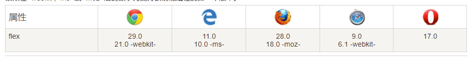
flex也存在一定的兼容性问题,不兼容ie9,兼容性不如calc

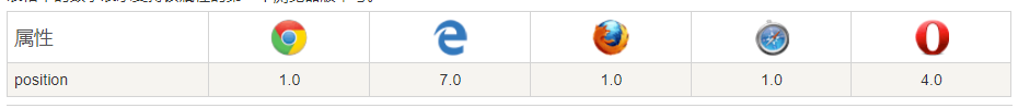
3.position两列布局
<div class="position-warpper">
   <div class="position-left">left</div>
   <div class="position-right">right</div>
</div>

.position-warpper {


  position: relative;
}
.position-left {


  width: 300px;
  height: 50px;
  background-color: skyblue;
}
.position-right {


  position: absolute;
  left: 300px;
  right: 0;
  top: 0;
  background-color: teal;
  height: 50px;
}
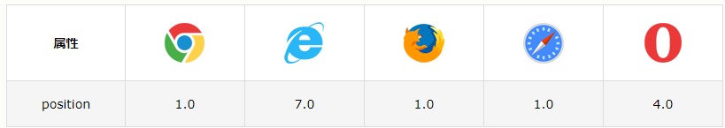
postion的兼容性是这几个里面最好的

4.float两列布局
<div class="float-warpper">
   <div class="float-left">left</div>
   <div class="float-right">right</div>
</div>

.float-warpper {


  overflow: hidden;
}

.float-left {


  width: 300px;
  height: 50px;
  float: left;
  background-color: skyblue;
}

.float-right {


  float: right;
  width: calc(100% - 300px);
  background-color: teal;
  height: 50px;
}
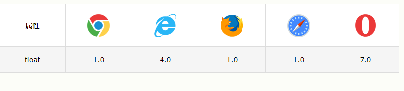
float的兼容性没得说,calc是这种用法的限制

二、水平居中布局(最佳方案2)
1.flex水平居中布局
<div class="flex-outter">
  <div class="flex-center"></div>
</div>

.flex-outter {


  background-color: lawngreen;
  display: flex;
  justify-content: center;
  width: 300px;
  height: 300px;
}

.flex-center {


  background-color: pink;
  width: 50%;
  height: 50%;
}
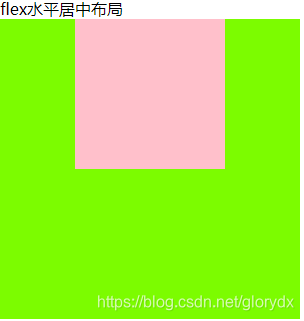
要兼容ie9就会有问题,尽量别使用flex
2.text-align 居中布局
<div>text-align水平居中布局</div>
    <div class="text-align-outter">
      <div class="text-align-center"></div>
    </div>

.text-align-outter {


  background-color: plum;
  text-align: center;
  width: 300px;
  height: 300px;
}

.text-align-center {


/** text-align:center 只对非block生效 */
  display: inline-block;
  background-color: pink;
  width: 50%;
  height: 50%;
}
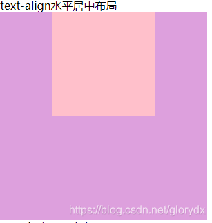
兼容性极好
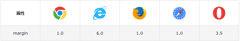
3.margin水平居中布局
<div>margin水平居中布局</div>
<div class="margin-outter">
    <div class="margin-center"></div>
</div>

.margin-outter {


  width: 300px;
  height: 300px;
  background-color: plum;
}

.margin-center {


  margin: 0 auto;
  /** margin 0 auto 只对block生效 */
  display: block;
  width: 50%;
  height: 50%;
  background-color: pink;
}
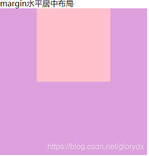
margin的兼容性当然没什么问题
4.position水平居中
 <div class="position-outter">
     <div class="position-center"></div>
  </div>

.position-outter {


  position: relative;
  width: 300px;
  height: 300px;
  background-color: plum;
}

.position-center {


  position: absolute;
  left: 50%;
  width: 100px;
  height: 100px;
  margin-left: -50px;
  background-color: pink;
}
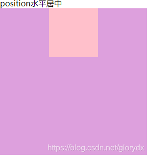
如果需要兼容ie6,不能使用position这种方式。总的来说兼容性很好
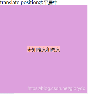
5.position translate 水平居中
<div>translate position水平居中</div>
<div class="translate-position-outter">
    <div class="translate-position-center">未知跨度和高度</div>
</div>

.translate-position-outter {


  position: relative;
  width: 300px;
  height: 300px;
  background-color: plum;
}

.translate-position-center {


  position: absolute;
  left: 50%;
  background-color: pink;
  transform: translateX(-50%);
}
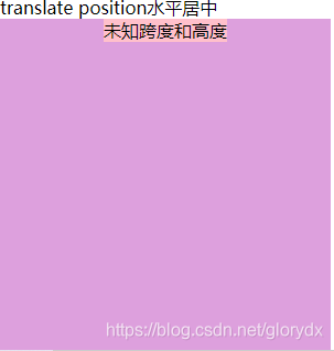
translate属于2d,满足大多数浏览器的兼容需求
三、水平垂直居中(最佳方案2)
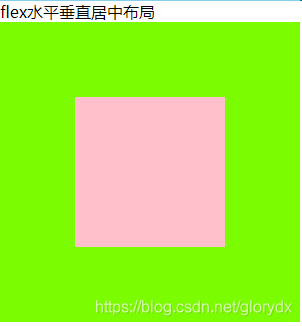
1.flex水平垂直居中布局
在flex水平居中的基础上,加上align-item: center
<div>flex水平垂直居中布局</div>
 <div class="flex-outter">
   <div class="flex-center"></div>
 </div>
.flex-outter {


  background-color: lawngreen;
  display: flex;
  justify-content: center;
  width: 300px;
  height: 300px;
  align-items: center;
}

.flex-center {


  background-color: pink;
  width: 50%;
  height: 50%;
}
兼容性同上flex
2. text-align:center + vertical-align: middle水平垂直居中布局
 <div> text-align:center + vertical-align: middle水平垂直居中布局</div>
    <div class="text-align-outter">
      <div class="text-align-center"></div>
    </div>
.text-align-outter {


  background-color: plum;
  text-align: center;
  vertical-align: middle;
  /** 要配合table-cell一起使用 */
  display: table-cell;
  width: 300px;
  height: 300px;
}

.text-align-center {


  display: inline-block;
  background-color: pink;
  width: 50%;
  height: 50%;
}
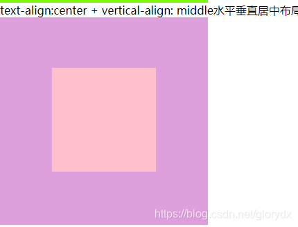
vertical-align的兼容性还是可以的,总的来说这套方案兼容性很好。

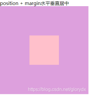
3.position+margin水平垂直居中布局
优点是兼容性较好,缺点是必须知道子组件的宽高
 <div>position + margin水平垂直居中</div>
    <div class="position-outter">
        <div class="position-center"></div>
    </div>
.position-outter {


  position: relative;
  width: 300px;
  height: 300px;
  background-color: plum;
}

.position-center {


  position: absolute;
  left: 50%;
  top: 50%;
  width: 100px;
  height: 100px;
  margin-left: -50px;
  margin-top: -50px;
  background-color: pink;
}
4. translate + position水平垂直居中布局
不需要根据内盒子的高度调整样式,但是兼容性只能满足主流浏览器及其版本,存在一定的兼容问题。transform的兼容性限制,ie9就会出现问题
未知跨度和高度
.translate-position-center {
position: absolute;
left: 50%;
top: 50%;
background-color: pink;
transform: translate(-50%, -50%);
}
四、圣杯布局
<div class="header">header</div>
<div class="body">
  <div class="content">content</div>
  <div class="left">left</div>
  <div class="right">right</div>
</div>
<div class="footer">footer</div>

* {


  margin: 0;
  padding: 0;
  box-sizing: border-box;
}

.header {


  height: 40px;
  width: 100%;
  background-color: #ff2d52;
  text-align: center;
  line-height: 40px;
  position: sticky;
  position: -webkit-sticky;
  position: -moz-sticky;
  position: -ms-sticky;
  top: 0;
  text-align: center;
}

.body {


  height: calc(100vh - 440px);
  overflow: hidden;
  /* padding: 0 300px 0 400px; */
}

.left {


  width: 300px;
  height: 100%;
  background-color: lawngreen;
  float: left;
  margin-left: -100%;
}

.content {


  width: 100%;
  height: 100%;
  padding: 0 400px 0 300px;
  float: left;
  background-color: skyblue;
}

.right {


  width: 400px;
  height: 100%;
  background-color: yellow;
  float: left;
  margin-left: -400px;
}

.footer {


  height: 400px;
  width: 100%;
  background-color: teal;
  position: fixed;
  bottom: 0;
}

五、双飞翼布局
 <div class="header">header</div>
    <div class="body">
      <div class="content">content</div>
    </div>
    <div class="left">left</div>
    <div class="right">right</div>
    <div class="footer">footer</div>

	* {


  margin: 0;
  padding: 0;
  box-sizing: border-box;
}

.header {


  height: 40px;
  width: 100%;
  background-color: #ff2d52;
  text-align: center;
  line-height: 40px;
  position: sticky;
  position: -webkit-sticky;
  position: -moz-sticky;
  position: -ms-sticky;
  top: 0;
  text-align: center;
}

.body {


  height: 600px;
  overflow: hidden;
  width: 100%;
  float: left;
  padding: 0 400px 0 300px;
}

.left {


  width: 300px;
  height: 600px;
  background-color: lawngreen;
  float: left;
  margin-left: -100%;
}

.content {


  height: 100%;
  width: 100%;
  float: left;
  background-color: skyblue;
}

.right {


  width: 400px;
  height: 600px;
  background-color: yellow;
  float: left;
  margin-left: -400px;
}

.footer {


  height: 400px;
  width: 100%;
  background-color: teal;
  position: fixed;
  bottom: 0;
}
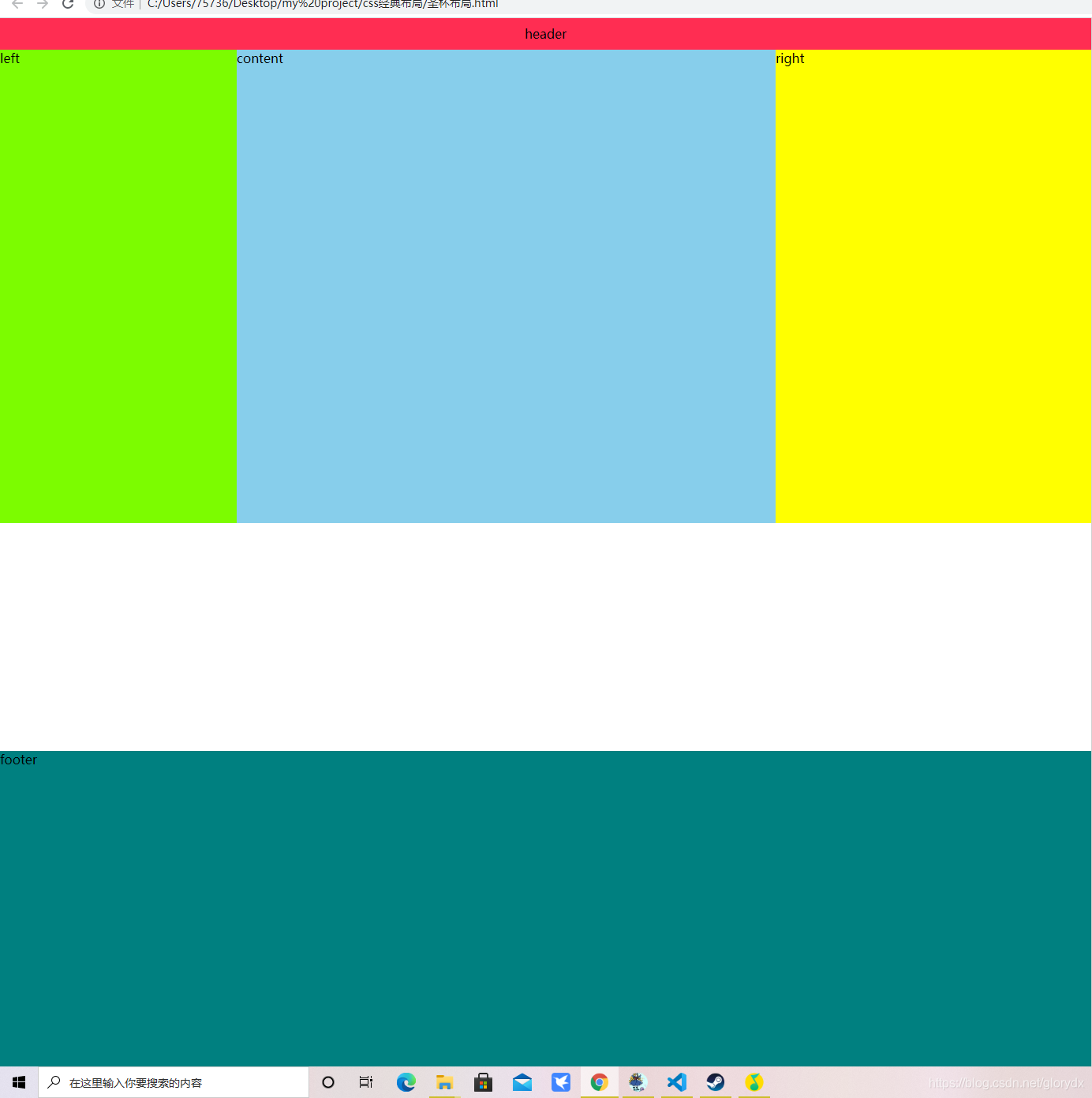
圣杯布局和双飞翼布局 展现出来的效果基本一致
顶部header实现吸顶效果,但 position: sticky;的吸顶效果兼容性不好
底部无论整体的内容有多高,底部始终出现在页面的最底部。
中间的内容分为 left content right 三部分,三部分在视觉上属于同一行
其中left和right宽度固定,content自适应屏幕的宽度。
都看到这里了,求点赞,关注,评论,感谢各位大佬的支持,是我继续创作的动力。
