


设计思路
1、将sql文件导入数据库:在数据库中运行sql文件
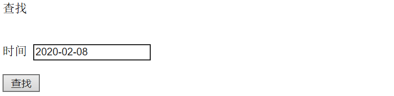
2、查询并以列表形式展示,基本的查询操作
扫描二维码关注公众号,回复:
9610978 查看本文章

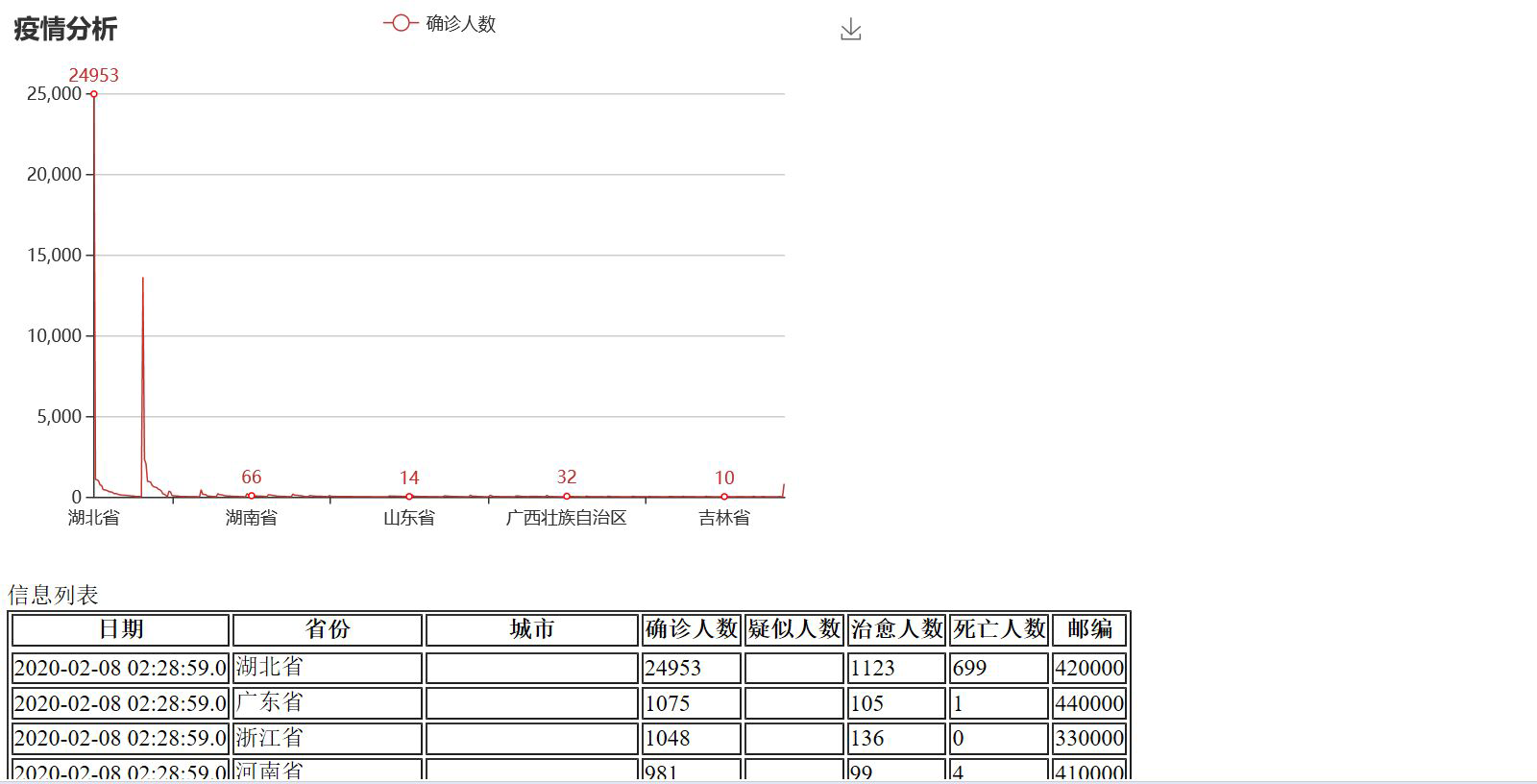
3、查询并以图表形式展示,用到echats的插件
源代码
<%@ page language="java" contentType="text/html; charset=UTF-8" pageEncoding="UTF-8"%> <!DOCTYPE html> <html> <head> <meta charset="UTF-8"> <title>Insert title here</title> </head> <body> <% Object message = request.getAttribute("message"); if(message!=null && !"".equals(message)){ %> <script type="text/javascript"> alert("<%=request.getAttribute("message")%>"); </script> <%} %> <h>查找</h> <div class="content"> <div class="main"> <br><br> <form name="form" action="yiqingservlet?method=search" method="post" "> <a>时间</a> <input type="text" name="date" /> <br><br> <input type="submit" value="查找" /></td> </form> </div> </div> </body> </html>
<%@ page language="java" contentType="text/html; charset=UTF-8"
    pageEncoding="UTF-8"%>
<%@taglib uri="http://java.sun.com/jsp/jstl/core" prefix="c"%>
<!DOCTYPE html>
<html>
<head>
<meta charset="UTF-8">
<title>Insert title here</title>
<script type="text/javascript" src="https://cdn.bootcss.com/echarts/4.2.1-rc1/echarts.min.js"></script>
<script src="jquery.js"></script>
</head>
<body>
<%
          Object message = request.getAttribute("message");
          if(message!=null && !"".equals(message)){

     %>
          <script type="text/javascript">
               alert("<%=request.getAttribute("message")%>");
          </script>
     <%} %>

     <div id="main" style="width:800px;height:400px"></div>
<script type="text/javascript">
// 基于准备好的dom,初始化echarts实例
var myChart = echarts.init(document.getElementById('main'));
var arr = new Array();
var index = 0;
<c:forEach items="${tens}" var="goods">
    arr[index++] = ${goods.confirmed_num};
</c:forEach>
// 指定图表的配置项和数据
var option = {
    title: {
        text: '疫情分析'
    },
    toolbox:{
        show:true,
        feature:{
            saveAsImage:{
                show:true
            }
        }
    },
    legend: {
        data:['确诊人数']
    },
    xAxis: [
        {
            type : 'category',

            data : [
                <c:forEach items="${tens}" var="g">
                ["${g.province}"],
                </c:forEach>
            ]
        }
    ],

    yAxis : {},
    series: [{
        name: '确诊人数',
        type: 'line',
        data: arr,
        itemStyle:{
            normal:{
              // 拐点上显示数值
              label : {
              show: true
              },
              borderColor:'red',  // 拐点边框颜色
              lineStyle:{
                width:1,  // 设置线宽
                type:'solid'  //'dotted'虚线 'solid'实线
              }
            }
          }
    }]
};
// 使用刚指定的配置项和数据显示图表。
myChart.setOption(option);
    </script>
     <h>信息列表</h>
    <div class="content">
        <div class="main">

        <table align="left" border="1">
            <tr>
                <th>日期</th>
                 <th>省份</th>
                <th>城市</th>
                <th>确诊人数</th>
                <th>疑似人数</th>
                <th>治愈人数</th>
                <th>死亡人数</th>
                <th>邮编</th>
            <tr>
                <c:forEach items="${tens}" var="item">
                <tr>
                    <td>${item.date}</td>
                    <td>${item.province}</td>
                    <td>${item.city}</td>
                    <td>${item.confirmed_num}</td>
                    <td>${item.yisi_num }</td>
                    <td>${item.cured_num }</td>
                    <td>${item.dead_num }</td>
                    <td>${item.code }</td>
                </tr>
                </c:forEach>
        </table>
    </div>
</body>
</html>
结果截图