一、概述
1.1 EasyUI是什么?
EasyUI全称是Jquery-EasyUI,它是基于Jquery的一个UI插件库,封装了许多实用的控件和功能,并且是完美支持HTML5网页的框架。提供的控件包括数据表格,树形表格,菜单,进度条,选项卡,日期组合框,调节器,对话框等等。
EasyUI的目标就是帮助Web开发者更轻松的打造出功能丰富并且美观的UI界面。开发者不需要编写复杂的JavaScript,也不要对CSS样式有深入的了解,开发者只需要了解一些简单的Html标签(table标签、form标签、div标签等)即可。
EasyUI开发前端页面的好处:
- 丰富的jQuery插件库
- 使用简单,可以快速开发出原型界面
- 支持html5,实现跨浏览器等等
1.2 搭建开发环境
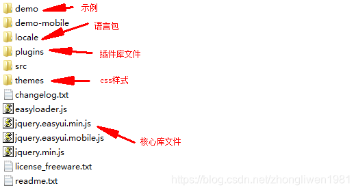
下载地址:http://www.jeasyui.net
下载完成后直接解压缩,其目录结构如下图所示:
在页面中引入下面文件:
<link rel="stylesheet" href="css/themes/bootstrap/easyui.css" />
<link rel="stylesheet" href="css/themes/icon.css" />
<!--描述:easyui基础包-->
<script type="text/javascript" src="js/jquery.min.js" ></script>
<script type="text/javascript" src="js/jquery.easyui.min.js" ></script>
<!--描述:中文包-->
<script type="text/javascript" src="js/locale/easyui-lang-zh_CN.js" ></script>
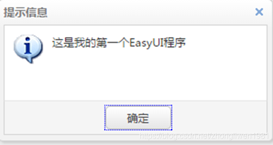
1.3 入门示例
<script type="text/javascript">
      $(function(){
            $.messager.alert("提示信息","这是我的第一个EasyUI程序","info");
      });
</script>
运行效果:
二、常用控件
2.1 消息框
messager提供了不同类型的消息框。例如:confirm、alert、p’rompt等等。所有消息框都是异步的,用户可以使用messager回调函数进行交互。
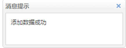
(1)消息提示框
<script type="text/javascript">
	$(function(){
    	$.messager.show({
			title:'消息提示',
			msg:'添加数据成功',
			showType:'slide',
			timeout:2000
        });
   });
</script>
运行效果:
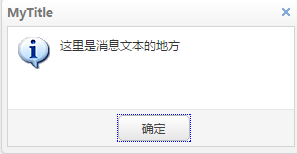
(2)消息警告框
$.messager.alert('消息', '这里是消息文本的地方');
运行效果:
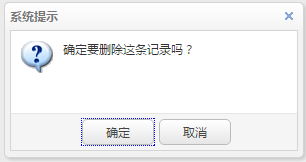
(3)确认对话框
$.messager.confirm('系统提示','确定要删除这条记录吗?',function(r){
     if(r){
          $.messager.alert('系统提示','确定删除','info');
     }
});
运行效果:
2.2 对话框
对话框是一个特殊类型的窗口。它在顶部有一个工具栏,在底部有一个按钮栏。默认情况下,对话框(dialog)只有一个显示在头部右侧的关闭工具。用户可以配置对话框行为来显示其他工具(比如:可折叠 collapsible、可最小化 minimizable、可最大化 maximizable,等等)。
- 创建对话框:
方式一: 通过DOM节点标签创建;
方式二:通过javascript脚本创建;
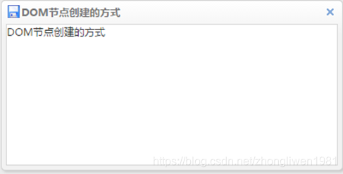
(1)DOM节点创建对话框
<div id="d1" class="easyui-dialog" title="DOM节点创建的方式" style="width: 400px;height: 200px;" data-options = "iconCls:'icon-save',resizable:true,modal:true">
     DOM节点创建的方式
</div>
运行效果:
对话框常用属性:
- title:定义对话框标题,如:MyDialog
- collapsible:定义是否显示可折叠按钮。默认:false(不显示)
- minimizable:定义是否显示最小化按钮。默认:false(不显示)
- maxmizable:定义是否显示最大化按钮。默认:false(不显示)
- resizable:定义对话框窗口是否可以被拖拉缩放。默认:false(不可以)
- closable:定义是否显示关闭按钮。默认:true(显示)
- closed:定义是否在初始化组件时关闭(隐藏)窗口。默认:false(不隐藏)
- modal:定义窗口是否带有遮罩效果。默认:true(有遮罩)
- buttons:该对话框按钮通过数组定义。
- href:定义引用的页面的url。
(2)js脚本创建对话框
//在body标签追加一个id=”dd”的div标签
$('body').append('<div id="dd"></div>');
$('#dd').dialog({
	title:'My Dialog',
	width:400,
                  height:200,
	closed:false,
	cache:false,
	modal:true,
	href:'index.html',
	buttons:[{
	      text:'保存',
	      handler:function(){$.messager.alert('系统提示','这里是点击保存触发的事件');}
	},{
	      text:'取消',handler:function(){$('#dd').dialog('destroy'); }
	}]
});
注意:href属性只是引入被引用<body></body>标签之间的内容。所以被引入页面的css、js是继承使用父页面的。另外一个值得大家注意的地方是,父页面和子页面标签的id不能出现重复,否则会被替换。
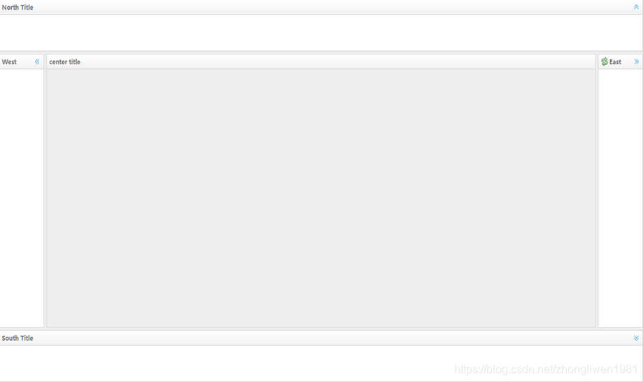
2.3 布局控件
布局(layout)是有五个区域(北区 north、南区 south、东区 east、西区 west 和中区 center)的容器。中间的区域面板是必需的,边缘区域面板是可选的。每个边缘区域面板可通过拖拽边框调整尺寸,也可以通过点击折叠触发器来折叠面板。
例如:
<div id="cc" class="easyui-layout" data-options="fit:true">
    <div data-options="region:'north',title:'North Title',split:true" style="height:100px;"></div>
    <div data-options="region:'south',title:'South Title',split:true" style="height:100px;"></div>
    <div data-options="region:'east',iconCls:'icon-reload',title:'East',split:true" style="width:100px;"></div>
    <div data-options="region:'west',title:'West',split:true" style="width:100px;"></div>
    <div data-options="region:'center',title:'center title'" style="padding:5px;background:#eee;"></div>
</div>
运行效果:
属性说明:
- title:布局面板的标题。默认为null(String),当为null或者不填写,布局自动隐藏折叠按钮;
- region:定义布局面板的位置(方向),可以取下列值的其中之一:north、south、east、west、center;
- border:设置为true将显示布局面板的边框。默认为true。
- spilt:如果设置为true将显示一个分割条,用户可以拖动分割条来改变布局面板的尺寸。默认为false;
- iconCls:一个用来显示布局面板头部图标的css类。默认为null;
2.4 表格控件
数据网格(datagrid)以表格格式显示数据,并为选择、排序、分组和编辑数据提供了丰富的支持。数据网格(datagrid)的设计目的是减少开发时间,且不要求开发人员具备指定的知识。它是轻量级的,但是功能丰富。它的特性包括单元格合并,多列页眉,冻结列和页脚,等等。
创建表格的三种方式:
- 从现有表格元素基础上创建DataGrid
- 通过table标签创建DataGrid
- 通过js脚本创建DataGrid
2.4.1 从现有表格元素基础上创建DataGrid
<table class="easyui-datagrid" data-options="fit:true">
    <thead>
        <tr>
            <th data-options="field:'code'">编码</th>
            <th data-options="field:'name'">名称</th>
            <th data-options="field:'price'">价格</th>
        </tr>
    </thead>
    <tbody>
        <tr>
            <td>001</td><td>name1</td><td>2323</td>
        </tr>
        <tr>
            <td>002</td><td>name2</td><td>4612</td>
        </tr>
    </tbody>
</table>
2.4.2 通过table标签创建DataGrid
<table class="easyui-datagrid"
data-options="url:'datagrid_data.json',fitColumns:true,singleSelect:true,fit:true">
    <thead>
        <tr>
            <th data-options="field:'code',width:100">编码</th>
            <th data-options="field:'name',width:100">名称</th>
            <th data-options="field:'price',width:100,align:'right'">价格</th>
        </tr>
    </thead>
</table>
datagrid_data.json文件的内容是一个json数组格式的数据。
[{
	'code':1,
	'name:'电冰箱',
	‘price’:1999
}, {
	'code':2,
	'name:'洗衣机',
	‘price’:1599
}, {
	'code':3,
	'name:'空调',
	‘price’:2999
}]
2.4.3 通过js脚本创建DataGrid
首先定义一个table标签。
<table id="dg"></table>
然后通过js脚本初始化表格。
<script>
$(function(){
	$('#dg').datagrid({
	    url:'datagrid_data.json',
	    method:'get',
	    fit:true,
	    columns:[[
	        {field:'code',title:'编号',width:100},
	        {field:'name',title:'名称',width:100},
	        {field:'price',title:'价格',width:100,align:'right',formatter:function(value,row,index) {
	        	return value + "元";
	        }}
	    ]]
	});
});
</script>
表格属性:
- nowrap:当数据长度超出列宽时将会自动截取。默认true
- idField:表示该列是唯一数据(id)。默认null
- url:用于从远程站点请求数据的超链接地址。默认null
- pagination:设置为true,将在表格的底部显示分页工具条。默认false
- rownumbers:设置为true时,将显示行号。默认false
- singleSelect:设置为true时,表示只能选中一行。默认false
- toolbar:添加一个工具条
- pagePosition:定义分页栏的位置。可用top、bottom(默认)、both。
- pageNumber:分页的初始页面数。默认1
- pageSize:初始化分页每页显示的条数。默认10
- pageList:初始化分页每页记录数列表。默认[10,20,30,40,50]
数据列属性:
- title:列标题。默认undefined
- field:列字段。默认undefined
- width:列宽。默认undefined
- rowspan:表示一个单元格可以跨越多少行。默认0
- colspan:表示一个单元格可以跨越多少列。默认0
- align:表示列数据对齐方式。可用left、center、right。默认left
- checkbox:设置为true时,将在最前面显示复选框。默认false
- formatter:格式化单元格函数有3个参数
- value:字段值
- rowData:行数据
- rowIndex:行索引
2.4.4 DataGrid的主要方法
load:载入并显示第一页记录,通常用于执行条件查询功能;
$('#table').datagrid('load', {'参数名':'参数值', ...});
reload:重载表格数据,与load方法的功能相同。但是重载的是当前页面,而不是第一页;
$('#table').datagrid('reload');
getSelected:返回被选择的记录。例如:
{
	text:'修改',
	iconCls:'icon-edit',
	handler:function(){
		var row = $('#dg').datagrid('getSelected');
		$.messager.alert('你选择的值是:', row.code);
	}
}
2.5 Tree控件
树形菜单用于web页面以一个树形结构显示分层数据,它提供用户展开、折叠、拖拽、编辑和异步加载等功能。
2.5.1 使用DOM标签创建Tree
<ul id="tt" class="easyui-tree">
    <li>
        <span>Folder</span>
        <ul>
            <li><span>Sub Folder 1</span>
                <ul><li> <span><a href="#">File 11</a></span></li></ul>
            </li>
        </ul>
    </li>
    <li>
        <span>File21</span>
    </li>
</ul>
2.5.2 js脚本创建Tree
$(function(){
    $('#tt').tree({
    	url:'tree_data.json'
	});
});

<ul id="tt"></ul>
tree_data.json文件内容的数据格式:
[{
	"id":1,
	"text":"My Documents",
	"children":[{
		"id":11,
		"text":"Photos",
		"state":"closed",
		"children":[{
			"id":111,
			"text":"Friend"
		},{
			"id":112,
			"text":"Wife"
		},{
			"id":113,
			"text":"Company"
		}]
	},{
		"id":12,
		"text":"Program Files",
		"children":[{
			"id":121,
			"text":"Intel"
		},{
			"id":122,
			"text":"Java",
			"attributes":{
				"p1":"Custom Attribute1",
				"p2":"Custom Attribute2"
			}
		},{
			"id":123,
			"text":"Microsoft Office"
		},{
			"id":124,
			"text":"Games",
			"checked":true
		}]
	},{
		"id":13,
		"text":"index.html"
	},{
		"id":14,
		"text":"about.html"
	},{
		"id":15,
		"text":"welcome.html"
	}]
}]
属性说明:
- id:节点ID,对加载远程数据很重要。
- text:显示节点文本。
- state:节点状态,‘open’ 或 ‘closed’,默认:‘open’。如果为’closed’的时候,将不自动展开该节点。
- checked:表示该节点是否被选中。
- attributes: 被添加到节点的自定义属性。
- children: 一个节点数组声明了若干节点。
2.6 表单控件
form控件提供了各种方法来操作执行表单字段,比如:ajax提交, load, clear等等。当提交表单的时候,还可以调用validate方法检查表单是否合法。
<form id="ff" method="post">
    <div>
        <label for="name">Name:</label>
        <input class="easyui-validatebox" type="text" name="name" data-options="required:true" />
    </div>
    <div>
        <label for="email">Email:</label>
        <input class="easyui-validatebox" type="text" name="email" data-options="validType:'email'" />
    </div>
</form>
2.6.1 验证框
validatebox(验证框)的设计目的是为了验证输入的表单字段是否有效。如果用户输入了无效的值,它将会更改输入框的背景颜色,并且显示警告图标和提示信息。
- 创建验证框:
方式一:通过DOM标签创建验证框
<input id="email" class="easyui-validatebox" data-options="required:true,validType:'email'" />
方式二:通过js脚本创建验证框
<input id="email" />

$('#email').validatebox({
    required: true,
    validType: 'email'
});
运行效果:
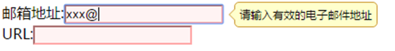
完整代码:
<body>
	<script type="text/javascript">
	   $(function(){
	         $('#email').validatebox({
	               required: true,
	               validType: 'URL'
	         });
	   });
	</script>

	邮箱地址:<input id="email" class="easyui-validatebox" data-options="required:true,validType:'email'" /><br/>
</body>
2.6.2 输入框
TextBox(文本框)是一个增强的输入字段组件, 它允许用户非常简单的创建一组表单。它是一个用于构建其他组合控件的基础组件,如:combo,databox、spinner等。
- 创建输入框:
方式一:通过标签创建输入框
<input class="easyui-textbox" data-options="iconCls:'icon-search',required: true" style="width:300px">
方式二:通过js脚本创建输入框
<input id="tt" />

$('#tt').textbox({
    required: true,
    iconCls:'icon-man',
    iconAlign:'left'
});
运行效果:
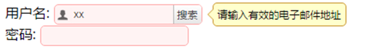
完整代码:
<body>
	<script type="text/javascript">
	    $(function(){
			$('#tt1').textbox({
			     required: true,  //必填
			     validType:'email',//验证邮箱
			     buttonText:'搜索',//追加按钮
			     iconCls:'icon-man', //追加图标
			     iconAlign:'left'    //图标位置(left、right)
			});
	    });
	</script>
	<form id="ff" method="post">
	     <div><label for="name">用户名:</label><input id="tt1"/></div>
	     <div><label for="password">密码:</label><input id="tt2" class="easyui-textbox" data-options="required:true" /></div>
	</form>
</body>
2.6.3 数值输入框
数值输入框是用来限制用户只能输入数值型数据的。他可以转换一个输入的元素到其他类型,比如:数字、百分比、货币等。
- 创建数值输入框:
方式一:通过标签创建;
<input class="easyui-numberbox" data-options="iconCls:'icon-search',required: true,min:0,precision:2" style="width:300px">
方式二:通过js脚本创建;
// 验证必填、最小值为0、有两位小数
$('#tt').numberbox({
    required: true,
    min:0,
    precision:2,
    iconAlign:'left'
});
运行效果:

完整代码:
<body>
	<script type="text/javascript">
	      $(function(){
			 $('#tt1').numberbox({
			     required: true,  //必填
			     min:0,//最小值
		         precision:2 //保留两位小数
		   });
	    });
	</script>
	<form id="ff" method="post">
	     <div><label for="name">人数有:</label><input id="tt1" style="width:300px"/></div>
	     <div><label for="password">平均分:</label><input class="easyui-numberbox" data-options="iconCls:'icon-search',required: true,min:0,precision:2" style="width:300px"> </div>
	</form>
</body>
2.6.4 日期输入框
日期输入框结合了一个可编辑的文本框控件和允许用户选择日期的下拉日历面板控件。选择的日期会自动转变为一个有效的日期然后填充到文本框中。选定的日期也可以被格式化为预定格式。
- 创建日期输入框:
方式一:通过标签创建;
<input id="dd" type="text" class="easyui-datebox" required="required"></input>
方式二:通过js脚本创建;
<input id="tt" />

$('#tt').datebox({
    required: true
});
运行效果:
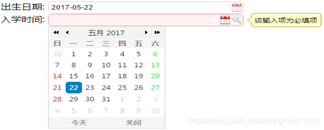
完整代码:
<body>
	<script type="text/javascript">
		$(function(){
			$('#tt1').datebox({
		    	required: true  //必填
			});
	    });
	</script>
	<form id="ff" method="post">
	     <div><label for="name">出生日期:</label>
	     <input id="tt1" style="width:300px"/></div>
	     <div><label for="password">入学时间:</label>
	     <input class="easyui-datebox" data-options="iconCls:'icon-search',required: true" style="width:300px"> </div>
	</form>
</body>
2.6.5 下拉列表框
下拉列表框显示一个可编辑文本框和下拉式列表,用户可以选择一个值或多个值。用户可以直接输入文本到列表顶部或选择一个或多个当前列表中的值。
- 创建下拉列表框:
方式一:通过标签创建;
<input id="cc" class="easyui-combobox" name="dept" data-options="valueField:'id',textField:'text',url:'get_data.json'" />
get_data.json文件内容的格式:
[{
	"id":1,
	"text":"Java",
	"desc":"Write once, run anywhere"
},{
	"id":2,
	"text":"C#",
	"desc":"One of the programming languages designed for the Common Language Infrastructure"
},{
	"id":3,
	"text":"Ruby",
	"selected":true,
	"desc":"A dynamic, reflective, general-purpose object-oriented programming language"
},{
	"id":4,
	"text":"Perl",
	"desc":"A high-level, general-purpose, interpreted, dynamic programming language"
},{
	"id":5,
	"text":"Basic",
	"desc":"A family of general-purpose, high-level programming languages"
}]
方式二:通过js脚本创建;
<input id="cc" name="dept">

$('#cc').combobox({
    url:'combobox_data.json',
    valueField:'id',
    textField:'text'
});
方式三:通过select元素创建一个预定义结构的下拉框;
<select id="cc" class="easyui-combobox" name="dept" style="width:200px;">
    <option value="aa">aitem1</option>
    <option>bitem2</option>
    <option>bitem3</option>
    <option>ditem4</option>
    <option>eitem5</option>
</select>
方式四:创建2个有依赖关系的下拉框;
<input id="cc1" class="easyui-combobox" data-options="
        valueField: 'id',
        textField: 'text',
        url: 'getData',
        onSelect: function(rec){
            var url = 'getData?id='+rec.id;
            $('#cc2').combobox('reload', url);
        }"/>
<input id="cc2" class="easyui-combobox" data-options="valueField:'id',textField:'text'" />
