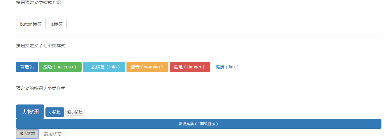
<!doctype html>
<html lang="en">
<head>
    <meta charset="utf-8">
    <meta http-equiv="X-UA-Compatible" content="IE=edge">
    <meta name="viewport" content="width=device-width, initial-scale=1">

    <!-- Bootstrap -->
    <link href="__STATIC__/插件/bootstrap-3.3.7-dist/css/bootstrap.min.css" rel="stylesheet">

    <!-- HTML5 shim 和 Respond.js 是为了让 IE8 支持 HTML5 元素和媒体查询(media queries)功能 -->
    <!-- 警告:通过 file:// 协议(就是直接将 html 页面拖拽到浏览器中)访问页面时 Respond.js 不起作用 -->
    <!--[if lt IE 9]>
      <script src="https://cdn.bootcss.com/html5shiv/3.7.3/html5shiv.min.js"></script>
      <script src="https://cdn.bootcss.com/respond.js/1.4.2/respond.min.js"></script>
    <![endif]-->

    <!-- jQuery (Bootstrap 的所有 JavaScript 插件都依赖 jQuery,所以必须放在前边) -->
    <script src="__STATIC__/插件/jquery-3.3.1.min.js"></script>
    <script src="__STATIC__/插件/bootstrap-3.3.7-dist/js/bootstrap.min.js"></script>
    <title>bootstrap</title>
    <style>

    </style>
</head>
<body>
    <div class="container">
        <div class="row">
            <div class="col-md-12">
                <p>按钮预定义类样式介绍</p>
                <hr>
                <button type="button" class="btn btn-default">button标签</button>
            <!--     html 里面的 role 本质上是增强语义性,当现有的HTML标签不能充分表达语义性的时候,就可以借助role来说明。通常这种情况出现在一些自定义的组件上 -->
                <a href="#" role="button" class="btn btn-default">a标签</a>
                <hr>
                <p>按钮预定义了七个类样式</p>
                <hr>
                <button type="button" class="btn btn-primary">首选项</button>


                <button type="button" class="btn btn-success">成功(success)</button>
                <button type="button" class="btn btn-info">一般信息(info)</button>

                <button type="button" class="btn btn-warning">警告(warning)</button>
                <button type="button" class="btn btn-danger">危险(danger)</button>

                <button type="button" class="btn btn-link">链接(link)</button>
                <hr>
                <p>预定义的按钮大小类样式</p>
                <hr>
                <button type="button" class="btn btn-primary btn-lg">大按钮</button>
                <button type="button" class="btn btn-primary btn-sm">小按钮</button>
                <button type="button" class="btn btn-default btn-xs">超小按钮</button>
                <button type="button" class="btn btn-primary btn-sm btn-block">块级元素(100%显示)</button>
                <button type="button" class="btn btn-default btn-sm active">激活状态</button>
                <button type="button" class="btn btn-default" disabled="disabled">禁用状态</button>
            </div>
        </div>
    </div>

</div>
</body>
</html>