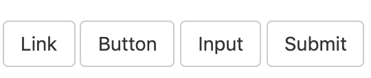
可作为按钮使用的标签或元素
为 <a>、<button> 或 <input> 元素添加按钮类(button class)即可使用 Bootstrap 提供的样式。
<a class="btn btn-default" href="#" role="button">Link</a>
<button class="btn btn-default" type="submit">Button</button>
<input class="btn btn-default" type="button" value="Input">
<input class="btn btn-default" type="submit" value="Submit">
效果:
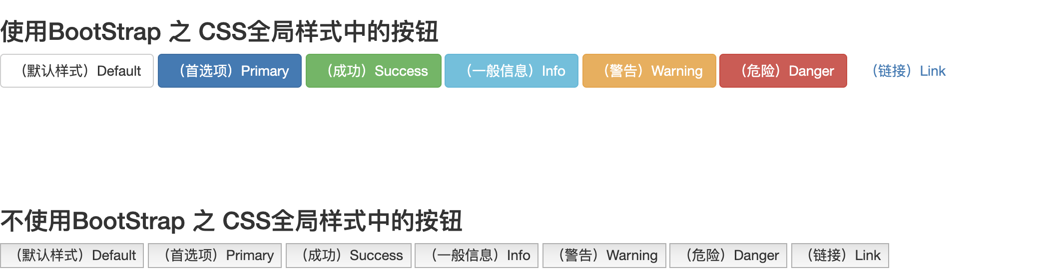
预定义样式
使用下面列出的类可以快速创建一个带有预定义样式的按钮。
<!DOCTYPE html>
<html lang="en">
<head>
    <meta charset="utf-8">
    <meta http-equiv="X-UA-Compatible" content="IE=edge">
    <meta name="viewport" content="width=device-width, initial-scale=1">
    <title>Bootstrap 栅格系统</title>
    <link href="./BootStrap_3.3.7_libs/css/bootstrap.min.css" rel="stylesheet">
    <script src="./jQuery/jquery-3.2.1.min.js"></script>
    <script src="./BootStrap_3.3.7_libs/js/bootstrap.min.js"></script>
</head>
<body>

<!-- 使用BootStrap 之 CSS全局样式中的按钮 -->
<h3>使用BootStrap 之 CSS全局样式中的按钮</h3>
<!-- Standard button -->
<button type="button" class="btn btn-default">(默认样式)Default</button>

<!-- Provides extra visual weight and identifies the primary action in a set of buttons -->
<button type="button" class="btn btn-primary">(首选项)Primary</button>

<!-- Indicates a successful or positive action -->
<button type="button" class="btn btn-success">(成功)Success</button>

<!-- Contextual button for informational alert messages -->
<button type="button" class="btn btn-info">(一般信息)Info</button>

<!-- Indicates caution should be taken with this action -->
<button type="button" class="btn btn-warning">(警告)Warning</button>

<!-- Indicates a dangerous or potentially negative action -->
<button type="button" class="btn btn-danger">(危险)Danger</button>

<!-- Deemphasize a button by making it look like a link while maintaining button behavior -->
<button type="button" class="btn btn-link">(链接)Link</button>

<br><br><br><br><br><br>
<!--不使用BootStrap 之 CSS全局样式中的按钮-->
<h3>不使用BootStrap 之 CSS全局样式中的按钮</h3>
<button type="button">(默认样式)Default</button>
<button type="button">(首选项)Primary</button>
<button type="button">(成功)Success</button>
<button type="button">(一般信息)Info</button>
<button type="button">(警告)Warning</button>
<button type="button">(危险)Danger</button>
<button type="button">(链接)Link</button>

</body>
</html>
效果:
详情参考:全局 CSS 样式