前言
本系列主要整理前端面试中需要掌握的知识点。本节介绍如何实现两栏布局右侧自适应以及三栏布局中间自适应。
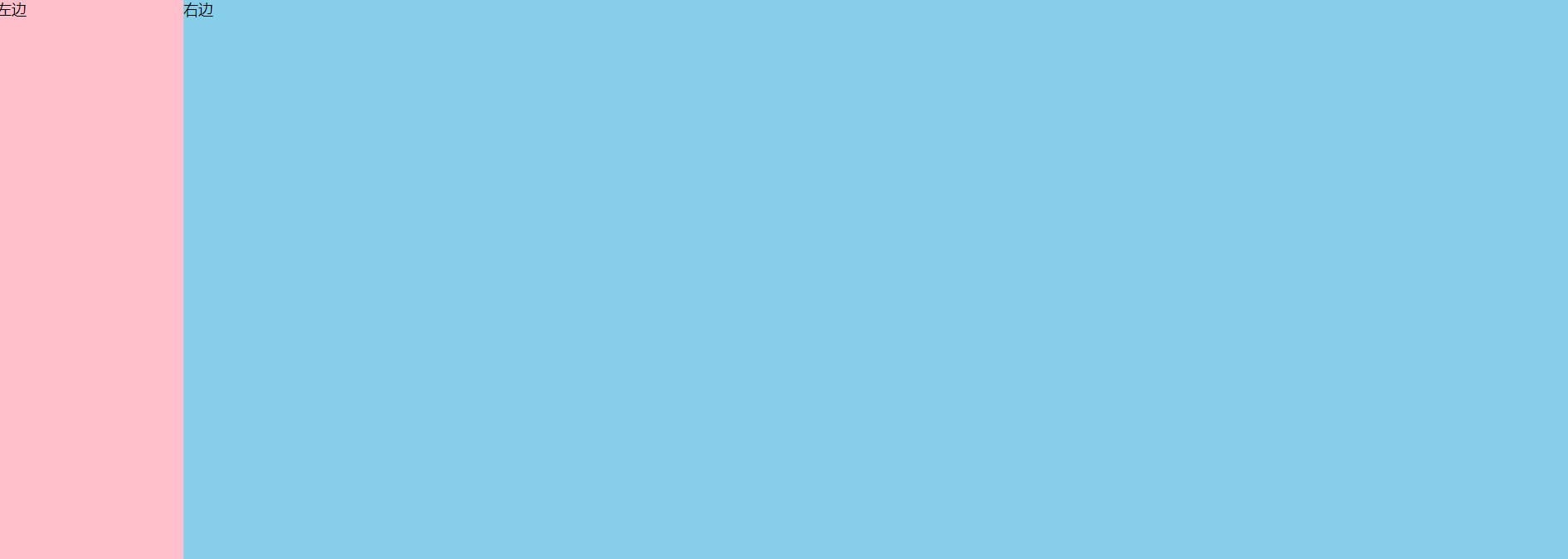
一、双栏布局
效果如下:给定左栏的宽度,右边自适应调整宽度。
1、浮动
<head>
    <style>
        .box{


            overflow: hidden;        /*设置BFC,防止下方元素飞到上方*/
        }
        .left {


            float: left;
            width: 200px;           /*给左侧盒子一个固定宽度*/
            height: 600px;
            background-color: pink;

        }
        .right {


            height: 600px;
            background-color: skyblue;
            margin-left: 200px;      /*让出左侧宽度*/
        }
    </style>
</head>
<body>
    <div class="box">
        <div class="left">左边</div>
        <div class="right">右边</div>
    </div>
</body>
</html>
2、flex布局
/* 弹性布局 */
.box {


    display: flex;
}
.left {


    width: 200px;
    height: 600px;
    background-color: pink;
}
.right {


    height: 600px;
    background-color: skyblue;
    flex-grow: 1;            /*当有多余空间时,元素的放大比例*/
}
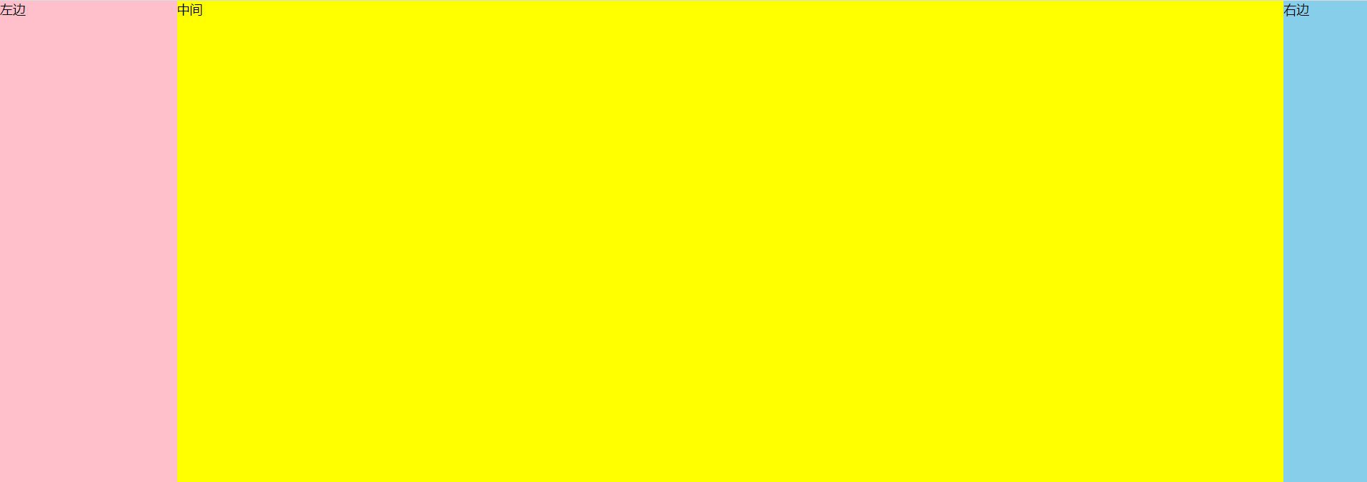
二、三栏布局
效果如下:左侧和右侧分别给定宽度,中间自适应。
1、左右浮动,中间margin(和双栏一样,略了)
2、左右定位,中间margin
.box {


    position: relative;
}
.left {


    position: absolute;
    top: 0;
    left: 0;
    width: 220px;
    height: 600px;
    background-color: pink;
}
.right {


    position: absolute;
    top: 0;
    right: 0;
    width: 110px;
    height: 600px;
    background-color: skyblue;
}
.middle {


    height: 600px;
    margin-left: 220px;
    margin-right: 110px;
    background-color: yellow;
}
3、flex布局
.box {


    display: flex;
}
.left {


    width: 220px;
    height: 600px;
    background-color: pink;
}
.right {


    width: 110px;
    height: 600px;
    background-color: skyblue;
}
.middle {


    flex: 1;
    background-color: yellow;
}