-
如下代码:写一个带有宽度高度的div,并为其增加边框
<!DOCTYPE html>
<html lang="en">
<head>
    <meta charset="UTF-8">
    <title>Title</title>
    <style>
        div{
            height: 100px;
            width: 100px;
            margin: 100px auto;
            background-color: black;
            border-left: blue solid 50px;
            border-top: green solid 50px;
            border-bottom: red solid 50px;
            border-right: yellow solid 50px;
        }
    </style>
</head>
<body>
    <div></div>
</body>
</html>
运行效果:
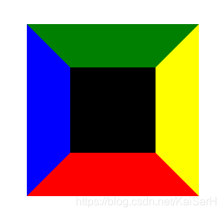
CSS会自动在交界处隔开。 -
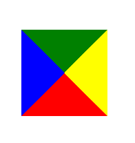
删除div高度和宽度,呈现如下效果
<!DOCTYPE html>
<html lang="en">
<head>
    <meta charset="UTF-8">
    <title>Title</title>
    <style>
        div{
            height: 0;
            width: 0;
            margin: 100px auto;
            /*background-color: black;*/
            border-left: blue solid 50px;
            border-top: green solid 50px;
            border-bottom: red solid 50px;
            border-right: yellow solid 50px;
        }
    </style>
</head>
<body>
    <div></div>
</body>
</html>
运行效果:
-
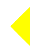
即可得到思路,需要哪一种三角形,将其他的设置为透明即可。
比如:<!DOCTYPE html> <html lang="en"> <head> <meta charset="UTF-8"> <title>Title</title> <style> div{ height: 0; width: 0; margin: 100px auto; /*background-color: black;*/ border-left: transparent solid 50px; border-top: transparent solid 50px; border-bottom: transparent solid 50px; border-right: yellow solid 50px; } </style> </head> <body> <div></div> </body> </html>运行效果:
-
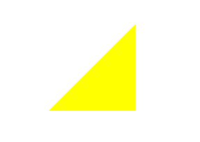
又比如:
<!DOCTYPE html>
<html lang="en">
<head>
    <meta charset="UTF-8">
    <title>Title</title>
    <style>
        div{
            height: 0;
            width: 0;
            margin: 100px auto;
            /*background-color: black;*/
            border-left: transparent solid 50px;
            border-top: transparent solid 50px;
            border-bottom: yellow solid 50px;
            border-right: yellow solid 50px;
        }
    </style>
</head>
<body>
    <div></div>
</body>
</html>