使用五种方法来实现DIV的一边固定一边自适应写法,并分析各自特点。
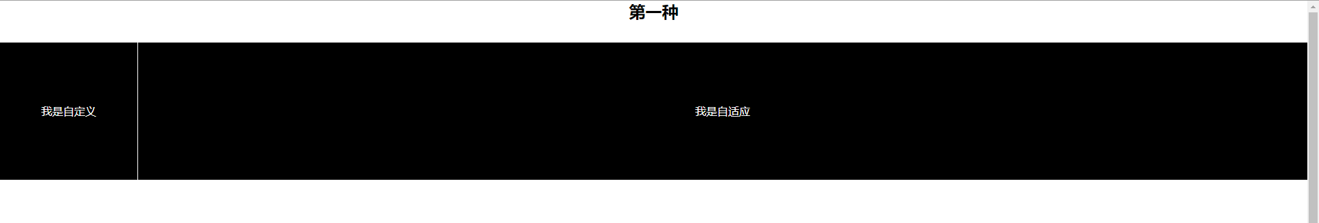
第一种(CSS3):
.wrapper1, .wrapper2, .wrapper3, .wrapper4, .wrapper5{
     width: 100%;
     height: 100%;
     min-height: 300px;
     line-height: 200px;
     overflow: hidden;
     margin: 30px 0;
     position: relative;
}
.wrapper1 .custom{
    width: 200px;
    border-right: 1px solid white;
}
.wrapper1 .auto{
    width: calc(100% - 201px);
}
.wrapper1 .custom, .wrapper1 .auto{
    height: 200px;
    float: left;
    color: white;
    background: black;
}
现在CSS3都已经普及了,移动端更是,通常使用CSS3较多,所以第一种就是利用CSS3来写了。
CSS3中新增一种新的属性 CALC :
使用方法: width: calc(100% - 200px);
这一功能通俗易懂,简单的加减乘除谁不会啊,只需要了解盒子宽高(padding + margin + border),若使用border-box除外。
自适应盒子一个100%宽 - 固定盒子宽 = 自适应的宽。
第二种(CSS3):
.wrapper2 .custom, .wrapper2 .auto{
    height: 200px;
    color: white;
    background: black;
    position: absolute;
    top: 31px;
}
.wrapper2 .custom{
    width: 200px;
    border-right: 1px solid white;
    left: 0;
    z-index: 1;
}
.wrapper2 .auto{
    left: 0;
    width: 100%;
    padding-left: 200px;
    box-sizing: border-box;
}
利用绝对定位来写,给父元素一个相对定位,固定与自适应盒子各一个绝对定位,当然你也可以只给第二个盒子。
没太多要点,需要注意的就是在box-sizing这里需设置borde-box。
脱离了文档流的DIV宽度100%是等于设备像素宽,所以需要给DIV增加一个padding值,那么增加了padding值的话,相当于是100%的宽度 + 200px padding宽度,这样导致DIV子元素居中不对称,所以使用box-sizing来辅助。

第三种(CSS3):
.wrapper3{
     display: flex;
     flex: 1;
}
.wrapper3 .custom{
     width: 200px;
     height: 200px;
     flex: none;
     border-right: 1px solid white;
     color: white;
     background: black;
}
.wrapper3 .auto{
     flex: 1;
     color: white;
     background: black;
}
同样的,CSS3新增了一种布局方式,display:flex;这种功能非常强大,若想学好H5,这个功能必定要会使用,可以不记,但要知道它有哪些辅助属性,具体可以通过W3C了解。
小弟不才,自己写了一下,但是做笔记的时候没写好,给自己写了几个坑,所以一定要试了才知道,不要一味的看,看了不动手或不用也记不住点击打开链接
使用方法:
给父元素设定: display: flex;flex: 1;
设定后,子元素默认为横向布局,无论里面的子元素是块还是行,具体不多做介绍...
flex: 1;代表分成几份,这里是1份。
固定的元素自定义宽度,自适应的设为flex: 1;宽度不需要设定,自适应的宽,当然也可以设auto。

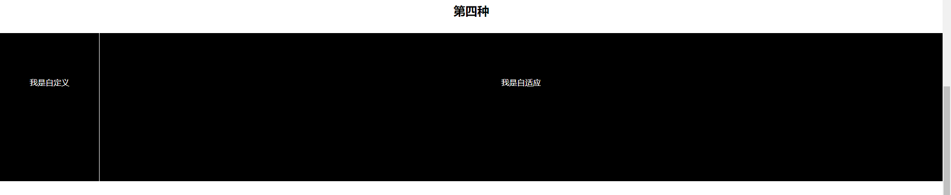
第四种(table):
.wrapper4{
    display: table;
}
.wrapper4 .custom, .wrapper4 .auto{
    display: table-cell;
    background: black;
    color: white;
}
.wrapper4 .custom{
    width: 200px;
    height: 200px;
    border-right: 1px solid white;
}
.wrapper4 .auto{
    width: auto;
    height: 100%;
}
display: table;这种方式对于运用较少的人来说,属于冷门型的,若要想IE8下就不要用这种了。
理解:
给父元素定义table相当于是让父元素以块级的表格来显示,然后定义子元素,子元素的定义用display: table-cell; 此时的子元素相当于表格内的td元素,表格大家应该用的多,这个就不多做解释了。
缺点:
若父元素设了高度,那么子元素无论你设多高他都按照父元素的高度来定。
第五种(BFC):
.wrapper5 .custom{
    width: 200px;
    height: 200px;
    float: left;
    border-right: 1px solid white;
}
.wrapper5 .auto{
    height: 200px;
}
.wrapper5 .custom, .wrapper5 .auto{
    background: black;
    color: white;
}
是时候介绍一下压轴的方法了,简单、明了、“暴力美”,还TM接地气。
只需要给固定元素设宽高,重点是浮动,第二个就不用管了,只要设一个高就搞定!

贴上文档源码!
<!DOCTYPE html>
<html lang="en">
<head>
    <meta charset="UTF-8">
    <meta name="viewport" content="width=device-width, initial-scale=1.0">
    <meta http-equiv="X-UA-Compatible" content="ie=edge">
    <title>Document</title>
    <style>
        *{
            margin: 0;
            padding: 0;
        }
        body{
            text-align: center;
        }

        /* 第一种利用calc计算 */
        .wrapper1, .wrapper2, .wrapper3, .wrapper4, .wrapper5{
            width: 100%;
            height: 100%;
            min-height: 300px;
            line-height: 200px;
            overflow: hidden;
            margin: 30px 0;
            position: relative;
        }
        .wrapper1 .custom{
            width: 200px;
            border-right: 1px solid white;
        }
        .wrapper1 .auto{
            width: calc(100% - 201px);
        }
        .wrapper1 .custom, .wrapper1 .auto{
            height: 200px;
            float: left;
            color: white;
            background: black;
        }

        /* 第二种利用绝对定位 */

        .wrapper2 .custom, .wrapper2 .auto{
            height: 200px;
            color: white;
            background: black;
            position: absolute;
            top: 31px;
        }
        .wrapper2 .custom{
            width: 200px;
            border-right: 1px solid white;
            left: 0;
            z-index: 1;
        }
        .wrapper2 .auto{
            left: 0;
            width: 100%;
            padding-left: 200px;
            box-sizing: border-box;
        }

        /* 第三种利用flex */
        .wrapper3{
            display: flex;
            flex: 1;
        }
        .wrapper3 .custom{
            width: 200px;
            height: 200px;
            flex: none;
            border-right: 1px solid white;
            color: white;
            background: black;
        }
        .wrapper3 .auto{
            flex: 1;
            height: 200px;
            color: white;
            background: black;
        }

        /* 第四种表格 */
        .wrapper4{
            display: table;
        }
        .wrapper4 .custom, .wrapper4 .auto{
            display: table-cell;
            background: black;
            color: white;
        }
        .wrapper4 .custom{
            width: 200px;
            height: 200px;
            border-right: 1px solid white;
        }
        .wrapper4 .auto{
            width: auto;
            height: 100%;
        }

        /* 第五种BFC */
        .wrapper5 .custom{
            width: 200px;
            height: 200px;
            float: left;
            border-right: 1px solid white;
        }
        .wrapper5 .auto{
            height: 200px;
        }
        .wrapper5 .custom, .wrapper5 .auto{
            background: black;
            color: white;
        }
    </style>
</head>
<body>
    <h2>第一种</h2>
    <div class="wrapper1">
        <div class="custom">
            <p>我是自定义</p>
        </div>
        <div class="auto">
            <p>我是自适应</p>
        </div>
    </div>

    <h2>第二种</h2>
    <div class="wrapper2">
            <div class="custom">
                <p>我是自定义</p>
            </div>
            <div class="auto">
                <p>我是自适应</p>
            </div>
        </div>

        <h2>第三种</h2>
    <div class="wrapper3">
            <div class="custom">
                <p>我是自定义</p>
            </div>
            <div class="auto">
                <p>我是自适应</p>
            </div>
        </div>
        </div>

        <h2>第四种</h2>
    <div class="wrapper4">
            <div class="custom">
                <p>我是自定义</p>
            </div>
            <div class="auto">
                <p>我是自适应</p>
            </div>
        </div>

        <h2>第五种</h2>
    <div class="wrapper5">
            <div class="custom">
                <p>我是自定义</p>
            </div>
            <div class="auto">
                <p>我是自适应</p>
            </div>
        </div>
</body>
</html>