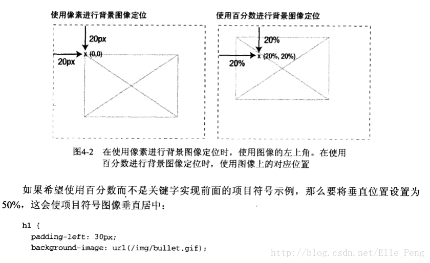
对image标签的滥用导致纯修饰性的图像把页面弄乱了,好在我们能够在页面上显示图像,为不需要,而不需要让图像成为标记的一部分。实现方法是将图像作为背景添加到现有的元素中
背景图像基础
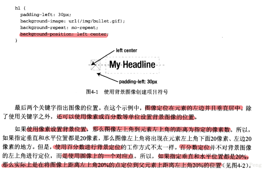
- h1 {
padding-left: 30px;
background-image: url(/img/bullet.gif);
background-repeat: no-repeat;
background-position: left center;
}
- h1 {
background: #ccc url(/img/bullet.gif) no-repeat left center;
}
- h1 {
- h1 {
padding-left: 30px;
background-image: url(/img/bullet.gif);
background-repeat: no-repeat;
background-position: 0 50%;
}
- h1 {
background: #ccc url(/img/bullet.gif) no-repeat 0 50%;
}
- h1 {
圆角技术
- css3中已经提供了border-radius:的属性来设置圆角。关于使用背景图片来设置圆角的想法,可以参考一下,为解决其他问题的思路!
- 设置三个嵌套,最外层放 中间平铺的的图片 中间的块放置下圆角 最里面的放上圆角。
- 滑动门技术,四个角分别设置不同的背景图片 可以 解决方法1中,宽度必须固定的限制。
- 山顶角,不过总体还是使用不同的图片 使不同的区块显示不同的颜色 不适合较大的区块。
多个背景图像和border-radius属性
- 多个背景图像
.box {
    background-image: url(img/mtop-left.gif), url(img/mtop-right.gif), url(img/mbottom-left.gif), url(img/mbottom-right.gif);
    background-repeat: no-repeat, no-repeat, no-repeat, no-repeat;
    background-position: top left, top right, bottom left, bottom right;
}
- border-radius
.box {
    borer-radius: 1em;
}
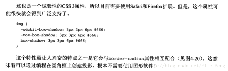
CSS投影
- CSS3中的box-shadow属性可以很简单的做到投影。
- 这个属性需要四个值
- 水平平移 垂直平移 投影的宽度(也就是模糊程度) 颜色
- img {
box-shadow: 3px 3px 6px #666;
}
不透明度和RGBa
- 适当地使用不透明度可以让设计的效果更丰富。对于相互重叠的元素,还可以用它显露下面的元素
 .box {
 background-color: #000;
 opacity: 0.8;
 filter: alpha(opacity=50); /*proprietary IE code*/
 }
- RGBa是一种同时设置颜色和不透明度的机制。RGB代表红色、绿色和蓝色,a代表alpha透明度
 .box {
 background-color: rgba(0,0,0,0.8);
 }
让PNG适用于IE的老版本
- PNG文件格式最大的特点就是它支持alpha透明度
 .img-wrapper div {
 filter:progid:DXImageTransform.Microsoft.AlphaImageLoader(src='/img/shadow2.png',sizingMethod='crop');
 background:none;
 }