import pandas as pd
import matplotlib.pyplot as plt
import datetime
import matplotlib as mpl
import numpy as np
from pyecharts import Map
import math
from scipy.optimize import curve_fit
data=pd.read_csv("virus.csv")
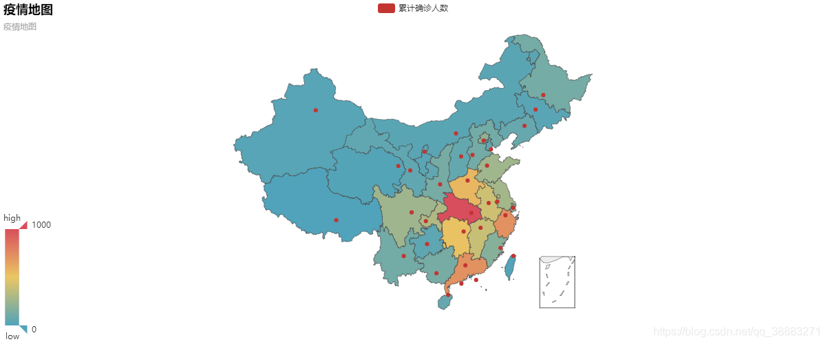
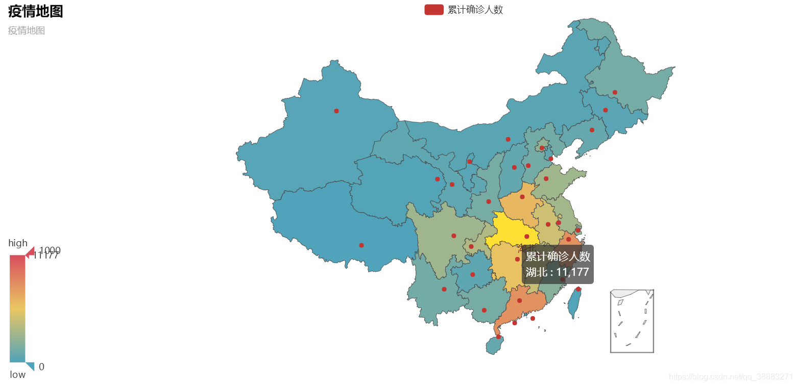
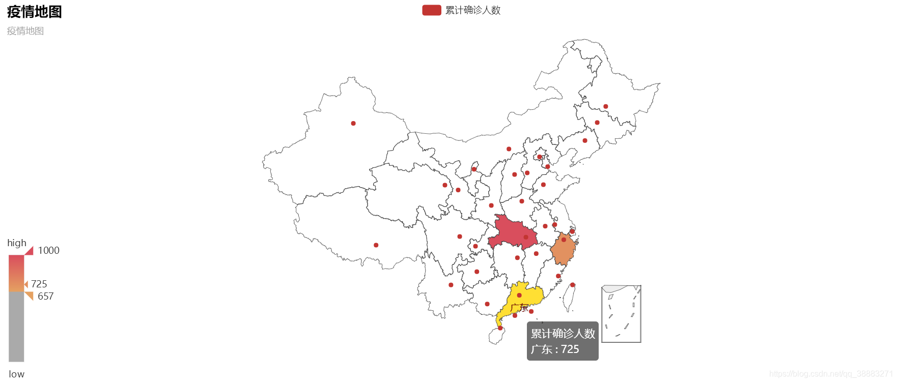
province_set={'湖北':11177,'广东':725,'浙江':724,'河南':566,'湖南':521,'安徽':408,\
'江西':391,'重庆':312,'江苏':271,'山东':259,'四川':254,'北京':212,\
'上海':203,'福建':179,'陕西':128,'广西':127,'黑龙江':121,'云南':114,\
'河北':113,'辽宁':73,'海南':71,'山西':66,'天津':56,'甘肃':51,'贵州':46,\
'内蒙古':34,'宁夏':31,'吉林':31,'新疆':24,'香港':15,'青海':13,'台湾':10,\
'澳门':8,'西藏':1}
province=list(province_set.keys())
value=list(province_set.values())
starttime=datetime.datetime(2020,1,23) #数据起始时间
endtime=datetime.datetime(2020,2,3) #数据终止时间
interval=datetime.timedelta(days=1) #时间间隔
dates=mpl.dates.drange(starttime,endtime,interval)
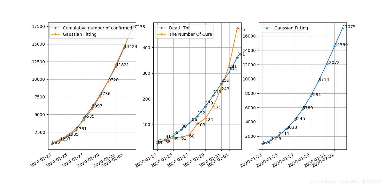
def fun(x,a,u,sig):
return a*np.exp(-(x-u)**2/(2*sig**2))/(sig*math.sqrt(2*math.pi)) #定义高斯函数
x=np.arange(1,12,1)
y=np.array(data['numbers'])
ymean=np.mean(y)
y_mean=np.zeros((1,11))
for i in range(11):
y_mean[:,i]=ymean
popt,pcov=curve_fit(fun,x,y)
a=popt[0]
u=popt[1]
sig=popt[2]
yvals=fun(x,a,u,sig)
R=1-np.sum((y-yvals)**2)/np.sum((y-y_mean[0])**2) #拟合优度
print("高斯拟合的拟合优度是:",'%.4f'%R) #拟合优度是0.9987(精确到小数点后四位)
print("预计峰值时期的累计确诊人数为:",int(round(fun(u,a,u,sig))))
print("预计峰值时间为1月23日起后"+str(int(round(u)))+"天左右")
fig=plt.figure()
ax1=fig.add_subplot(131)
ax1.plot_date(dates,data['numbers'],'-*',label='Cumulative number of confirmed')
for x,y in zip(dates,data['numbers']):
plt.text(x,y,y)
ax1.plot_date(dates,yvals,'-*',label='Gaussian Fitting')
ax1.grid()
ax2=fig.add_subplot(132)
ax2.plot_date(dates,data['death'],'-*',label='Death Toll')
for x,y in zip(dates,data['death']):
plt.text(x,y+8,y)
ax2.plot_date(dates,data['cure'],'-*',label='The Number Of Cure')
for x,y in zip(dates,data['cure']):
plt.text(x,y-10,y)
ax2.grid()
ax3=fig.add_subplot(133)
ax3.plot_date(dates,yvals,'-*',label='Gaussian Fitting')
for x,y in zip(dates,yvals):
plt.text(x,int(y),int(round(y)))
ax3.grid()
fig.autofmt_xdate()
ax1.legend()
ax2.legend()
ax3.legend()
plt.show()
map = Map("疫情地图",'疫情地图', width=1200, height=500)
map.add("累计确诊人数", province, value, visual_range=[0,1000], maptype='china', is_visualmap=True,\
visual_text_color='#333',is_map_symbol_show=True)
map.show_config()
map.render(path="疫情地图.html")