【确认Tensorflow版本】
import tensorflow as tf
print(tf.__version__)

# EXPECTED OUTPUT
# 2.0.0
【创建合成数据】创建具有季节性、趋势和一些噪声的时间序列。
import numpy as np
import matplotlib.pyplot as plt
import tensorflow as tf
from tensorflow import keras

def plot_series(time, series, format="-", start=0, end=None):
    plt.plot(time[start:end], series[start:end], format)
    plt.xlabel("Time")
    plt.ylabel("Value")
    plt.grid(True)

def trend(time, slope=0):
    return slope * time

def seasonal_pattern(season_time):
    """Just an arbitrary pattern, you can change it if you wish"""
    return np.where(season_time < 0.1,
                    np.cos(season_time * 7 * np.pi),
                    1 / np.exp(5 * season_time))

def seasonality(time, period, amplitude=1, phase=0):
    """Repeats the same pattern at each period"""
    season_time = ((time + phase) % period) / period
    return amplitude * seasonal_pattern(season_time)

def noise(time, noise_level=1, seed=None):
    rnd = np.random.RandomState(seed)
    return rnd.randn(len(time)) * noise_level

time = np.arange(4 * 365 + 1, dtype="float32")
baseline = 10
series = trend(time, 0.1)
baseline = 10
amplitude = 40
slope = 0.01
noise_level = 2

# Create the series
series = baseline + trend(time, slope) + seasonality(time, period=365, amplitude=amplitude)
# Update with noise
series += noise(time, noise_level, seed=42)

plt.figure(figsize=(10, 6))
plot_series(time, series)
plt.show()

# EXPECTED OUTPUT
# Chart as in the screencast. First should have 5 distinctive 'peaks'
现在我们有了时间序列,我们把它分开,这样我们就可以开始预测了
split_time = 1100
time_train = time[:split_time]
x_train = series[:split_time]
time_valid = time[split_time:]
x_valid = series[split_time:]
plt.figure(figsize=(10, 6))
plot_series(time_train, x_train)
plt.show()

plt.figure(figsize=(10, 6))
plot_series(time_valid, x_valid)
plt.show()

# EXPECTED OUTPUT
# Chart WITH 4 PEAKS between 50 and 65 and 3 troughs between -12 and 0
# Chart with 2 Peaks, first at slightly above 60, last at a little more than that, should also have a single trough at about 0
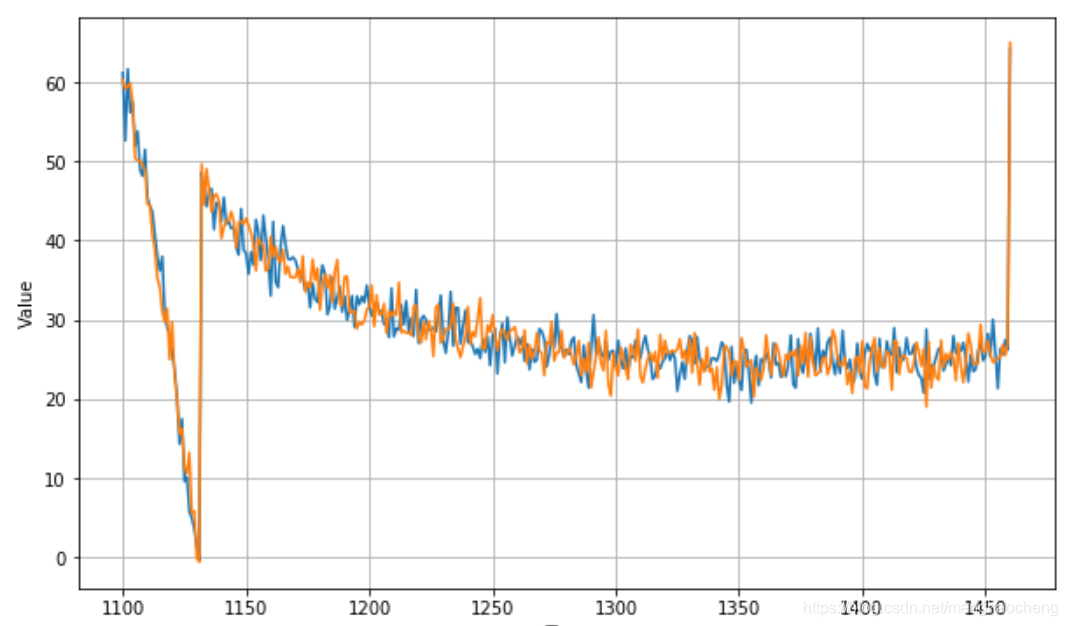
【朴素预测】
naive_forecast = series[split_time-1:-1]

plt.figure(figsize=(10, 6))
plot_series(time_valid, x_valid)
plot_series(time_valid, naive_forecast)

# Expected output: Chart similar to above, but with forecast overlay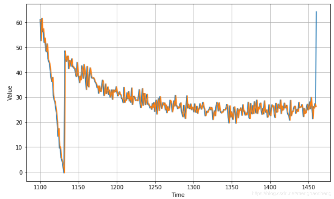
我们把验证证期的开始放大一点:
plt.figure(figsize=(10, 6))
plot_series(time_valid, x_valid, start=0, end=150)
plot_series(time_valid, naive_forecast, start=1, end=151)

# EXPECTED - Chart with X-Axis from 1100-1250 and Y Axes with series value and projections. Projections should be time stepped 1 unit 'after' series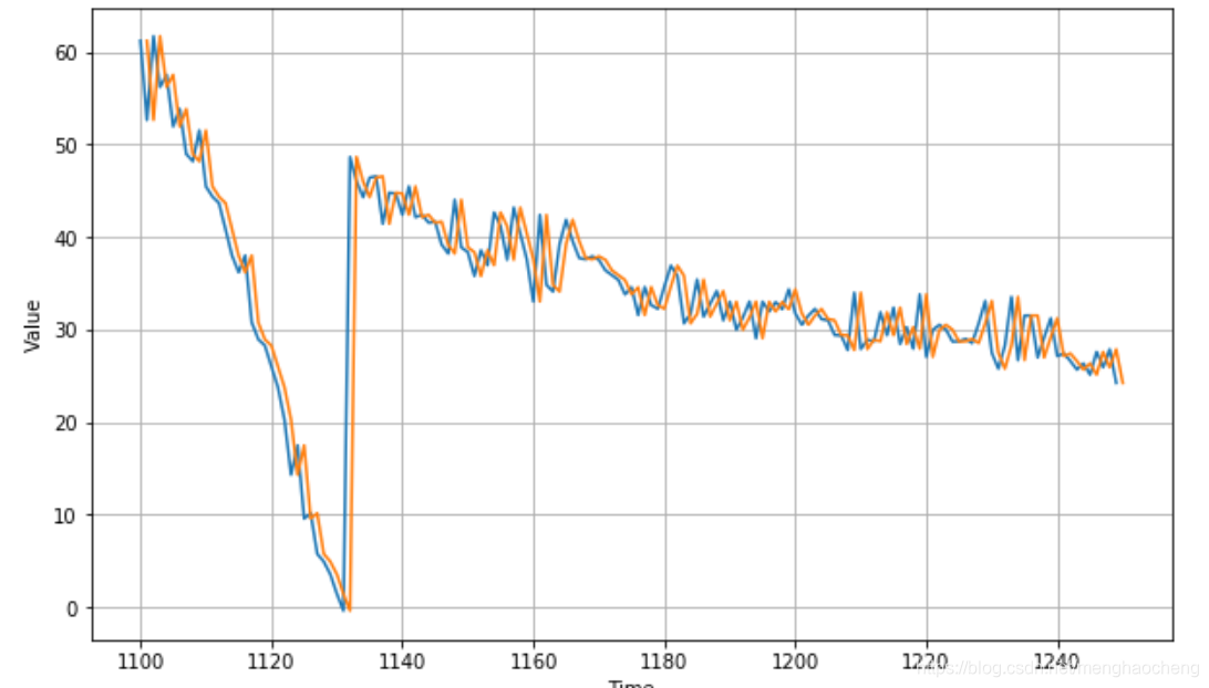
计算验证期预测和预测之间的均方误差和平均绝对误差:
print(keras.metrics.mean_squared_error(x_valid, naive_forecast).numpy())
print(keras.metrics.mean_absolute_error(x_valid, naive_forecast).numpy())
# Expected Output
# 19.578304
# 2.6011968
这是我们的基线,现在让我们试试移动平均线:
【用移动平均线】
def moving_average_forecast(series, window_size):
  """Forecasts the mean of the last few values.
     If window_size=1, then this is equivalent to naive forecast"""
  forecast = []
  for time in range(len(series) - window_size):
    forecast.append(series[time:time + window_size].mean())
  return np.array(forecast)

moving_avg = moving_average_forecast(series, 30)[split_time - 30:]

plt.figure(figsize=(10, 6))
plot_series(time_valid, x_valid)
plot_series(time_valid, moving_avg)

# EXPECTED OUTPUT
# CHart with time series from 1100->1450+ on X
# Time series plotted
# Moving average plotted over it
均方误差和平均绝对误差:
print(keras.metrics.mean_squared_error(x_valid, moving_avg).numpy())
print(keras.metrics.mean_absolute_error(x_valid, moving_avg).numpy())
# EXPECTED OUTPUT
# 65.786224
# 4.3040023
这比朴素的预测还要糟糕!移动平均线不能预测趋势或季节性,所以让我们试着通过使用差分来去除它们。因为季节周期是365天,所以我们要用t - 365的值减去t的值。
diff_series = (series[365:] - series[:-365])
diff_time = time[365:]

plt.figure(figsize=(10, 6))
plot_series(diff_time, diff_series)
plt.show()

# EXPECETED OUTPUT: CHart with diffs
很好,趋势和季节性似乎消失了,所以现在我们可以使用移动平均线:
diff_moving_avg = moving_average_forecast(diff_series, 50)[split_time-365-50:]

plt.figure(figsize=(10, 6))
plot_series(time_valid, diff_series[split_time-365:])
plot_series(time_valid, diff_moving_avg)
plt.show()

# Expected output. Diff chart from 1100->1450 +
# Overlaid with moving average
现在让我们通过添加t - 365的过去值来还原趋势和季节性:
print(keras.metrics.mean_squared_error(x_valid, diff_moving_avg_plus_past).numpy())
print(keras.metrics.mean_absolute_error(x_valid, diff_moving_avg_plus_past).numpy())
# EXPECTED OUTPUT
# 8.498155
# 2.327179
比朴素的预测要好,很好。然而,这些预测看起来有点太随机了,因为我们只是在添加过去的值,这些值很噪音。让我们使用移动平均过去的值,以消除一些噪音:
diff_moving_avg_plus_smooth_past = moving_average_forecast(series[split_time-370:-360], 10) + diff_moving_avg

plt.figure(figsize=(10, 6))
plot_series(time_valid, x_valid)
plot_series(time_valid, diff_moving_avg_plus_smooth_past)
plt.show()

# EXPECTED OUTPUT:
# Similar chart to above, but the overlaid projections are much smoother
print(keras.metrics.mean_squared_error(x_valid, diff_moving_avg_plus_smooth_past).numpy())
print(keras.metrics.mean_absolute_error(x_valid, diff_moving_avg_plus_smooth_past).numpy())
# EXPECTED OUTPUT
# 12.527958
# 2.2034433