widget 渲染过程
Widget 视图的一种结构化描述,里面储存有关视图渲染的配置信息,包括布局,渲染属性,事件响应信息。轻量级
Element:widget的一个实例化对象,承载视图构建的上下文数据,
RenderObject:负责实现视图渲染的对象。
flutter的视图开发是声明式的,核心是将视图和数据分离。
statelessWidget (无状态组件)一旦创建成功就不再进行重绘。
statefulWidget(有状态组件) widget 创建完成后,还需要setState方法响应数据变化来进行重绘。
App 是一个特殊的widget
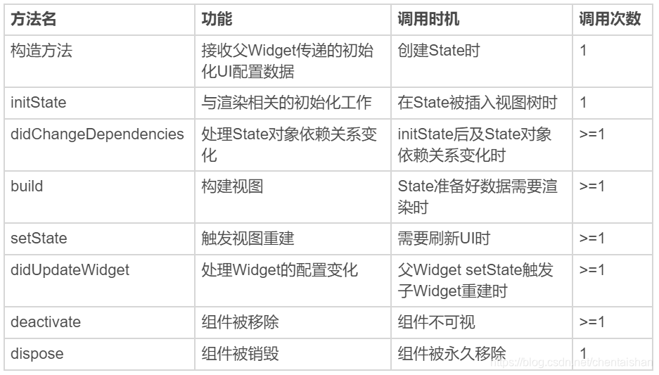
state 生命周期
- 创建
构造方法
initState
didChangeDependencies
build - 更新
setState 当状态数据发生变化,刷新视图
didChangeDependencies state依赖关系发生变化,会回调该方法。
didUpdateWidget 当widget配置发生变化,回调该方法。如:热重载 - 销毁
deactive 可见状态发生变化,被回调
dispose 永久从视图树移除。
控件:
Text 支持两种类型的文本展示,一个是默认的展示单一样式的文本 Text,另一个是支持多种混合样式的富文本 Text.rich。
   Text(
              'You have pushed the button this many times:',
              textAlign: TextAlign.center,
              textDirection: TextDirection.ltr,
              maxLines: 3,
              overflow: TextOverflow.clip,
              style: TextStyle(fontWeight: FontWeight.bold, fontSize: 20, color: Colors.red),
            )
多种样式
TextStyle blackStyle = TextStyle(fontWeight: FontWeight.normal, fontSize: 20, color: Colors.black); //黑色样式

TextStyle redStyle = TextStyle(fontWeight: FontWeight.bold, fontSize: 20, color: Colors.red); //红色样式

Text.rich(
    TextSpan(
        children: <TextSpan>[
          TextSpan(text:'文本是视图系统中常见的控件,它用来显示一段特定样式的字符串,类似', style: redStyle), //第1个片段,红色样式
          TextSpan(text:'Android', style: blackStyle), //第1个片段,黑色样式
          TextSpan(text:'中的', style:redStyle), //第1个片段,红色样式
          TextSpan(text:'TextView', style: blackStyle) //第1个片段,黑色样式
        ]),
  textAlign: TextAlign.center,
);
图片
加载本地资源图片,如 Image.asset(‘images/logo.png’);
加载本地(File 文件)图片,如 Image.file(new File(’/storage/xxx/xxx/test.jpg’));
加载网络图片,如 Image.network(‘http://xxx/xxx/test.gif’) 。
填充模式 fit、拉伸模式 centerSlice、重复模式 repeat 等属性
FadeInImage 支持占位图、加载动画
FadeInImage.assetNetwork(
  placeholder: 'assets/loading.gif', //gif占位
  image: 'https://xxx/xxx/xxx.jpg',
  fit: BoxFit.cover, //图片拉伸模式
  width: 200,
  height: 200,
)
CachedNetworkImage
图片缓存 占位 加载出错
CachedNetworkImage(
        imageUrl: "http://xxx/xxx/jpg",
        placeholder: (context, url) => CircularProgressIndicator(),
        errorWidget: (context, url, error) => Icon(Icons.error),
     )
按钮:
Flutter 提供了三个基本的按钮控件,即 FloatingActionButton、FlatButton 和 RaisedButton
FloatingActionButton:一个圆形的按钮,一般出现在屏幕内容的前面,用来处理界面中最常用、最基础的用户动作。
RaisedButton:凸起的按钮,默认带有灰色背景,被点击后灰色背景会加深。FlatButton:扁平化的按钮,默认透明背景,被点击后会呈现灰色背景。
点击事件 onPressed 配置为null,禁止点击
child 内部的布局 比如text
FlatButton(
    color: Colors.yellow, //设置背景色为黄色
    shape:BeveledRectangleBorder(borderRadius: BorderRadius.circular(20.0)), //设置斜角矩形边框
    colorBrightness: Brightness.light, //确保文字按钮为深色
    onPressed: () => print('FlatButton pressed'),
    child: Row(children: <Widget>[Icon(Icons.add), Text("Add")],)
);
Listview
列表组件,可以水平和垂直,可以直接添加children,适合少量元素的数据情况。
ListView(
  children: <Widget>[
    //设置ListTile组件的标题与图标
    ListTile(leading: Icon(Icons.map),  title: Text('Map')),
    ListTile(leading: Icon(Icons.mail), title: Text('Mail')),
    ListTile(leading: Icon(Icons.message), title: Text('Message')),
  ]);
ListView.builder 适合数据较多的情况。参数:itemBuilder item count
itemBuilder 是列表项的创建方法。当列表滚动到相应位置时,ListView 会调用该方法创建对应的子 Widget
itemCount 表示列表项的数量,如果为空,则表示 ListView 为无限列表
ListView.builder(
    itemCount: 100, //元素个数
    itemExtent: 50.0, //列表项高度
    itemBuilder: (BuildContext context, int index) => ListTile(title: Text("title $index"), subtitle: Text("body $index"))
);
ListView.separated 分割线
//使用ListView.separated设置分割线
ListView.separated(
    itemCount: 100,
    separatorBuilder: (BuildContext context, int index) => index %2 ==0? Divider(color: Colors.green) : Divider(color: Colors.red),//index为偶数,创建绿色分割线;index为奇数,则创建红色分割线
    itemBuilder: (BuildContext context, int index) => ListTile(title: Text("title $index"), subtitle: Text("body $index"))//创建子Widget
)

CustomScrollView
用来处理多个需要自定义滚动效果的 Widget。在 CustomScrollView 中,这些彼此独立的、可滚动的 Widget 被统称为 Sliver。
CustomScrollView(
  slivers: <Widget>[
    SliverAppBar(//SliverAppBar作为头图控件
      title: Text('CustomScrollView Demo'),//标题
      floating: true,//设置悬浮样式
      flexibleSpace: Image.network("https://xx.jpg",fit:BoxFit.cover),//设置悬浮头图背景
      expandedHeight: 300,//头图控件高度
    ),
    SliverList(//SliverList作为列表控件
      delegate: SliverChildBuilderDelegate(
            (context, index) => ListTile(title: Text('Item #$index')),//列表项创建方法
        childCount: 100,//列表元素个数
      ),
    ),
  ]);
ScrollController 滚动的监听
class MyAPPState extends State<MyApp> {
  ScrollController _controller;//ListView控制器
  bool isToTop = false;//标示目前是否需要启用"Top"按钮
  @override
  void initState() {
    _controller = ScrollController();
    _controller.addListener(() {//为控制器注册滚动监听方法
      if(_controller.offset > 1000) {//如果ListView已经向下滚动了1000,则启用Top按钮
        setState(() {isToTop = true;});
      } else if(_controller.offset < 300) {//如果ListView向下滚动距离不足300,则禁用Top按钮
        setState(() {isToTop = false;});
      }
    });
    super.initState();
  }

  Widget build(BuildContext context) {
    return MaterialApp(
        ...
        //顶部Top按钮,根据isToTop变量判断是否需要注册滚动到顶部的方法
        RaisedButton(onPressed: (isToTop ? () {
                  if(isToTop) {
                    _controller.animateTo(.0,
                        duration: Duration(milliseconds: 200),
                        curve: Curves.ease
                    );//做一个滚动到顶部的动画
                  }
                }:null),child: Text("Top"),)
        ...
        ListView.builder(
                controller: _controller,//初始化传入控制器
                itemCount: 100,//列表元素总数
                itemBuilder: (context, index) => ListTile(title: Text("Index : $index")),//列表项构造方法
               )
        ...
    );

  @override
  void dispose() {
    _controller.dispose(); //销毁控制器
    super.dispose();
  }
}
ScrollNotification ,NotificationListener 是一个 Widget,为了监听滚动类型的事件,我们需要将 NotificationListener 添加为 ListView 的父容器,从而捕获 ListView 中的通知
Widget build(BuildContext context) {
  return MaterialApp(
    title: 'ScrollController Demo',
    home: Scaffold(
      appBar: AppBar(title: Text('ScrollController Demo')),
      body: NotificationListener<ScrollNotification>(//添加NotificationListener作为父容器
        onNotification: (scrollNotification) {//注册通知回调
          if (scrollNotification is ScrollStartNotification) {//滚动开始
            print('Scroll Start');
          } else if (scrollNotification is ScrollUpdateNotification) {//滚动位置更新
            print('Scroll Update');
          } else if (scrollNotification is ScrollEndNotification) {//滚动结束
            print('Scroll End');
          }
        },
        child: ListView.builder(
          itemCount: 30,//列表元素个数
          itemBuilder: (context, index) => ListTile(title: Text("Index : $index")),//列表项创建方法
        ),
      )
    )
  );
}
