单子 Widget 布局:
Container、Padding 与 CenterContainer
Container
是一种允许在其内部添加其他控件的控件,也是 UI 框架中的一个常见概念。
Container(
  child: Text('Container(容器)在UI框架中是一个很常见的概念,Flutter也不例外。'),
  padding: EdgeInsets.all(18.0), // 内边距
  margin: EdgeInsets.all(44.0), // 外边距
  width: 180.0,
  height:240,
  alignment: Alignment.center, // 子Widget居中对齐
  decoration: BoxDecoration( //Container样式
    color: Colors.red, // 背景色
    borderRadius: BorderRadius.circular(10.0), // 圆角边框
  ),
)
Padding
适合要设置内间距的单一控件
Padding(
  padding: EdgeInsets.all(44.0),
  child: Text('Container(容器)在UI框架中是一个很常见的概念,Flutter也不例外。'),
);
EdgeInsets提供的便捷方法:
1.fromLTRB(double left, double top, double right, double bottom):分别指定四个方向的填充。
2.all(double value) : 所有方向均使用相同数值的填充。
3.only({left, top, right ,bottom }):可以设置具体某个方向的填充(可以同时指定多个方向)。
4.symmetric({ vertical, horizontal }):用于设置对称方向的填充,vertical指top和bottom,horizontal指left和right。
Center
适合要居中排列的控件
Scaffold(
  body: Center(child: Text("Hello"))
   // This trailing comma makes auto-formatting nicer for build methods.
);
多子 Widget 布局:
Row、Column 与 Expanded
Row、
水平排列,类似于android的线性布局
Column
垂直排列,竖向排列的线性布局
Expanded
布局方向(行 / 列)中剩余空间的 Expanded
横向排列,expanded 填充剩余空间。
Row(
  children: <Widget>[
    Expanded(flex: 1, child: Container(color: Colors.yellow, height: 60)), //设置了flex=1,因此宽度由Expanded来分配
    Container(color: Colors.red, width: 100, height: 180,),
    Container(color: Colors.black, width: 60, height: 80,),
    Expanded(flex: 1, child: Container(color: Colors.green,height: 60),)/设置了flex=1,因此宽度由Expanded来分配
  ],
);
mainAxisAlignment
滚动的方向叫做主轴。主轴方向 start 表示靠左对齐、center 表示横向居中对齐、end 表示靠右对齐、
spaceEvenly 表示按固定间距对齐;
crossAxisAlignment
纵轴,和主轴垂直的方向叫纵轴
而纵轴方向 start 则表示靠上对齐、center 表示纵向居中对齐、end 表示靠下对齐
Row(
  mainAxisAlignment: MainAxisAlignment.spaceEvenly, //由于容器与子Widget一样宽,因此这行设置排列间距的代码并未起作用
  mainAxisSize: MainAxisSize.min, //让容器宽度与所有子Widget的宽度一致
  children: <Widget>[
    Container(color: Colors.yellow, width: 60, height: 80,),
    Container(color: Colors.red, width: 100, height: 180,),
    Container(color: Colors.black, width: 60, height: 80,),
    Container(color: Colors.green, width: 60, height: 80,),
  ],
)
层叠 Widget 布局:
Stack 与 Positioned
Stack 提供了层叠布局的容器,而 Positioned 则提供了设置子 Widget 位置的能力。Positioned 控件只能在 Stack 中使用,在其他容器中使用会报错。
Stack(
  children: <Widget>[
    Container(color: Colors.yellow, width: 300, height: 300),//黄色容器
    Positioned(
      left: 18.0,
      top: 18.0,
      child: Container(color: Colors.green, width: 50, height: 50),//叠加在黄色容器之上的绿色控件
    ),
    Positioned(
      left: 18.0,
      top:70.0,
      child: Text("Stack提供了层叠布局的容器"),//叠加在黄色容器之上的文本
    )
  ],
)
限制类容器
尺寸限制类容器用于限制容器大小。
ConstrainedBox、SizedBox、UnconstrainedBox(不限制容器,不常用)
ConstrainedBox
用于对子组件添加额外的约束。例如,如果你想让子组件的最小高度是80像素,你可以使用const BoxConstraints(minHeight: 80.0)作为子组件的约束
ConstrainedBox(
  constraints: BoxConstraints(
    minWidth: double.infinity, //宽度尽可能大
    minHeight: 50.0 //最小高度为50像素
  ),
  child: Container(
      height: 5.0,
      child: redBox
  ),
)
SizedBox
用于给子元素设置固定的宽高
SizedBox(
  width: 80.0,
  height: 80.0,
  child: redBox
)
组合和组装控件
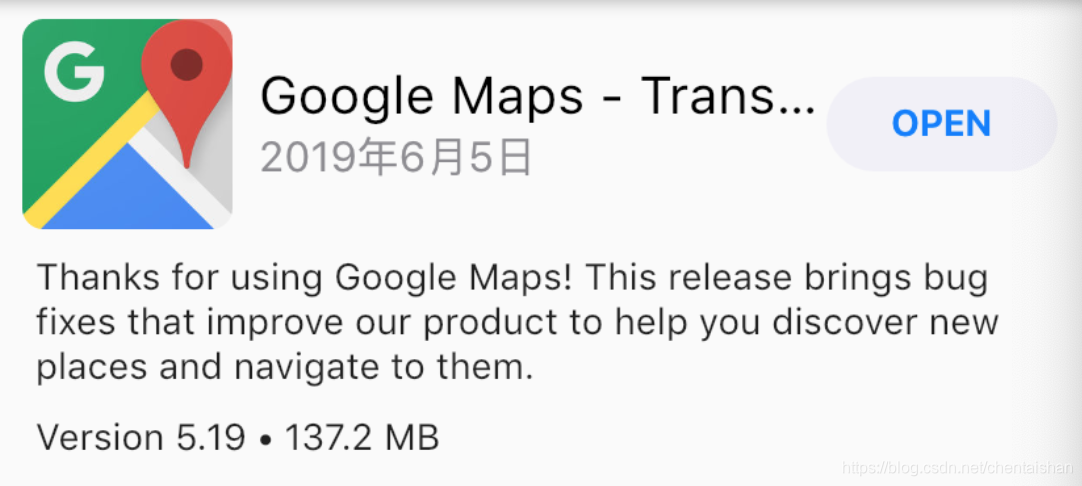
class UpdatedItem extends StatelessWidget {
  final UpdatedItemModel model;//数据模型
  //构造函数语法糖,用来给model赋值
  UpdatedItem({Key key,this.model, this.onPressed}) : super(key: key);
  final VoidCallback onPressed;

  @override
  Widget build(BuildContext context) {
    return Column(//用Column将上下两部分合体
        children: <Widget>[
          buildTopRow(context),//上半部分
          buildBottomRow(context)//下半部分
        ]);
  }
  Widget buildBottomRow(BuildContext context) {...}
  Widget buildTopRow(BuildContext context) {...}
}


Widget buildTopRow(BuildContext context) {
  return Row(//Row控件,用来水平摆放子Widget
    children: <Widget>[
      Padding(//Paddng控件,用来设置Image控件边距
        padding: EdgeInsets.all(10),//上下左右边距均为10
        child: ClipRRect(//圆角矩形裁剪控件
          borderRadius: BorderRadius.circular(8.0),//圆角半径为8
          child: Image.asset(model.appIcon, width: 80,height:80)图片控件//
        )
      ),
      Expanded(//Expanded控件,用来拉伸中间区域
        child: Column(//Column控件,用来垂直摆放子Widget
          mainAxisAlignment: MainAxisAlignment.center,//垂直方向居中对齐
          crossAxisAlignment: CrossAxisAlignment.start,//水平方向居左对齐
          children: <Widget>[
            Text(model.appName,maxLines: 1),//App名字
            Text(model.appDate,maxLines: 1),//App更新日期
          ],
        ),
      ),
      Padding(//Paddng控件,用来设置Widget间边距
        padding: EdgeInsets.fromLTRB(0,0,10,0),//右边距为10,其余均为0
        child: FlatButton(//按钮控件
          child: Text("OPEN"),
          onPressed: onPressed,//点击回调
        )
      )
  ]);
}


Widget buildBottomRow(BuildContext context) {
  return Padding(//Padding控件用来设置整体边距
    padding: EdgeInsets.fromLTRB(15,0,15,0),//左边距和右边距为15
    child: Column(//Column控件用来垂直摆放子Widget
      crossAxisAlignment: CrossAxisAlignment.start,//水平方向距左对齐
      children: <Widget>[
        Text(model.appDescription),//更新文案
        Padding(//Padding控件用来设置边距
          padding: EdgeInsets.fromLTRB(0,10,0,0),//上边距为10
          child: Text("${model.appVersion} • ${model.appSize} MB")
        )
      ]
  ));
}
自绘
CustomPaint 是用以承接自绘控件的容器,并不负责真正的绘制。既然是绘制,那就需要用到画布与画笔。
画布是 Canvas,画笔则是 Paint
class WheelPainter extends CustomPainter {
 // 设置画笔颜色
  Paint getColoredPaint(Color color) {//根据颜色返回不同的画笔
    Paint paint = Paint();//生成画笔
    paint.color = color;//设置画笔颜色
    return paint;
  }

  @override
  void paint(Canvas canvas, Size size) {//绘制逻辑
    double wheelSize = min(size.width,size.height)/2;//饼图的尺寸
    double nbElem = 6;//分成6份
    double radius = (2 * pi) / nbElem;//1/6圆
    //包裹饼图这个圆形的矩形框
    Rect boundingRect = Rect.fromCircle(center: Offset(wheelSize, wheelSize), radius: wheelSize);
    // 每次画1/6个圆弧
    canvas.drawArc(boundingRect, 0, radius, true, getColoredPaint(Colors.orange));
    canvas.drawArc(boundingRect, radius, radius, true, getColoredPaint(Colors.black38));
    canvas.drawArc(boundingRect, radius * 2, radius, true, getColoredPaint(Colors.green));
    canvas.drawArc(boundingRect, radius * 3, radius, true, getColoredPaint(Colors.red));
    canvas.drawArc(boundingRect, radius * 4, radius, true, getColoredPaint(Colors.blue));
    canvas.drawArc(boundingRect, radius * 5, radius, true, getColoredPaint(Colors.pink));
  }
  // 判断是否需要重绘,这里我们简单的做下比较即可
  @override
  bool shouldRepaint(CustomPainter oldDelegate) => oldDelegate != this;
}
//将饼图包装成一个新的控件
class Cake extends StatelessWidget {
  @override
  Widget build(BuildContext context) {
    return CustomPaint(
        size: Size(200, 200),
        painter: WheelPainter(),
      );
  }
}
